How to create amazing infographics
Pro tips for making memorable data visualisations.

Valentina D'Efilippo is an award-winning information designer and the woman behind some of the best infographics around (including those pictured above). But infographics have exploded in popularity in recent years – you can see them everywhere. So what do you need to do to make one that truly stands out?
We caught up with D'Efilippo after her infographics masterclass at D&AD Festival 2018 to find out her best tips for building a data visualisation from scratch (including her tips for the best infographic tools) and how to elevate the design from good to great.
01. Pick an unexpected topic

Clearly your infographic needs a subject. But don’t be fooled into thinking infographics are only for topics with lots of obvious facts and figures – an infographic can explore just about anything, says D'Efilippo. A good subject is anything that’s relevant to the public, be it political, social, economic or cultural.
“The good thing with data is that it can actually be found everywhere,” she says. “Data is everywhere around us; what we do, what we consume, what we like, what we share.” It's just that it doesn’t often come in a format that’s ready to be visualised.
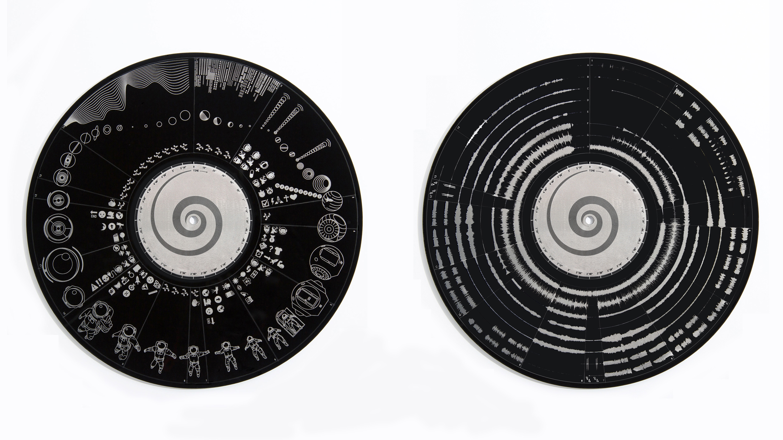
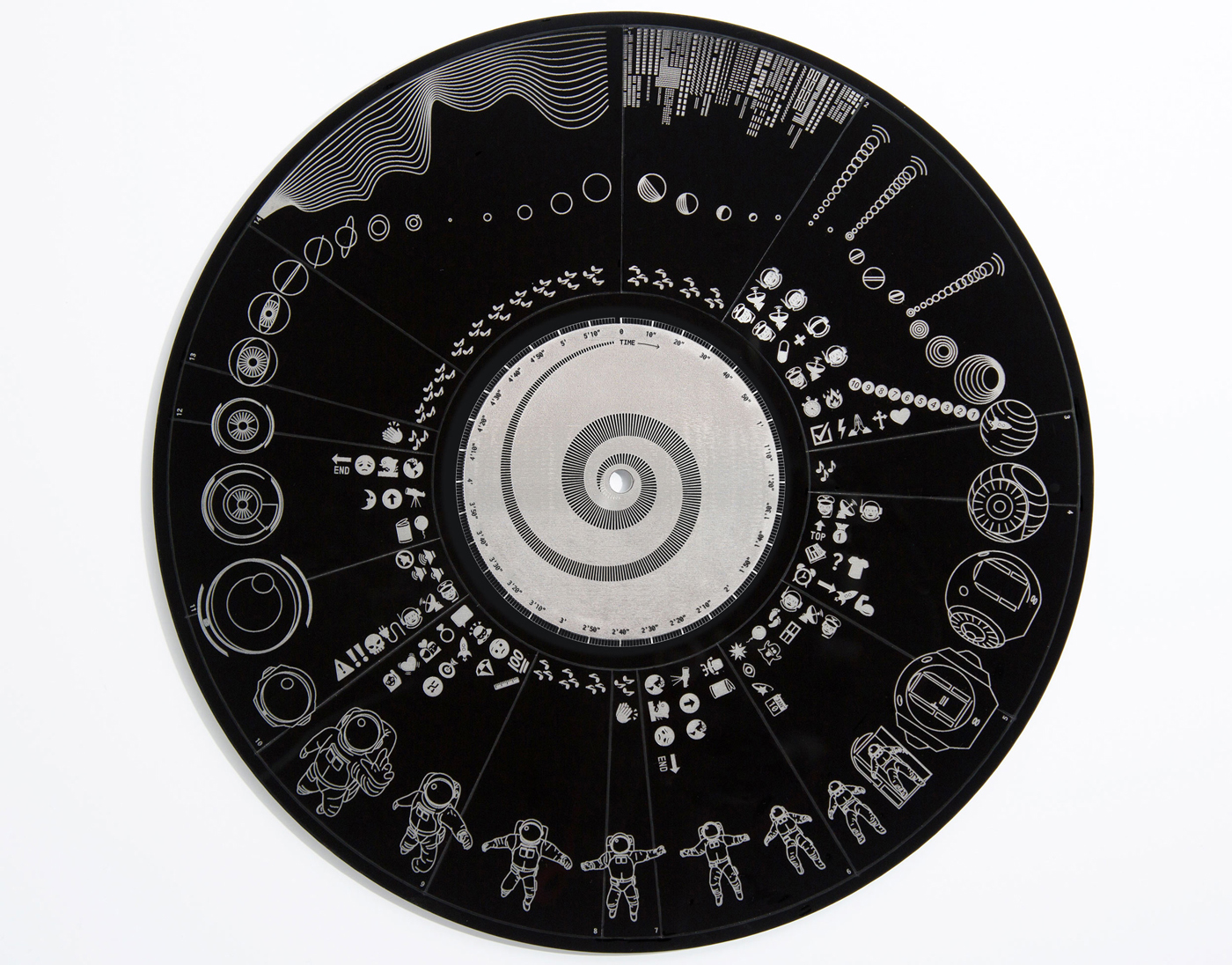
A case in point is D'Efilippo's OddityViz project, which visualised David Bowie’s Space Oddity, and won an Information is Beautiful award. . “The Bowie project started with: ‘If you could actually see this song, if you could capture the complexity of te music, the imagery, as well as the emotional response, what would we see?‘” she explains.
02. Bring in an expert
The next step is to take the data and narrow it down to what you’re going to show. D'Efilippo describes this process as “very arbitrary and editorial”, and recommends bringing in an expert in that topic.
Consulting someone who fully understands the complexity of the subject matter can help guide you when making decisions on how it will be best represented. As a designer, that’s not your area – and that’s ok, she says. Great data visualisation is a collaboration of different disciplines.
So for her Bowie tribute, D'Efilippo spoke to a musicologist. For her book The Infographic History of the World, she brought in a data journalist.
Once you have your specialist in the room, ask as many questions as possible to try and gain a full picture of the topic.
03. Shape the data
When it comes to turning the data into a visualisation, D'Efilippo has three main considerations:
- Audience: Who am I talking to?
- Purpose: What am I trying to say?
- Channel: How will people interact with this visualisation (social media, print and so on)?
“When I have a clear answer to these questions, I feel like I have the right framework to decide how I’m going to visualise it,” she explains.
The next step in the process involves playing around with the data and analysing it to get a sense of the patterns, variables, dimensions, outliers and so on.
“I need to get my head around it and get a picture of what I’m seeing. Because I’m not a data expert, the only way I can see this is though visualising them,” she adds.
D'Efilippo recommends getting the data into Excel and plotting some basic graphs so you can start to see where the interesting parts are and the shapes the data might take.
04. Make it relevant

While the subject can be anything, what's really key is finding the story you want to tell, and turning the data – in whatever format it comes, and however complex it may be – into something that's relevant to people. “How can we bridge the gap between the complexity and something that can resonate with the audience? How can we create a shortcut?”
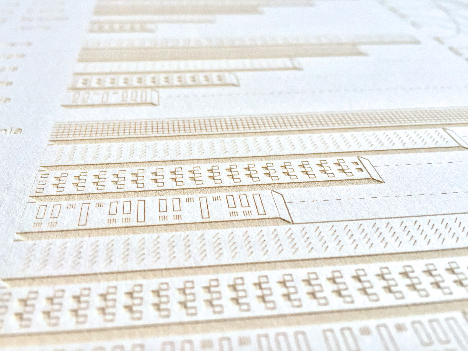
D'Efilippo's Invisible Cities project focuses on the idea of sustainability in cities. Rather than printing the design in ink, she laser engraved it. The cities take form without the need for another material to be added to the process – the paper itself becomes the sculptural medium. The process adds another connection to the subject matter and reinforces the idea of sustainability.
“Usually I feel like there's a lack of humanisation in the way we represent the data,” muses D'Efilippo. “We’re missing opportunities to communicate really interesting stories because we're not making them accessible.”
05. Be accurate
It should go without saying, but there’s no bending the truth to fit your story or design here: your infographic should be entirely accurate and factual. “Whenever we’re representing data, we need to make sure we’re using sources that are already providing a truthful point of reference, and are as accurate as possible,” warns D'Efilippo. Make sure your scales are correct and your data is plotted properly.
06. Don't hide the story
A few years ago, data visualisation was all about lots of complex dashboards, filters, buttons and ways to interact with the data, but we’re moving away from this now, says D'Efilippo. In data journalism in particular, there’s been a shift to designs that enable users to explore the data but at the same time explain the process – sometimes in the form of walkthroughs that guide the viewer through the complexity of a chart.
It's a welcome shift for D'Efilippo. "Because actually, [when presented with complex, interactive data] most people don’t click," she explains. "You're submerged by all this visible information and to ask for the audience to interact with your piece is asking a lot. The more you can deliver by guiding the user, the better.”
07. Use visual storytelling

With data visualisation, you have a number of elements through which to tell your story. “Because the stories we’re visualising are so complex, it would be quite reductive to visualise them all though bar graphs,” says D'Efilippo. “Then you lose the shortcut, or the empathetic bridge into the story.”
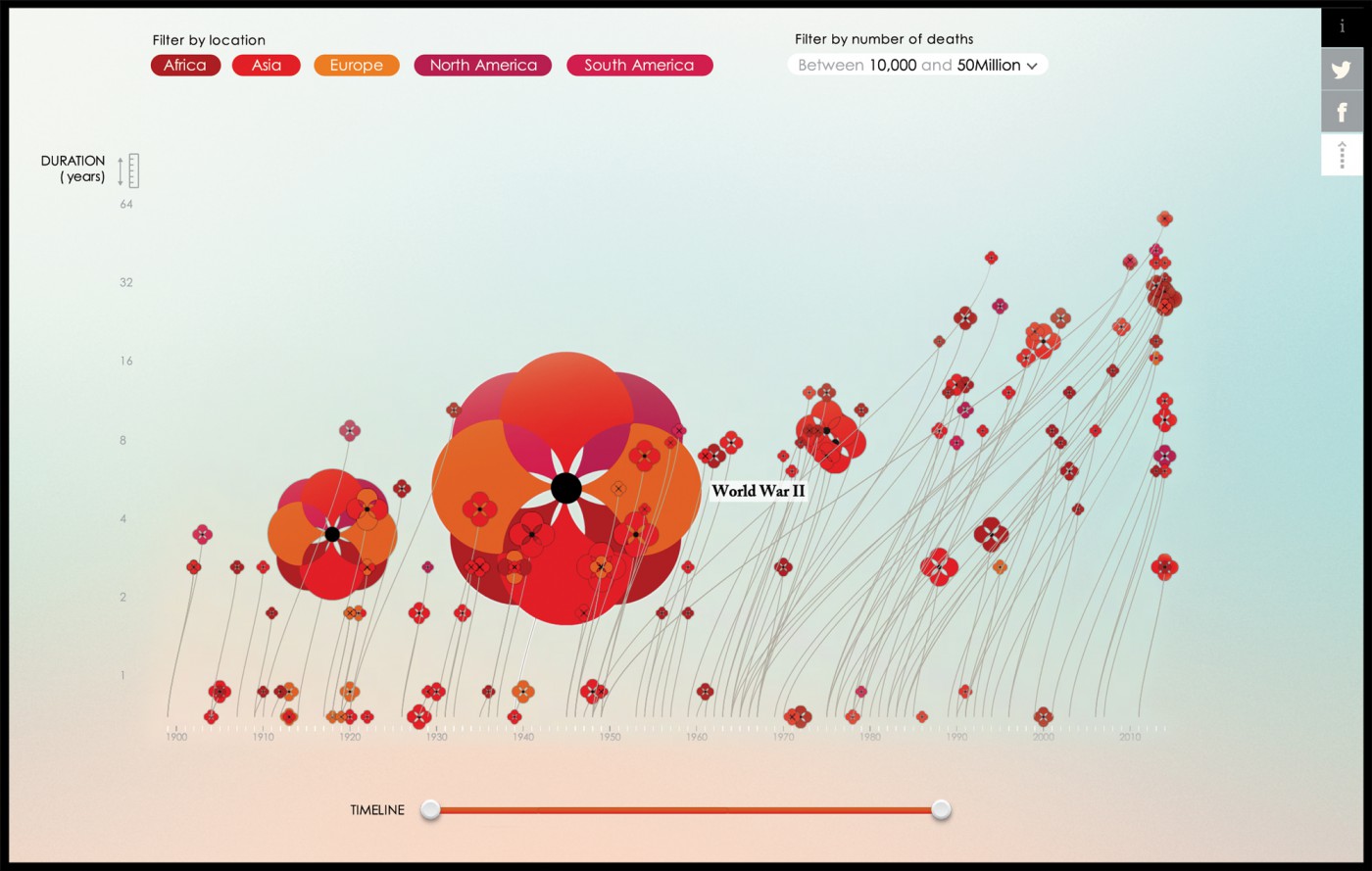
So consider all the elements you can use to visualise the data in a way that carries more of the meaning of the subject matter – the iconography, images, colour and so on. For D'Efilippo's interactive data visualisation of the wars of the last century, she used the motif of poppies. The stem starts in the year the war began and finishes when the war ended, while the size of the flower reveals the number of deaths, and the variation of colour represents the areas involved.
For this step, D'Efilippo uses Illustrator predominantly, although if there’s lots of interactivity she might delve into Adobe XD or Sketch, and use those to build a user flow.
08. Create something memorable
"Especially in my personal work, I really put an emphasis on the experience,” says D'Efilippo. We tend to focus on processing the numbers and analysing them to form a story, and then rendering the story, but for D'Efilippo there’s a third part: sensing.
She aims to create infographics that viewers will look at and gain a true understanding of the topic. ”Like ‘Oh, now I get it!’ Like a lightbulb,” she smiles. “I haven’t just seen a chart, I actually understood the story.”
Related articles:

Thank you for reading 5 articles this month* Join now for unlimited access
Enjoy your first month for just £1 / $1 / €1
*Read 5 free articles per month without a subscription

Join now for unlimited access
Try first month for just £1 / $1 / €1
Get the Creative Bloq Newsletter
Daily design news, reviews, how-tos and more, as picked by the editors.

Ruth spent a couple of years as Deputy Editor of Creative Bloq, and has also either worked on or written for almost all of the site's former and current design print titles, from Computer Arts to ImagineFX. She now spends her days reviewing small appliances as the Homes Editor at TechRadar, but still occasionally writes about design on a freelance basis in her spare time.
