How to create effective brand guidelines
Ensure your branding work stays strong with these expert tips.
We’ve already explored how to master colour theory, understand shape psychology and choose the right typography for your logo design, as well as how to develop a coherent brand strategy.
But once all is said and done, post-launch you’ll need to hand all of this over to someone to continue rolling out without your direct day-to-day input. This may be the client’s in-house team, another agency working on a different part of the project, or even a designer further down the chain in your own studio.

Here’s where carefully thought-through brand guidelines can become invaluable, to ensure your hard work during the brand development process doesn’t go to waste. But they shouldn’t be overly restrictive or prescriptive – like all great brand identities, they should have the flexibility to evolve.
Here are nine ways to ensure your brand guidelines hit the mark every time.
Put the guidelines in context

Researching your client’s needs is essential at the start of the branding process, and it’s equally essential to take them into consideration at the end.
Ultimately, brand guidelines are about describing how the brand will be used in certain conditions. Discuss what those conditions will be with the client, and how they plan to use your work, and always tailor your guidelines accordingly.
Pare it back...
Small businesses may only need a very basic set of brand guidelines, if at all – and some studios may prefer to act as an ongoing ‘brand guardian’, reducing the need for a handover document that does anything other than summarise core values. But even for multinational clients for which you’re passing the baton to an in-house team, an exhaustive 100-page tome is likely to be counterproductive, and may just end up sat on a shelf or left in a drawer.
Simplicity and transparency is key, and ongoing, clear communication and collaboration with the client during the design process itself will help instil the brand values internally from the outset, rather than relying on a printed document to convey them.
…but go into detail where necessary
Where very specific aspects, such as Pantone shades, production methods, or tone of voice are concerned, you need to be detailed enough to avoid confusion further down the line.
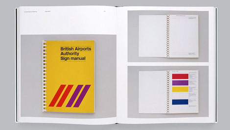
Provide accurate colour references for coated and uncoated stocks, as well as on-screen and more diverse applications such as liveries and exhibition graphics if appropriate. Test these on actual stocks, and involve the client in every stage of the process.
Build a coherent toolkit
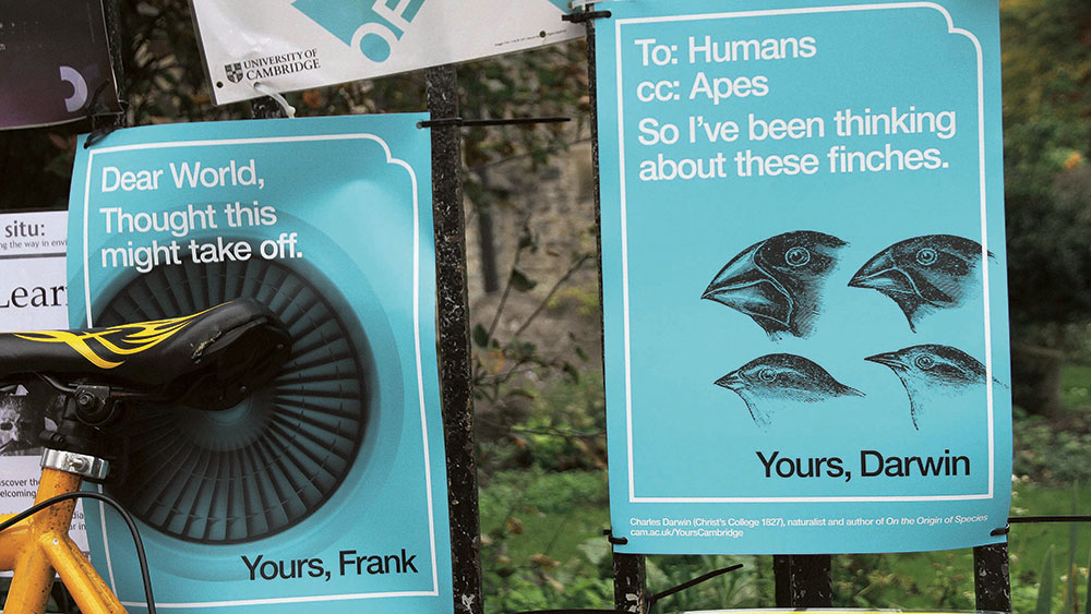
Consistency across multiple brand touchpoints helps build recognition, so within your brand guidelines consider what these are, and how to take full advantage.
However, consistency alone can become dry, brittle and inflexible. Instead, strive for coherence. Consider how the core elements that define the brand can combine across different channels, and use the brand guidelines to explore this versatility rather than setting an application in stone.
Steer clear of pointless jargon
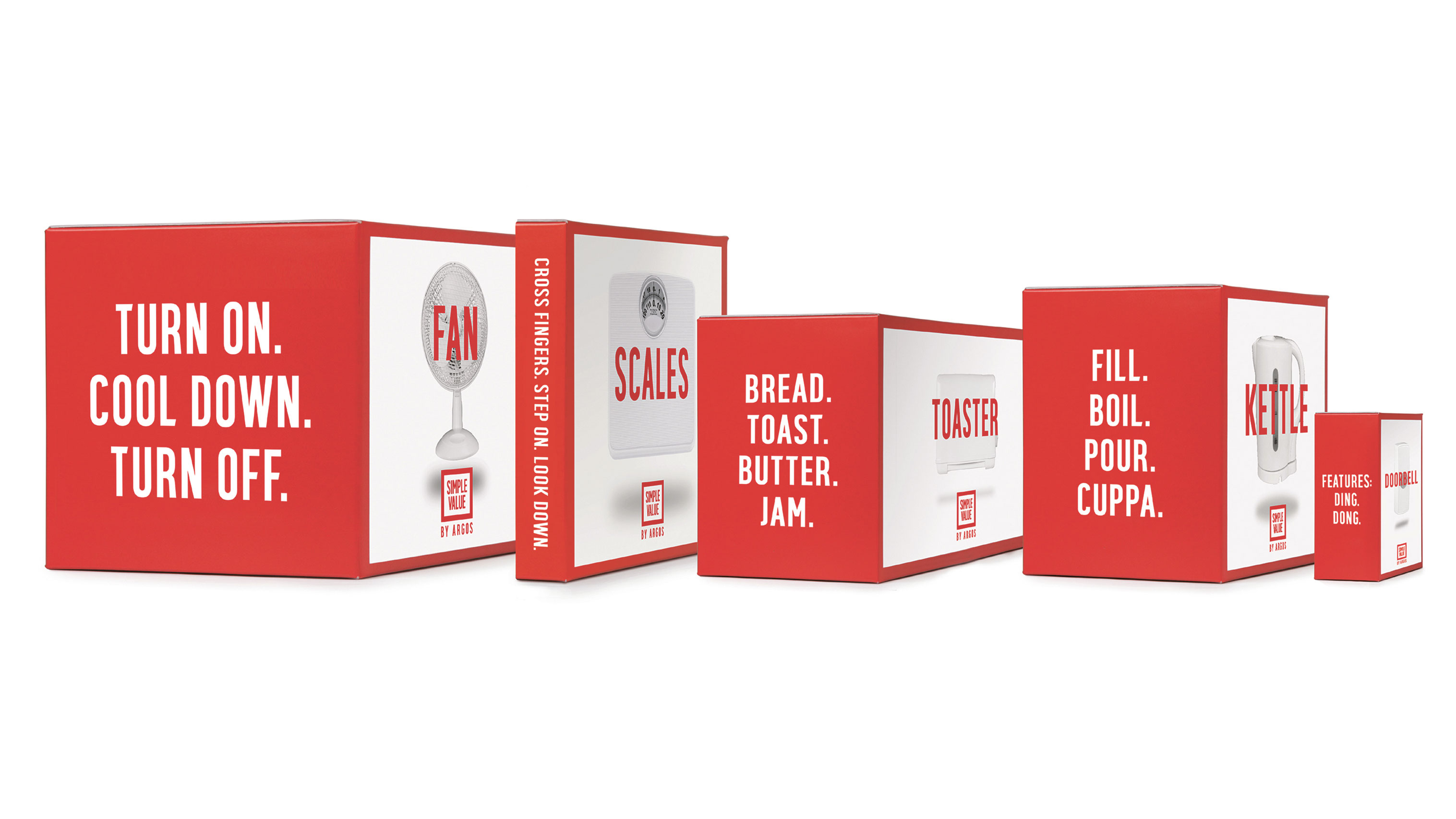
Keep your guidelines short, concise and accessible to ensure they can be understood by a broad range of readers and applied effectively.
Part of this is to write them in plain English, and not obfuscate the point with complicated, industry-specific terminology or pages and pages of strategic waffle. Treat your brand guidelines like a simple, practical manual, and clients will love you.
Keep practical considerations in mind
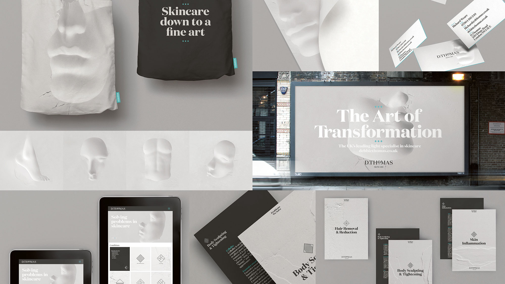
It’s easy to get carried away with the best-case scenario when developing a new brand, and only consider the most stylish, portfolio-worthy applications of it.
Your creative thinking should never be ruled by the lowest common denominator, but always consider a client’s practical constraints in the brand guidelines you produce, particularly when it comes to less glamorous realisations such as PowerPoint presentations or internal templates.
Show things in context
With this in mind, it pays to demonstrate the workability of the brand you’ve created in different contexts within the brand guidelines you produce. This will show the adaptability of the brand, as well as bringing it to life for the client.
Make sure the applications in question are appropriate, and will actually be used by the client - not shown for the sake of it. Remember that these are only demonstrations, so there's no need to include every possible variation.
Build in flexibility…
Try not to be too constrictive in your brand guidelines. Correct usage is important, but so is the freedom to expand into new applications and territories.
Ultimately, brand guidelines should define and protect the core characteristics of a brand, and its visual and verbal identifiers. This is about providing a coherent toolkit of parts that has room to breathe and evolve.
…but don’t allow brands to drift
Of course, evolution is different from drifting and fragmenting. Your brand guidelines need to strike the right balance between flexibility and effectiveness, and this is not always easy to achieve. Where possible, try to build in time to audit the brand at key stages after its launch to ensure the core brand values are still maintained.
In an ideal world, your brand guidelines will be future-proofed, but it may be necessary to freshen, update and amend them to make sure they stay relevant. Don’t be afraid to do so.
Enter your best branding to the Brand Impact Awards
If you’ve already mastered the craft of branding, submit your best work to Computer Arts’ international awards scheme.
The Brand Impact Awards celebrate the very best branding work from all around the world. Deadline for 2017 entries is 9 June. Find out more at www.brandimpactawards.com.
Related articles:

Thank you for reading 5 articles this month* Join now for unlimited access
Enjoy your first month for just £1 / $1 / €1
*Read 5 free articles per month without a subscription

Join now for unlimited access
Try first month for just £1 / $1 / €1
Get the Creative Bloq Newsletter
Daily design news, reviews, how-tos and more, as picked by the editors.

Nick has worked with world-class agencies including Wolff Olins, Taxi Studio and Vault49 on brand storytelling, tone of voice and verbal strategy for global brands such as Virgin, TikTok, and Bite Back 2030. Nick launched the Brand Impact Awards in 2013 while editor of Computer Arts, and remains chair of judges. He's written for Creative Bloq on design and branding matters since the site's launch.
