How to build light and shadow in charcoal
Bring depth to charcoal portraits with these techniques.
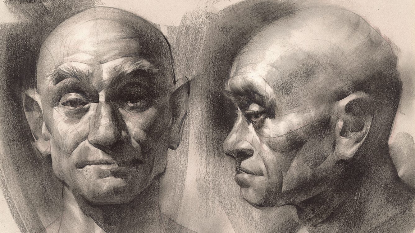
Light and shadow can bring a new level of artistry and storytelling to our charcoal drawings. My professional work as an animation artist calls for a strong understanding of light and shadow. Indeed, it’s one of the most important art techniques in my toolbox. I need to have a technical understanding of how light works so that I can give a believability to the scenes that I create.
Passages of light and shadow can be designed to give special emphasis to each moment of a film. Vibrant contrasts of light can convey an exciting energy, while nuances of light can create subtle mood changes.
- This workshop is taken from How to Draw Portraits in Charcoal – buy your copy here
Long before I began working in film, my understanding of light developed through observational drawing. The study of light on form has been key to everything I do as an artist. In this workshop we’ll explore how to draw a portrait in charcoal, using light and shadow to convey form.
01. Establish where direct light falls
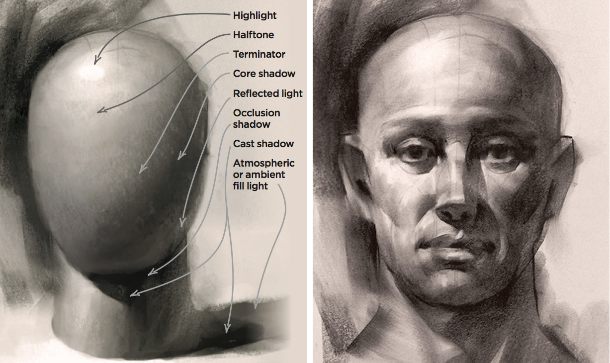
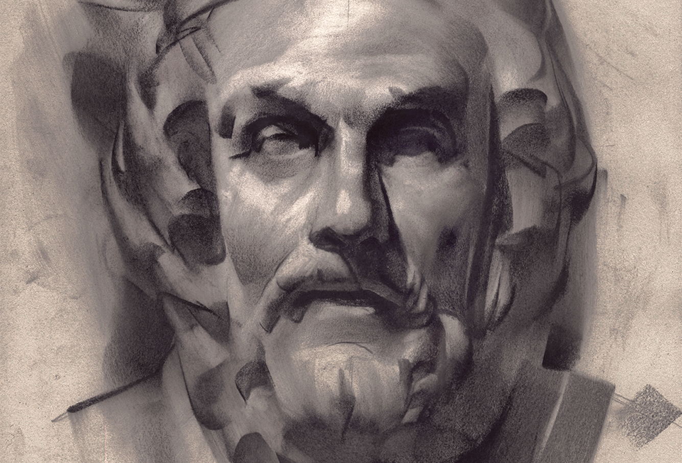
Compare the egg diagram with the generic light-and-shadow head (below). Notice how each major protuberance of the head is like a mini version of our simple diagram. For instance, take a look at the nose: it has a highlight, halftone, core shadow, reflected light and cast shadow.
Now analyse the chin, the lower lip, the cheek and the forehead: each has the same quality of light and shadow. Even the eye, as it protrudes out of its socket, can be treated the way a simple sphere reacts to light. When you learn to observe these simple relationships of light and shadow, rendering form becomes relatively straightforward.
02. Find the ambient light
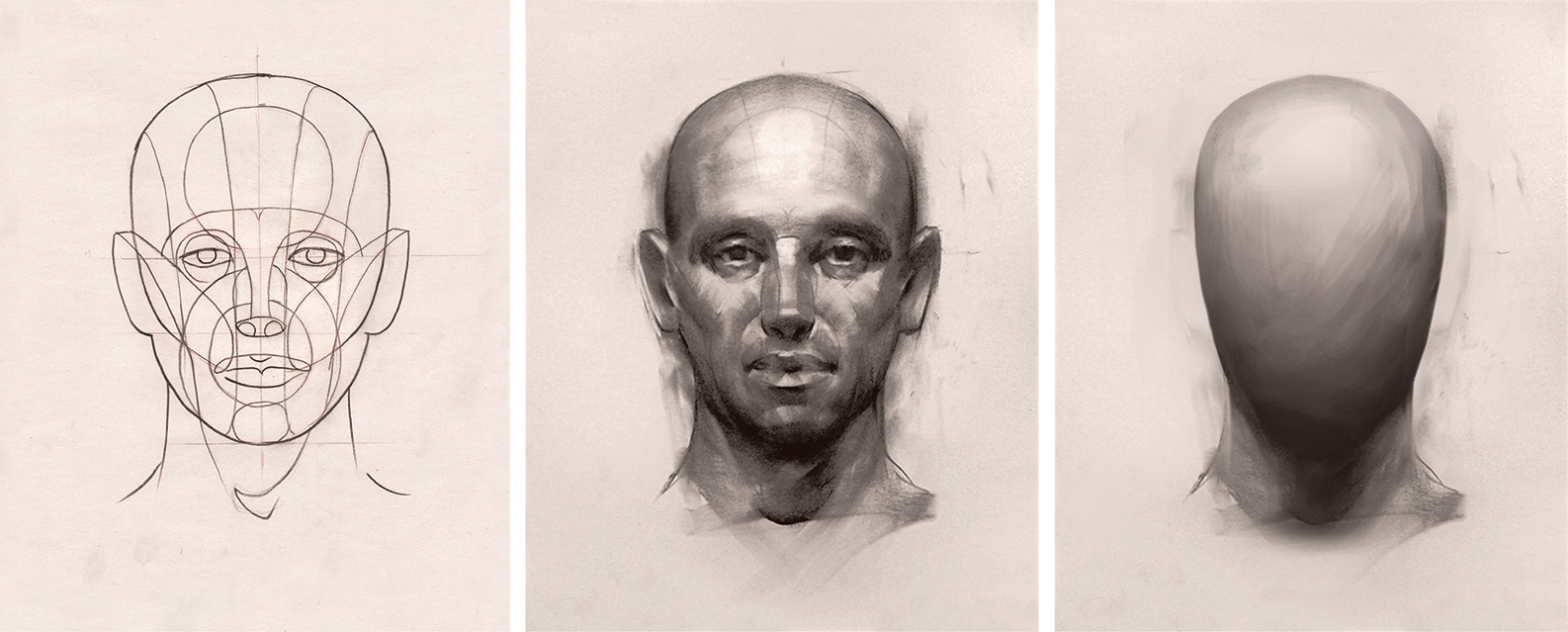
Common sources of ambient light are indirect window light or outdoor lighting on an overcast day. This type of lighting is potentially even simpler than direct light: forms curve away from the light source into shadow, and cast shadows are soft edged and diffuse.
Because electric lighting is relatively recent, there’s a long tradition of portraits painted under ambient light sources. Standard practice was to place the portrait subject in the light of a north-facing window, which would maintain a consistent level of illumination for many hours during the day. Even today, many portrait artists prefer the soft quality of ambient lighting for a sensitive rendering of their subjects.
03. Simplify what you see
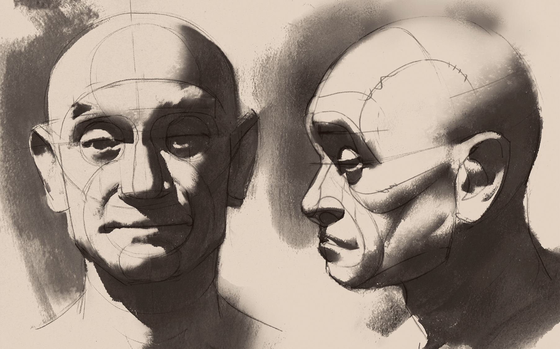
The next important simplification is to organise the head into clear, committed masses of light and shadow. As a drawing teacher I’ve found that new students nearly always look at individual contrasts of anatomy as they draw, rather than noticing the bigger, simpler masses of light and shadow. The results are bumpy, overwrought anatomy that starts to look more like a sack of walnuts than like a human head.
So before we ever start rendering the nuances of light and shadow, I ask students to identify and commit to the simple masses of light and shadow. They also have to look for and emphasise the quality of the shadow edge. For instance, cast shadows tend to have a hard edge, and turning forms tend to have a soft, blended edge. If we emphasise this simple statement of light and shadow in our portraits before we render nuances, we’re more likely to end up with strong forms and an accurate likeness.
04. Use highlights to emphasise form
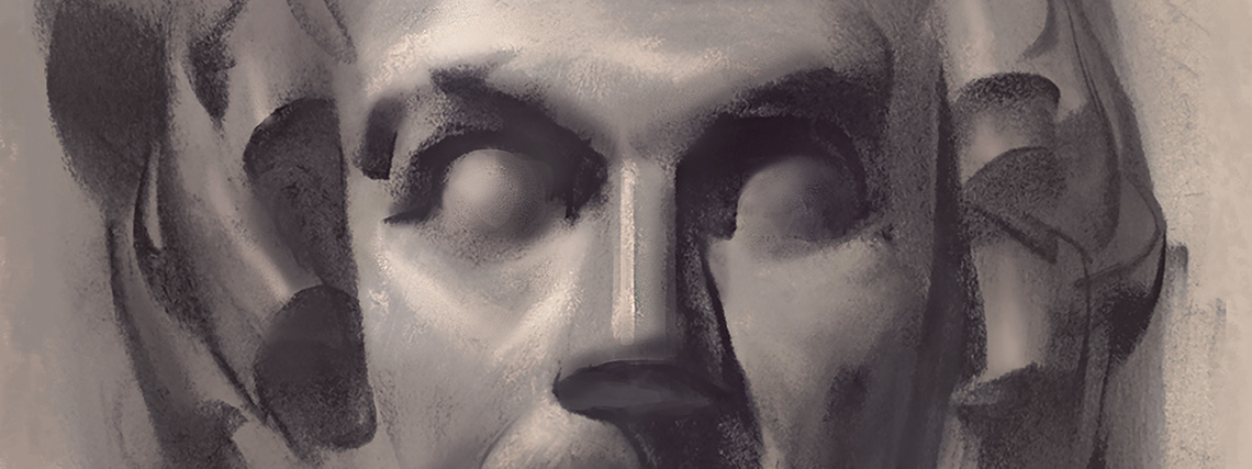
Examine the highlights in the drawing of this plaster cast. See how they tend to fall at the crest of each form facing the light? The placement of highlights is critical to show turning forms. Pictured above is a simplified version of the face to show how the highlights describe the curving forms. The highlights tend to fall on the corners between the large planes of the head.
05. Notice where planes meet
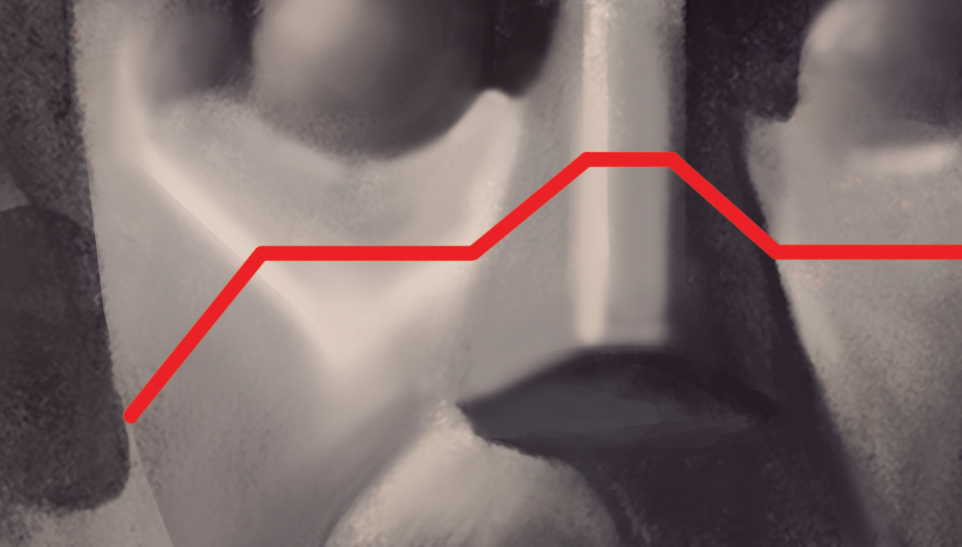
The red-lined diagram shows the side plane and front plane of the cheek, with the highlight falling where they meet. It’s the same with the nose: the highlight falls along the edge where the side plane and the front plane meet. Whenever you’re struggling with creating clear form in your drawings, fall back on this simple quality of highlights. Even if you end up exaggerating what you see, you’re telling the little white lie to convey a greater truth.
06. Don't draw everything you see
In these two drawings, the woman on the left is primarily in shadow and the woman on the right is primarily in light. When I was drawing the woman on the left my eyes could perceive a great deal of value range. But I knew if I tried to render every subtlety, not only would it take too long but the masses of light and shadow would be broken up and confusing. I had to decide what to emphasise about my subject and what to edit.
07. Explore different types of light
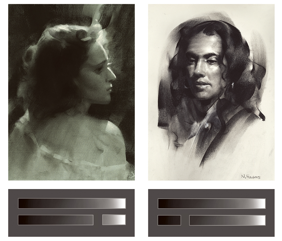
I decided that the rim light on the left-hand face should be pushed into a narrow range of brightness so that I would have the rest of the value range to render subtleties on the shadow side of the face. The value chart below the drawing shows the break between light and shadow. The result is a clearer, more committed drawing.
For the right-hand drawing, I was interested in the subtleties of character and form created by the halftone lights. This led me to make the decision to push all the shadows into a very narrow dark range, as seen in the lower part of the value graph. That choice opened up a wide range of tone to render strong form and character in the light.
This article was originally published in ImagineFX, the world's best-selling magazine for digital artists. Subscribe here.
Read more:

Thank you for reading 5 articles this month* Join now for unlimited access
Enjoy your first month for just £1 / $1 / €1
*Read 5 free articles per month without a subscription

Join now for unlimited access
Try first month for just £1 / $1 / €1
Get the Creative Bloq Newsletter
Daily design news, reviews, how-tos and more, as picked by the editors.
