Getting started with Google Tilt Brush
Pro artists pass on their tips for mastering the Google Tilt Brush.

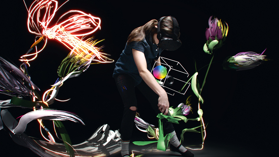
Google Tilt Brush is a new tool that allows you to paint in 3D space with virtual reality. Something very different to creating traditional 2D and 3D art, using this nifty new device would undoubtedly make a pretty impressive addition to your design portfolio.
But this is new ground for many, so how do you get started? Here, top artists pass on their advice for mastering Google's Tilt Brush.
01. Take time to experiment
“The most important thing to keep in mind is that you’re working in a 3D space and have the ability to move around,” says illustrator and comic book artist Alex Moore. “There are also some neat luminous brushes that give off light, so don’t be afraid to play around with them. Just have fun and experiment. This is pretty new territory, after all.”
02. Understand your brushes
“Some brushes react to light and the environment in different ways,” says art director Sparth. “The flat brush will receive shadows on its surfaces, unlike the marker brush, which will keep the same value. The cloud brush is great but a little on the heavy side. Using a very dark colour will enable you to add subtle fog or smoke effects.”
03. Beware of custom brushes
“Be patient, try every single tool and menu, and try to adapt to it,” advises Geoffrey Ernault. “There are a lot of fancy brushes – like sparks – but it’s just like Photoshop: custom brushes won’t make your image look cool by default. They have to be used in a certain way to get something more personal.”
04. Start at waist level
If you make an environment, don’t start painting the ground where your feet are,” warns Sparth. “It’ll be much kinder on your back!”
05. Wire tool for line work
The Wire tool is good for sketching in your line work,” says concept artist Darren Bacon. “Go back and add in planes with another tool. Try the straight edge if you want precision.”
06. Share your art in VR
“I’ve noticed that if you have an awesome sketch in VR, you can expect it to be a lot less cool-looking outside VR,” says Sparth. “I go back and forth, taking screen shots and GIFs to check on my monitor to see if my VR idea is translating well to 2D. Since most of this stuff will be consumed and viewed in a 2D format, it’s good to check as you go and make sure that what you’re working on resonates well with the average viewer.”
This article originally appeared in ImagineFX issue 139; buy it here.

Thank you for reading 5 articles this month* Join now for unlimited access
Enjoy your first month for just £1 / $1 / €1
*Read 5 free articles per month without a subscription

Join now for unlimited access
Try first month for just £1 / $1 / €1
Get the Creative Bloq Newsletter
Daily design news, reviews, how-tos and more, as picked by the editors.

Julia is editor-in-chief, retail at Future Ltd, where she works in e-commerce across a number of consumer lifestyle brands. A former editor of design website Creative Bloq, she’s also worked on a variety of print titles, and was part of the team that launched consumer tech website TechRadar. She's been writing about art, design and technology for over 15 years.
