Colour correction is a phrase that often appears in job ads for junior designers, but it can mean different things to different people. If a studio mainly works with motion graphics, animation and film, the ad is probably talking about colour correction of video, aka colour grading. However, if it’s a studio dealing mainly with graphic design, branding, digital and/or packaging design, it’s more likely to be referring to the colour correction of still images.
In this sense, colour correction essentially means improving the look of a photograph by adjusting the levels of particular colours within it, using image editing software such as Photoshop CC.
It’s a key skill that any junior (or even intern) in a design role will be expected to be familiar with, and a common task they’re liable to get passed at a moment’s notice. So let's find out more about it.
What colour correction involves

Scott Kimble, speaking when he was image creation director at London design agency BrandOpus (he's now the founder or Scott Kimble Ltd), offers an example of what colour correction might involve: “We’ll have shot some biscuits, and you want them to look golden and vibrant when they appear on the packaging. But they’ve come out a bit green. That might be due to the level of cyan, so colour correction might involve, among other things, dropping the cyan down to take the greenness out of the image and make the biscuits look more golden.”
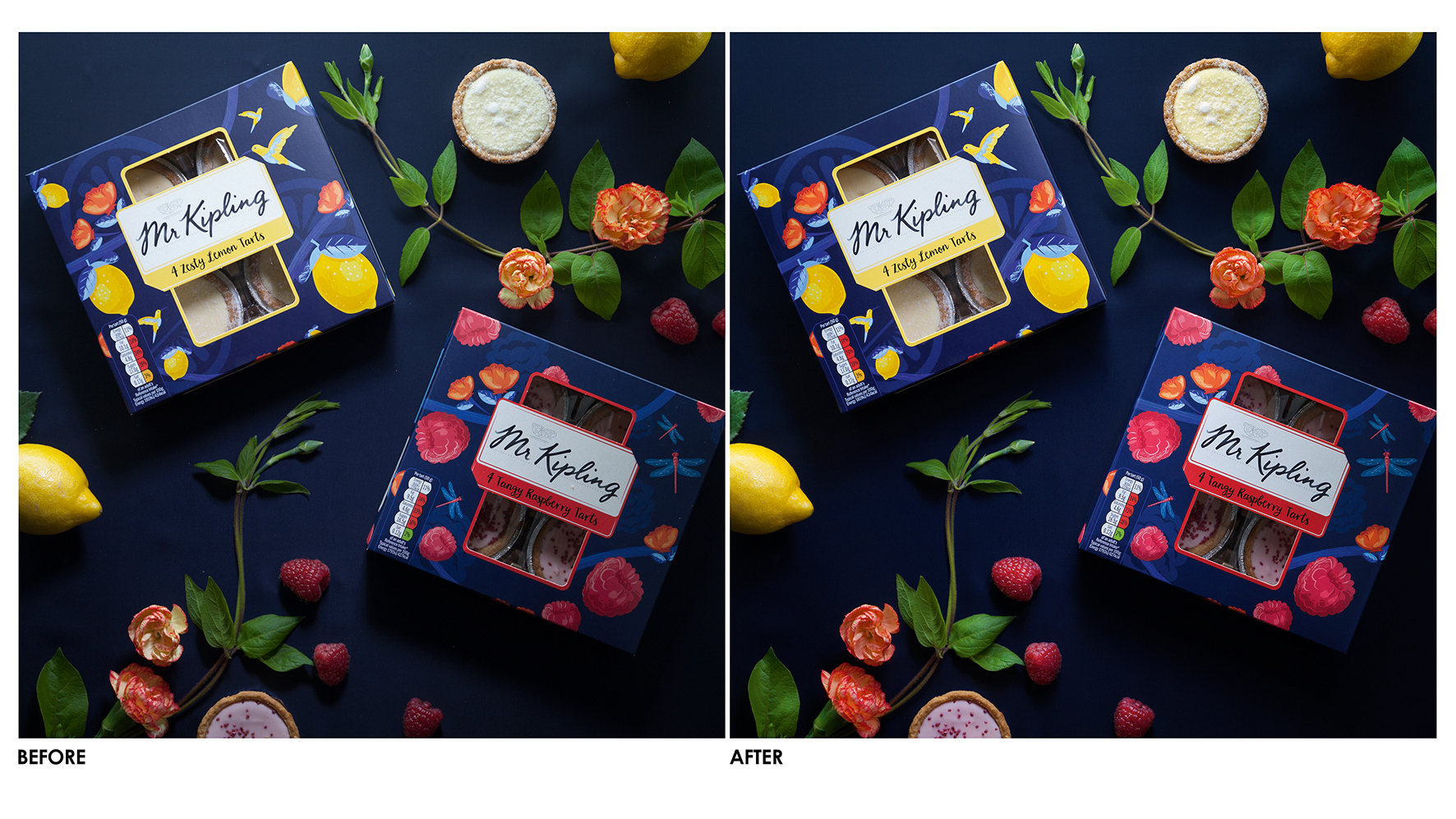
On the image above, for Mr Kipling, Kimble says: “I needed to make the fruit and the tarts look appetising, but for the scene to still feel rich and intense. Every element was considered, from the crust of the tart to the white of the label.
"I worked on each element separately. For instance, I only did one lemon at a time because you have to take into account the lighting on each one. The key to colour balancing is to make the right selections; one tip is to use the most contrasted channels to create a more natural selection.”
Know the colour fundamentals

To be able to colour correct images, you first need to learn some basic colour theory principles, such as which colours are complementary (on opposite sides of the colour wheel), so you can adjust one colour to cancel out too much of another.
You also need to be able to spot where colours are the most prominent, such as when red is dominating the light areas of a photo, or blue is dominating the dark areas.
It’s also about mastering the different tools in Photoshop involved in colour correction, including Curves and Levels. Similarly, you’ll need to become proficient at using Photoshop’s selection tools, so you’re able to efficiently colour correct specific sections of an image.
Colour correction is particularly important when it comes to printing, where you often need to convert images from RGB to CMYK (or from the colour system used for screens to the system used to talk to colour printers).
“If you’ve got something in RGB, on the screen it looks lovely and bright and fluorescent,” explains Kimble. “You’ve got the greens punching and the purples are really rich. But when you convert that to CMYK, it’s just flattened. The green’s going to go flat, the purple’s going to die a bit. So you’ve got to go into that image and punch those colours back up again, so it looks as good in print as it did on the screen.”
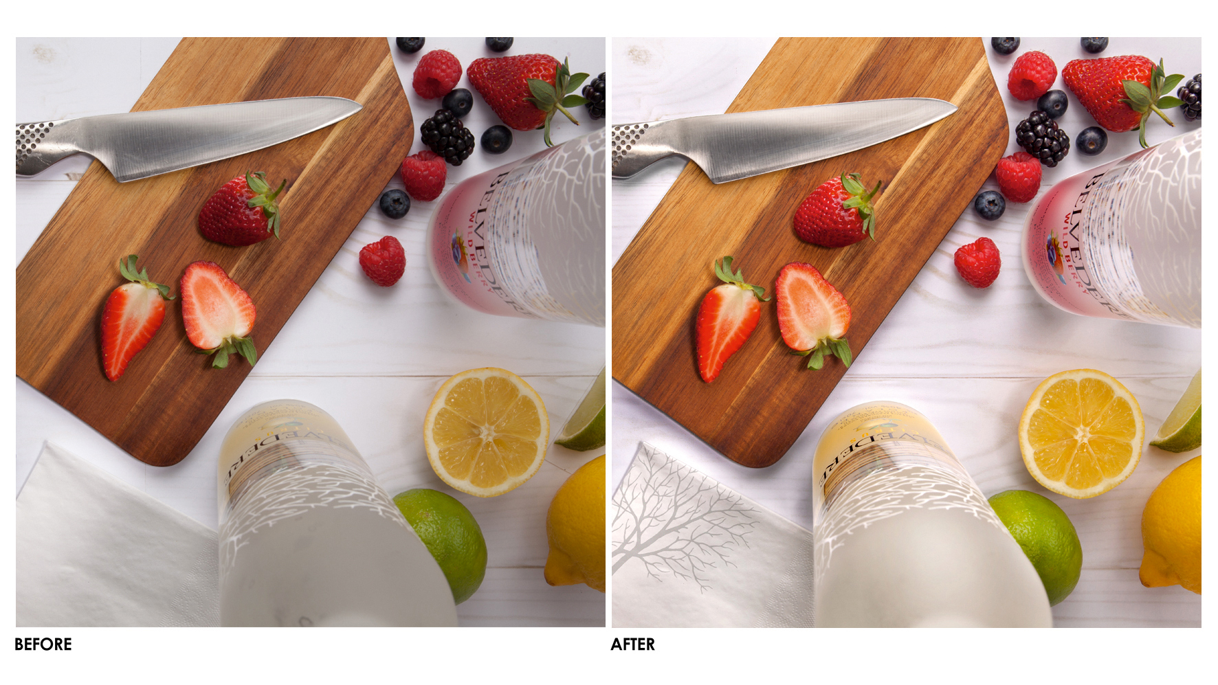
For the Belvedere image above, Kimble says: “I needed to make the fruit look punchier and fresh; not just brightening it but lifting the colour. I kept the actual bottle in front of me to make sure I got it right. I also warmed up the wood on the cutting board to make it stand out a bit more. The whites came out of the camera a bit dull, so I used curves to brighten – dropping the cyan ever so slightly so as not to look too blue.”
From principles to practice

The fundamental principles and techniques of colour correction are relatively straightforward, and there are a number of online tutorials, videos and books that will explain them to you. As well as YouTube and Vimeo, check out TutsPlus, Photoshop Essentials and LinkedIn Learning.
But although understanding the basic rules will help get you started, colour correction is as much of an art as it is a science. And that means the only way you’ll improve your abilities over time is to practise.
“Watching tutorials is great,” says Anthony Passler, senior creative artworker at Hogarth Worldwide, “But you really need to get your hands dirty, take photos of stuff and compare the photograph to the real-world item, and then try to match them up.”
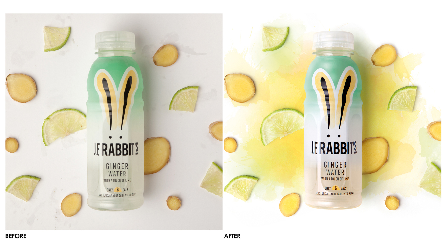
For example, in the JF Rabbit's picture above, Kimble relied on the real-world item for inspiration. “I needed to brighten up the white while retaining the detailing that came out of the camera. The label is a white vignette that fades to clear to reveal the liquid inside. From the camera, you couldn’t tell the colour, so I kept a bottle on my desk," he explains. "The green on the label came out a bit dull so I stripped out some yellow to match the brand colour.”
Experiment with colour correction
Gwendolyn Mumford, a junior designer at AIG in Texas, agrees that it’s well worth improving your skills beyond the minimum levels formally required. “When I use colour correction as part of my regular workflow for print and web graphics, these are usually fairly simple jobs,” she explains.
“But it still helps to have taken courses that taught more advanced correction techniques, as it prevents that task from slowing down my workflow.”
Kyriakos Kokkinos, former junior designer at London and Leeds agency Delete (he's now a digital designer at Only) concurs, and notes that practice will boost your confidence. “While I was at university I was very afraid of trying to colour correct, thinking it would look very off and not as intended,” he admits.
“But, just like everything, the more you experiment and fail, the better you understand the subject. And that’s exactly what is going to get you the best end result.”
This article originally appeared in a 2017 issue of Computer Arts, the world's leading graphic design magazine. Subscribe here.
Related articles:

Thank you for reading 5 articles this month* Join now for unlimited access
Enjoy your first month for just £1 / $1 / €1
*Read 5 free articles per month without a subscription

Join now for unlimited access
Try first month for just £1 / $1 / €1
Get the Creative Bloq Newsletter
Daily design news, reviews, how-tos and more, as picked by the editors.

Tom May is an award-winning journalist and editor specialising in design, photography and technology. Author of the Amazon #1 bestseller Great TED Talks: Creativity, published by Pavilion Books, Tom was previously editor of Professional Photography magazine, associate editor at Creative Bloq, and deputy editor at net magazine. Today, he is a regular contributor to Creative Bloq and its sister sites Digital Camera World, T3.com and Tech Radar. He also writes for Creative Boom and works on content marketing projects.
