Creating infographics in Illustrator: 10 top tips
Pro advice for creating clear, concise and engaging infographics in Illustrator.

If you think about it, we’ve been making infographics since the dawn of time – those early cave paintings were passing on information graphically that could be processed and understood quickly.
The best infographics wrap information and/or data into a story in a clear, concise and engaging manner. Making them is an increasingly used way of communicating data to the masses, and therefore a skill no designer should be without.
In this article, you'll find some pro tips for producing infographics in Illustrator that will help you pull things together quickly and efficiently. For more advice, be sure to check out my talk on creating infographics in Illustrator at Adobe MAX 2018.
A whole lot of information
Before you get started on making infographics in Illustrator CC (sign up to Adobe Creative Cloud here), you’re going to need information, and probably lots of it. Think about the story you'll be presenting and then do some digging (fortunately there are a lot of free data sources available and you’ll find some listed at the end of this article).
You’ll be looking for several things to make the data more meaningful to your viewers; look for trends or patterns that can show movement in the numbers. Are there any outliers that can either make or break the story? Look for context and comparisons, which often may come from other data sets, to help the viewer make sense of it all. Examine any history associated with the information to see if that helps make things any clearer.
Once you have the information, it’s time to examine it.
01. Master pivot tables...
Dealing with cold, hard numbers is going to involve working with spreadsheets, and you can make sense of data sets, especially large ones, by learning how to use pivot tables (Excel and Google Sheets both support these). Trust me when I say once you've got the hang of these, you'll wonder how you ever managed without them.
02. ...Or make friends with someone who already has
Getting spreadsheets to handle your data makes life so much easier, it's filtered into the second tip too! If numbers are really not your thing, I'd go so far as to suggest you make friends with someone who is awesome with spreadsheets, and buy them the best dinner you can afford whenever you work with them (yes, I totally do this).
03. Sketch out your ideas
Next, you’ll need to start sketching out your ideas, and working out how to present that information. The first thing you’ll need to do is work out what size and format the completed work is going to take; I’m often asked about what size to make an infographic and my answer is always the same, 'the size that best suits the medium and the audience'.
If you think that the infographic is most likely to be viewed on a phone for example, then make it as wide as the device being held in landscape orientation, and as tall as needs be to convey everything, which is why there are lots of skyscraper-style infographics to be found online.
For structuring the story, try to adhere to the principle of the information sandwich, start with an introduction, fill with all of the yummy information and close with a conclusion or Call to Action (CtA).
04. Choose your tools wisely

I use Adobe Photoshop Sketch on my tablet to work out my ideas, as I have more tools available than I can carry with me, and I can push my sketches directly to Illustrator as a basis for my finished work.
05. Use a grid
Use a grid as a guide for your layout – and remember that it is only a guide, not a ruleset; you don’t have to make things fit exactly within the guide boundaries. Mostly, my preference is to use a grid that has twelve columns, as twelve is easily divisible by two, three and four, but use whatever you need.
For skyscraper statics, vertically you should divide the grid up into rows that are roughly representative of the screens that you’re anticipating it being viewed on – try to give a tantalising glimpse of the next screen’s content (“below the fold” in press terminology) to encourage the viewer to keep scrolling. Your grid type will vary for other kinds of presentation but always use one – they’re invaluable.
06. Use video tutorials
Simply follow this video tutorial for an easy way to make an awesome grid for your infographic in Illustrator.
07. Work with linked assets
Create your chart elements in separate documents and place them as linked assets. You don’t have to produce all of the charts, graphs and other graphics in the same document. There are a number of advantages to working with linked assets during infographic production, but the main ones are:
- Illustrator doesn’t have to actually redraw the entire graphic – just a representation of it while you’re working – and you can work faster.
- More than one person can be working on the project at once – simply update your placed version if someone else makes any changes.
- It makes it easy to resize graphs and charts, which otherwise normally involves using the Scale Tool.
08. Chart or graph?

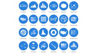
Knowing how to best present a piece of information is part of the challenge, and if it isn’t immediately obvious, then I can offer you no better tip here than to use Data Visualisation Catalogue (and ideally buy the eBook version of the site) – that way you’ve always got a copy to hand plus you’re rewarding the author Severino Ribecca, for his hard work that’s helping you out.
Illustrator has nine chart/graph tools and while that doesn’t sound like a lot, you’d be amazed at what can be achieved with them, although there’s a bit of learning involved there.
That said, there are times when you’re going to need to hack the default tools. At the moment, the number one thing I get asked about in this regard is how to make doughnut charts, and segmented doughnut charts – the answer to both of these can be found on my YouTube channel and you’ll be able to keep the data live, too.
09. Keep a live connection
Always try and keep the connection between the graph/chart and data live. If you’re watching a tutorial online that mentions ungrouping the chart, then stop watching and look elsewhere as there is almost always a way to keep the data live, and it’ll save you a lot of effort if you can.
10. Group Selection Tool is your friend
The Group Selection Tool is essential for working with charts and graphs in Illustrator; you’ll find it nested with the Direct Selection Tool in the toolbox.
There’s so much more to learn than I can present in this article, but I hope that you found this advice useful. I’m always keen to see what you’re making in Illustrator, so let me know via Twitter.

Further reading
Here’s some of my favourite titles on my bookshelves; some of these deal with data representation, some with process (e.g: Raw Data and Visual Storytelling) and some are whimsical, perhaps (e.g: Infographic Guide to Cycling and Super Graphic), but I’d recommend:
- Visualize This: The Flowingdata Guide to Design, Visualization, and Statistics by Nathan Yau
- Knowledge is Beautiful by David McCandless
- Information is Beautiful by David McCandless
- Infographics: Designing & Visualizing Data by Wang Shaoqiang
- Cool Infographics: Effective Communication with Data Visualization and Design by Randy Krum
- Raw Data: Infographic Designers' Sketchbooks by Steven Heller and Rick Landers
- Visual Storytelling: Infographic Design in News by Edited by Liu Yikun and Dong Zhao
- Infographics: The Power of Visual Storytelling by Jason Lankow and Josh Ritchie
- Infographic Guide to Cycling by Roadcyclinguk
- Super Graphic: A Visual Guide to the Comic Book Universe by Tim Leong
Also note that some of the titles and authors have websites that are well worth visiting.
Read more:

Thank you for reading 5 articles this month* Join now for unlimited access
Enjoy your first month for just £1 / $1 / €1
*Read 5 free articles per month without a subscription

Join now for unlimited access
Try first month for just £1 / $1 / €1
Get the Creative Bloq Newsletter
Daily design news, reviews, how-tos and more, as picked by the editors.


