Create your own 3D typeface
Discover the creative process behind 3D type family Rig Shaded.
06. Work on extrudes
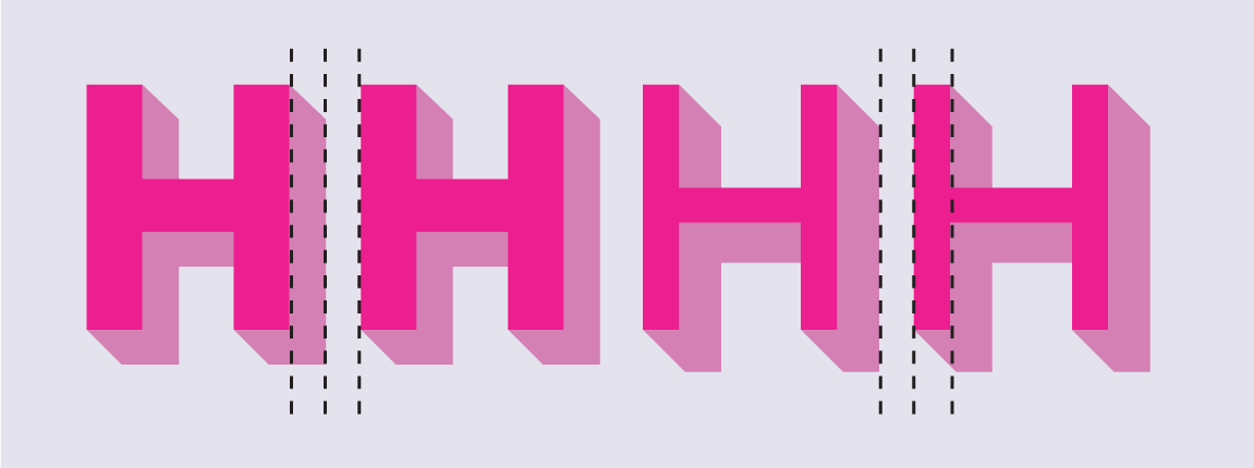
During my experimental stage I’d figured out the rough extrude depths for each weight so I could build visual harmonies between the stem widths and/or spacing in each weight. This aids the uniformity and rhythm of the type, which is important as the shapes become more complex.
To create the extrude styles, I used a plugin to do the heavy lifting. This created the extrude shapes mechanically, and I then adjusted or redrew to achieve a consistent weight. I needed to ensure that none of the extrudes clogged up their partner face characters or obscured their details, so I adjusted several of the original face characters to make them more compatible.

07. Make Zero weight style
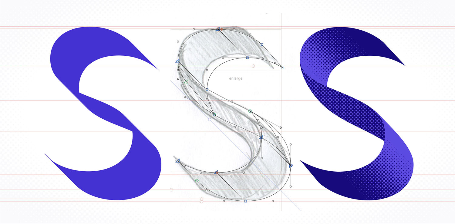
I wanted to make a razor-thin, ‘zero’ weight style for the font family. For this to work, the extrude style needed to become the main shape of the type. I redrew each glyph with open paths, as if creating a monoline font. This gave me the skeleton of each character so it could be mechanically extruded and then adjusted or redrawn. The 'S' was particularly tricky as its spine produced almost no extrude naturally due to its diagonal direction.
08. Adjust spacing and kerning
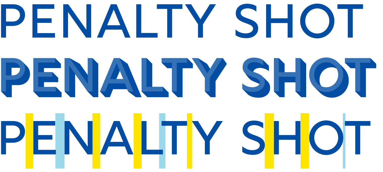
I’d spaced my characters throughout the drawing process to ensure they were working well together as words and sentences. However, a shaded font cannot be spaced like a regular black and white typeface. Because the extrude shapes become an integral part of each character, the spacing and kerning needs to be optimised for the overall combined shape. To do this I made both the face and the extrude black, to form one solid block, and spaced and kerned them together.
09. Prepare for shading
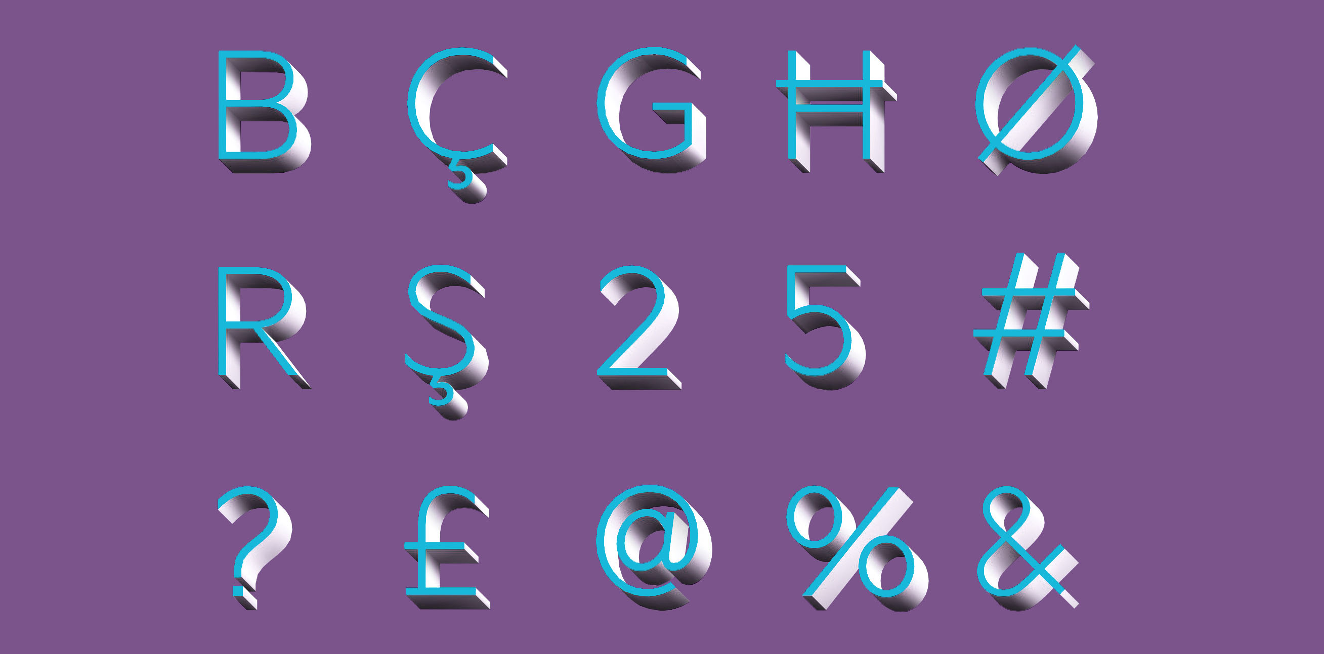
To guide the halftone shading process, I commissioned a 3D designer to create and light a 3D model of my full character set. This wasn’t meant to produce a realistic shadow but rather a consistent stylistic effect, and show me where the light might fall across more complex shapes.
In the end however, the final shading diverged even further from the 3D model so that the shadows could be distributed evenly across all the glyphs.
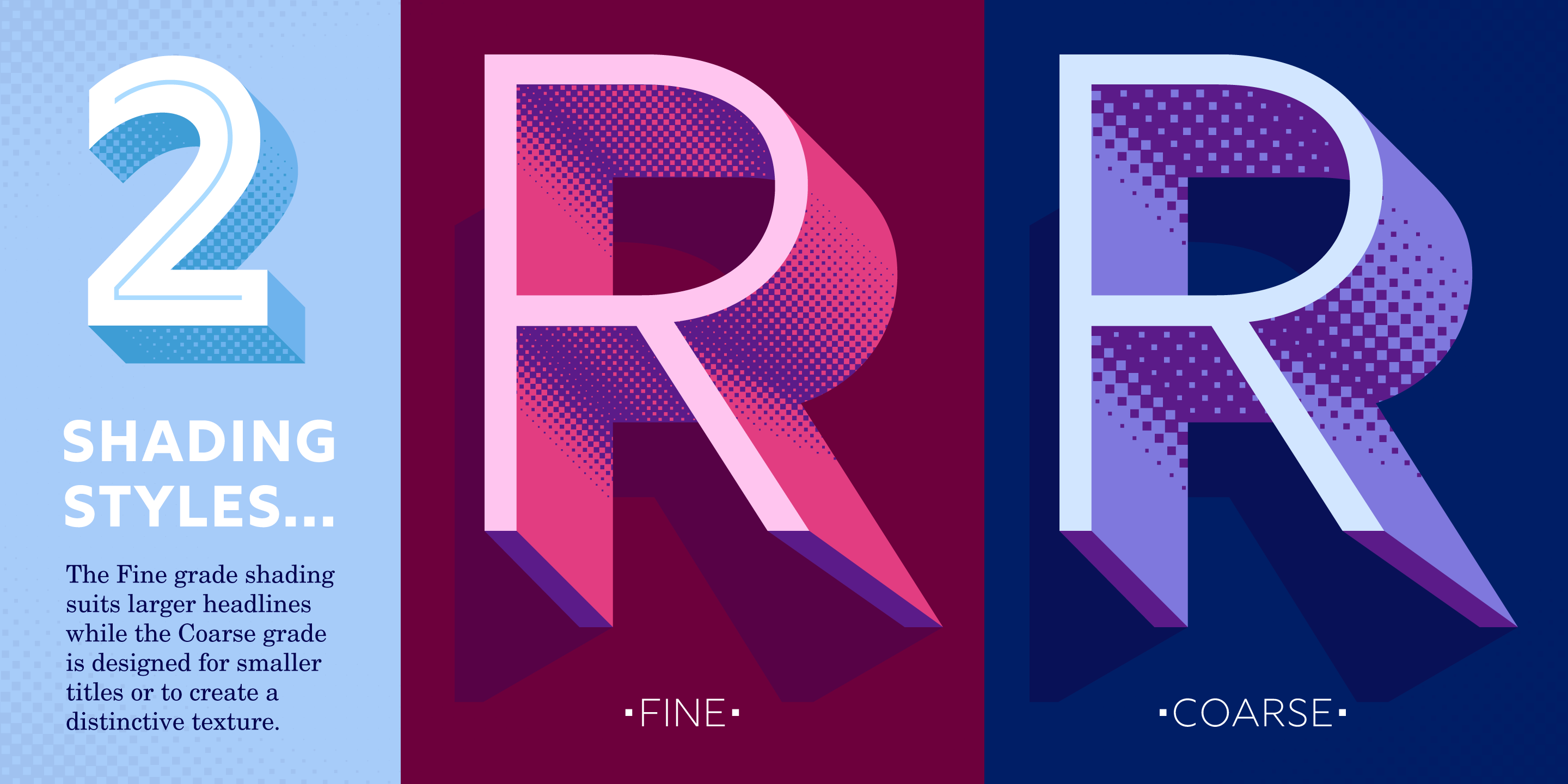
After talking with a few designer friends, I decided that it was important to offer two grades of halftone shading to provide greater control at various type sizes. Depending on the colour combinations and sizes chosen, Rig could then produce subtle gradients through to strong graphic effects.
10. Start shading marathon

Each separate gradient was made in Adobe Illustrator then brought back into Glyphs to be cleaned up, and often adjusted square by square. There was no way to batch-process the halftone effects and the combined number of glyphs across four weights and two shading styles is approaching 2,000. It was a long, gruelling process.
In Illustrator, I made a black and white gradient at the approximate size of the curve or edge that needed shading. Then, with some manipulation, I would run the Phantasm filter on these gradients to create the vector halftone squares. These were then cropped using the shape of the letter’s extrude.
Back in Glyphs, at high magnification I went around all the curved edges to correct any stray points. To reduce the overall file size of the font I also removed any redundant curve handles from squares positioned on the edges of curves.

There were several intricate gradients to build, like in crotches of 'K' and 'R', but many of the gradients were shared across multiple shapes, and keyboard shortcuts sped up the process. The last step was to even out the shading to avoid dark areas as much as possible.
The result
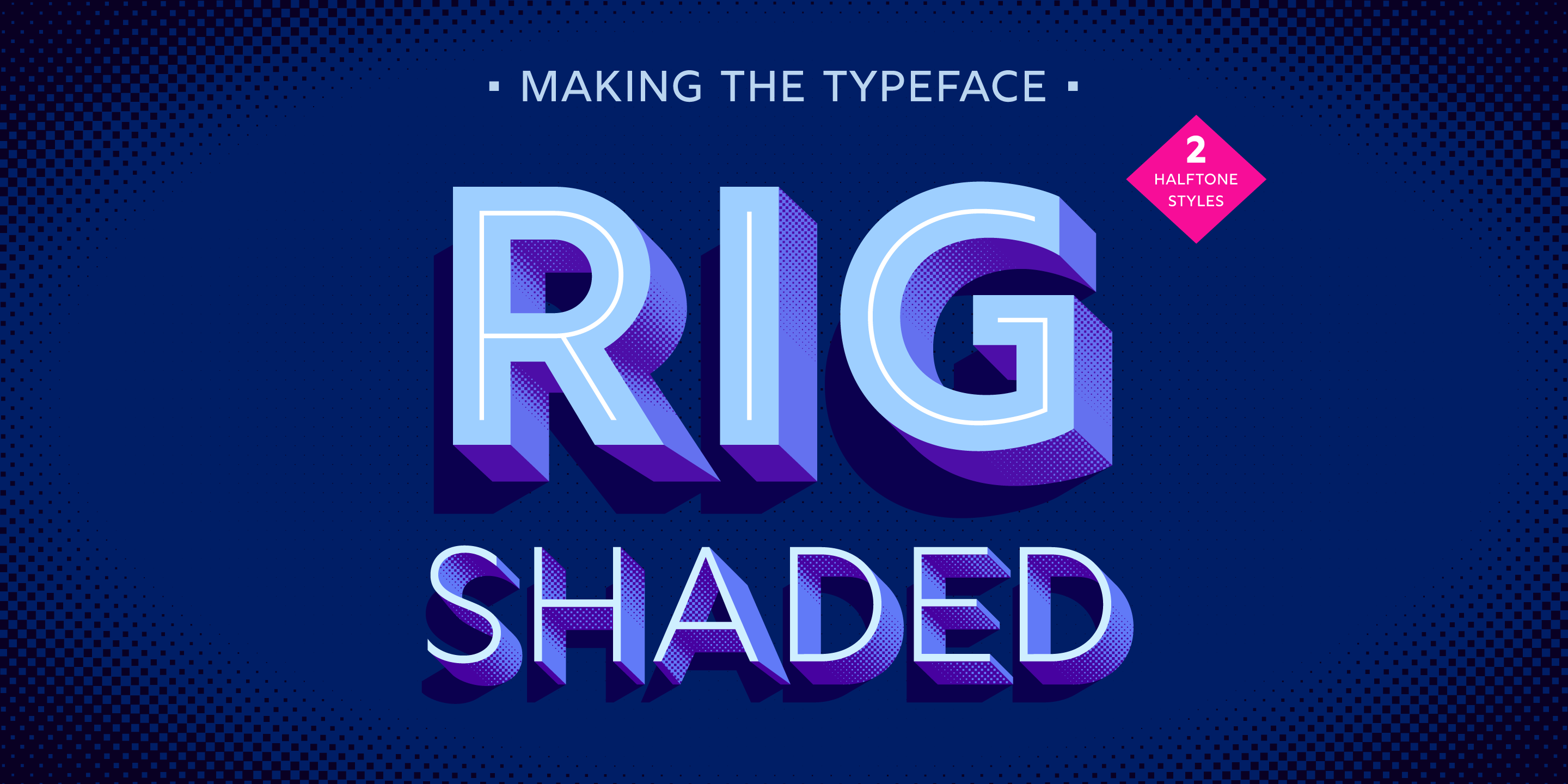
I admit that while producing the shading I cursed myself for deciding to make four weights, but the final result was worth it. The unusual approach to Rig’s design eventually led to its unique appearance. The character shapes, extrude depths and spacing have all been devised to complement each other and produce harmony within each weight. By allowing the tail to wag the dog in this way, Rig’s lively yet assured voice was forged.


Related articles:

Thank you for reading 5 articles this month* Join now for unlimited access
Enjoy your first month for just £1 / $1 / €1
*Read 5 free articles per month without a subscription

Join now for unlimited access
Try first month for just £1 / $1 / €1
- 1
- 2
Current page: Create your own 3D typeface: steps 06-10
Prev Page Create your own 3D typeface: steps 01-05Get the Creative Bloq Newsletter
Daily design news, reviews, how-tos and more, as picked by the editors.

Jamie Clarke is a type designer and lettering artist, expertly bridging both fields. Since refining his skills at Reading University in 2013, Jamie has created a growing collection of contemporary typefaces. He unveiled his first font, Brim Narrow, in 2015, followed by his award-winning 3D font, Rig Solid, which became part of Canva’s library in 2018. His lettering projects are known for blending words and imagery to create meticulously crafted illustrations. Notable examples of his work include branding for Kelmscott Bakery and his cover design for The Woman in Black.
