Choose the right words for your interfaces
When creating web and app interfaces, your choice of words can aid or hinder usability.
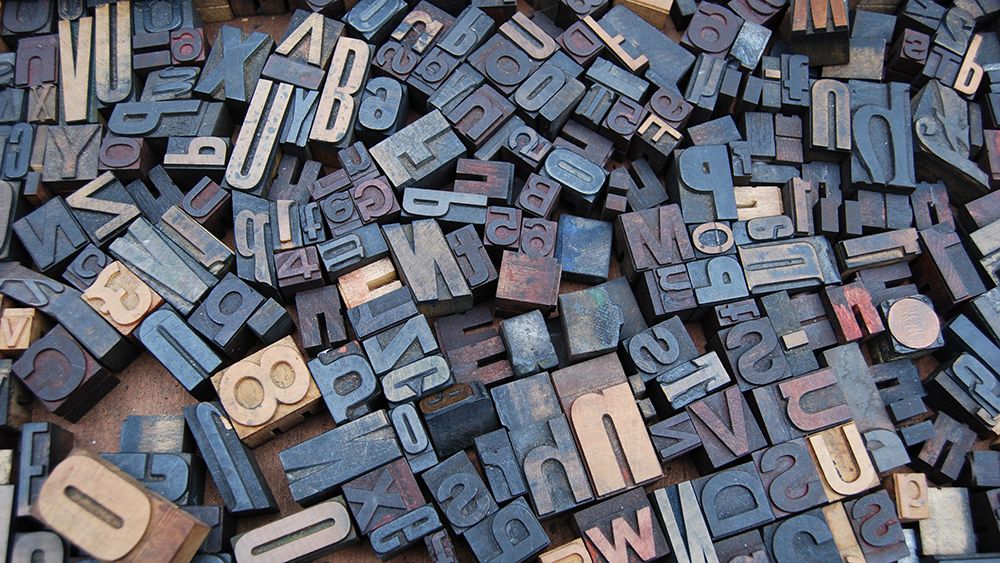
Most of us use interfaces every day; the apps on our smartphones, train departure boards, maps, chatbots and even the control panels on our microwaves. So every day, we see hundreds of words without really reading them – words like ‘OK’ and ‘Defrost’ and ‘I confirm that I am over 18 years of age’.
We don’t think about the words in these interfaces much, but they can have a powerful effect on usability, particularly the first few times we use an interface, or when we’re trying to do something new. If we skip over them, it’s usually a sign that they are doing their job well – but it can take a great deal of effort to achieve this.
Consider the opposite.
A classic example of a badly worded interface would be a window that pops up on your computer when you try to cancel an action: ‘Are you sure you want to cancel?’, followed by ‘OK’ and ‘Cancel’ buttons. Does ‘Cancel’ cancel the action, or cancel the cancellation? It’s not clear. The words aren’t doing their job. On the other hand, ‘Yes, cancel’ and ‘Go back’ are pretty clear.
Clarity is the main goal of an interface. But character is important too. When we worked with FreeStyleGames on the brand voice of Guitar Hero Live, the balance between accessibility and tone was critical. That’s why the game ended up with a ‘Song catalog’, rather than the more prosaic ‘Library’, or the more playful ‘Songbook’.
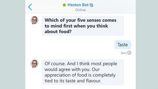
New platforms are creating new kinds of interfaces. Consider chatbots and voice assistants, such as Amazon’s Alexa. With these conversational interfaces, you talk to them in natural language, which means they understand what you’re saying, and act appropriately.
To write them well, you need to step into the mind of a user. Skype’s chatbot Heston Bot, which we worked on, opens with a big question: ‘What’s the one thing that stops people from experimenting in the kitchen?’ This feels open and engaging – but actually, the range of likely responses is relatively small. People might say ‘laziness’ or ‘takeaways’ or ‘too busy’ or ‘not enough money’ or ‘dunno’; they probably won’t say ‘a tyrannical government’ or ‘Boaty McBoatface’. Even if they do, Heston politely moves the conversation forward: ‘For me, the biggest barrier of all is fear.’
As interfaces become more complex, language – like design – will need to work harder. If you don’t notice the shift, then we’re probably getting it right.
This article was originally published in issue 270 of Computer Arts, the global design magazine – helping you solve daily design challenges with insights, advice and inspiration. Buy issue 270 here or subscribe to Computer Arts here.
Related articles:

Thank you for reading 5 articles this month* Join now for unlimited access
Enjoy your first month for just £1 / $1 / €1
*Read 5 free articles per month without a subscription

Join now for unlimited access
Try first month for just £1 / $1 / €1
Get the Creative Bloq Newsletter
Daily design news, reviews, how-tos and more, as picked by the editors.
