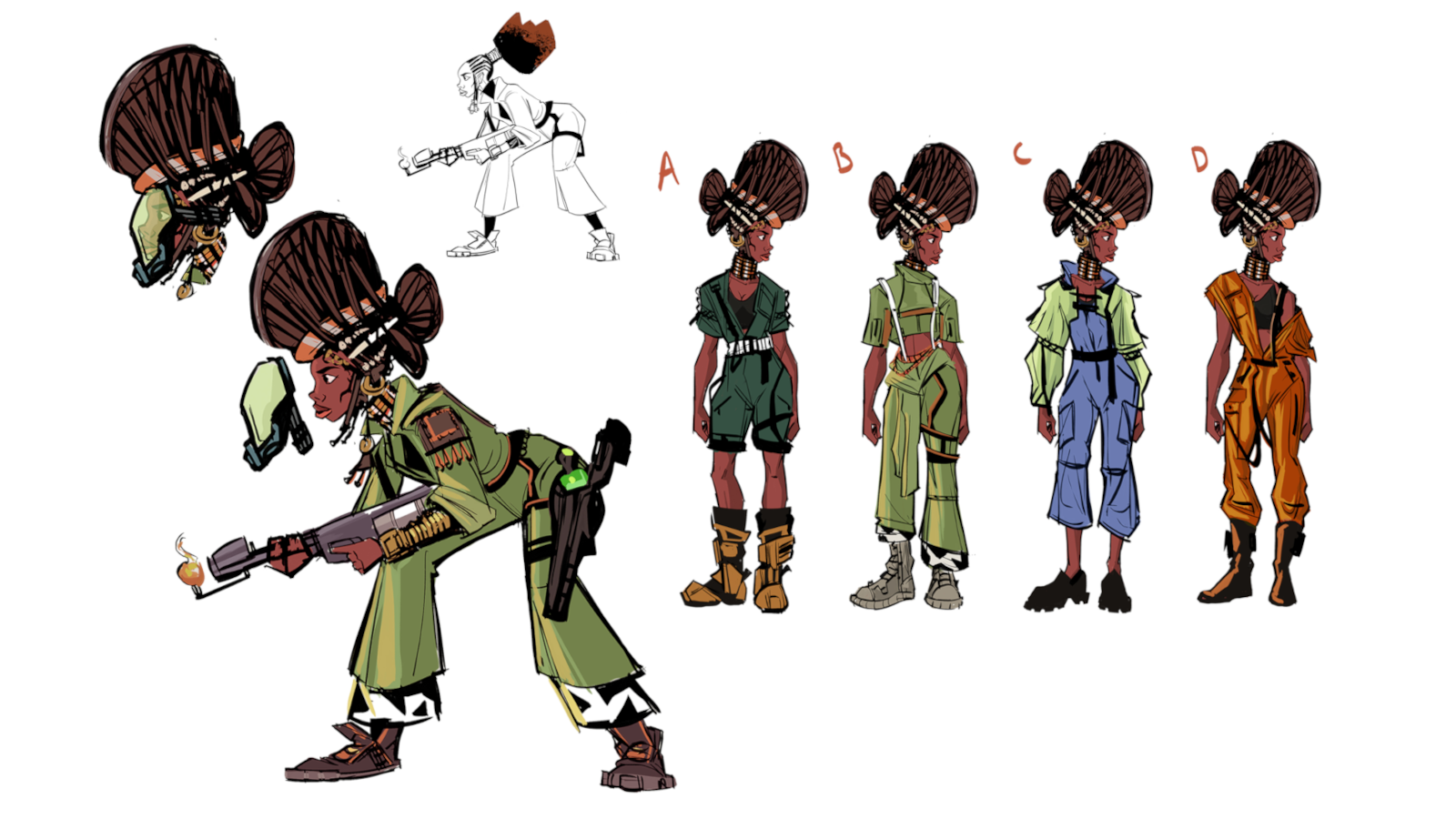
Bring 3D tools into your 2D art
Learn how to incorporate 3D posing software into your 2D painting process, helping you to save time without losing your edge.
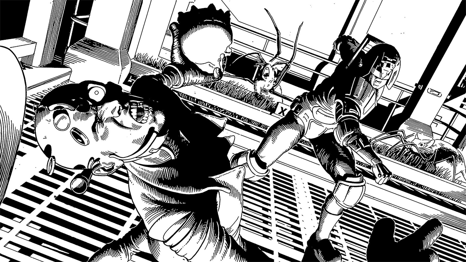
People often lament that the 'magic' of the entertainment industry, a market in which comics reside fairly perilously, dissipates when you become aware of how it is achieved. Indeed, drawing professionally is a bit like being a magician: it's an instantly impressive skill; it takes years of solitary, thankless toil to master; and it often requires you to pull something out of your arse at a moment's notice. And yes, when the mechanics are exposed, it often seems considerably less supernatural – but, just like magic, the end result relies entirely on the deftness of its performer. Management of resources is simply part of the craft, not a way of cheating.
3D posing software is often similarly mislabelled as cheating. The knowledge that it's been used shatters the illusion that everything on the page has come purely from the imagination: the inference being that, so long as they had the same software, anyone could achieve the same results. Not so. The use of a mechanical technique in art only becomes an issue if the artist's lack of skill betrays it. It all comes down to the performer.
With that in mind, let's look at some of the ways to make the most of today's advanced creative resources, without giving away the prestige.
Download the accompanying resources here.
01. Getting to know the software
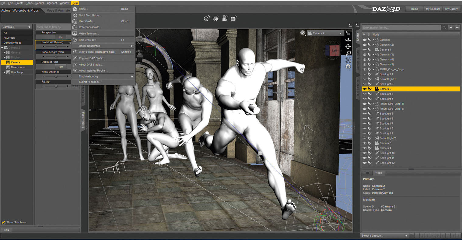
I use Daz 3D to compose my scenes and there are a lot of time-saving techniques that eluded me when I started out, so I'd advise familiarising yourself with the basics. Looking for answers to problems on a case-by-case basis usually works, but there are always shortcuts you would never even think to look for. A few online instructional videos, a bit of a play around to get a sense of the UI, and you should be good to go.
02. Kitbashing elements
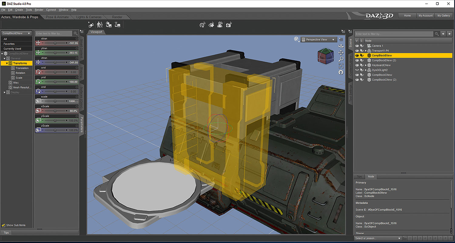
One thing you may notice when using posing software to create scenes is that the assets available for purchase rarely fit your script requirements perfectly. Even Daz 3D's many costumes, props and sets won't cover every scenario, because the way a scene plays out often requires specific topography or architecture.
So, rather than building custom geometry in a modelling program, I try to find elements that resemble what I need and then cobble them together. My 3D scenes are just a starting point, so details don't always have to be perfect.
03. Balanced directing
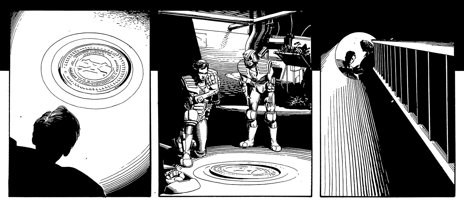
It can be tempting, with the ability to manipulate the camera at will, to make every panel wild and unusual. This tends to lead to images that look good on their own, but are almost unreadable as a story. Dramatic shots work well for dramatic moments, but without the ballast of conventional visual storytelling, they lose any impact or meaning. Old-fashioned, proscenium-style storytelling still has its place, and subtle variations on this will usually serve better than going all out with your compositions.
04. Negative space
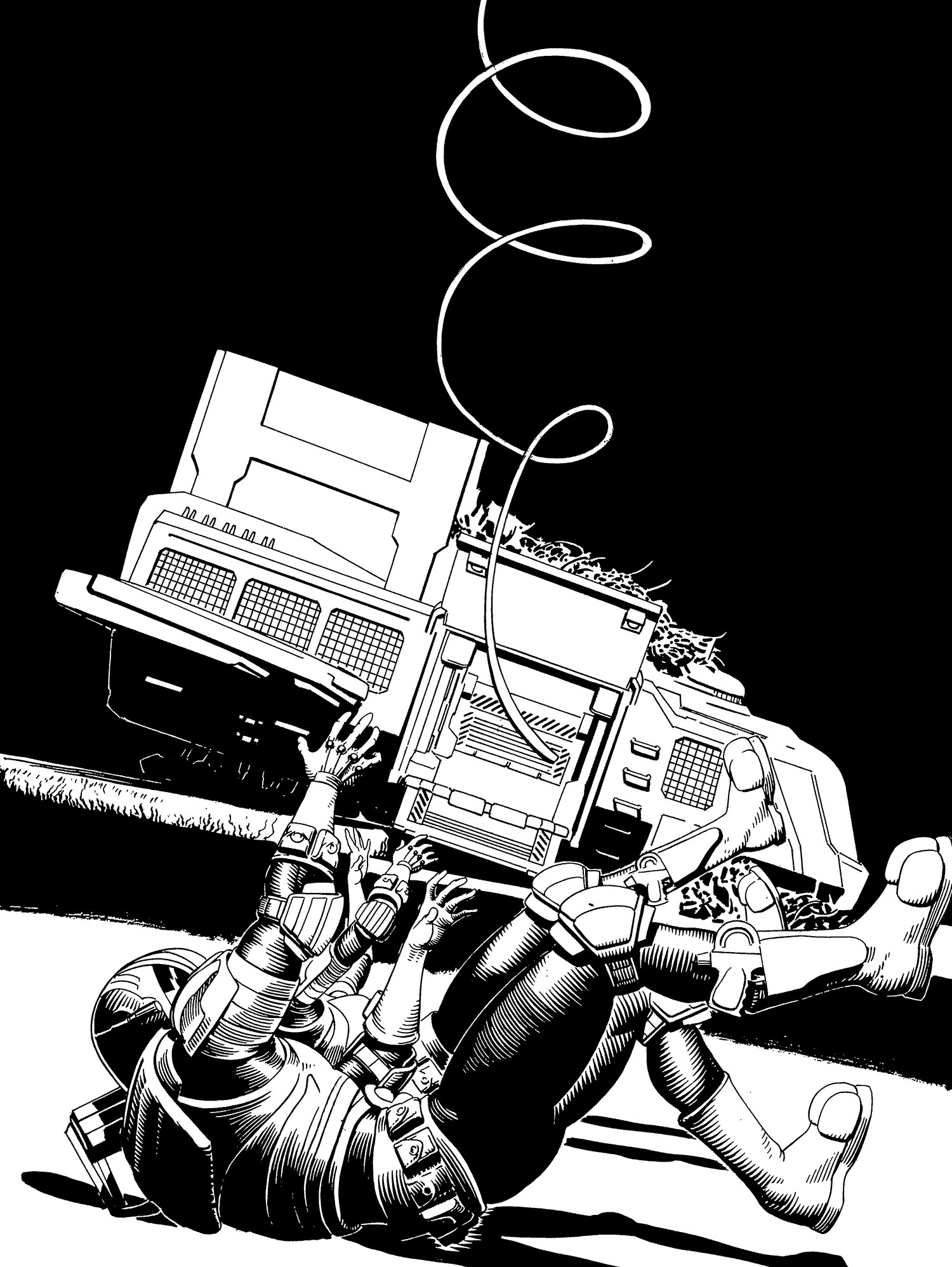
Even though I'm able to create complex backgrounds, the power of negative space can't be overstated. Negative space is basically just any space that's fairly free of detail. As such, it directs the reader's eye to anything that interrupts that space, and is usually found either around or adjacent to the image's key elements.
05. Challenging composition
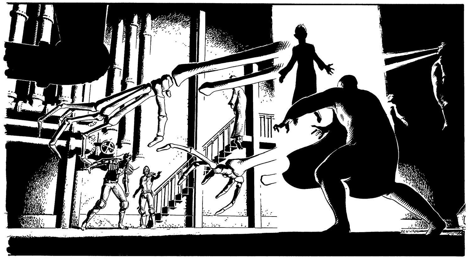
Sometimes I have to juggle a lot of elements in one relatively small panel. 3D posing can help find compositions that balance all the essential information, without scenes seeming crammed and unnatural. I also usually move elements of my environments around a little, to make for a better image. If Canaletto could tweak the architectural topography of Venice, it's probably okay for me to shift a pipe in a fictional basement.
06. Creative lighting
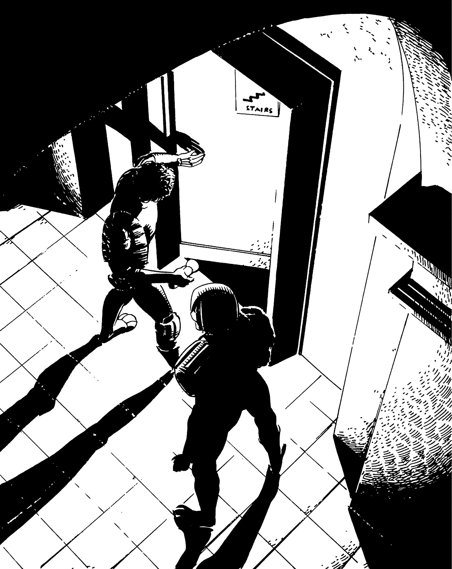
The rendering of virtual lighting in posing software also affords opportunities for interesting use of shadow. They can be manipulated to create symbolic shapes, suggest foreboding or even dictate composition. When overused this can become visually frustrating and bring the reader out of the story. However, if exercised with care it can enhance a dramatic scene. When lighting the figure though, I have to be careful that I don't give myself a tricky drawing exercise when I get to the pencilling stage. Drawing figures in complex lighting can be a supreme test of anatomical understanding.
07. Changing lenses
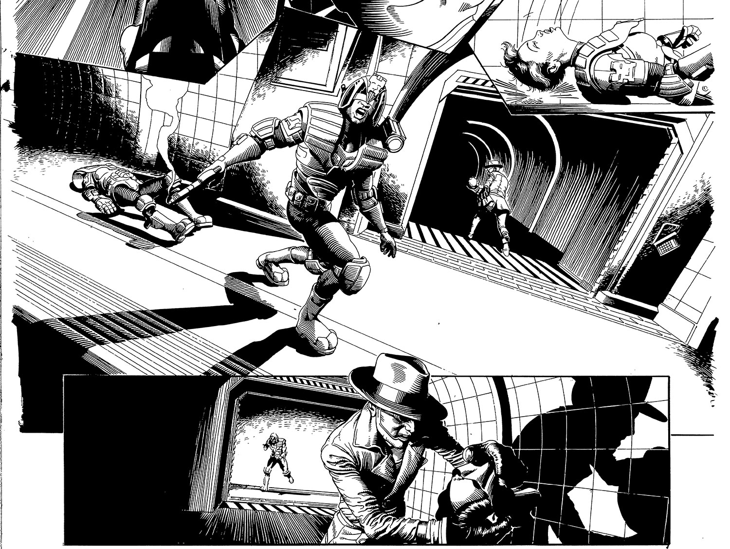
Just as a filmmaker would change lens sizes for a wide-shot or an extreme close-up, I change mine for different panels. The camera options in Daz 3D enable me to do this pretty easily with a Frame Width slider. It can help create natural-looking establishing shots, spacious vistas or claustrophobic interiors. I can also use it to create a sense of unease or oddness.
08. Crowd control
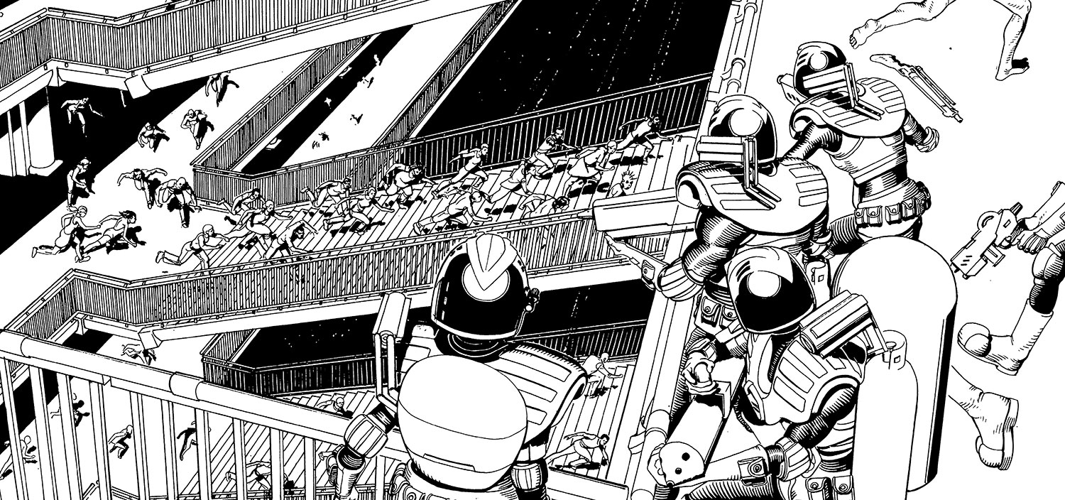
Drawing group shots can be pretty unforgiving. In one panel, I may have to figure out proportions and anatomy for over a dozen characters, and I can find myself getting tired or, even worse, losing time. Throw in an unusual camera angle, and all the foreshortening complications that demands, and things start to look a bit bleak.
Using 3D to compose these types of panels can help take some of the pressure off, enabling me to focus on the visible details, rather than struggling with whole forms that will be partially obscured.
09. Formalising layouts
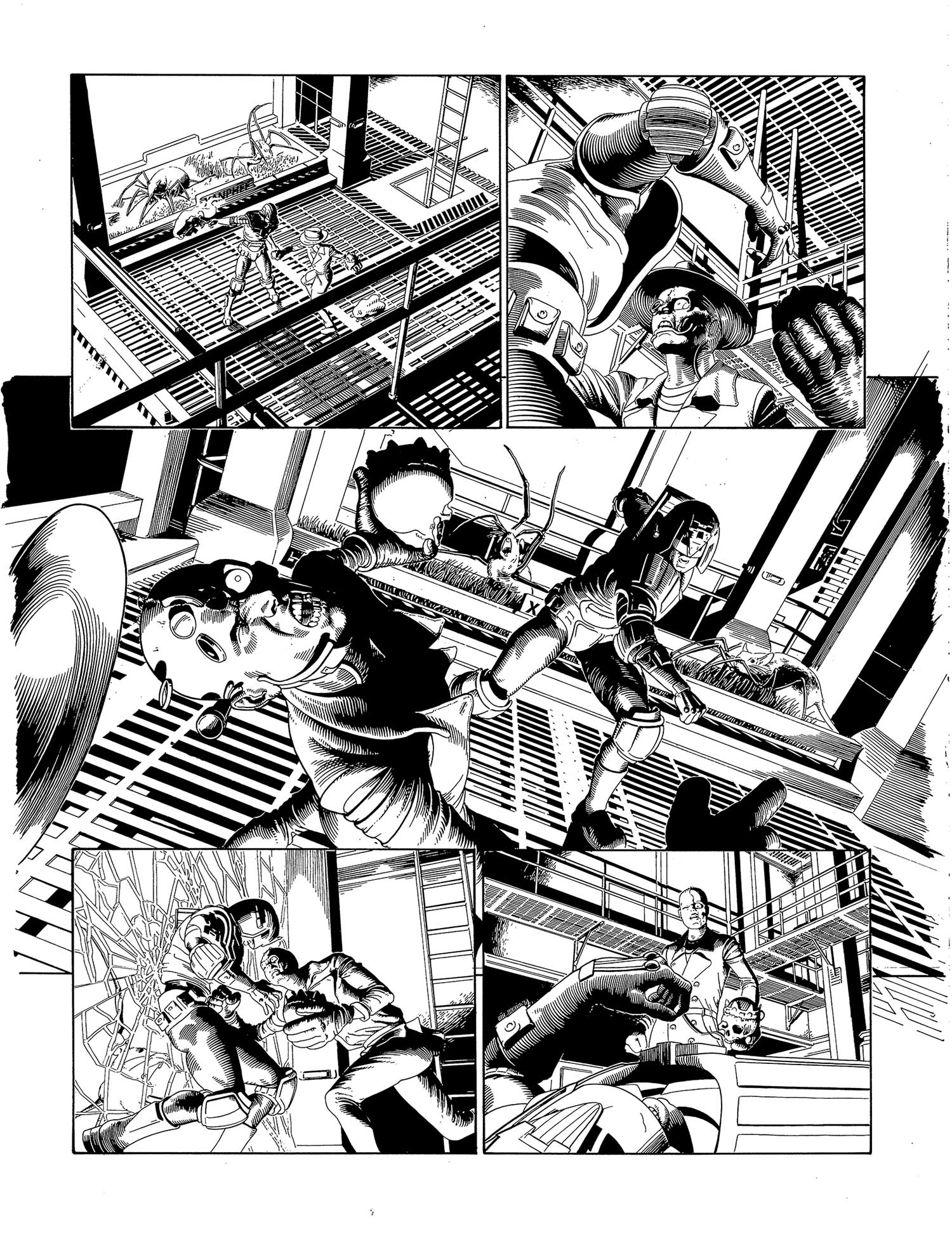
The fact that I'm composing my panels independently of one another can, if I'm not careful, have a detrimental effect on my overall page. It's often helpful to start with a strong, thumbnail sketch of the full page so that the principles of composition and leading-the-eye can be observed, even when dealing with one panel alone. This is one of the biggest pitfalls of working in 3D, so I try to stay as mindful of it as possible. Many's the time I've lovingly crafted a panel composition, only to find that it doesn't quite fit with the others.
10. Visual consistency
Given that the end result will always involve some level of drawing, it's important for me to be able to keep all the elements looking like they belong together. Since I'm using realistic models, I need to strive for verisimilitude in the drawing. Equally, those elements that aren't drafted from scratch must at least have the appearance of a drawing. To this end, I ink everything by hand on Bristol Board. This way, my computer-aided elements don't jar stylistically with those I've rendered independently.
11. From 3D render to 2D drawing
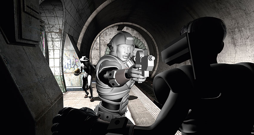
Render in 3D
Here's my exported render for a panel. My elements are arranged exactly how I would like and I've lit the figures in such a way as to emphasise all the important information and convey drama, but ultimately the scene looks very much like a slick CG render. Other than the composition and lighting choices, there is nothing particularly special about it.
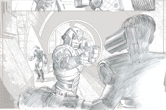
Knock back the CG
I apply a Stamp filter to the image in background with a couple of different Darkness settings, each on a separate layer. This gives me some idea where my basic forms and areas of shadow will be. The filter will be enough for more geometrically straightforward background and prop elements, but everything even vaguely organic-looking must be drawn in by hand.
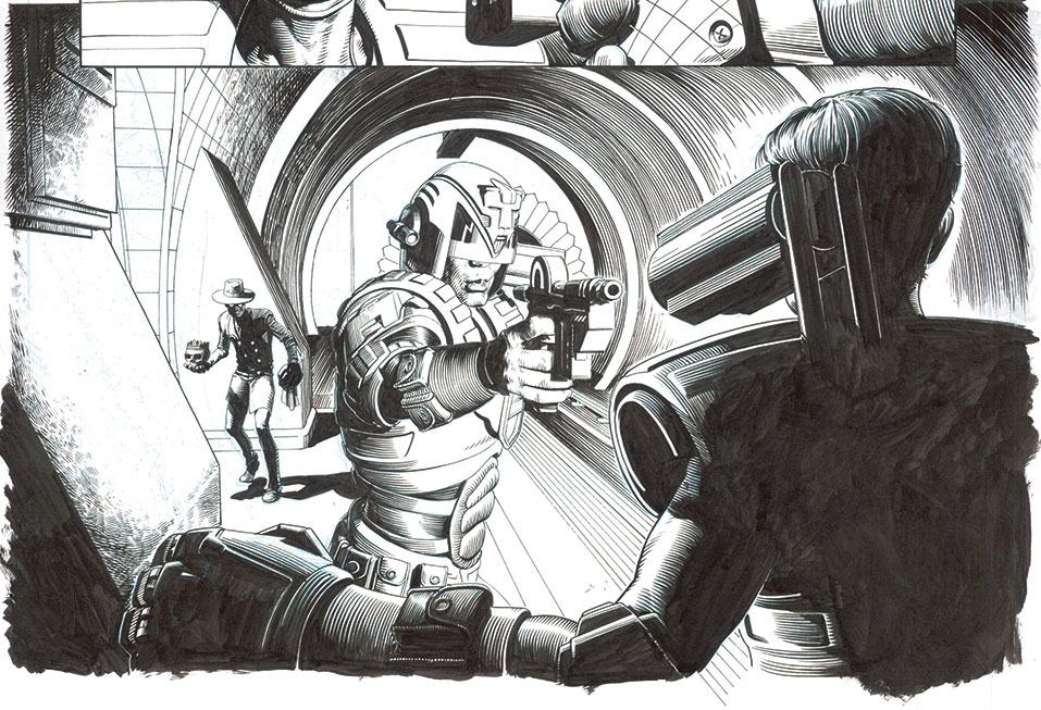
Ink over the line art
I then print out the composite of the digital elements and practical pencil drawing in blueline, and ink it all by hand. At this stage I can make decisions about how much background detail I want to preserve, how best to render it and what elements I need to clarify.
12. Retaining depth

Two-dimensional visuals are inherently flat – so, to give my visuals a sense of dimension, I have to compensate for this in my art. It helps to think of things in terms of three distinct planes: foreground, middle-ground and background.
To distinguish each from the others, I'll usually make one predominantly white, one mostly black and one a fairly even balance of the two. The middle ground will usually contain the primary focus of the scene and so will usually require the most detail. This usually ends up being the plane with the greatest balance of tones, the other two serving to frame it by utilising negative space.
13. Economising on detail to save time
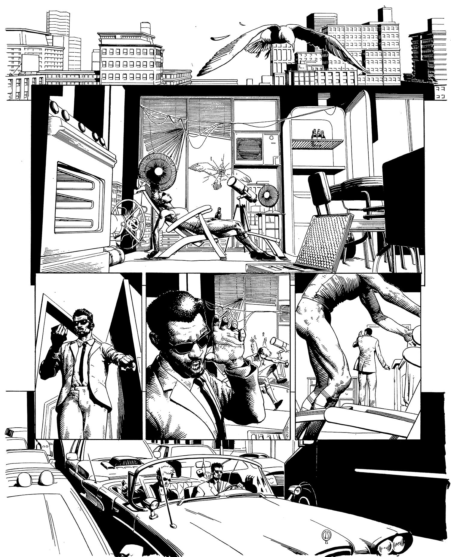
It's easy to get lulled into a false sense of security with posing software. Often I'll get to the inking stage and realise that my background is full of laborious details that now have to be carefully delineated by hand.
Owing to the fact that not everything has been drawn that way to begin with, I've frequently lost any sense of how long an image will take to render. So I now try to think as carefully as possible about how much I will really have time to ink. I also try to build in areas of solid black to help create a balanced page.
14. Draw on your traditional skills
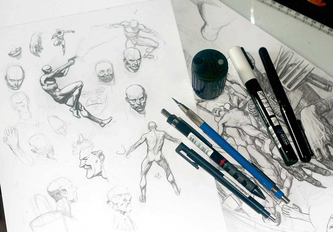
Of all the tools at my disposal, none is more valuable than my fundamental knowledge of how to draw. It represents every aspect of my visual understanding. It's the arbiter in deciding which resources will help me most and my safety net whenever other resources fail me. It distinguishes me from those who use a similar process and enables me to communicate visually with fluency and attractiveness. It requires regular cultivation and is the product of decades of application. Without it, I would have no career. And wouldn't that be dreadful?
15. Mark-making for storytelling
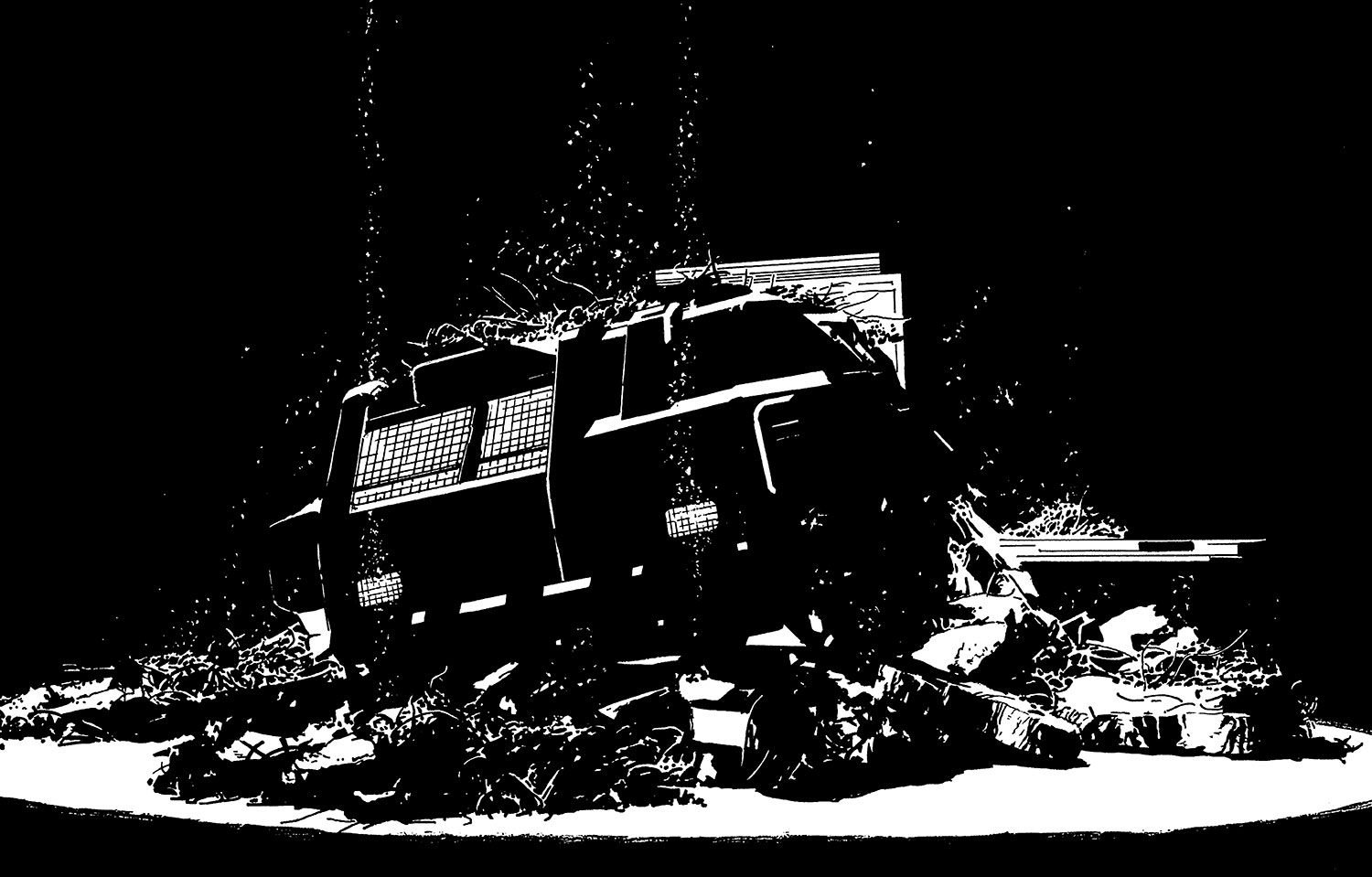
Occasionally, particularly with shadowy panels that only involve backgrounds and props, I'll find that I've achieved a near-complete image with Daz 3D and Photoshop CC. In these instances, however, the lack of anything remotely organic can lead to a static-looking panel.
Thankfully, there's always something that can be done at the drawing board to help. Here, I've used some white spots to suggest falling debris, illuminated by the lights of a crashed ship. As well as livening up the image a little, this tells the viewer that the crash was recent, as well as lending a sense of environmental context and mood.
16. Incorporating other forms of reference
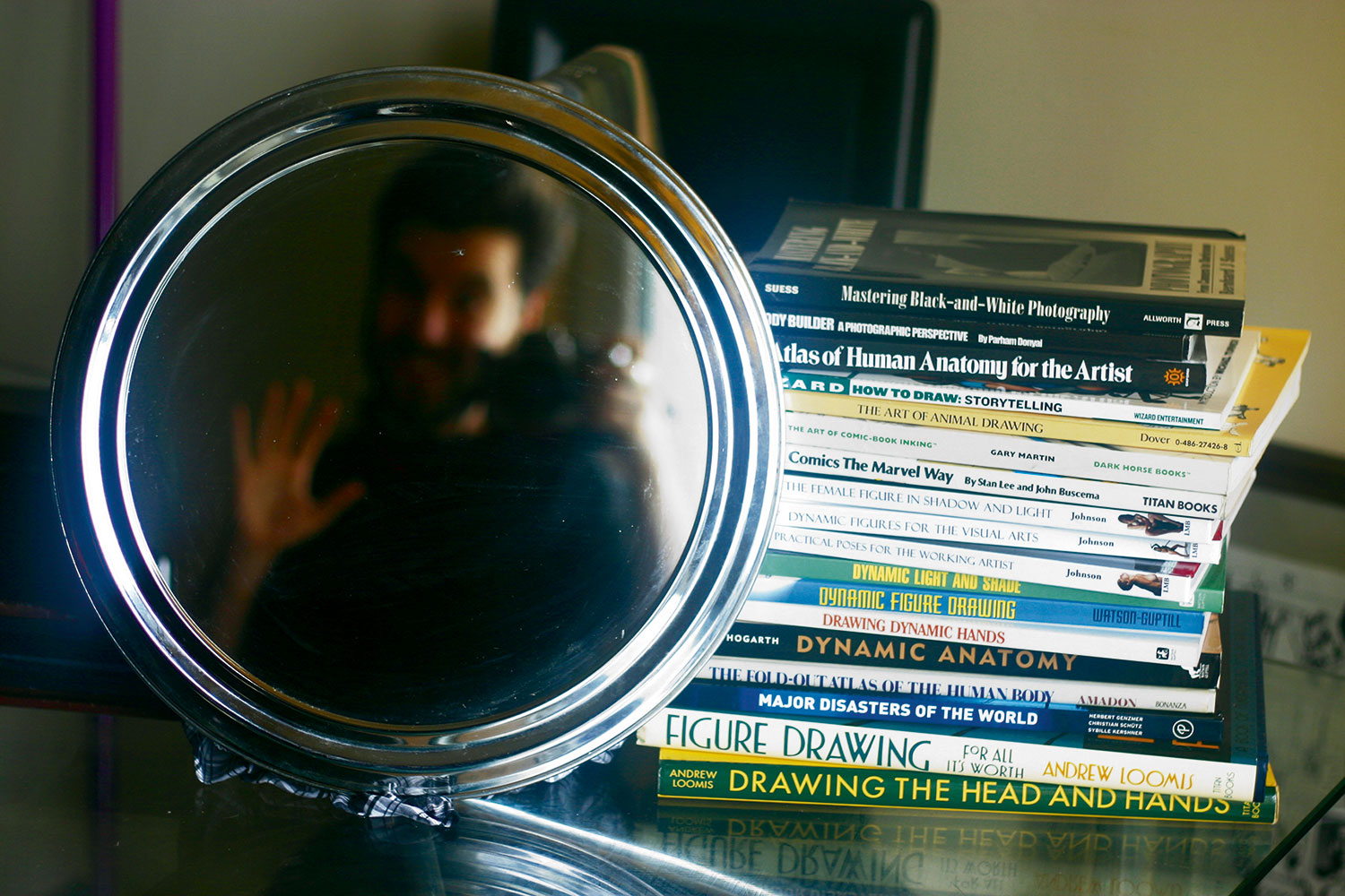
Daz 3D can be great for dealing with issues of complex foreshortening or composition, but the niceties of anatomy, hair, drapery and countless other elements may require an alternative.
Photo reference and anatomy books can help nail those nuances, and basic modelling programs such as SketchUp can help build custom elements quickly (although these will have to be exported separately, because they won't be compatible with most posing software). Some comic artists even mould models of recurring elements out of clay to use as live reference.
This article originally appeared in ImagineFX issue 139; buy it here!

Thank you for reading 5 articles this month* Join now for unlimited access
Enjoy your first month for just £1 / $1 / €1
*Read 5 free articles per month without a subscription

Join now for unlimited access
Try first month for just £1 / $1 / €1
Get the Creative Bloq Newsletter
Daily design news, reviews, how-tos and more, as picked by the editors.
