9 stunning portfolio templates for creatives
Make your work stand out with these portfolio templates.
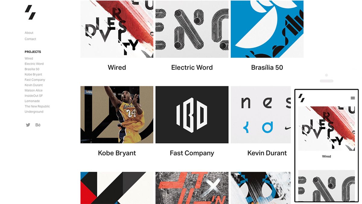
The best portfolio templates are invaluable. They'll help you create a standout portfolio with ease, meaning you can concentrate on the work itself rather than worrying about how to showcase it. A portfolio site is crucial for any freelance designer, operating as a shop window to show off your work, and yourself. If front end web design is one of your skills, then you should practice what you preach and create something bespoke. But for illustrators, graphic designers, artists, 3D designers and photographers, off-the-shelf portfolio templates and website themes can serve to create the professional-looking layout you need without a major investment of time and resources. Most of the best portfolio templates can be easily customised to create an original portfolio of your own with little – or no – CSS tinkering.
Read on for our pick of some of the very best portfolio templates out there from five of the most popular portfolio website platforms. For more portfolio inspiration, check out some of our favourite design portfolios, and to get started building your own portfolio site, take a look at our guide to choosing the best website builder.
01. Adobe Portfolio: Thomas
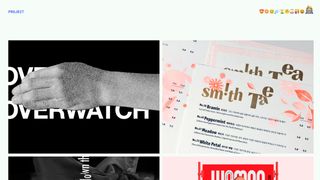
Thomas is one of a fine selection of portfolio website themes for Adobe Portfolio, and one that really lets your work shine through.
This popular portfolio template has a minimalist layout that lets your work do the talking since projects are shown with large hero images alone, which reveal the project title when scrolled over, and more information and/or images when clicked on.
Given that Adobe Portfolio comes bundled with Creative Cloud, existing subscribers may find this portfolio template to be an attractive option. Judging by the range of examples on the Adobe Portfolio website, there are lots of creatives using Thomas to brilliant effect.
02. Squarespace: Flatiron

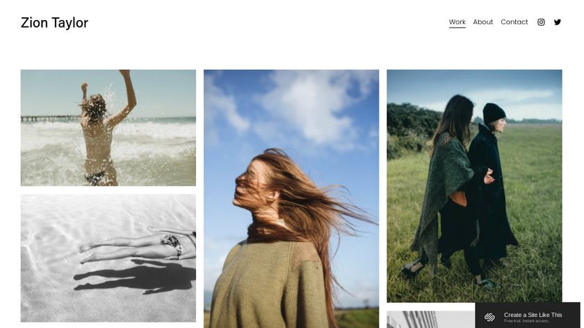
The Squarespace portfolio template Flatiron has an especially eye-catching gallery display, which locks together images with different aspect ratios to create a visually pleasing grid.
This is another option that ensures your work is the true star of the show by keeping site navigation simple and unobtrusive. There's a menu at the top left of the page, and the elegant puzzle structure lets your work take up the maximum real estate on the site.
03. WordPress: Helium
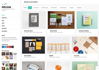
WordPress is a platform that offers plenty of versatility when it comes to customisation, especially if you have some coding skills. Helium is a good choice as a portfolio template for the platform, and it has a richer array of features than many of the other examples on our list.
The theme costs $48 for a regular license. It includes a built-in blog, as well as the option to add a fully functional online store if you choose. The support is excellent.
If you've already decided to go with a WordPress theme and want to see more options, check these other WordPress portfolio examples.
04. Wix: 3D designer portfolio template

We fell in love with the style of this portfolio template for 3D designers from Wix. It could arguably be used to showcase any creative's work, but it's particularly suited to moving images.
Parallax scrolling allows you to show off your top two or three images by making them full-screen. Users can then scroll down to see more examples of your work in a grid format. This is a clean portfolio template that allows 3D work to really stand out.
05. Cargo Collective: Malken-Hill
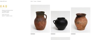
Cargo Collective has a range of strong portfolio templates, but we love the clean simplicity of Malken-Hill. It enables you to show off your work or wares on a crisp, minimal white background, with the option to click through for more information or images. A simple navigation bar at the top adds to the sparse feel and proves that, at least when it comes to portfolio sites, less is indeed more.
06. Adobe Portfolio: Marta
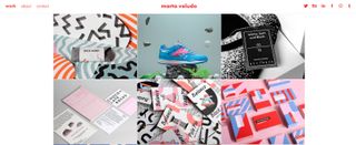
Marta is a stylish Adobe Portfolio theme courtesy of Amsterdam-based art director Marta Veludo.
Its fixed navigation can change colour when you scroll and ensures your key details remain visible while visitors browse the site.
Your logo appears in the centre of the page and navigation options to the left-hand side. The whole site is built on a responsive grid with fixed gutters, making for a slick, colourful and eye-catching option that should do the job for any creative.
07. Squarespace: York
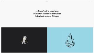
Another classy Squarespace portfolio template, the York template was created specifically with designers in mind. It's refreshingly minimal compared to thumbnail-led approaches, putting a bigger focus on individual projects with either full-width or half-width images for each. The largest portion of the area above the fold is reserved for a big, punchy introductory statement that can be used to make your mark.
It's a simple portfolio template that exudes confidence, so you need the work to support it. This is an option to showcase a small selection of truly killer projects that back up your personal claim.
08. Wordpress: Throne
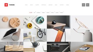
Another ultra-versatile Wordpress template, Throne could serve a fully fledged studio as well as a freelance creative. Its flexibility when it comes to customisation is particularly suited to those with wide-ranging portfolios that cross multiple disciplines, as the navigation allows work to be filtered by category.
This portfolio template will set you back $39, but it comes equipped with a range of widgets, icons, fonts, CSS3 animations, video support and page layout options that make it more customisable than many others.
09. Wix: Emma Brewer

Many of the portfolios templates available for the Wix platform are quite versatile in terms of the type of work they can be used to showcase, but there's usually a suggested discipline that each would suit best.
This Emma Brewer theme is pitched at art directors and graphic designers. It features large, half-page thumbnails on the homepage, which click through to expansive project galleries.
Each gallery has a killer screen-filling hero image at the top, a paragraph of info, and a selection of secondary images beneath, which is an ideal way to show branding and design projects with multiple touchpoints.
Related articles:

Thank you for reading 5 articles this month* Join now for unlimited access
Enjoy your first month for just £1 / $1 / €1
*Read 5 free articles per month without a subscription

Join now for unlimited access
Try first month for just £1 / $1 / €1
Get the Creative Bloq Newsletter
Daily design news, reviews, how-tos and more, as picked by the editors.

Nick has worked with world-class agencies including Wolff Olins, Taxi Studio and Vault49 on brand storytelling, tone of voice and verbal strategy for global brands such as Virgin, TikTok, and Bite Back 2030. Nick launched the Brand Impact Awards in 2013 while editor of Computer Arts, and remains chair of judges. He's written for Creative Bloq on design and branding matters since the site's launch.
- Beren NealeEcom Editor

