A guide to writing better CSS
These 8 simple tips will help you write CSS that is clean, efficient and useful.

Writing better CSS doesn't have to be a painstaking ordeal. A few minor adjustments to how you work within your CSS code file can have a big impact. In this article, we'll take a look at eight simple ways you can improve your CSS skills and write cleaner, more efficient, and better CSS code.
01. Start with a CSS Reset
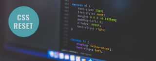
Some might argue that using a CSS Reset is unnecessary. However, a CSS Reset allows you to start with a clean base, making it easier to style your website, with more predictable outcomes across the board.
A CSS Reset resets or overrides the default styles of the browser. You may write your own, use one of the many resets available online, or use a combination of the two.
02. Know when to use CSS shorthand
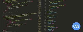
CSS shorthand enables you to set multiple properties of an element in a single line. Using shorthand saves space and takes less time to load. However, you shouldn't use it for everything.
Sometimes longhand provides much-needed clarity. But more importantly, when you only need to set one or two properties – or you simply need to override something – longhand may actually be better.
Something else to remember: when you're using shorthand, the ignored properties will reset, which could have an undesirable effect.
03. Keep it DRY
Quite possibly the best advice for writing better CSS code is to follow the DRY methodology. DRY means 'don't repeat yourself' – essentially, don't use the same bits of code over and over again.
One way to keep things DRY in CSS is to group things together. Let's look at an example.
Original CSS
.menu li {
  color: red;
}

.menu li a {
  color: red;
}
Refactored and DRY
.main li, .main li a {
  color: red;
}
As you can see, not only will this reduce the overall size of your CSS file – which creates faster load times – but you'll also benefit in the area of maintenance too. If the color property needs updating, you're only updating it one spot.
You can also use CSS custom properties to help stay DRY. Custom properties are created like so:
:root {
  --primary-color: red;
}
And then can be used anywhere within your CSS code, as often as you'd like:
.main li, .main li a {
  color: var(--primary-color);
}
04. Stop over-using !important
There are very few occasions where you need to use !important. It's one of the most – if not the most – misunderstood and over-used declarations.
Don't get me wrong, !important does have its place, but generally web developers use it in desperation when things don't look right. So to fix things, they give their rule a little more weight by adding the !important declaration to it.
The problem is, this starts to create a domino effect that rapidly turns into a maintenance nightmare, as more and more things are declared !important. Only use !important when it's absolutely necessary.
05. Keep consistent
Regardless of how you write your CSS, and in which order you add the properties, keep it consistent. Some people order their properties alphabetically, while others use more of a logical approach – for example, organising things by line length or type. I opt for the former, but it's entirely up to you. The bottom line is whatever you choose, stick with it so it's easy to find things later.
06. Name things intelligently

This seems like a no-brainer, but when naming your selectors, don't get overly complicated. Be succinct and stick with a standard naming convention.
Some things to consider when coming up with your selector names:
- Avoid presentation words: These are the ones that involve colour and display location (for example, green-text or top-menu-bar)
- Only use lowercase: CSS is case-sensitive, so don't create names like, MeNuBaR. It should be noted, however, that camel case (menuBar) is an acceptable practice, just not preferred in some cases
- Separate multiple words using a dash: For example, main-menu. You may also use camel case (mainMenu), but again, this is often not preferred
- Don't be too specific: You'll end up using multiple selectors for the same type of element. For instance, list-one and list-two can be combined, creating a single list-items
07. Add comments when appropriate
While it's true that good code doesn't need comments, it's also true that adding comments to code is necessary in some cases. The rule of thumb here is that if the source code will benefit from the comment, then add it; otherwise, don't.
If you're wondering when comments might be necessary, here are a few examples:
- Commented code: If you comment out a specific portion of code, for a particular reason, leave a comment explaining that reason. If you don't, you may not remember why you commented it out in the first place
- Hot fixes: If you add a 'hot fix', it might be a good idea to add a comment explaining it too
- Reminders: You're likely working on more than one project at any given moment. If your attention is pulled before you have a chance to complete something, you can use comments as a reminder for what you still have left to do
- Explanations: If a section of code is unclear, and you feel an explanation would help clear it up, then add a comment – it's that simple
08. Explore Flexbox

When it comes to aligning elements on the page, the Flexible Box Layout module (or Flexbox) gives you complete control. Using flex containers and flex items you're able to precisely define how things look. Flexbox also enables you to arrange items vertically on a page, which wasn't possible with floats.
It's a little tricky to get your head around, but well worth it. Start by reading our Web designer's guide to Flexbox.
Read more:

Thank you for reading 5 articles this month* Join now for unlimited access
Enjoy your first month for just £1 / $1 / €1
*Read 5 free articles per month without a subscription

Join now for unlimited access
Try first month for just £1 / $1 / €1
Get the Creative Bloq Newsletter
Daily design news, reviews, how-tos and more, as picked by the editors.
Tammy is an independent creative professional, author of Apple Game Frameworks and Technologies, and the maker behind the AdventureGameKit – a custom SpriteKit framework for building point and click adventure games. As an innovative problem solver and industry leader, Tammy enjoys working on projects from content creation – including books, tutorials, videos, and podcasts – to the design and development of cross-platform applications and games. For Creative Bloq, she has written about an array of subjects, including animation, web design and character design.
