9 golden rules for combining fonts
Advice for nailing the balance of typefaces on your website.
Finding the right font pairing is an artform – in this article, we offer some tips and tricks for getting it right. Let's say you've hunted through all the great paid and free fonts you can find, and picked the perfect typeface to suit your project (if it's a website build, make your site pop with the right web hosting service).
Great fonts don't live in isolation – you need something to go with it that will complement it and help it shine. Then you need to figure out how to use your choices effectively within your design. Here are the golden rules of matching fonts to help get you started. Designing a site? Use a top website builder.
01. Don't use too many fonts

First things first: don’t go mad with fonts. You want to pick a couple that work together and set the tone and mood you want to portray. Too many fonts will create a jarring experience.
02. Consider context

Where is your typography being displayed and who is going to read it? Consider this when deciding which font is right for your project. Striking the right visual direction and tone is important when it comes to making sure your messages are relatable.
03. Don’t be afraid of space
Clarity and breathing space is important when making a message noticeable. Ensure your textual elements aren't fighting for prominence within a tight space – in this situation nobody wins. Space helps keep focus.
04. Introduce hierarchy
Sizing is a great way to introduce hierarchy within a design and help guide the user through the content. However, for this to be effective it’s important there’s not a huge variety of text sizes on a page. Consistency, hierarchy and readability are key.
05. Keep styles consistent
Consistency is key to ensure a good UX. Are you using uppercase or letter spacing for your headlines? Pick an approach and don’t deviate. Similarly, ensure your fonts follow set size rules and don’t vary from them. Stick to a pattern.
06. Apply colour with accessibility in mind
Legibility is essential when choosing a colour for the type elements on your site, so be mindful of accessibility. Make sure contrast between text and background is high enough to remain clear to users with visual impairments. A great tool to check this is WebAIM's Color Contrast Checker.
07. Mix your styles

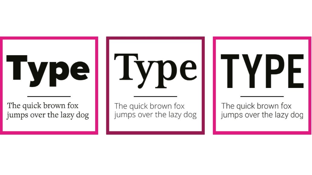
There needs to be enough contrast between your choices to create variety within your design – but go for the wrong combination and you'll have a clash on your hands. Use contrasting styles like sans-serif and serif to achieve more varied looks.
08. Watch your weight
Most fonts come in variety of options and weights. When pairing with other fonts, you can use variations from families but be mindful not to overdo it – mixing and matching too many of these can be just as jarring as using too many fonts (save any design experiments in cloud storage). Use one or two weights to add variety and hierarchy. As a rule of thumb, don’t deviate from 'normal' on body text, to ensure you keep text readable.
09. Try something new
Everyone has tried-and-tested font pairings they know work well together, and it's tempting to return to them again and again. While it's good to have some go-to fonts, be wary of getting stuck in a rut. There are so many different fonts out there to experiment with, so if you can find the time it's always worth having a play with new and interesting offerings.

Web design event Generate New York returns on 25-27 April 2018, offering a packed schedule of industry-leading speakers, a full day of workshops and valuable networking opportunities – don’t miss it. Get your Generate ticket now.
This article was published in issue 271 of Web Designer magazine. Subscribe here.
Read more:

Thank you for reading 5 articles this month* Join now for unlimited access
Enjoy your first month for just £1 / $1 / €1
*Read 5 free articles per month without a subscription

Join now for unlimited access
Try first month for just £1 / $1 / €1
Get the Creative Bloq Newsletter
Daily design news, reviews, how-tos and more, as picked by the editors.
Carl is a creative who has been in the web industry for more than 14 years. Blessed with a passion for UX/UI design, Carl has been awarded Creative of the Year for his contribution to the industry. His diverse portfolio of past clients includes Facebook, Twitter, Unity Technologies, Ordnance Survey, and beauty brand Lush. He has written features for Web Designer magazine, and currently heads up the Salo Creative agency, which he also founded.
