Whether you’re designing a brochure, poster, flyer, website or app in your agency work, you’re probably going to need some imagery to bring it to life. The standard go-to is photography, but don’t discount the idea of going down the illustration route.
There’s something about illustration that can sometimes engage with audiences better than even the best photography.
Perhaps that’s because it takes a step back from the starkness of real life, when photography can sometimes seem too immediate and obvious. Perhaps it’s to do with our deep and lasting relationship with illustrated children’s books. Or maybe it’s just because it offers a great way to convey simple shapes, silhouettes and ideas quickly and simply, without any associated surface noise.
So what kind of illustrations should you use, and how? In this post we offer eight pointers about how to get the most from illustration in your designs.
In an ideal world, of course, you’d always be able to commission your illustrations. But timescales and budgets don’t always allow for that, especially when the best illustrators can be booked up for months ahead.
The good news is that iStock by Getty Images isn’t just a world leader in stock photography, it’s a major provider of stock illustrations too. So it’s the perfect place to find a huge range of exclusive, royalty-free illustrations by high-end professional illustrators, plus powerful search tools to help you find the perfect images quickly.
01. Minimalism can be magical

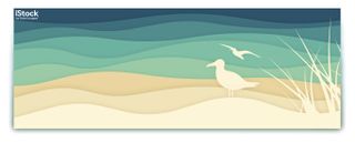
When looking at illustrations for inspiration, the designer’s attention will often be drawn to detailed, intricate artworks. But after you’ve finished marvelling at the artist’s talent, you also need to step back and ask how well it will actually function in your design. Because to grab people’s attention and conveying a concept quickly and easily, you’re often better off with something simpler.
That doesn’t mean it can’t be beautiful, of course. Some of the most aesthetically pleasing and engaging illustration work out there harnesses minimalist styles, including the wonderfully concise work of Misha Petrick, the stripped-down stylings of Christian Jackson, and the simple pop culture forms of Dennis de Groot.
02. Make an emotional connection

Ultimately, the holy grail of any design is to forge an emotional bond with the viewer. So why not go straight for the jugular, with an illustration where a sense of emotion is already baked in?
If you do go down this route, of course, you need to steer clear of cheap sentiment and focus in on the kind of work that genuinely pulls at your heartstrings. After all, if it does for you, it’s more likely to do so for others too. Illustrations that evoke strong feelings in the viewer include the intense and raw work of Ivana Besevic, the delicate, feminine lines of Weronika Siwiec and the wistful wonderings of Kailey Whitman.
03. Confound expectations

Sometimes you really want to arrest a viewer’s attention with your design. That’s something that high-quality photography can achieve, of course. But by freeing themselves from the real world, illustrators have the ability to go further in turning reality on its head and producing something truly fantastical.
Illustrators with offbeat and original visions include the likes of surrealist Sebastiao Peixoto, the softly subversive Langdon Graves and the king of cut-out colour, Pierre-Paul Parisea.
04. Maximise colour

‘Make the colours pop’ may be the client demand designers hate to hear. But have you considered that the illustrations you use can do that job for you?
More and more illustrators nowadays are playing with bright, vivid and kaleidoscopic colours, and their creations can all help bring an otherwise unremarkable design to life.
Illustrators known for their strong use of colour include Malika Favre, known for her ‘less is more’ approach; Laura Breiling, who takes a bold and daring approach to editorial illustration; and Kiki Ljung, whose geometric styling are filled with a sense of fun.
05. Harness the power of retro

While once nostalgia was just nostalgia, now terms like ‘retro’ and ‘vintage’ describe an approach to illustration that’s not about looking back but looking forward.
In the iTunes era, when a cheesy 80s pop song can share space in the chart with the latest Grime release, retro all about requisitioning, remixing and reinventing the past. Illustrators working with an inventive take on retro include Zara Pickens, Mads Berg and Tad Carpenter.
06. Experiment with styles

Whether you’re working in print or digital design, the temptation is to use illustrations that fit in with mainstream contemporary style. But if you’re looking for a way to make your design stand out, maybe you should consider seeking out work that takes a different approach to the norm and experiment with illustrative approaches.
The faux-naiive cartoon stylings of Jean Jullien, the seductive ‘glitch’ oil paintings of Andy Denzler and the dreamy swirls of James R Eads are just some of the illustrators pushing the boundaries and playing with your expectations in delightful ways.
07. Delve into doodles

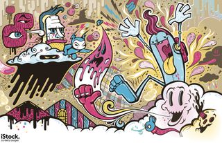
Doodles were once just something you did by yourself when you were bored. But in the 2010s they’ve become a new and exciting sub-genre of illustration.
Doodle illustrations are a great option for a design that doesn’t take itself too seriously, and encourages the viewer to engage with it in a fun and relaxed atmosphere. Noted illustrators working with doodles include Sam Cox, aka Mr Doodle, Jon Burgerman and Pez.
08. Craft

The rise in digitisation that has swept popular culture over the last couple of decades has prompted an equal and opposite counter-revolution in the form of physical, craft based illustration. Many of us crave the physical, tangible and touchable, and you can harness this trend in your designs by using illustrations based on paper art and other physically based techniques.
Illustrators working with craft materials include paper artist Elsa Mora, Zack Mclaughlin, who uses wood and feathers, and multimedia illustrator Kim Sielbeck.
To see all of the illustrations featured in this article, and thousands more, check out the wide range of stock illustrations at iStock by Getty Images. Until the end of the month, you can also get 10% off credits with code ZKFPC46N at checkout.

Thank you for reading 5 articles this month* Join now for unlimited access
Enjoy your first month for just £1 / $1 / €1
*Read 5 free articles per month without a subscription

Join now for unlimited access
Try first month for just £1 / $1 / €1
Get the Creative Bloq Newsletter
Daily design news, reviews, how-tos and more, as picked by the editors.
Tom May is an award-winning journalist and editor specialising in design, photography and technology. Author of the Amazon #1 bestseller Great TED Talks: Creativity, published by Pavilion Books, Tom was previously editor of Professional Photography magazine, associate editor at Creative Bloq, and deputy editor at net magazine. Today, he is a regular contributor to Creative Bloq and its sister sites Digital Camera World, T3.com and Tech Radar. He also writes for Creative Boom and works on content marketing projects.


