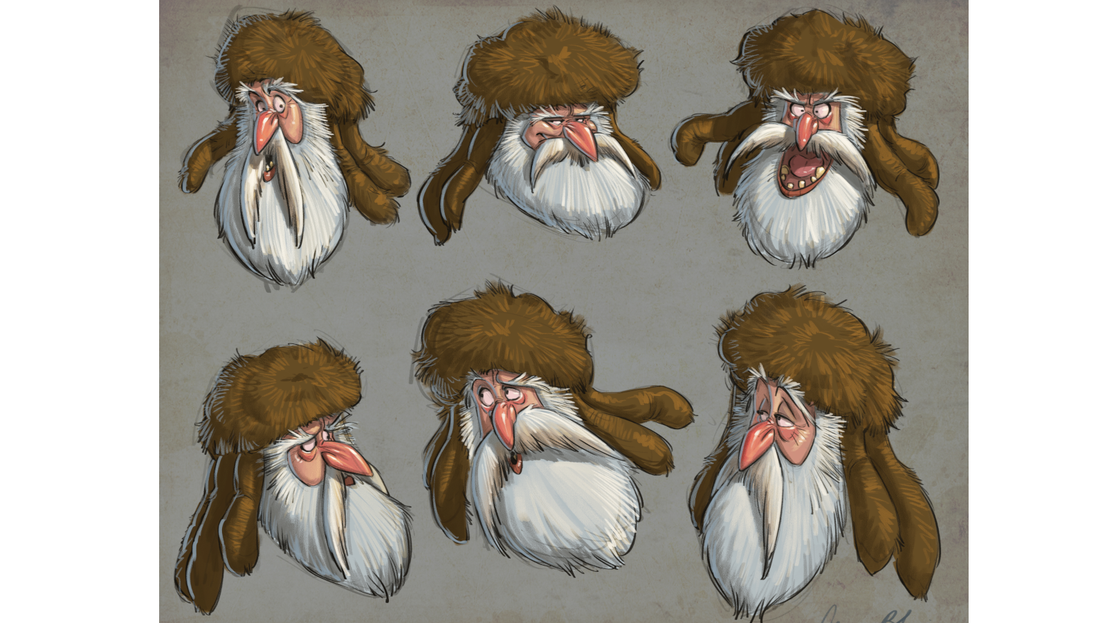
8 expert ways to commission better illustration
Art-direct the perfect illustration every time with these pro tips.
As an art director, commissioning illustration can be one of the most rewarding parts of the job. But it can also be one of the most frustrating. Illustration has no limits in terms of scope, or style, or subject matter. You can communicate ideas of all kinds, whether abstract or literal – and totally change the look, feel and mood of a piece of design.
It takes experience to get the commissioning process spot-on, and sometimes you don't have the time, or the budget, to do so from scratch. That's where savvy use of stock imagery can come in, or a different solution entirely.
But if you do have time to go down the commissioning route, here are our eight top tips to improve your illustration commissioning skills.
01. Choose the right style
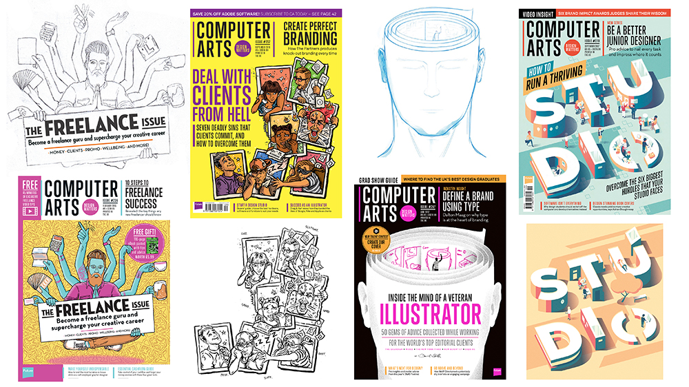
Once you've decided that commissioned illustration is the right route to take for a project, the crucial first stage is to determine what style is the best fit for that particular job.
You may already have a look and feel in mind, or even a specific person (see our hot list of the best new illustrators for inspiration). But it's worth compiling a moodboard of different potential illustrators before making an approach. Test some of their previous work in situ in your design if you can.
If you have a rough concept in mind but aren't sure who to do it, illustration agencies can be helpful in bridging the gap and suggesting options. Design magazines such as our sister title Computer Arts, creative conference line-ups, or schemes such as the World Illustration Awards are also useful sources of inspiration.
As a commissioner, it's always helpful to use an illustrator's previous work as a reference point. It proves they can execute the concept you have in mind if they've done something similar. But remember, many illustrators aren't keen on treading the same ground, so be prepared to work with them to push the idea in fresh directions.
02. Consider composition early
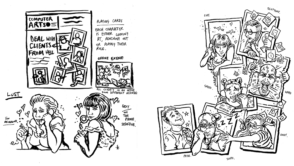
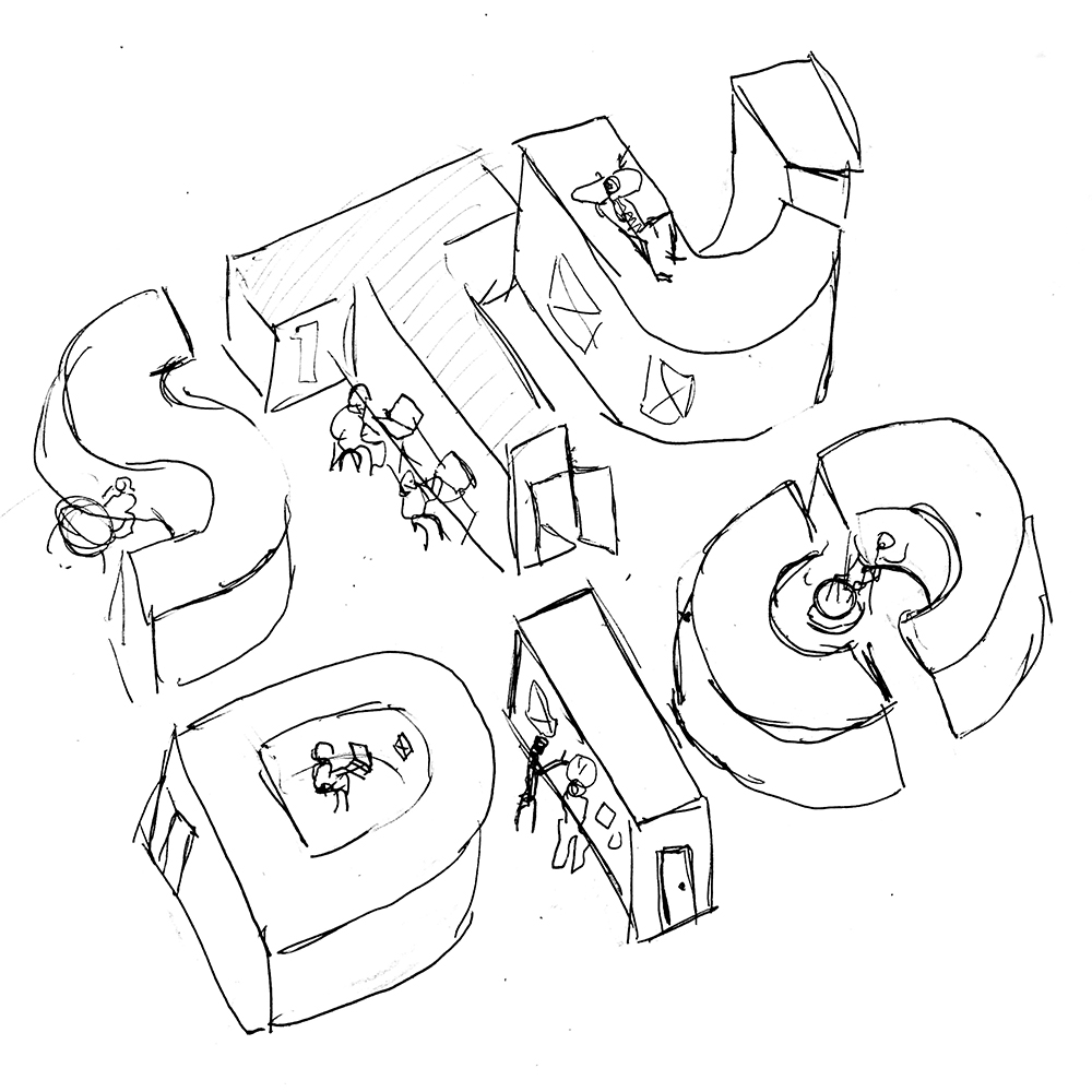
It's vital to nail the composition of the piece at an early rough stage – particularly where hand-drawn or handmade illustration is involved – as it'll save a lot of potential hassle further down the line.
Sometimes this can be as simple as a quick thumbnail sketch that demonstrates an understanding of how the illustration needs to function alongside other elements of a design. It's rarely shown in isolation, after all.

If you have a clear concept and composition in mind from the outset, it may be necessary for you to provide this sketch as part of the initial brief to avoid confusion and make sure you're on the same page as the illustrator.
03. Set a detailed brief
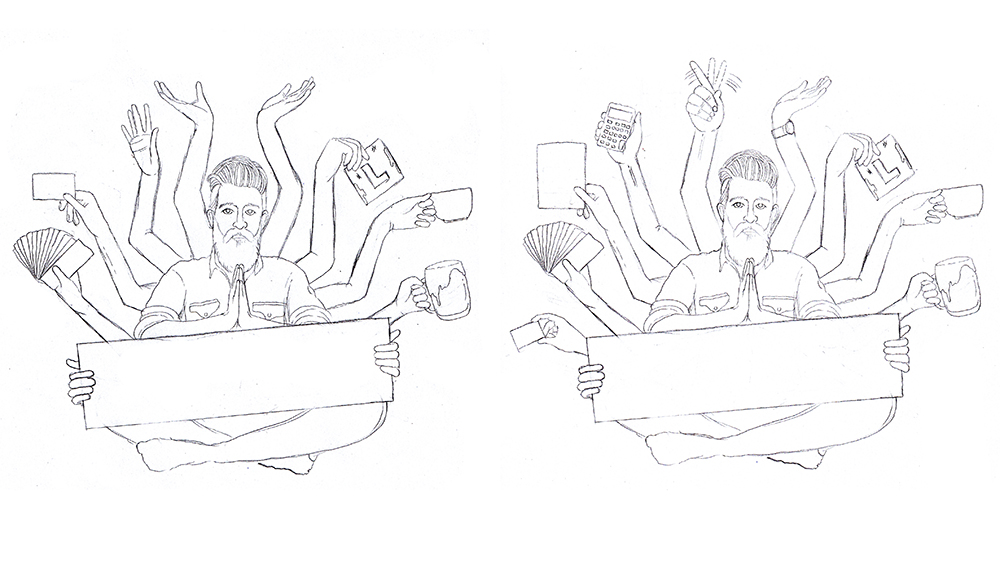
There are times when giving an illustrator the freedom to develop their own concepts can yield stunning results that go beyond your wildest expectations. It's a collaborative process, and two heads are usually better than one.
However, sometimes a very tight brief is the best way to deliver the concept you need for the job. A totally blank sheet of paper can be a curse as well as a blessing for the illustrator, and it can be reassuring to know that their commissioner has a clear vision in mind.
If there's a particular concept or visual metaphor at play, as well as discussing the composition of the piece consider particular elements that could be included, and suggest options. Just try not to be so restrictive and controlling that you end up cramping the illustrator's style.
04. Discuss references
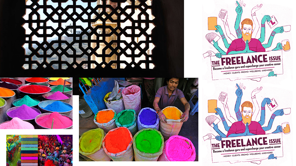
References and visual moodboards can provide an invaluable creative steer for the illustrator, whether at the initial commissioning stage alongside discussions about concept and composition, or further down the line while adding detail.
Stock image libraries can be a treasure trove for this kind of material, whether or not you end up using the assets in the final design – as can visual platforms such as Pinterest, Behance or Instagram.
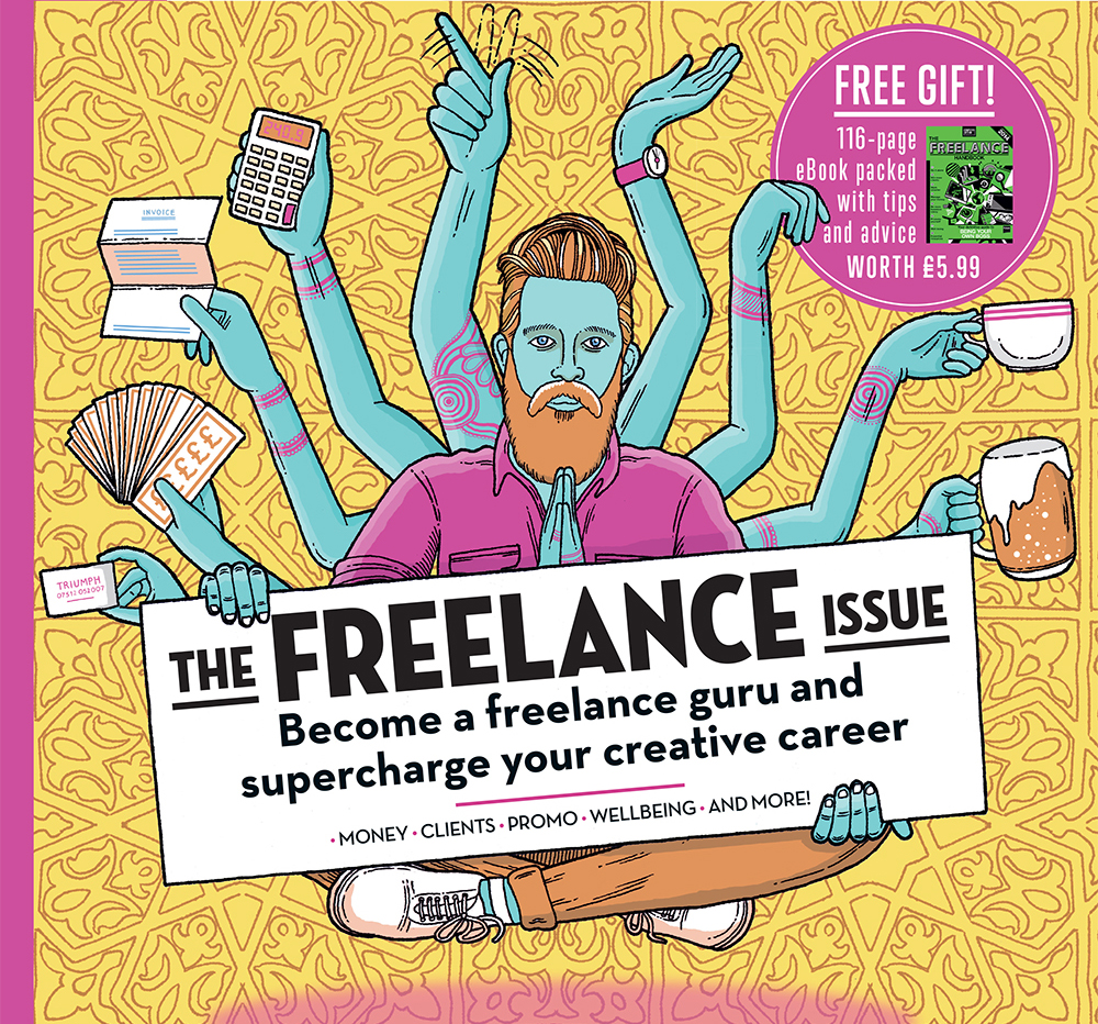
Remember, these are only references at this stage, and the final illustration could take a very different direction. Your moodboard may only inform the broad colour palette, help determine the shape and form of certain elements, or inspire a background pattern, for instance.
If you're looking to ground your commissioned illustration in the look, feel and heritage of a particular culture, the more research the better. In the interests of authenticity, use someone with first-hand knowledge and experience if you can.
05. Brainstorm concepts
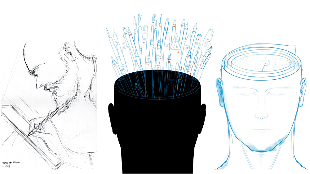
If your brief is more open and conceptual, provide the illustrator with enough of a theme or direction for them to explore concepts at an early sketch stage, and then work with them to develop them further.
Think of it like the process you go through when developing logo ideas for a client. There may be elements of different ideas that you can combine, refine or take in new directions.
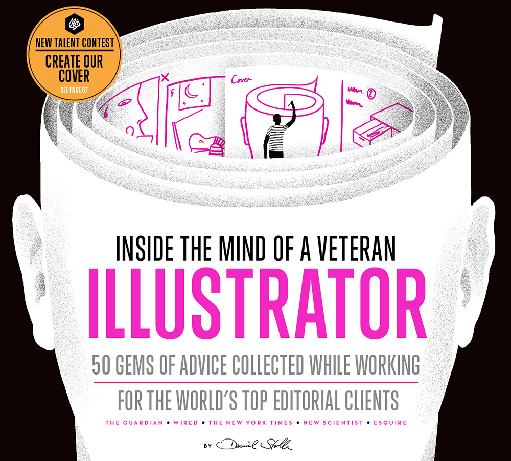
As a designer, you know what it's like to be on the other side of the table with a difficult, indecisive and inarticulate client. Don't be that person: help steer the illustrator towards the best solution, and work together to find it.
06. Collaborate on layouts
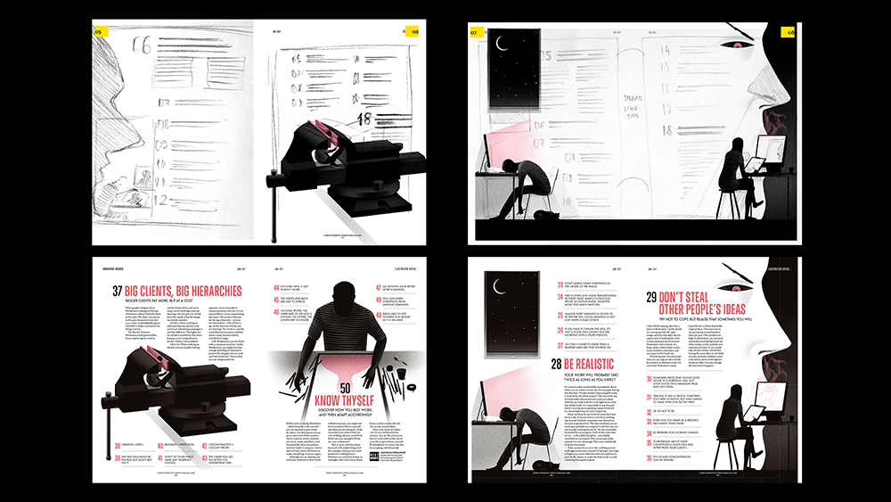
When it comes to spot illustrations, often the brief demands very specific dimensions to fit into predetermined boxes. If the layout is fixed at the point of commission, or if there are certain design elements the illustrator must work around, be sure to specific this very clearly at the outset.
If, however, there's more flexibility in the design – such as small, moveable elements that can fit around illustration – then consider collaborating with the illustrator on something more dynamic.
07. Give direction with annotations
During the collaboration process between designer and illustrator, sometimes feedback is best provided in the form of notes and annotations to steer the design in a very specific direction.
This is much quicker, more accurate, and ultimately less likely to be lost in translation than just trying to describe the changes in an email or over the phone, for instance.
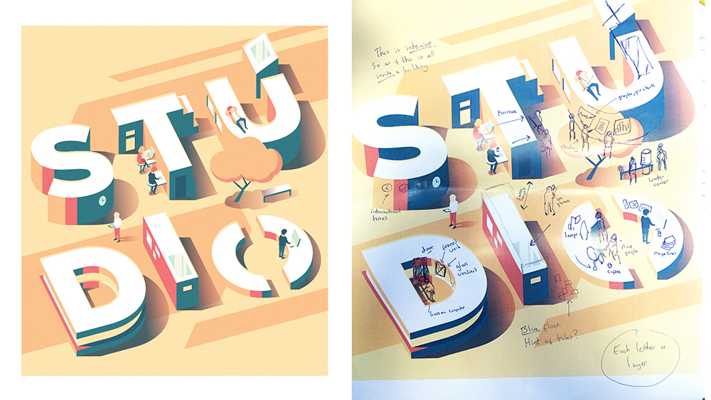
This type of sharply focused art direction is particularly helpful once a concept is locked down, and finer details are being tweaked and refined, although broader-brush notes are also useful at the compositional stage.
08. Reuse key elements

Due to time, budget or other constraints, sometimes a main 'hero' illustration needs to take priority over smaller spot illustrations in a design. One solution is to consider the re-use of certain elements from the outset.
If you're commissioning a digital illustrator, if possible make sure they supply a layered file with key compositional elements kept separate. Vector files are even better, as there's more scope to manipulate scale and colour to keep things fresh.
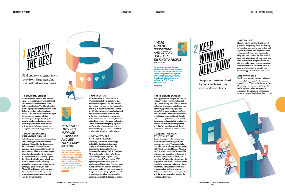
This isn't always possible, of course, either because the illustration doesn't lend itself to this kind of reuse, or the usage rights you've negotiated as part of the commission don't permit it.
Even if they do, it's good practice to explain to the illustrator how you intend to use it – they may have some suggestions of their own to bring to the table. It's a collaborative process, after all.
Thanks to CA art editor Mark Wynne, and former art editor Jo Gulliver, for their help providing images (and for art directing these covers in the first place).
Read more:

Thank you for reading 5 articles this month* Join now for unlimited access
Enjoy your first month for just £1 / $1 / €1
*Read 5 free articles per month without a subscription

Join now for unlimited access
Try first month for just £1 / $1 / €1
Get the Creative Bloq Newsletter
Daily design news, reviews, how-tos and more, as picked by the editors.

Nick has worked with world-class agencies including Wolff Olins, Taxi Studio and Vault49 on brand storytelling, tone of voice and verbal strategy for global brands such as Virgin, TikTok, and Bite Back 2030. Nick launched the Brand Impact Awards in 2013 while editor of Computer Arts, and remains chair of judges. He's written for Creative Bloq on design and branding matters since the site's launch.
