Portfolios come in all shapes and sizes. There’s no one-size-fits all answer to creating the best presentation of your work. Individual personality and creativity are part of what you want to show, and the arrangement of your work will also depend on what type of client you are trying to reach.
But there are some things that help showcase your work and get you hired, and others that don’t. It could be because they distract, complicate or put prospective clients off looking any further. It could be because they leave the viewer with so many questions that they decide to look elsewhere.
From too much work to a lack of interactivity, here are seven things people usually won’t want to see in your portfolio. There are of times when breaking the rules can work and there are outstanding portfolios out there that include these elements, but generally these are things to avoid.
For inspirational portfolio examples, see our top design portfolios.
01. Everything you’ve ever designed
It can be hard to resist the temptation to include everything you've ever worked on, from school projects right up to your latest work. It's understandable that designers want to show just how much experience they have, but fight the urge. No potential clients is going to look at it all.
What's more, including too much work means they might select and look at the pieces that aren’t your best work, making it counterproductive. It can also leave your website bloated and sluggish. Going to the other extreme and including too little is also a mistake. Try to include enough variety for the client to be able to form an impression, without it being too much to take in.
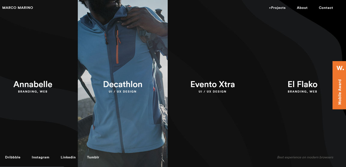
UI designer Marco Marino’s portfolio features just four standout projects designed for quite different clients. They're well presented with image reveals that appear when you move the cursor over each project, and you can click through to detailed case studies. The work is presented in a clear way that makes a great impression and shows how as few as four projects can be enough to show what a designer can do if they contain variety.
02. Your life story
Most clients won’t be interested in knowing about where you went to primary school, how many cities you've lived in or where you go on holiday. Too much information can come across as rambling and unprofessional. Overly boastful or brash personal presentations and claims of being the best designer in the world or a vector warlord can also fall flat. But clients do want to know who you are. A minimalist profile can work great for navigability and showcasing your work, but it needs to have some personality, both in the design and the copy. While you want your work to do most of the talking, you also want to avoid an anonymous corporate image.
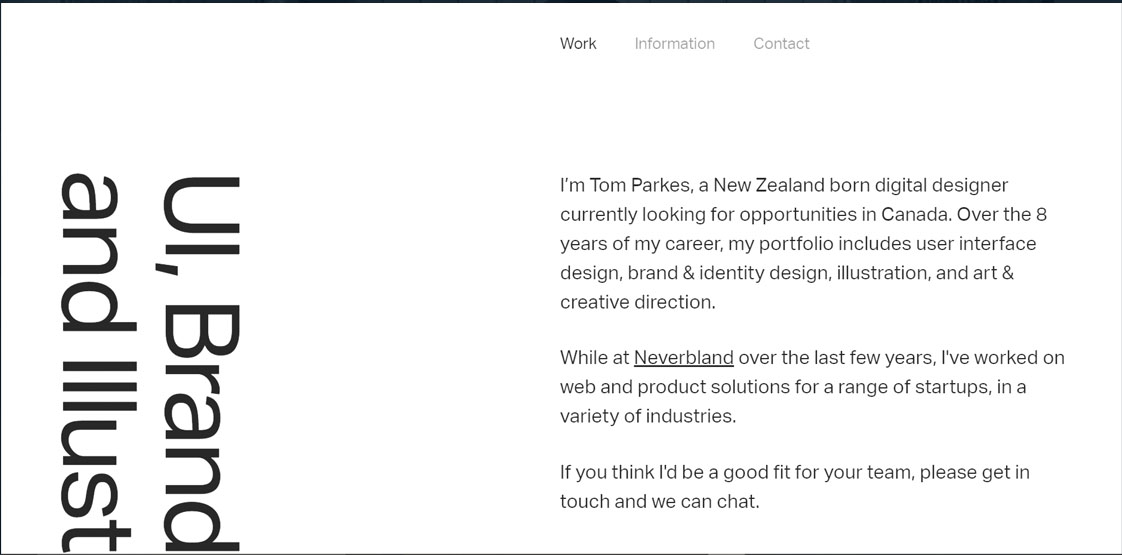
It’s best to aim for a simple, genuine and concise personal introduction that gives readers enough insight into your personality and career that they can decide whether you’re someone they'd like to work with without having to wade through a lot of irrelevant details. Digital designer and illustrator Tom Parkes strikes a good balance on his portfolio. He says clearly who he is and what he does before you scroll down to clearly presented examples of his work.
03. An overly complex or distracting layout
An elaborate and unusual layout can showoff creativity or coding skills, but it can also be bewildering and frustrating for potential clients with little time on their hands and no patience to work out how your portfolio is organised. Unless a client has already seen something of your work or knows you from a recommendation, they won't want to have to work too hard to find the information they need. Often simpler is better, with the most important details easy to find. Certainly don't make a potential client have to search for your email address or social links.
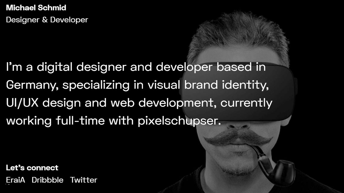
Germany-based digital designer and developer Michael Schmid’s simple but eye-catching one-page portfolio site says who he is and provides a link to where he works along with email and social links. He uses a micro glitch effect as a creative way to make it clear which text elements are clickable, adding originality without complicating usability.
04. Finished pieces with no context
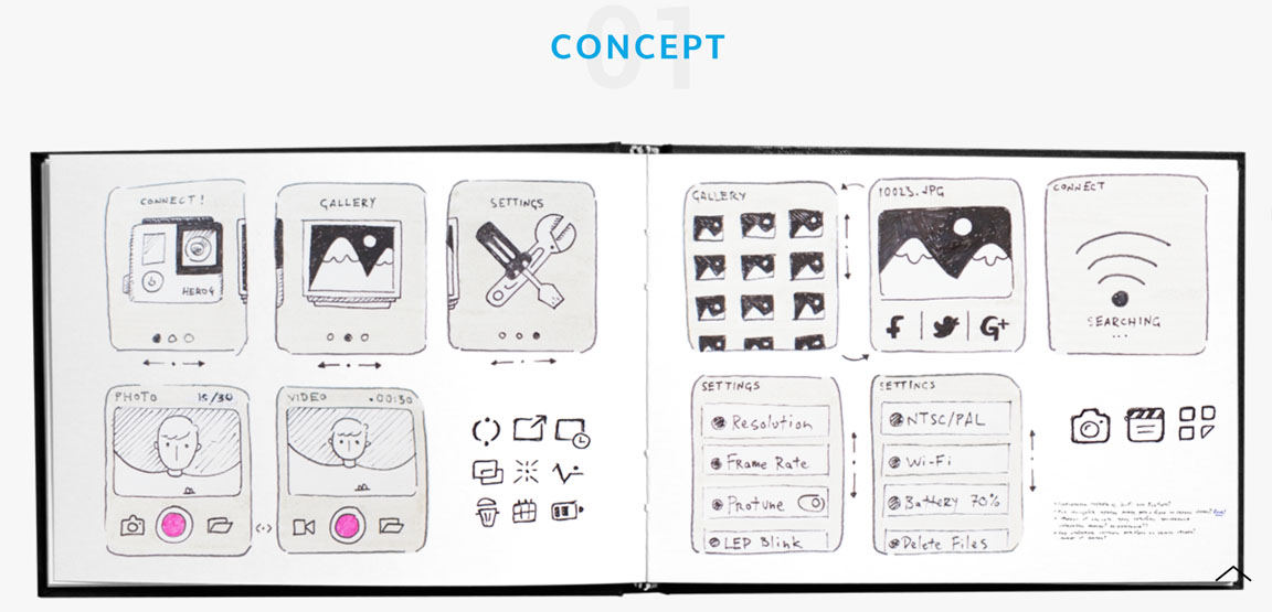
Many portfolios aim to wow clients by showing perfect finished work. The problem with this is that no two projects are the same, and the chances are that what a client wants does not fall within the exact style of the work you've done before. By showing only finished pieces, you give a client little idea of how you work, what your thought processes are, and how you make decisions. Sometimes it can come across as a random presentation of attractive designs based on your own tastes. A client looking for a designer rather an artist is more likely to want to see the context behind your work to know what the problem was and how you solved it. As in the old adage from school mathematics classes, you need to show your working out.
Product designer Daniel Polevoy includes sketches and detailed background context in his portfolio. The above image is a hand-drawn sketch made for a personal project to redesign Go Pro app content for iOS before he moved on to making mockups. Try to avoid technical jargon where possible so that the work can be understood by the average client, and talk them through how you arrived at the finished design.
05. Only one type of work
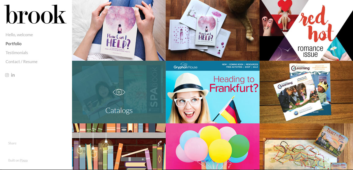
Unless you specialise in a particular niche or are someone to whom clients come looking for a very specific style, you will probably have clients looking for different types of products and different visual styles. Showing examples of only one type of product or style of work risks turning them away. Potential clients may form the impression that you have a personal style that you impose on all projects and that you don't have the versatility they need to develop something different.
Aim to present a range of work of different types and for varied clients. This will show that you can work to diverse briefs. It can be a good idea to classify work into categories to make it easy for a client to find what they're interested in hiring you for. In the case of US graphic designer Brook Perryman, she uses clearly presented categories such as catalogues, book covers and packaging to be able to show an extensive range of work that may otherwise have been too much to take in.
06. Unresponsive content
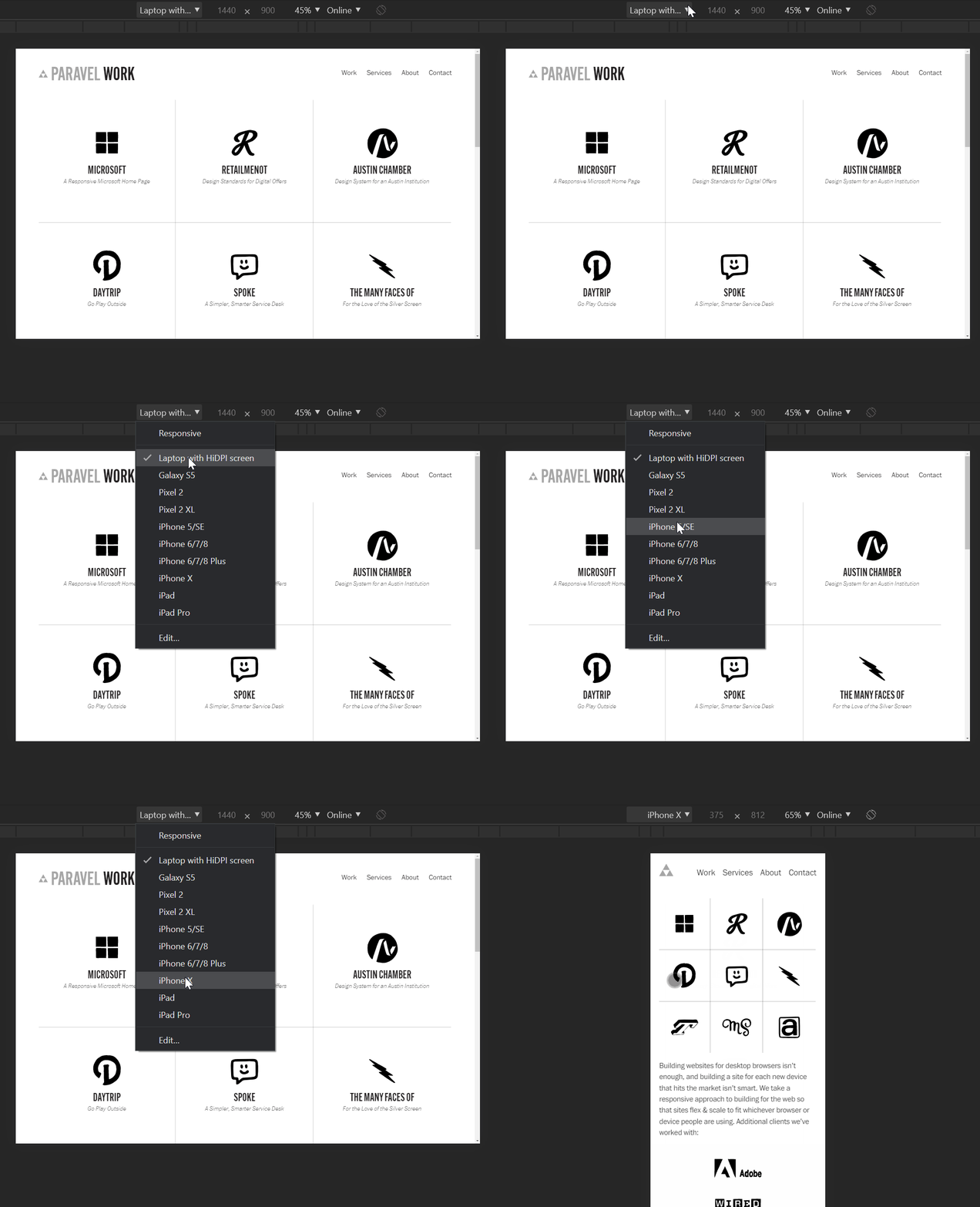
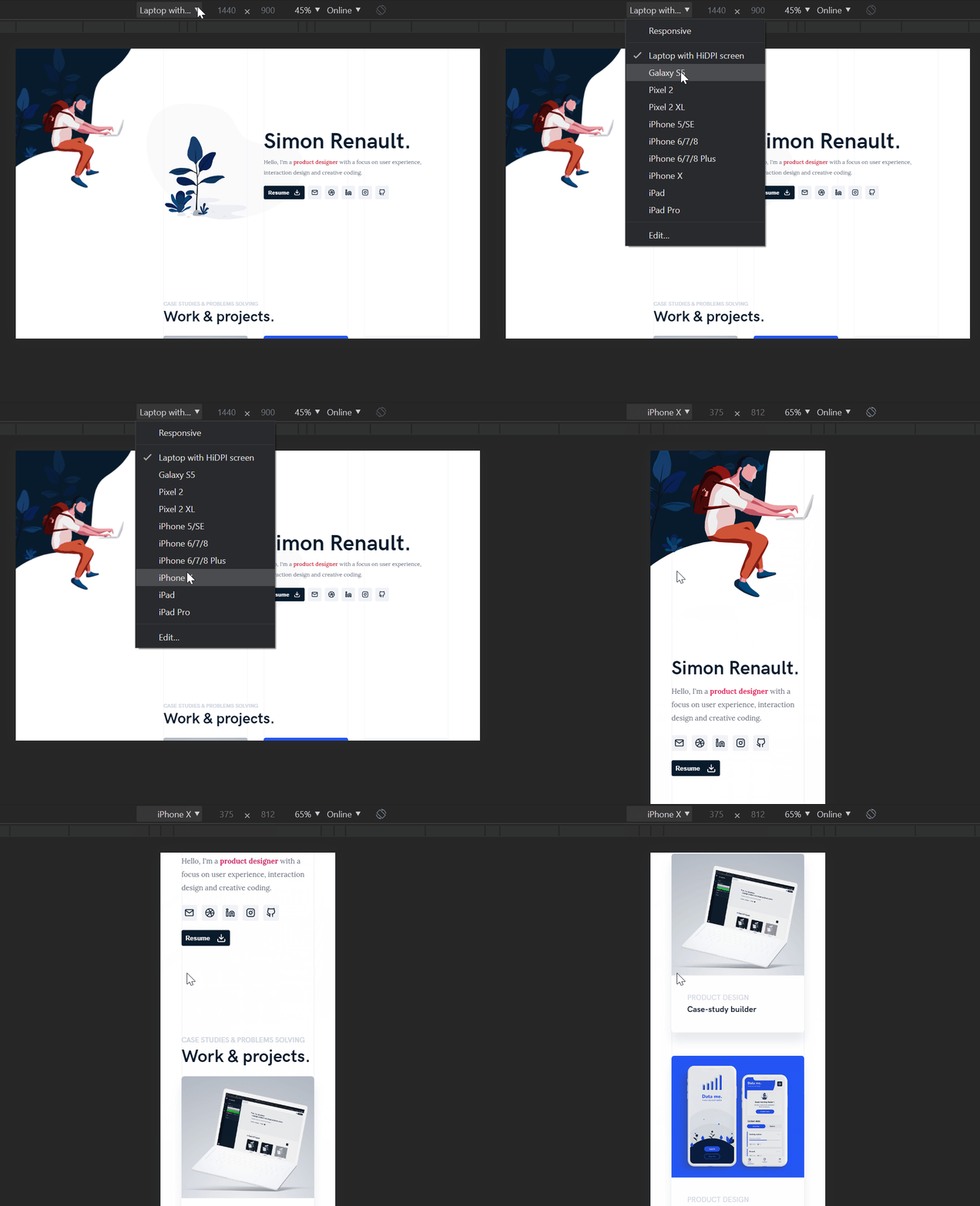
It's a given that anyone working in digital design needs to make sure their own portfolio site performs well and looks the business on any device. But even designers working exclusively in print need to consider responsiveness. In any sector, clients are as likely to be looking at your work on a mobile phone as on a desktop. There's no worse first impression than that caused by a sluggish site that fails to adjust to mobile or tablets.
You can put your site through Google's Mobile-Friendly Test, and if you right click and select "inspect" in Chrome, you can see how your site looks on different devices. Texan Web design shop Paravel's portfolio adapts to different devices, showing the names of the clients behind each of project on larger screens and only the logos on smaller screens. Making your portfolio site a progressive web app (PWA) is also a sharp way to gain lightning-fast app-like presentation that impresses clients. Simon Renault's portfolio feels smooth, sleek and offers impressive presentation on both desktop and mobile.
07. A static presentation

As the online world becomes more immersive, people are coming to expect more interactivity and moving elements on a site. Amid so much competition to get noticed, movement draws attention and can make a passing visitor stick around. Designers are adding movement to their portfolios in the form of minimal micro interactions, screen transition effects, and visual accents such as background colour changes that can make static designs more engaging.
If you work in digital design and UI, movement is crucial. Nobody wants to have to click through numerous screenshots to see and understand the user flow that you designed. Instead use video or GIFs to show animated flows. Rather than present a walk-through of an entire interface, consider using captioned videos of a particular series of transitions to demonstrate how you solved a specific problem or enabled a particular behaviour. This allows you to show a level of design thinking and attention to detail that is difficult to achieve with static images.
On the other hand, too much movement can be difficult to take in. Viewers’ eyes will naturally drift to the largest, most dynamic action and possibly miss details that you put a lot of thought into. Eugene So uses multiple screens alongside each other to present app projects but cuts down on the visual noise by having only one of the screens move. One needs to be hovered over to come into life, and the final screen is still. This allows viewers to take in the presentation bit by bit and not feel overwhelmed.
Read more:

Thank you for reading 5 articles this month* Join now for unlimited access
Enjoy your first month for just £1 / $1 / €1
*Read 5 free articles per month without a subscription

Join now for unlimited access
Try first month for just £1 / $1 / €1
Get the Creative Bloq Newsletter
Daily design news, reviews, how-tos and more, as picked by the editors.

Joe is a regular freelance journalist and editor at Creative Bloq. He writes news, features and buying guides and keeps track of the best equipment and software for creatives, from video editing programs to monitors and accessories. A veteran news writer and photographer, he now works as a project manager at the London and Buenos Aires-based design, production and branding agency Hermana Creatives. There he manages a team of designers, photographers and video editors who specialise in producing visual content and design assets for the hospitality sector. He also dances Argentine tango.
