7 simple steps to creating a great brand identity
Take small steps to redefining a visual identity.
There are many ways to approach a rebrand. A trend of late has been to focus on reawakening a brand's heritage by looking to the past, but sometimes a huge overhaul of a visual identity isn't what's needed.
If a brand hasn’t lost its way entirely, but is becoming a little tired, sometimes the rebranding process is more about modernising, and making a brand fit-for-purpose, rather than dramatically looking either forwards or backwards for inspiration. But sometimes making small steps towards a new identity or tweaking things slightly is actually more difficult than starting from scratch or making big changes.
Here, leading designers reveal how to best go about rebranding in small steps.
01. Don't disregard the current brand

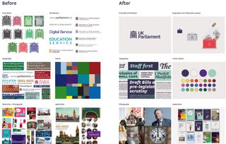
Like so many high-profile projects before it, SomeOne’s recent rebrand of the UK Parliament faced a wave of initial criticism for spending public money on what was perceived to be a few tiny tweaks to the portcullis logo. But as the tweets piled up, and more of the ‘brand world’ was revealed, it became clear to anyone willing to dig a little deeper that the rebrand was about digital versatility.
“Only a fool rushes into an established brand with a total disregard for the brand’s history,” believes Simon Manchipp, co-founder and executive strategic creative director at SomeOne. “There’s nearly always something worth preserving,” he insists.
“With the UK Parliament, the portcullis is part of the very fabric of the buildings," continues Manchipp. "The Royal documentation. Even the curtains. So there was never a question of replacing it. It’s a globally recognised symbol, which in brand terms is worth billions. “It was streamlining and making it digitally adept that formed the basis of our brand work, as well as creating systems to better clarify Parliament’s role in a modern democracy. Connecting many parts to make one cohesive whole.”
02. Make small changes that make a big impact

Chris Moody, chief creative officer at Wolff Olins, compares this approach to the principle of ‘incremental gains’ embraced by Team Sky in cycling events, and admits that Wolff Olins has actively encouraged it in recent years. “However, just like Team Sky, I’m now questioning the true validity of doing this,” he adds. “It’s not so much about being unable to plug in to other people’s designs, but more that it’s more important than ever to design with totality in mind.”
If you aren’t pissing someone off a bit, you aren’t trying hard enough
Chris Moody, Wolff Olins
If small changes make a big impact, he reasons, then it’s a course of action worth pursuing, but you need to be completely honest with yourself. “If you are fiddling with line weight for the sake of it, then it’s a waste of everyone’s time,” he smiles.
Moody gives the example of Ericsson’s recent minimalist brand overhaul: “It’s pure hygiene,” he argues. “This is commendable, and a critical part of any brand design process, but it’s neither genuine ‘rebranding’ in any major sense, nor newsworthy.
“Fetishising these tweaks – see also eBay, Audi, and YouTube – gives them an inflated level of importance,” he adds. “It feels like [highly-acclaimed architect] Richard Rogers making a big deal about bleeding the radiators in one of his buildings. Designers should aim for big, bold, radical change. If you aren’t pissing someone off a bit, you aren’t trying hard enough.”
03. Make a brand digital-friendly
“If you’re going to change anything, you must have a good reason. Something should be fundamentally broken, or substantially shifting in the market,” says The Clearing’s Richard Buchanan. “Making sure that brands are fit-for-purpose, particularly digitally, is what people are most concerned about. If not a digital-first strategy, they need a digital-friendly strategy. Look at Audi: it’s got to work as a badge on the front of a car, but also a 16x16-pixel favicon.”
04. Let form follow function

“Small incremental changes are about subliminal reaction to the change, not overt signalling of newness,” explains North's Sean Perkins. “They’re useful when brands need to address certain functional issues to move forward, without jeopardising the equity and reputation in their existing brand recognition.”
Perkins gives Lufthansa as a great example of this approach: "incremental change, with huge effect on recognition. Masterfully successful, in my opinion.”
05. Make the change visible
“Tiny tweaks become very hard to justify, when you consider the cost of rebranding projects,” believes Michael Johnson of Johnson Banks. “There may be a legitimate business reason to tweak your verbal brand and not the visual – but my old boss Wally Olins called his job ‘change made visible’, and I still subscribe to that view. If nothing appears to have changed or the changes are imperceptible, it makes it much harder to re-position a brand on just words.”
06. Pick your battles

“Change in general is resisted by all but the most progressive of thinkers,” reflects Manchipp. “Part of our position is to identify the elements of the brand that will make the greatest positive impact. In the UK Parliament’s case, the symbol is well-known and needed technical attention but not a radical creative overhaul. However, the infographic systems and iconography to aid non-written communications were underdeveloped, and increasingly sought after.”
07. Don't reinvent the wheel

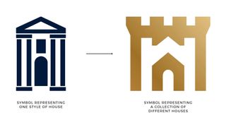
“As a younger designer, I avoided ‘evolutionary’ routes,” recalls Johnson. “Now? I’m a little wiser, and can see that some clients’ previous identities weren’t completely broken. They just needed to work better. We changed Action Against Hunger’s confusing symbol to simply one of food and water. Historic Houses’ monosyllabic old symbol became a visual reminder of the many houses they represent.”
This article was originally published in issue 279 of Computer Arts, the world's leading design magazine. Buy issue 279 or subscribe here.
Related articles:

Thank you for reading 5 articles this month* Join now for unlimited access
Enjoy your first month for just £1 / $1 / €1
*Read 5 free articles per month without a subscription

Join now for unlimited access
Try first month for just £1 / $1 / €1
Get the Creative Bloq Newsletter
Daily design news, reviews, how-tos and more, as picked by the editors.

Nick has worked with world-class agencies including Wolff Olins, Taxi Studio and Vault49 on brand storytelling, tone of voice and verbal strategy for global brands such as Virgin, TikTok, and Bite Back 2030. Nick launched the Brand Impact Awards in 2013 while editor of Computer Arts, and remains chair of judges. He's written for Creative Bloq on design and branding matters since the site's launch.


