7 quick design solutions to be on trend right now
On-trend design doesn't always have to mean starting from scratch. Sometimes even the most experienced designers take advantage of up-to-date professionally created assets to speed up their processes. Editable templates, backgrounds and icons can serve as inspiration when you're staring at a blank page as well as saving time so you can concentrate on the finer details.
iStock by Getty Images monitors the latest trends and regularly updates curated boards of contemporary templates, backgrounds and icons that can speed up the design process. Here are seven stylish solutions that they have seen trending at the moment and which could just save you a heap of time on your next project.
01. Templates with contrasts
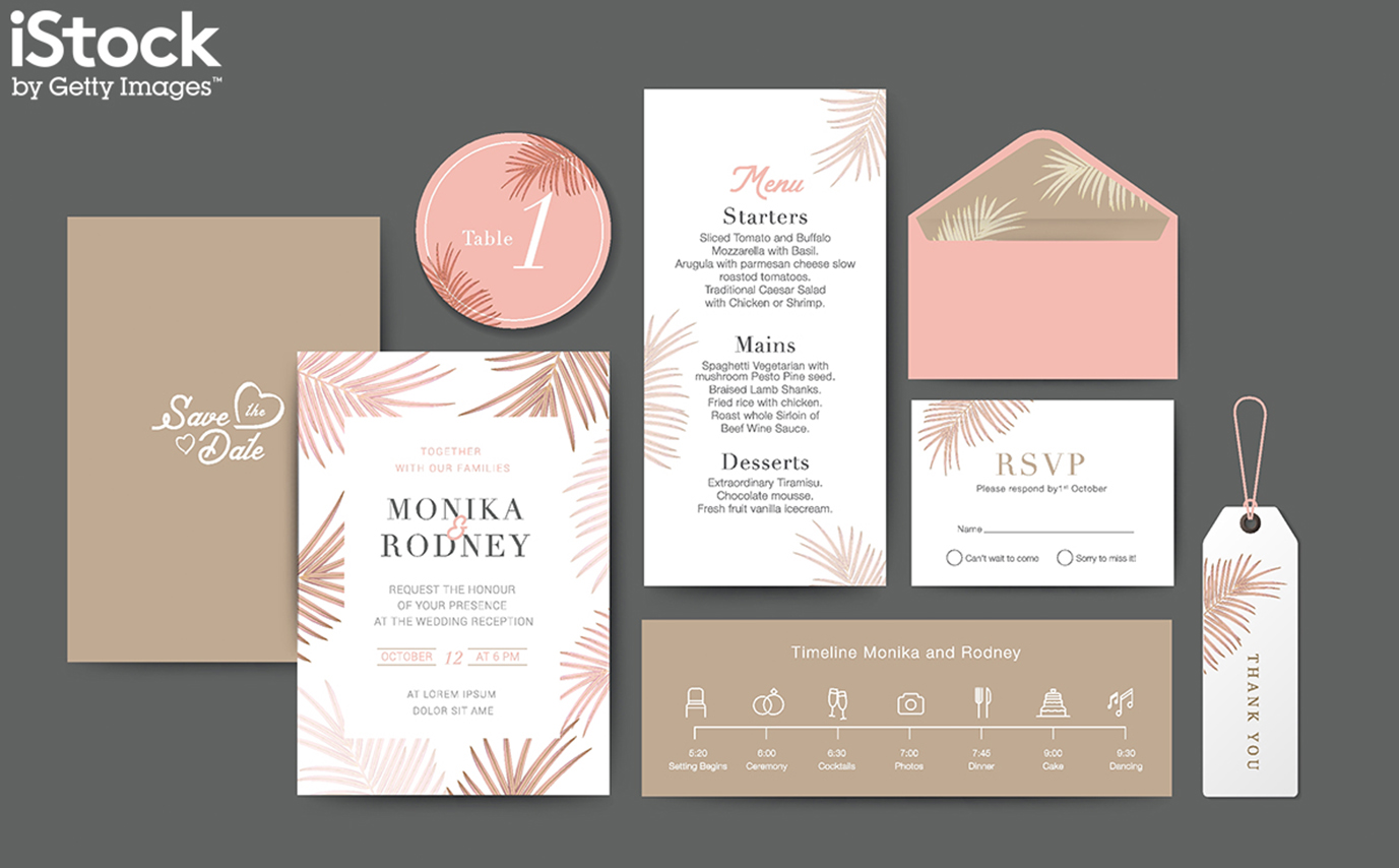
Templates can offer a great starting point when you're stuck for inspiration and need to get designing quickly. A good template can inspire the rest of the project and start other ideas flowing quickly, making them ideal for reacting to last-minute commissions.
Templates with a contrast between warm and cool colours are particularly on trend at the moment. Contrasting colours have always been effective, but the trend today is for a subtler and more sophisticated pastel colour palette, for example coral pink on a pale teal background.
02. Retro wave templates
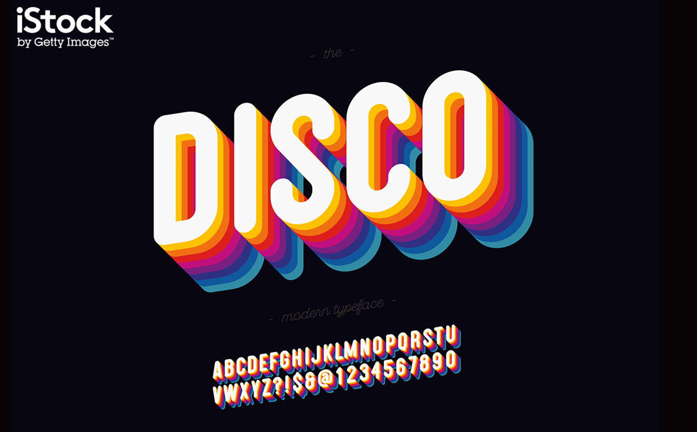
Another trend hitting big in 2020 is the return of retro waves straight from the 80s. They've become big in pop culture and already brands are looking to incorporate a modern take on this retro style. Try bringing in the hot pinks, highlighter yellows, and neon greens from decades past to turn a straightforward template into an eye-catching statement that's very much in vogue.
03. Metallic backgrounds
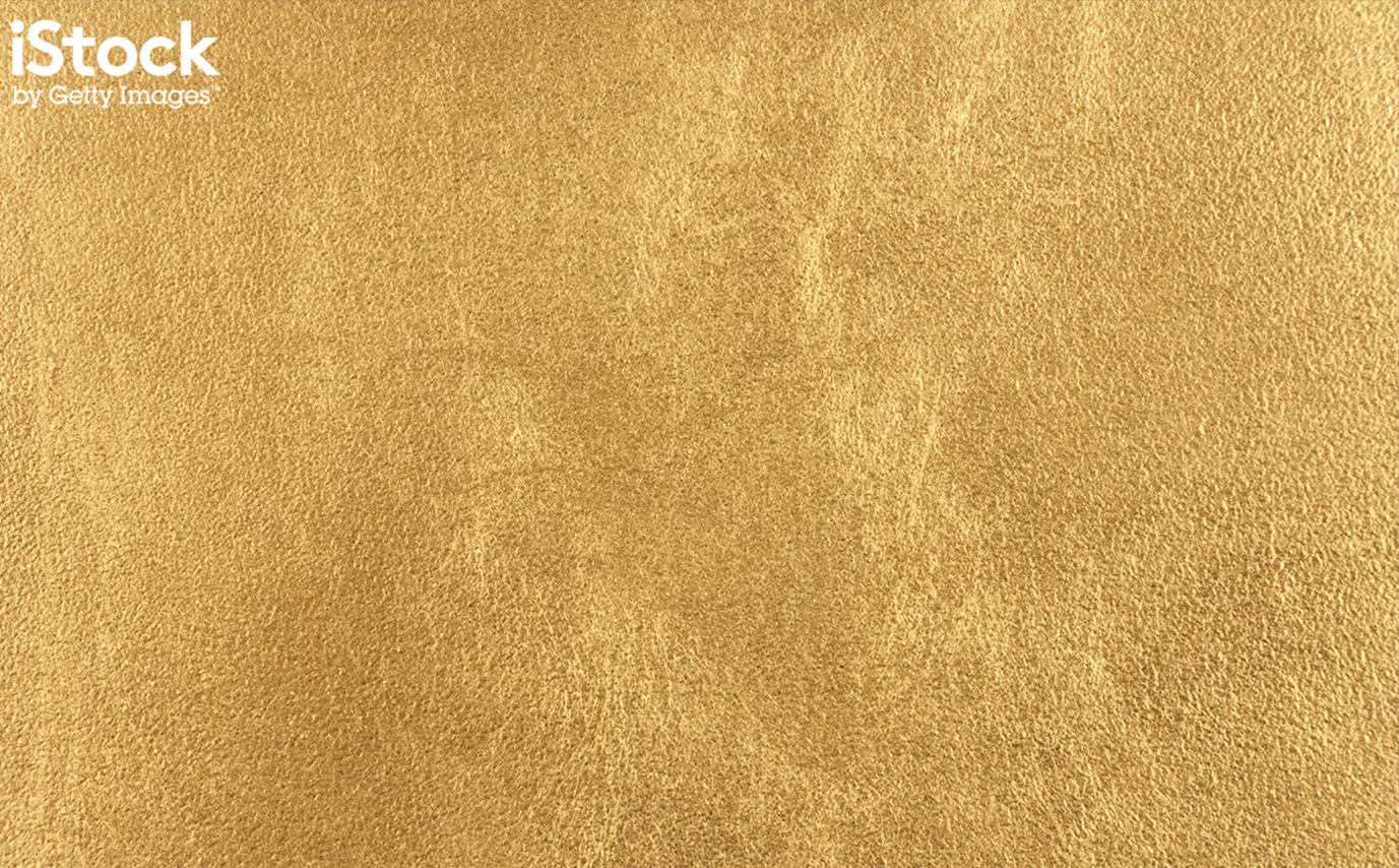
Whether you’re designing for digital or print, a strong background is the foundation to your whole design. It certainly shouldn't be left as an afterthought. The right choice adds depth, texture and supports text and other graphics to create a unified design. It also creates cohesion between different deliverables in a campaign.
A major trend in design at the moment is the use of metallic effects. Used as backgrounds, gold, silver, bronze and platinum can communicate elegance and add excellent texture to a background to give a sense of authenticity and realism. Consider using backgrounds that have a metallic glitter or paint effect for textures that really stand out.
04. Liquid backgrounds
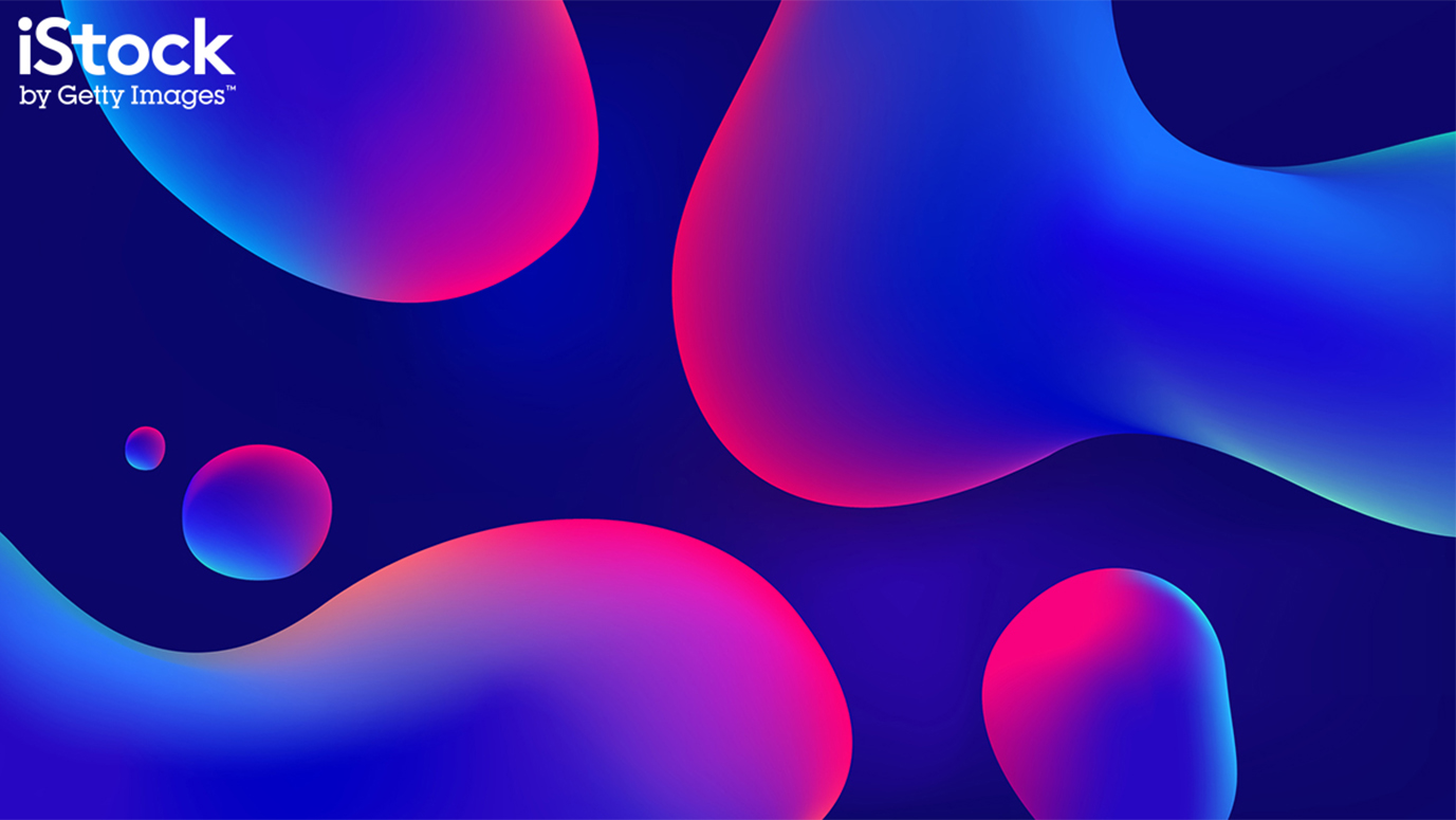
The background can be one of the most important parts of any message because the viewer sees it repeated across campaign elements, from a website to social media posts and banner ads, so it's important to ensure it feels contemporary.
Liquid shapes have become popular in general to add a modern sense of movement while also creating a warm, rounded feel. Melting patterns and merging objects are being used for decorations and illustrations but can also make for very effective backgrounds.
05. Video backgrounds
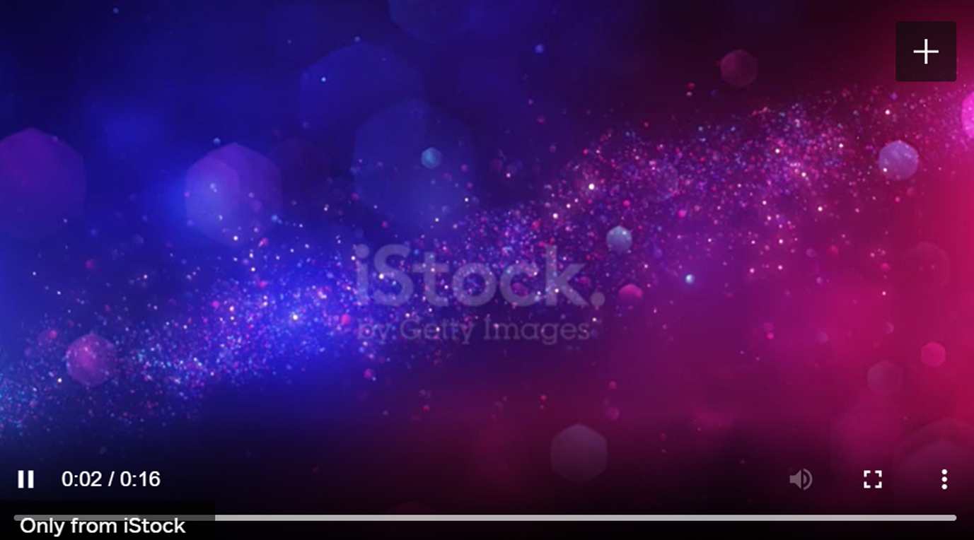
Another option to create fresh, modern backgrounds is to use video. Movement attracts attention, which is why so many brands are opting to embed video backgrounds in the hero area of their websites. Studies have shown that people spend an average 88% more time on websites with video, and there's evidence that video may help increase conversions. Designers can even look to combine trends by using background videos with liquid or metallic elements for a comtemporary look.
06. Icons in flat design 2.0
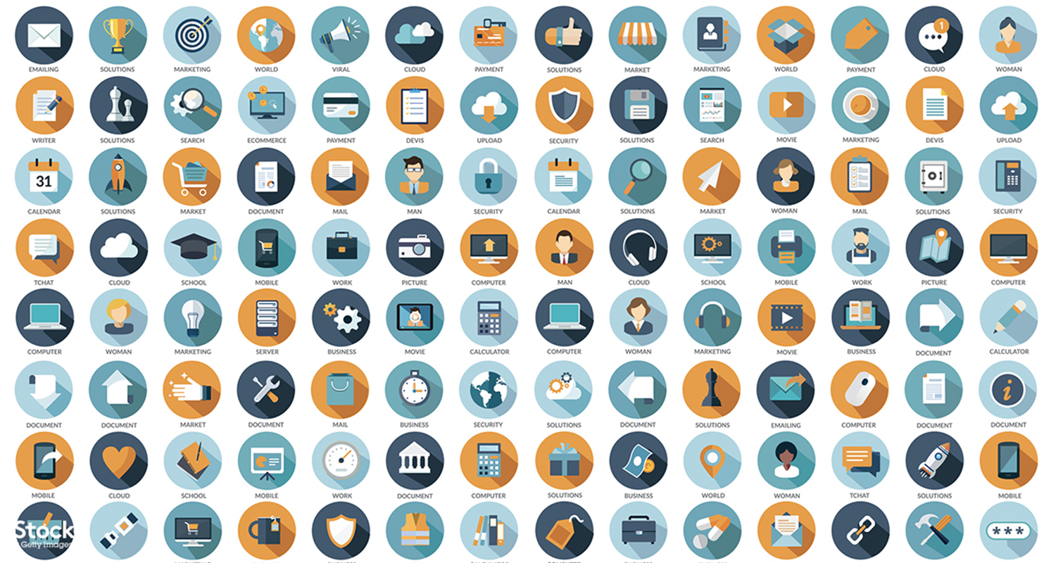
Icons can be an outstanding tool for all kinds of deliverables. They can be informative, but can also tell stories and add interest to large blocks of text. The best icons are easy to interpret and usually work across cultural and linguistic barriers, allowing viewers to understand messages more quickly. Since they're instantly recognisable, they also make the message more likely to stick.
Icons with flat design have been the rage for some time, but the look is evolving as screen resolutions improve. Icons in flat Design 2.0 look up-to-the-minute fresh as they reincoporate gradient shading and a wider range of colours and textures to add more detail.
07. Isometric icons
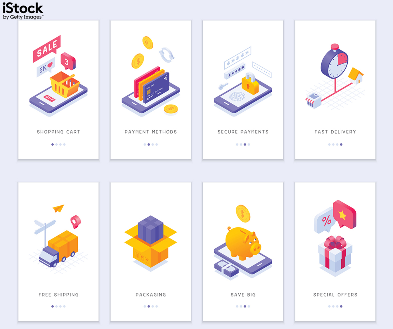
Icons can also help reinforce brand personality, whether it’s straightforward and serious or bubbly and fun. Isometric icons often help create the latter and can give a brand a friendly and approachable character.
This is one of the reasons that isometric projection, or the representation of three-dimensional objects in two dimensions, has made its way from technical drawings into commercial design in such a big way. To stay on trend, try using 3D in 2D icons as navigational elements, within infographics, or to support or simplify web copy.
At iStock by Getty, they keep on top of trends and curate boards of templates, background and icons that can be used in any project. To take advantage and gain access to a vast selection of material that can speed up your work, visit iStock by Getty.

Thank you for reading 5 articles this month* Join now for unlimited access
Enjoy your first month for just £1 / $1 / €1
*Read 5 free articles per month without a subscription

Join now for unlimited access
Try first month for just £1 / $1 / €1
Get the Creative Bloq Newsletter
Daily design news, reviews, how-tos and more, as picked by the editors.

Joe is a regular freelance journalist and editor at Creative Bloq. He writes news, features and buying guides and keeps track of the best equipment and software for creatives, from video editing programs to monitors and accessories. A veteran news writer and photographer, he now works as a project manager at the London and Buenos Aires-based design, production and branding agency Hermana Creatives. There he manages a team of designers, photographers and video editors who specialise in producing visual content and design assets for the hospitality sector. He also dances Argentine tango.
