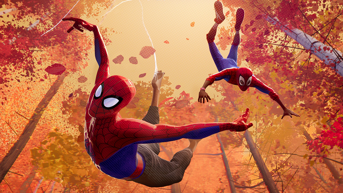
7 hidden design secrets from Into the Spider-Verse
From the man responsible for the movie's mind-blowing look.

Spider-Man: Into the Spider-Verse is a true game-changer in the animation industry. As the movie's production designer, Justin K. Thompson was the man responsible for guiding the movie's bonkers-but-brilliant visual direction. Thompson was one of the speakers at this year's Pictoplasma festival of character design, and took to the stage to share some of the decisions that made Spider-Verse so special.
The success of the film was against the odds - the announcement of another Spidey film is likely to be met with little more than an eye-roll these days. Thompson, along with filmmaking duo Chris Miller and Phil Lord, decided there was no point making the movie unless it did something very different. "If we're going to do it, let's do something no one has ever seen before. Let's throw out all the rules," Thompson says.
There was another motivation: "I felt like a lot of comic book movies had departed from the joy of comic books," Thompson adds. Spider-Verse remedied that, and picked up an Academy Award for Best Animated Feature in the process. Here are some of the design secrets we found out in Thompson's talk and when we caught up with him afterwards.
01. The key scenes are in red and blue
![The colours chart Miles' growth into Spider-Man [Image: Sony Pictures Entertainment]](https://cdn.mos.cms.futurecdn.net/QsTNgjHXjSvEnxUVkmYKok.jpg)
Thompson was keen to create thematic elements that run through the film. For example, red and blue is used only in the scenes that are pivotal to Miles Morales' – the lead character – personal development. They don't appear anywhere else in the movie. Thompson used it as a motif so that the audience could track his gradual growth into Spider-Man.
02. Realism was very important (really)
While the aesthetic is pretty wild, the world still needed to feel real to the audience. "It was important to me there was a high level of observation in everything we did," says Thompson. He describes it as primarily the real world, with the comic idiom laid on top. The Brooklyn in the movie was designed to feel as real and contemporary as possible.
"The thing I'm most proud of is how believable Miles Morales is," he continues. "Even though there's such a stylised look to the film, none of it affected his performance and the believability of the character. It's as hard thing to pull off when you're doing really stylised work, to get a character to have depth and to feel as rich as Miles does."
03. The aim was to push things to breaking point
![Into the Spider-Verse was a game-changer for animated films [Image: Sony Pictures Entertainment]](https://cdn.mos.cms.futurecdn.net/FdEN996kCnH5TAGFrvJnhk.jpg)
From the very beginning, Thompson, Miller and Lord were fully committed to an experimental approach. "I would always ask Danny [Dimean, visual effects supervisor] and his team to kind of go too far," says Thompson. "We had a saying: Keep going until it breaks. Because I think there's something that often happens when you're experimenting… you can almost limit yourself too early if you don't go to that place. And when you pull back just a little bit and you find the point right before it breaks, you can find some really great things there."
04. There's no motion blur
![The film artists found a range of different tricks to capture motion [Image: Sony Pictures Entertainment]](https://cdn.mos.cms.futurecdn.net/vEP4FwbLj4LuctPkut5FqH.jpg)
A decision made early on is that the movie wouldn't feature any motion blur, which if you know about animation is quite a feat. Motion blur helps avoid a wagon-wheel effect or feeling of strobing. "[The decision] really came out of the idea of 'what does a comic book look like?' And in traditional comic books, especially the older ones, there was no blur," explains Thompson.
Instead, the team introduced a range of novel ways to make the audience perceive movement. For example, in the underground scene where trains whizz past, Thompson used strokes of colour along the side of the carriages. The eye reads it as motion blur, but they in fact don't move. The technique draws inspiration from comic books - this time anime.
"'What would you do if you were drawing it?' is what we kept asking ourselves. It was a way to challenge ourselves to think differently," he continues. "Like how many ways can we embrace the idiom of the comic book? How can we look at every single aspect of our filmmaking and filter it through that lens? It forced us to experiment and come up with new ideas."
05. The style includes print errors
Much of the visual language of the film can clearly be linked to comic techniques: the use of halftone textures, dots for light and hatching for shadows, for example. But there were some comic book errors that found their way into the movie, too. Thompson found himself inspired by the inconsistencies and colour misalignment in printed comics.
"I looked at that and thought, oh, that's really cool - if we could simulate that in 3D, if we could get the colour to separate and slide apart… like if we could take one channel of the colour in three-dimensional space, and have it separate like the misprints that we saw on the comic book page. And use that as a storytelling device."
06. Linework from the character sketches appear on screen
![The visual effects team created software that would make linework appear and disappear on characters' faces [Image: Sony Pictures Entertainment]](https://cdn.mos.cms.futurecdn.net/hMwmypWTUPLtpkgqpRPibk.jpg)
Thompson explains how when the initial character sketches came in, they were expressive and exciting, but as soon as the 3D modelling process began they lost their spark. "It immediately looked like everything you've ever seen before," he says. Their movie's aim being the opposite of that, he set about finding a way to bring the energy of those early sketches into the film.
Thompson turned to visual effects supervisor Dimean, to ask if there was a way to make the linework appear in the scenes. The software that was created meant the artists could literally draw the strokes in 3D space, using a graphics tablet, then control their placement and movement, change their colour and make them appear and disappear as required. A further addition meant the lines that appeared frequently could be controlled programmatically.
07. All the best colours got saved until the end
![The final scenes also act as a visual climax to the film [Image: Sony Pictures Entertainment]](https://cdn.mos.cms.futurecdn.net/VpBHnDdsycwMu53Q3qfwnk.jpg)
Throughout the film, Thompson uses colour as a tool to help the audience feel how the character is feeling. In sadder scenes, for example, the lighting and colour becomes more muted and natural. Where they're feeling spun-out, the colours are jarring.
And while Spider-Verse is visually pretty bonkers from the get-go, the ending is a real visual spectacle. "I believe there has to be a visual climax to every film," smiles Thompson. "I saved all the most supernatural colours for the final sequence."
Read more:

Thank you for reading 5 articles this month* Join now for unlimited access
Enjoy your first month for just £1 / $1 / €1
*Read 5 free articles per month without a subscription

Join now for unlimited access
Try first month for just £1 / $1 / €1
Get the Creative Bloq Newsletter
Daily design news, reviews, how-tos and more, as picked by the editors.

Ruth spent a couple of years as Deputy Editor of Creative Bloq, and has also either worked on or written for almost all of the site's former and current design print titles, from Computer Arts to ImagineFX. She now spends her days reviewing small appliances as the Homes Editor at TechRadar, but still occasionally writes about design on a freelance basis in her spare time.
