So you’ve followed our advice on how to design a business card, and you’ve designed something that looks pretty decent. But you’re still not happy with it. It just somehow lacks the wow factor. And you get a sense that a lot of the ones you hand out are ending up in the waste paper basket.
In this post, we suggest a few simple ways you could redesign your business card, raise it above the norm, turn it into a topic of conversation and make people covet it, not discard it.
Meanwhile, if you’ve created a business card you’re proud of, feel free to share it in the comments below!
01. Use illustration

Whether or not you’re a pro illustrator, if you have any sort of talent for art then why on earth aren’t you showcasing it on your personal business card? Alternatively, if you’re designing cards for an agency, why not commission someone, as New York studio Ueno Design has done with this artwork from Malta-based illustrator Magda Azab?
This will transform your card from an onerous imposition on people’s wallet space to a covetable piece of art. So it’s an easy ways to make sure that people remember you and hang on to your details. And if you can slip the illo into the conversation when you hand it over, you’ve forged a mental connection in the receiver’s mind that could be very important in future.
02. Vary the shape
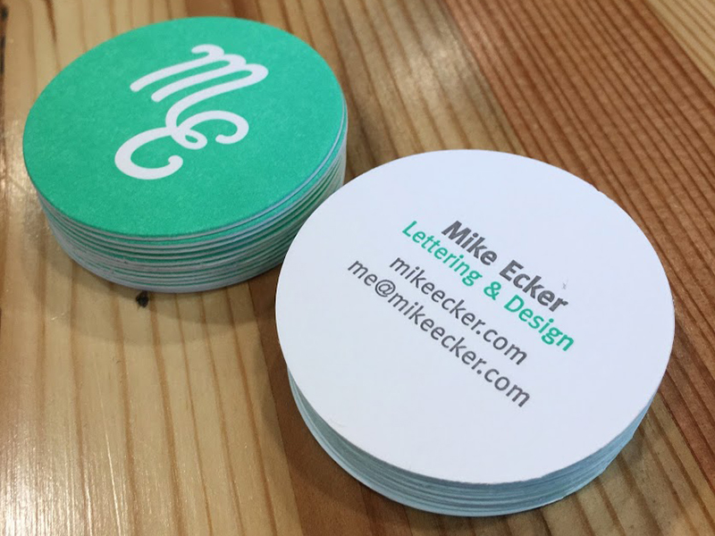
Business cards don’t have to be rectangular, and choosing an unusual shape can’t fail to make your business card stand out. When Baltimore-based designer Mike Ecker switched his focus to lettering, he designed these striking circular cards that were guaranteed to attract comment. Other examples of curvy cards include those of Fabian Landa, Inka Matthew, Joshua M Smith and Hillary Hopper.
03. Make it fun
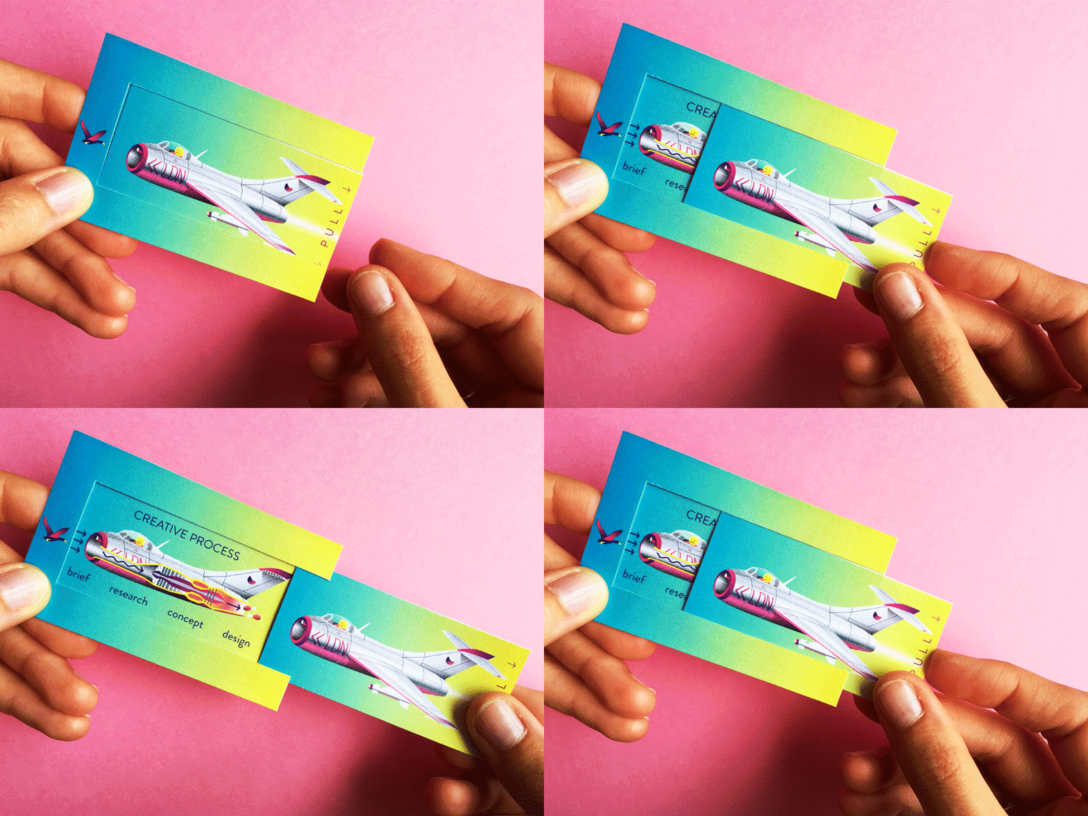
At heart we are all children, and giving us something to “play with” means we’re far less likely to throw it away, as well as showcasing your personality and creativity. Here’s a great example from Lukas Novotny, a multidisciplinary designer based in London. The front side of his business card has a movable tab: pull it out and a breakdown of his creative process is revealed. It’s a simple idea, but wonderfully executed. You can see more innovative business card designs here.
04. Make it funny
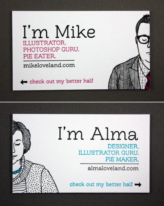
To work in the design world, it’s essential to have a sense of humour and be able to get on with people. So why not demonstrate that on your business card? Utah-based designer couple Mike and Alma Loveland, aka Ollybird, get it spot on with their joint business card above. One anyone would want to hang onto this card, if only to show it to others as a fun conversation piece.
Of course, it’s important to strike the right note and be original. Coming across as plagiaristic, offensive or (perhaps worst of all) unfunny on your business card is just counterproductive. So road-test your joke as widely as possible first, and if you’re in any doubt about its ability to raise a smile, best to take another tack.
05. Add a photo
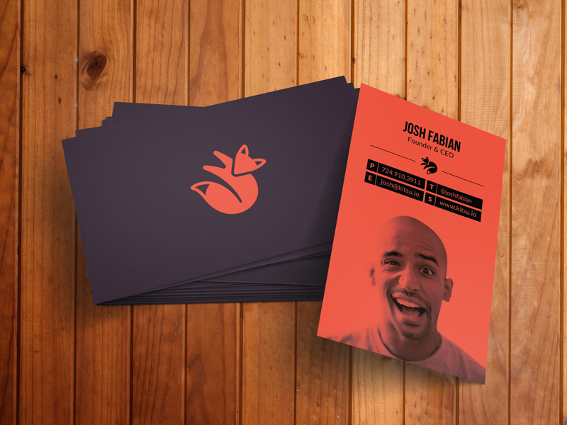
It’s often difficult for people to put a name to a face. Even if you met in person when you handed over your business card, you may not have spoken for long. And the person may have met dozens (or even hundreds) of other designers that day. So why not make it easy for them, and slap your mugshot on your card along with your details, as Pittsburg-based founder and CEO Josh Fabian has done?
“I wanted to include my big goofy picture so that the cards would be memorable,” Fabian says. “Business is about relationships, I want them to remember exactly who I am and I think a unique card can go a long way towards that goal.” Point made.
06. Embrace whitespace
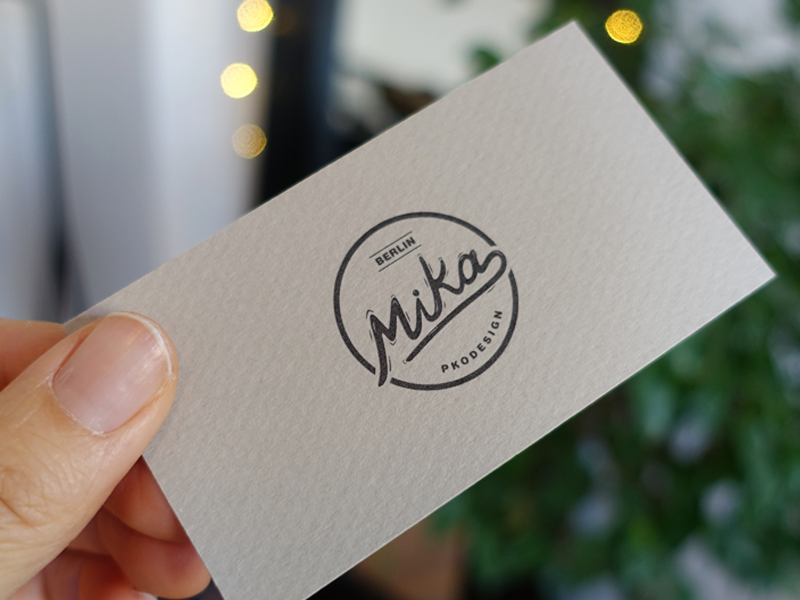
Most of the business cards we’ve featured in this post have been super-bright and colourful. But there’s more than one way to grab attention with your business card, and another is to go in the exact opposite direction, and use generous amounts of whitespace for a sleek and minimalist look. That’s a particularly good strategy when you’re using quality paper stock and/or cut and printing your cards yourself, as Berlin-based UX/UI designer Mika has done here.

Thank you for reading 5 articles this month* Join now for unlimited access
Enjoy your first month for just £1 / $1 / €1
*Read 5 free articles per month without a subscription

Join now for unlimited access
Try first month for just £1 / $1 / €1
Get the Creative Bloq Newsletter
Daily design news, reviews, how-tos and more, as picked by the editors.

Tom May is an award-winning journalist and editor specialising in design, photography and technology. Author of the Amazon #1 bestseller Great TED Talks: Creativity, published by Pavilion Books, Tom was previously editor of Professional Photography magazine, associate editor at Creative Bloq, and deputy editor at net magazine. Today, he is a regular contributor to Creative Bloq and its sister sites Digital Camera World, T3.com and Tech Radar. He also writes for Creative Boom and works on content marketing projects.
