Make sure you're not committing these common UI design mistakes on your site.
Certain UI design mistakes can really turn customers off, but they're surprisingly common. On the other hand, effective UI design can create a pleasant experience and boost conversations. So what are the errors to avoid?
We think there are at least three criteria that an app or website's user interface needs to satisfy in order to attract, convert, and retain visitors: it has to be engaging, and captivating, and it needs to trigger an emotional response. Below we'll delve into six common UX design mistakes that can get in the way of that, and we'll look at how to avoid them.
To learn more about UI design and UX in general, sign up for our online UX design course, UX Design Foundations, which covers all the fundamentals of this growing field of design. You might also want to see our piece on the perfect website layout.
Latest Videos From Creative Bloq
6 UI design mistakes to avoid
01. Unresponsive design
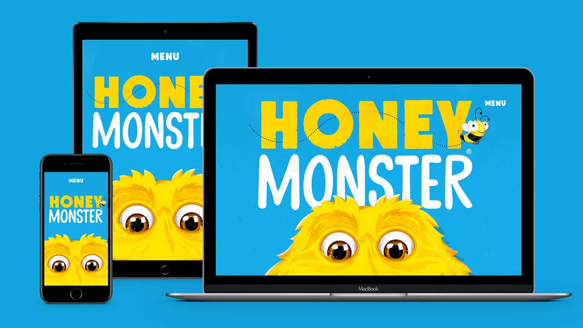
this one should almost go without saying by now, but in 2022 we still see sites that function badly on certain platforms. It's no secret that people often use a range of different devices to complete a task. That means your website needs to be responsive so that it engages the audience no matter how they access your site. A poor user experience caused by a site that hasn't been optimised for mobile or tablet users is sure to dissuade potential customers.
If that doesn't convince you, complying with Google’s ranking requirements is another major reason to consider focusing on responsive web design principles. Way back in 2015, the search giant released an algorithm update that prioritises mobile-friendly sites.
It’s impossible to over-stress the importance of calls to action. Not giving your CTAs the love they deserve is one of the most commonly made UI mistakes. Here are something to consider to help up those clicks.
Shape: Clickable buttons should usually be rectangular and surrounded by white space, to help define them and make them stand out
Location: Position CTAs right next to the main proposal – this makes them the most logical next step in your customer’s journey
Colour: There isn’t a universal 'best' colour for CTAs – aim to fit with your site's colour scheme, but make sure they stand out the most
Size: Make your CTAs large enough to stand out without being overwhelming
03. Lack of social proof
Customers trust other customers. One survey found that 60 per cent of consumers look for Google reviews before putting their trust in a business. Not only should you consider displaying positive reviews of your product or service, but you also need to make sure they're positioned properly. Customer reviews can help reassure potential customers of your brand's credibility if you display them somewhere towards the beginning of your sales pitch.
One of the most common UI mistakes is a cluttered layout. Too much of everything thrown together can be one of the most off-putting things for a user, because it can be confusing and difficult to process. While it’s understandable that you want to display as much information as you can, this approach probably won’t get you far in terms of conversions.
Simple and clean is usually a lot more successful in that regard. How can you achieve that? First up, the design scheme that you choose shouldn’t contain more than three main colours and more than two font types (for more advice, take a look at our guide to the things you need to consider when designing a UI.
Second, you need to make sure that everything you include really contributes. That means that the imagery you do use should be top quality. Avoid using low-resolution videos, photos and illustrations. If you can't afford to shell out for a pro, don't worry – there are plenty of places you can find good quality free vector art online.
UI animations have been a growing trend for some time time. They can help guide your users and create interest, while also ensuring your interface stands out (if you want to get started, here are some CSS animation examples you can recreate yourself).
05. Slow loading pages
One of the most common reasons for abandoned ecommerce shopping carts is actually slow page load. Data shows that 40 per cent of people abandon a website that takes more than three seconds to load.
But loading speed isn’t just important for conversions – it’s important for your overall site discovery. Page loading speed is a factor that Google's algorithms take into consideration for search results ranking.
06. A lack of video content
Video is an extremely useful tool in all kinds of communication. Videos can entertain and explain in a visual way (take a look at the explainer video for Young Alfred by Fireart Studio above as a nice example). Videos have great benefits for UI, and for winning conversions. And speed is of the essence when it comes to conversions. Despite this, videos are still underused, and for us, that's a UI mistake.
Some quick tips if you’re using video content already. First, it’s a good idea to insert some sort of lead capture elements in the video. For example, remind people to subscribe at the beginning of the video or thank them for watching and liking at the end. Second, consider using customised thumbnails – these can encourage people to watch your video in the first place.
Dana is a passionate writer and content ninja and she can talk about design, tech, and marketing for days. Now she is associated with Rioks B2B marketing consultancy, working mostly with the graphic design and app development companies. She writes on various topics of social media, web design, mobile apps, digital marketing, entrepreneurship, startups and much more in the cutting edge digital world.