6 top tips for CRO success in WordPress
Here’s how to convert users into customers on your WP site.

WordPress is everywhere these days. In fact, it powers around 25 per cent of the world’s top 10 million sites. And for good reason: the platform makes it easy to design and manage your site, and offers an impressive library of WordPress plugins you can use to add functionality.
In this WordPress tutorial, we’ll share some conversion rate optimisation (CRO) tips to help you convert as many customers as possible.
01. Don't rely solely on templates
Just because you have WordPress themes and templates at your disposal doesn't mean you should rely on cookie-cutter designs. Customers increasingly value an authentic brand personality, and the more digitally versed your consumers are, the harder you have to work to establish your brand’s uniqueness in an attention-grabbing way. Having more granular control over each facet of your landing page will help you with A/B testing later on.

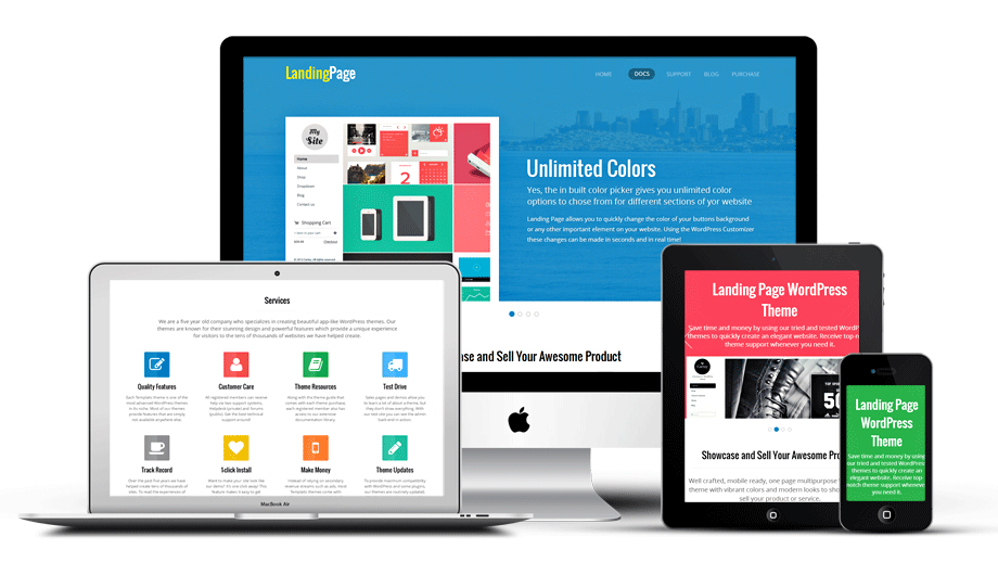
The WordPress Landing Pages plugin offers easily adaptable templates. You can drag-and-drop within its numerous templates to customise each page, and you can also use your own themes and upload your own content. This plugin also offers features that enable you to employ CRO techniques on your site.
02. Keep your goals clear
Modern day consumers are constantly bombarded by different offers, from paid search to social media and autoplay videos. As a result, users’ attention spans are shrinking every day. To grab (and hold) their attention, it's vital you make the goal of your page clear and concise. You don't want to bounce users away by flooding your page with too much information.

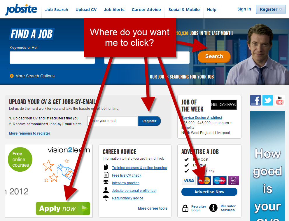
CRO isn't about bragging about everything awesome your brand does; it's about optimising each page for that specific goal conversion. This will include optimising your calls to action (CTAs) and ensuring you keep the user focused on that specific goal. You want to make the value/benefit of your conversion clear as soon as possible. Don’t use vague words or competing CTAs.
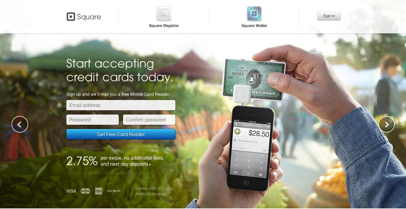
Keep your CTA visible at all times, so your user is constantly reminded to convert. You can even use sticky elements to ensure your CTA remains visible regardless of where your user is on the page.
03. Create more landing pages
Optimising your CTAs is only the first step in the process. Having one landing page (LP) simply isn't enough to accumulate the amount of data you need to fully understand your customers. Increasing your number of LPs just from 10 to 15 can grow your conversions by 55 per cent.
Digital marketers learn from data that comes from seeing where, when, and why users convert. This is why A/B testing is such a vital part of CRO. The more tests you’re running (the more variants you create), the more data you'll have to learn from.
04. Consider different visitors’ intentions
Not every user who clicks through to your landing page will be there for the same reason. There will be some who are curious about your service, others who are interested in your brand, and hopefully some will come with an actual intention to convert.

You should create page variants for each of these different visitor intents. The 'temperature' of your visitor should determine which variant they see. You can determine their temperature based on which pages on your site they visited before reaching your landing page.
Each variant will have different copy and different CTAs. They may even offer different content altogether, or use a whole new design. The point is to personalise their experience as much as possible to where they are in the marketing funnel.
05. Focus on design cues
Keep in mind that your designs will have a significant subliminal effect on your user. There are quite a few ways to subtly guide them towards converting. The use of colours, shapes, and even lines can all direct their attention where you want.
But keep in mind that these should all be built around your primary content piece for that page and remain consistent with your brand identity. Don't get caught copying some other brand's high-performing page just for conversions. Today's users are smart and they'll catch on to your trickery fast.
06. Make use of animation
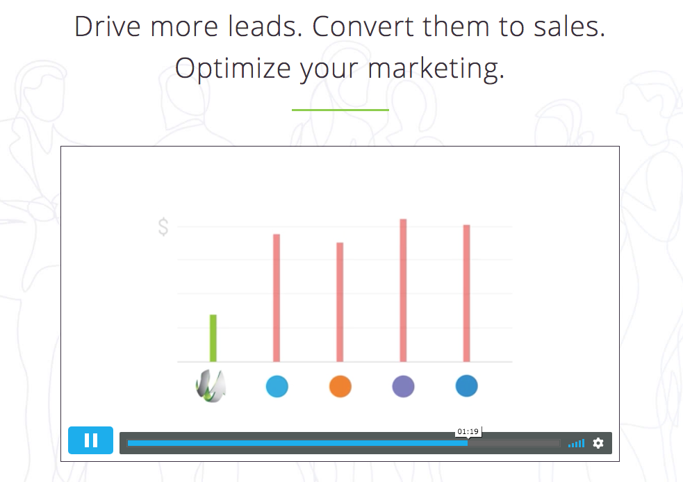
If you're looking to boost conversions by grabbing the user's attention, there's no better way than through movement. Animation and videos can be strong assets to help you cut through the noise and focus your user on converting. In fact, some studies indicate that using video can boost landing page conversions by up to 80 per cent.

But, as with all content, creating a shoddy, rushed video won't cut it. Don't think that shooting an iPhone explainer video will get you any boost in conversions. Invest some time and resources in your video’s quality. Write a script, shoot with a steadicam, and do some editing, and use graphics or animations to help explain any parts of your video that need it.
Read more:

Thank you for reading 5 articles this month* Join now for unlimited access
Enjoy your first month for just £1 / $1 / €1
*Read 5 free articles per month without a subscription

Join now for unlimited access
Try first month for just £1 / $1 / €1
Get the Creative Bloq Newsletter
Daily design news, reviews, how-tos and more, as picked by the editors.
