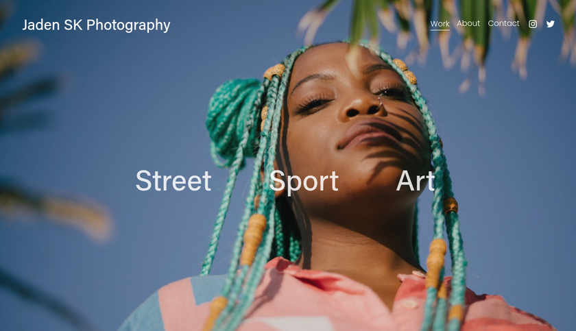
In January, we shared with you some quick tips to improve your portfolio. There are, though, more deep and fundamental ways to improve your portfolio over time. These may take a little longer, but get them right and the payoffs will be immense.
So whether you’re seeking to get more freelance work or a better job, follow these six pieces of expert advice and it should significantly boost your chances.
01. Showcase your personality
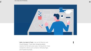
So you’ve got a great collection of work. But stand back a second and ask yourself: beyond that, does my portfolio give a sense of who I am?
You may think your work should just “speak for itself”. But in the real world, people hire people, and they’re interested to know the person behind the designs. Agencies are often looking for a certain personality type that’s going to fit in well with existing employees.
“For instance, a bit of humour, being a bit bold, a bit quirky is very much along our lines,” says Tim Smith, principal of design at ustwo.
So how do you do that within a portfolio? “The style of work is one way,” says Smith. “Sometimes, if a designer has done their own website, you can see through their choice of graphic design what their personality might be or what their stylistic choices are.
"And often even the little bits of copywriting – the little quirks about how they might describe a little thumbnail, or the navigation on the site, or the UI – might have some writing that conveys your personality.”
Example: Art director and visual designer Frank Li offers a great example of how to showcase your personality through a portfolio.
02. Describe what you did


It seems like a point that shouldn’t need to be made. But still in 2017, many designers showcase their projects through images alone. There’s little or next to no text explaining what the brief was, how they fulfilled it, what their design process was and, in the case of a joint project, what part they played.
Of course, you want your portfolio to be visually stimulating eye-candy. But that will only get you so far with prospective employers or clients.
As Tim Beard, partner at Bibliothèque, explains, “Design is a visual discipline and you make an immediate response based on that, but without some form of explanation it’s a bit empty. If there is a story to tell, or a context to set, then it's best explained as efficiently as you can. It’s about the journey as much as it is the destination.”
Madeleine Fortescue, resource and recruitment manager at Moving Brands, agrees. “When we’re hiring, we need to understand really quickly the role an individual candidate played within a project, so the accompanying text is really key,” she says. “We want to quickly glance over the project and see some information about it, not just some images.”
And we can’t emphasise this enough: get your text properly proof-read. “Spelling mistakes are always a bugbear, it’s very frustrating,” says Fortescue. “For us at Moving Brands it’s really key to be able to articulate yourself and talk about your work, to provide a rationale for what you’ve done. So not only does the work need to be perfect and have attention to detail, the text is extremely important, too.”
Don’t make it too long either, stresses Tony Brook, creative director of Spin. “You’re not going to start reading an essay. It’s not great fun reading on screen, period, let alone reading long lengths of text on screen. So you have to be fairly circumspect: a small amount of explanation, a short caption, will usually do it.”
Example: Creative director Jack De Caluwe gives great explanations of his multidisciplinary projects on his portfolio.
03. Empathise with your audience
These days, it seems like there’s somewhat of an arms race in terms of who can produce the most dynamic, flashy and attention-grabbing portfolio. And that’s fine if you’re a senior designer who primarily wants to appeal to your peers, and get featured on awards sites.
But for most jobbing designers, that’s not the target audience your portfolio should be aiming at. If you want more freelance work or a better job, it’s all about appealing to clients and employers, and they will often have very different perspectives.
Smith, for example, looks at dozens of portfolios in a typical week, but still often finds it difficult to find what he needs. “I want to know what sort of work you’re into and what kind of person you are,” he stresses.
“Websites that makes it difficult to do that can be because of an ill-considered user experience, or designer ego, where they’re trying too hard to be visual and to impress. Sometimes it would be nice to be made easy and quick for me just to understand what I’m interested in.”
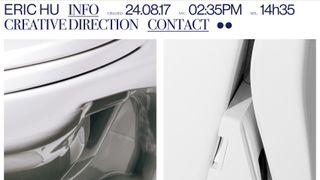
Example: Eric Hu does a great job at anticipating what people will be looking for on his site. He even provides the date and time it was last updated in the header.
04. Ask for a critique
Considering your target visitor and what they’ll be looking for will get you a long way. But sometimes there will just be things you won’t think of. So it’s always worth getting another designer to critique your portfolio.
That can be pretty scary, of course; nobody likes to hear criticism of their work. But let’s face it, if you don’t nip problems in the bud, people will be saying far nastier things about your work in private. And while you won’t hear that, you will experience the deafening silence of indifference.
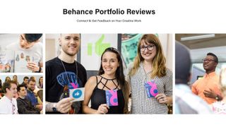
When it comes to getting a critique, you have the choice of going the formal route, by taking advantage of Behance Portfolio Reviews or similar sessions held at numerous design conferences. Or you could just ask a friend or colleague, in a more informal setting.
Either way, the important thing is to explain carefully what you want your portfolio to achieve. That way the person critiquing it can analyse how well it’s performing that function, rather than just saying they like or dislike it, which is much less helpful.
05. Edit ruthlessly
Just as with any design work you do, your portfolio needs to be ruthlessly edited to ensure that all but the bare essential elements are included. If there’s anything that could be removed, remove it.
Employers and clients won’t take kindly to having their time wasted, so prune, prune and prune some more. That doesn’t mean your site has to be minimalist, but if there’s anything unnecessary, whether that be waffly text, too many images or general graphic clutter, you need to lose it... or you’ll lose everyone’s attention.
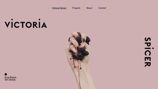
Example: Set designer Victoria Spicer’s homepage shows how little you need on your homepage while still allowing people to find what they’re looking for.
06. Be honest


The point of a portfolio is to sell yourself, so the temptation is to use stereotypical sales techniques, one of which is being ‘economical with the truth’. Anonymous websites make it easy to look like you’ve had more career success than you really have, in all sorts of ways. But ultimately, that kind of approach can be counter-productive.
The design industry is, after all, a small and close-knit one, and it’ll quickly become clear if you’re stretching the truth. It’s far better, in fact, to be brutally honest. If you haven’t had a lot of client work, for example, then just say so and present your personal projects as a sign that you’re keen to get on. If you didn’t have a big role in a team project, then just say what you did do, and express your enthusiasm for doing more in future.
Remember how at school, if you got a maths problem wrong but you showed the right working, you still got most of the marks? It’s a similar thing with employers: it’s not just about how well the project turned out, but what you put into it.
“We always like to see evidence of lateral thinking and concepts,” explains Beard. “Ideas are the most valued currency. So if there is a project that illustrates great scope, but little creativity, then share it and explain the context.
"Just in the same way as an awesome idea that didn’t get any traction with the client should be shared. If you didn’t like the outcome, show us what you wanted it to be. Just be passionate about what you do, and clear about why you do it.”
Sean Murphy, creative director at Moving Brands, takes a similar view. “Especially with more junior designers, we’re looking at potential,” he says. “There can be a real raw spark of something there that’s really exciting, that you know would be hard to teach, essentially. The rest you can refine. There are a lot of skills you can learn but there are some that are really difficult to teach.”
Example: Andrej Cibik lists the things that he’s bad at on his About Me page. But rather than making him look weak, it’s a sign of his strength and confidence as a designer.
Related articles:

Thank you for reading 5 articles this month* Join now for unlimited access
Enjoy your first month for just £1 / $1 / €1
*Read 5 free articles per month without a subscription

Join now for unlimited access
Try first month for just £1 / $1 / €1
Get the Creative Bloq Newsletter
Daily design news, reviews, how-tos and more, as picked by the editors.
Tom May is an award-winning journalist and editor specialising in design, photography and technology. Author of the Amazon #1 bestseller Great TED Talks: Creativity, published by Pavilion Books, Tom was previously editor of Professional Photography magazine, associate editor at Creative Bloq, and deputy editor at net magazine. Today, he is a regular contributor to Creative Bloq and its sister sites Digital Camera World, T3.com and Tech Radar. He also writes for Creative Boom and works on content marketing projects.
