There’s a special art to illustrating food. Because you’re not just trying to please the eye and grab people’s attention: you’re ideally trying to engage their senses and make their tastebuds tingle.
"Food is such an emotive subject," says Caz Hildebrand, creative partner at Here Design, who has worked on multiple food books for Nigella Lawson, Yotam Ottelenghi, Oliver Rowe, and her own books including The Geometry of Pasta and An Anarchy of Chillies. "Pretty much everyone has a response to images depicting food, but not everyone will feel the same way."
To get a clear message across, the most important thing about your illustrations is, she says: "Do they look good enough to eat? Are they appealing or repelling? So many images, both photographs and illustrations, make food look very unattractive and may well be unsuccessful if they are off-putting, rather than seductive."
Of course, your intention might actually be to turn people off. "If for example, you want to convert the audience to veganism, then there might be a case for making certain ingredients look especially ugly. But in general, if the intention is to create a positive response in your audience, then consider whether you'd want to eat whatever you've drawn. If not, it’s likely that no one else will, either."
Read on, as we offer some expert tips on how do so...
01. Use abstraction
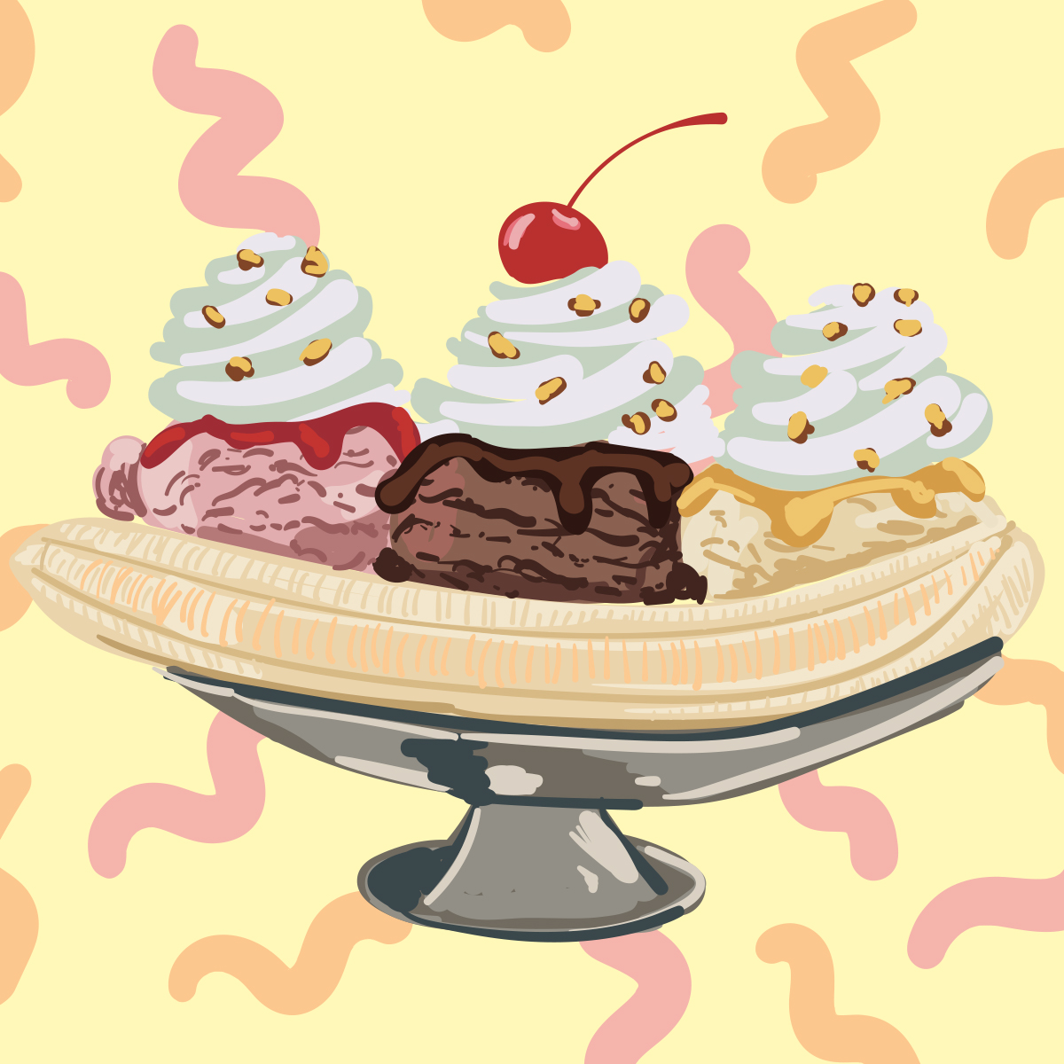
Chicago-based illustrator Judith Mayer follows a golden rule when it comes to drawing food.
“Simplify the details to hint at texture and pattern,” she says. “Don’t always try to draw every speckle, nook, fiber, bump, seed, or candy sprinkle.”
Obviously there’s a balance to strike between including too much detail and too little, and that balance will vary from illustrator to illustrator.
“I think a lot depends on your style,” says Mayer. “I prefer the less-is-more approach, so my illustrations have more abstraction. I add only enough details to feel right, no more. Check your work as you go is a good rule. If you prefer a more detailed look, you would add more details. Neither is right or wrong.”
02. Minimalise detail for motion

When it comes to turning your illustration into motion graphics, simplifying and minimalising often becomes even more important.
Al Boardman, an illustrator and motion designer based in Winchester, UK, faced this challenge when creating this animation for a client. “I produced a whole set of the food elements,” he recalls, “only to find out that there was too much detail in them which not only wasn't coming across once they were animated, but made it difficult to see what they were upon animating.
"So I had to really try and make them as minimal as possible in order for them to work when moving. I think it’s an issue that’s even more marked with motion than with static images”
03. Limit your colour palette
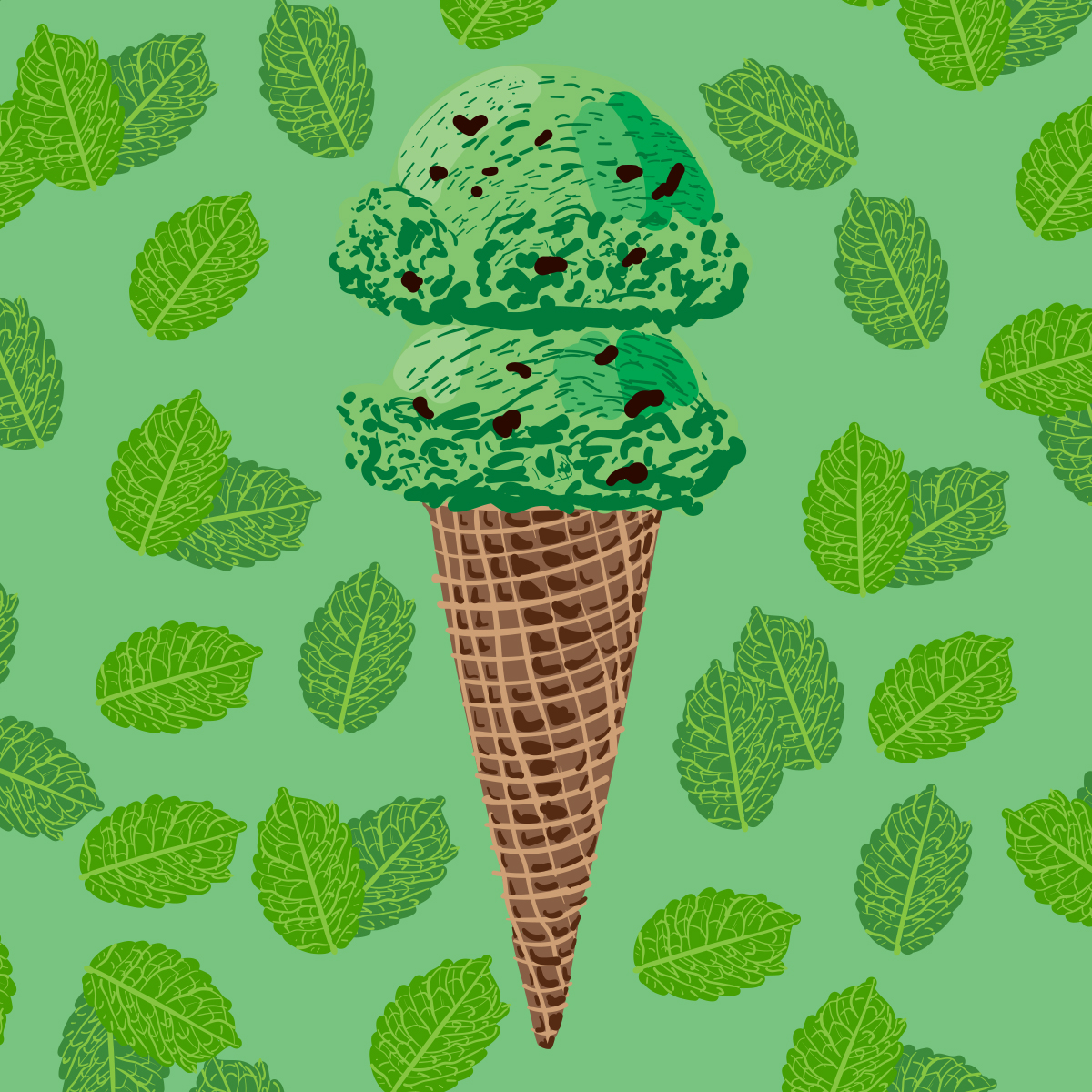
When it comes to the colours you use, Mayer again recommends keeping things simple for food illustration.
“Choose a smaller colour palette - sometimes just three colours - that includes a highlight, main colour and shadow to apply to the shape of the subject to describe its volume,” she advises. “This forces you to look at how light describes the form and less at surface details."
Sometimes, of course, the client will ask you to limit your colour palette even more, and that can be a big challenge, says Andrew Gibbs, the award-winning graphic designer and illustrator also known as SODAVEKT.
"I work in a flat vector style, usually in one colour, and I’m often commissioned to create icons," says Gibbs. "When I have had commissions involving food in the past - like the Wagamama menu I illustrated a few years ago - I’ve found it can be challenging illustrating food in one-colour.
So how does he manage it? "I always concentrate on shape, form and detail first, before adding colour," says Gibbs. "This is a general rule I apply across all my work. It helps me to consider what kind of visual details are unique to that object or food that I’m trying to represent."
04. Unnatural colours CAN work

It might seem the obvious choice to match the colours in your illustration accurately to those of the real-life foods.
But perhaps surprisingly, Mayer believes that unnatural colours can often work well if used thoughtfully, such as in the example above.
“Natural colour versus unexpected colour is purely a decision for the artist based on their style,” she believes. “As long as the highlights and shadows are applied logically, lemons can be blue and still read as lemons... but shape and texture are even more important when you take this liberty.”
05. Harness emotion and storytelling
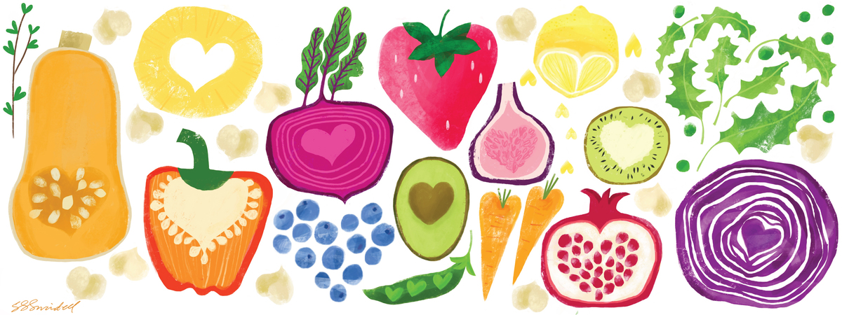
Salli Swindell is a food illustrator based in Ohio who’s also the producer of theydrawandcook.com, an online collection of food artists, and the author of several books including They Draw & Cook.
”My top advice for illustrating food is to try and create an illustration that can’t be captured by taking a photo,” she says. “An illustrator has the ability to add more emotion, storytelling and exaggeration to food illustration.”
She offers some examples. “Make the food appear like it’s being prepared right before your eyes by showing chopped veggies flying across the page and into the skillet. Capture the essence of watermelon by merely painting a swash of pink and green with a few black drops. An egg yolk can be made extra glossy with exaggerated highlights. Scale and perspective can be playfully altered in an illustration.”
In short, don’t just focus on recreating the food accurately. Think about what story you want your scene to tell, and what emotion you wish to convey.
On a similar note, UK illustrator Carly Allen-Fletcher feels it’s useful to add in some context to her food illustration: where it's from, the culture, or the scene that it’s part of.
“I find it interesting to learn about different places, and the dishes that come from different cultures,” she explains. “So depending on the brief, I like to add that into my illustrations, to add a bit of local flavour, if you’ll pardon the pun, as in these examples.”
06. Draw from (recent) memory
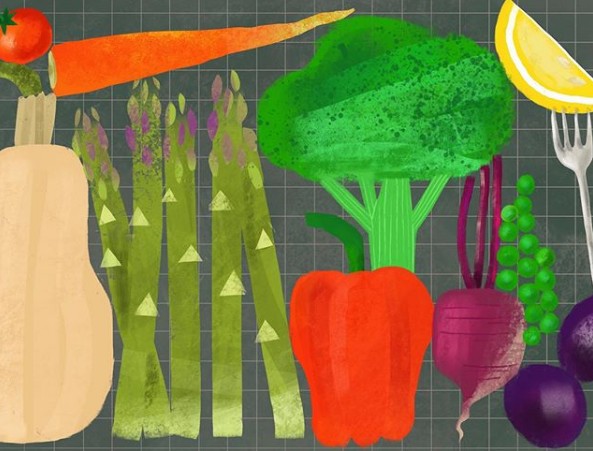
Most illustrators agree that you should draw food from life... but that needn’t necessarily mean sitting and staring at it the whole time.
“My personal technique for rendering food is to look at the real food - or a photo of it - for a few minutes then put it away and draw it how I remember it in my mind,” says Salli Swindell. “That way I’m not tempted to over illustrate it and my personal style shines through a bit more.”
That’s not the only way to approach a food illustration of course. “I truly love every single style of food illustration from graphic to stylized to animated to gestural to realistic,” she adds, “as long as a photo can’t capture the same vibe (or better),” she adds. “So if you are attempting to try a hyper realistic illustration of food you need to make it even MORE realistic than the real thing.”
You can read more food illustration tips from Swindell in this article.

Thank you for reading 5 articles this month* Join now for unlimited access
Enjoy your first month for just £1 / $1 / €1
*Read 5 free articles per month without a subscription

Join now for unlimited access
Try first month for just £1 / $1 / €1
Get the Creative Bloq Newsletter
Daily design news, reviews, how-tos and more, as picked by the editors.

Tom May is an award-winning journalist and editor specialising in design, photography and technology. Author of the Amazon #1 bestseller Great TED Talks: Creativity, published by Pavilion Books, Tom was previously editor of Professional Photography magazine, associate editor at Creative Bloq, and deputy editor at net magazine. Today, he is a regular contributor to Creative Bloq and its sister sites Digital Camera World, T3.com and Tech Radar. He also writes for Creative Boom and works on content marketing projects.
