5 ways to improve your design portfolio
Boss your brand: make your portfolio the best it can be with advice from our expert panel.
As a designer, your portfolio is your shop window. As well as selling your skills and your individual style – and hopefully winning you work in the process – it's also a chance to express your personality, and what you're like to work with. Getting it spot-on is no mean feat, and even the best portfolios have room for improvement.
Creative Bloq teamed up with moo.com to provide some killer advice to help you craft your ideal portfolio, whatever discipline you work in. Following a global call-out for submissions, over 100 portfolios were whittled down to just five – ready to be critiqued by an expert panel from Google, Wolff Olins, MOO and BrandOpus.
Those five are:
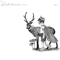
01. Gabriella Barouch
Gabriella is an award-winning illustrator from Tel Aviv, Israel, whose clients include Hallmark, Penguin Random House and Le Monde. Her intricate, whimsical hand-drawn style is showcased in a simple gallery-style format.
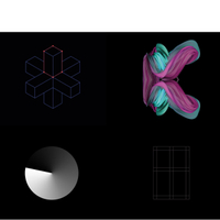
02. Bishal Limbu
Multi-disciplinary designer Bishal is a recent graduate from London College of Communication. Built around a square grid, his homepage uses animation to draw the eye, and his case studies take a mobile-first approach.
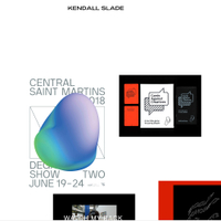
03. Kendall Slade
Another multi-disciplinary designer, and recent graduate from Central Saint Martins, Kendall has an ever-changing layout that panellist Steve Vranakis describes as "like taking a digital crowbar" to portfolio conventions.
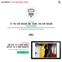
04. Jon Banuelos
A web and graphic designer from the USA, Jon has a personality-packed portfolio that leads you on a journey though his work, incorporating little touches of animation and showing off his various skills in the process.
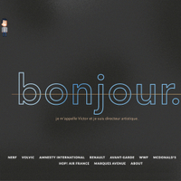
05. Victor Renaux
Paris-based art director Victor has worked for big-brand clients such as Volvic, Renault, McDonald's and Airbus – and puts them front and centre in his design, giving each one a cover image that matches the style of his folio.
Watch our panel – including moo.com's head of design Millie Scarlett Davies, Google Creative Lab ECD Steve Vranakis, Pedro Messias, multidisciplinary designer at Wolff Olins, and Meghan Hagerty, marketing director at BrandOpus – critique these five diverse portfolios in the video below...
The video above is packed with insights and advice from our expert panel. Here are five key takeaways to apply to your own portfolio website today...
01. Show things in context
Millie Scarlett Davies was particularly impressed with how Gabriella Barouch made the effort to show her commercial work in situ, rather than just the illustrations in isolation. "From our perspective, if we ever want to work with an illustrator, it helps to see that the work translates into the real world," she explains.
02. Design for mobile first
While the panel though Bishal Limbu's site felt a little sparse on desktop, it works more effectively on mobile. "We look at these sites in the moments in between the work we have to do – when we're commuting, or have a chance to get a tablet or phone out," points out Steve Vranakis. "Designing for mobile is a must."
03. Take viewers on a journey
The panel particularly liked how Jon Banuelos leads viewers through his portfolio, with twists of personality throughout. Meghan Hagerty compares his case studies to awards entries, a technique she admires: "He's got what his brief was, what exactly he did, and who he worked with," she says. "Everything is spelled out."
04. Curate an experience
Although several of the panellists felt that Victor Renaux's portfolio made people work a bit too hard to see his projects, Pedro Messias praised the way he gave each project its own cover image as part of a unified theme: "There's an element of storytelling to it; he's treating each project as a different chapter," he explains.
05. Don't be afraid to experiment
Less is often more when it comes to design portfolios, but Kendall Slade took the chance to show off her personality – and her coding skills – with her simple, but ever-changing layout. "It's got attitude, it's a bit punk," says Steve Vranakis. "It's like she's taken a digital crowbar and smashed up the windows of the shopfront."
Once you've nailed your portfolio, you need some top-quality self-promo materials to point people towards it. Digital print and design company moo.com provides fun, affordable, easy-to-use tools for creating premium business cards, postcards, stickers and more. There's even a 100% satisfaction guarantee with the MOO Promise: if there's any kind of mistake on the design – even if it's your fault – they'll fix it for free!
Related articles:
- 10 steps to go freelance this year
- Pro's guide to creating memorable business cards
- How to project your work onto the global stage
- 6 sure-fire ways to build your creative network
- Nail the art of networking and get more from events
- 4 brilliant personal logos – and why they work
- 3 tips for crafting stunning print promo materials
- Create better business cards in less than 5 minutes
- 5 ways to earn more as a freelancer

Thank you for reading 5 articles this month* Join now for unlimited access
Enjoy your first month for just £1 / $1 / €1
*Read 5 free articles per month without a subscription

Join now for unlimited access
Try first month for just £1 / $1 / €1
Get the Creative Bloq Newsletter
Daily design news, reviews, how-tos and more, as picked by the editors.

Nick has worked with world-class agencies including Wolff Olins, Taxi Studio and Vault49 on brand storytelling, tone of voice and verbal strategy for global brands such as Virgin, TikTok, and Bite Back 2030. Nick launched the Brand Impact Awards in 2013 while editor of Computer Arts, and remains chair of judges. He's written for Creative Bloq on design and branding matters since the site's launch.
