5 tips for using bespoke lettering in branding
How to incorporate a handmade feel into your branding.

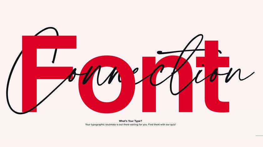
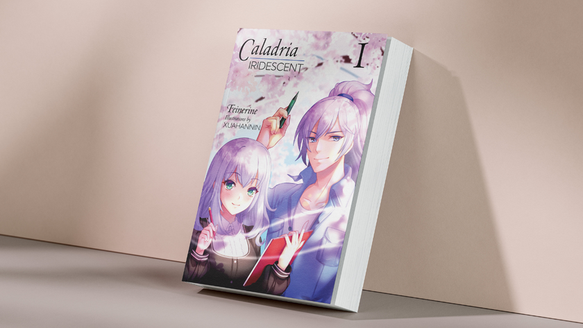
Recently, we’ve seen a resurgence of brands adopting a crafty, handmade aesthetic, and an increased focus on tactile and analogue elements. However it's not enough to just stick a script font on your packaging design. When Kyle Wilkinson was asked to create campaign imagery for RedLeg rum, he hand-painted a script-style brush type and combined it with metallic inks to create a laid-back, Caribbean vibe.
This kind of attention to detail can make or break this aesthetic. Here are our top tips for embracing bespoke lettering in your branding work.
01. Use it wisely
If hand lettering works with the overall brand – its origins, its ethos and its audience – great. If not, avoid; people will see straight through a tech giant trying to look personable using nothing but a script-y typeface. “It’s got its uses, but I feel it’s a lazy approach sometimes,” says Wilkinson.
02. Work with the printers
Specialist typography often requires special finishes: embossing, foils, and spot colours, for instance. So it’s best, where possible, to work as closely as you can when it comes to printing the project (preferably, be physically present). That way, you can see the colours, finishes and other elements as they’re done. For more on this, take a look at our tips for getting more from print projects.
03. Keep it beautiful
"For a logotype to be ‘great’ it has to be beautiful – in whatever style or font it’s in,” says Jessica Hische. It must also be legible. “The logo is the first visual insight a lot of people get into the company – it’s an opportunity to set the tone for how they want to be perceived and what they want people to think of them and what they do,” she adds.
04. Mix techniques
Hische works ‘by hand’ on an iPad Pro using Procreate. “I work the same in that programme as I do using pen and pencil, but with the added ability to colourise my sketches when colour is a big factor,” she says. “If I’m tweaking an existing logotype, I use my sketches as a quick ideation and iteration platform, but don’t push my sketches beyond the loose idea stage. If I’m working from scratch, I’ll take my sketches further before vectorizing.”
05. Do your research
Competition is tough, especially in retail. “To make a difference you’ve really got to know your stuff,” says Stranger & Stranger founder and CEO Kevin Shaw. “You’ve got to know what works with consumers and what doesn’t, what others are doing and how to stand out; how retailers think and stock products. You also need to know about logistics and costs, so you can get the most out of budgets.”
This article was originally published in Computer Arts, the world's best-selling design magazine. Buy issue 278 or subscribe.
Read more:

Thank you for reading 5 articles this month* Join now for unlimited access
Enjoy your first month for just £1 / $1 / €1
*Read 5 free articles per month without a subscription

Join now for unlimited access
Try first month for just £1 / $1 / €1
Get the Creative Bloq Newsletter
Daily design news, reviews, how-tos and more, as picked by the editors.
Emily Gosling is a freelance art and design journalist currently writing for titles including Creative Review, Eye on Design, Creative Boom and People of Print. She’s previously worked at Elephant magazine, It’s Nice That and Design Week, and was editor of Type Notes magazine. Her book Creative Minds Don’t Think Alike was published by Ilex Press in 2018, and she also plays bass as one-quarter of the eight-titted beast, Superstation Twatville.
