5 tips for presenting your work on social media
Adjust your photography approach to tap into your online audience.

Anyone with a smartphone can be a photographer now, it seems. Yet just as being able to play three chords on a guitar doesn’t make you Keith Richards, so owning one of the best camera phones doesn’t make you a capable image-maker. Alongside skills in things such as typography, layout and strategic thinking, today’s brand designers need to harness the value of great photography, and know how, why and where to use it.
When it comes to self-promotional photography across social media posts, such imagery should align with your values and personality as a studio or creative. Are you and your work, for instance, generally playful, modern, understated? Just as you’d include photography style in the brand guidelines you’d create for a client, your own photography style is a key part of your brand. Here we list five key things to consider when using photography on social media.
For more advice, explore our ultimate guide to social media, our guide to the TikTok app, or if you're inspired to get snapping, check out the best camera for creatives. And don't forget to follow Computer Arts on Instagram.
01. Consider context
Consider the channels that your imagery will appear on. An image that works in a deck won’t always be one that flies on Instagram, or keeps people on your site long enough for them to want to hire you.
02. Embrace your playful side
Consistency as a studio or creative is vital, but you have to carefully consider aspects including crops, use of colour and tone of voice. Platforms like Instagram allow for more playfulness than a straightforward portfolio site, for instance, and let you “speak” directly with your audience in a different way that’s more direct and lively – particularly with more ephemeral posts such as stories.
03. Remember, quality is key
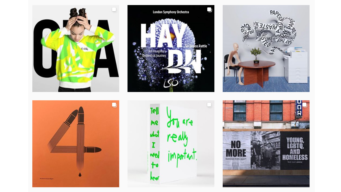
Quality is still key in showing off the very best of your work as dynamically as possible – especially since the vast majority of people will only see a maximum of around the first nine images on your feed.
04. Introduce some variety
Consider how one project looks alongside another. Retain your own distinctive style, but remember to keep it exciting, too. Variety within limitations is key. Those limitations might be thematic use of colour palettes for instance, but don’t just keep posting the same sort of documentation and use a variety of angles for projects.
05. Go behind the scenes
Pop in a few (well-shot) behind-the-scenes or process shots when you feel that they’re exciting enough. If you’re using interesting archive imagery for instance, or processes such as letterpress or screen printing, the build-up of a final image can be incredibly insightful for people and connect them with you as a studio. “There’s a realness, vibrancy and energy to the best work you see on Instagram,” says Superunion executive creative director Stuart Radford.
This article was originally published in Computer Arts, the world's best-selling design magazine. Buy issue 297 or subscribe.
Read more:

Thank you for reading 5 articles this month* Join now for unlimited access
Enjoy your first month for just £1 / $1 / €1
*Read 5 free articles per month without a subscription

Join now for unlimited access
Try first month for just £1 / $1 / €1
Get the Creative Bloq Newsletter
Daily design news, reviews, how-tos and more, as picked by the editors.

Emily Gosling is a freelance art and design journalist currently writing for titles including Creative Review, Eye on Design, Creative Boom and People of Print. She’s previously worked at Elephant magazine, It’s Nice That and Design Week, and was editor of Type Notes magazine. Her book Creative Minds Don’t Think Alike was published by Ilex Press in 2018, and she also plays bass as one-quarter of the eight-titted beast, Superstation Twatville.
