You invest a huge amount of effort, time and resources in getting your designs right. So the last thing you want is for them to come back from the printers looking like a blurry, incoherent mess.
But if you’ve spent your career to date focused on digital-only design, you may be unsure about what to do when sending a design to print. So in this post we round up five fundamental things you need to know, with some links for extra reading to expand your knowledge further.
01. The difference between RGB and CMYK
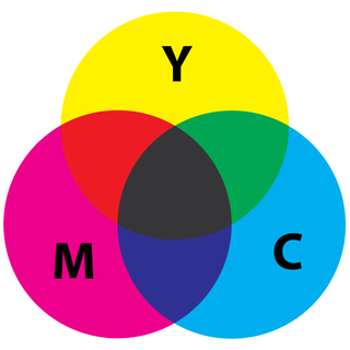
The system that your computer software uses for generating colour on screen is not the same system that printers use. Computer graphics use the RGB colour system, which is made up of red, green and blue. But printers work with the cyan, magenta, yellow and black colour set – commonly referred to as CMYK.
The RGB system has a greater range of colours than most printers can reproduce. If your designs are intended for digital only, you need your software set to RGB. If it’s for print, you must use CMYK.
However, even working in CMYK, what you see on the screen won’t always be exactly what you’ll see on the printed product. That's why proofing your designs is so important. For more on this, read our article: How to colour-match your print projects.
02. The importance of resolution
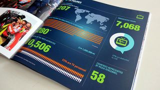
When you're working on the web, resolution isn't such an issue. But when it comes to printing, you’re going to need some very high-resolution files indeed, or your prints will come back blurry, muddy and incoherent.
For print output, the most important measure you need to worry about is DPI: dots per inch. As the name suggests, this determines the number of dots your printer will create on one square inch of your printed page.
The best practice is to set your software to the maximum DPI of 300. There’s no benefit to going any higher, and it will just make your file larger and more unwieldy.
Also note that DPI should not be confused with PPI (pixels per inch), which is concerned with the density of dots in a square inch of screen space, and is thus used for digital design rather than print design.
03. How your design scales

When you look at your design on the screen, it may look perfect. But if it’s going to be printed at a much bigger size (such as a poster or billboard) or a dramatically smaller one (such as a business card), you need to consider how well the different elements of your design will scale.
One of the most important aspects of that is typography. So to make sure the text on a business card is legible, for example, it’s best to avoid light and thin fonts. Also, don’t set the size so small that people won’t be able to read it when it’s printed.
Another problem with scaling your designs comes when images are printed at large sizes. If they’re raster images, you need to supply them at a high enough resolution to avoid them blurring. But vector images shouldn’t cause a problem, as they are innately, infinitely scalable. For more details, read our ultimate guide to image resolution.
04. The need for bleed

The way a printer cuts the paper down is not an exact science, so designers have always left a little room around the edge of their designs as room for error. This is called bleed, and all good design software will include guides to show you where the bleed starts and finishes.
Different printers will require different amounts of bleed, so you should always ask your printing company to tell you this (or check your own printer settings if you’re using an in-house machine). Here are some other questions to ask your printer.
05. The importance of proofreading
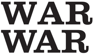
This sounds like obvious advice, but it cannot be stressed enough: one of the biggest pitfalls of printing your designs in physical form is making silly mistakes. Because unlike the web, you can't go back to correct it. If it's wrong, you’ve simply wasted your money.
Obviously you should spell check your work, but spell checking will only get you 75 per cent of the way there. It won’t pick up on many grammatical mistakes, it won’t notice if you misspell proper nouns such as company names, and it won’t know if you’ve used the wrong homophone – such as 'you're' when you should have used 'your' (or their/there, it’s/its, and so on).
Plus, typos are not the only mistakes that can ruin your print design. You need to meticulously check your kerning. You need to check your punctuation (is that the correct form of dash? Should that be in smart or dumb quotes?). In short, anything that can go wrong probably will go wrong, so it’s best to get as many eyes as possible on your design – preferably a printed proof – before you send it off.
These are just the very basics of what you need to know about printing your designs. To learn more, check out our glossary of printing terms, our advice on how to get more from your print projects, our guide to printing a poster and our pro tips for being perfect in print.

Thank you for reading 5 articles this month* Join now for unlimited access
Enjoy your first month for just £1 / $1 / €1
*Read 5 free articles per month without a subscription

Join now for unlimited access
Try first month for just £1 / $1 / €1
Get the Creative Bloq Newsletter
Daily design news, reviews, how-tos and more, as picked by the editors.
Tom May is an award-winning journalist and editor specialising in design, photography and technology. Author of the Amazon #1 bestseller Great TED Talks: Creativity, published by Pavilion Books, Tom was previously editor of Professional Photography magazine, associate editor at Creative Bloq, and deputy editor at net magazine. Today, he is a regular contributor to Creative Bloq and its sister sites Digital Camera World, T3.com and Tech Radar. He also writes for Creative Boom and works on content marketing projects.
