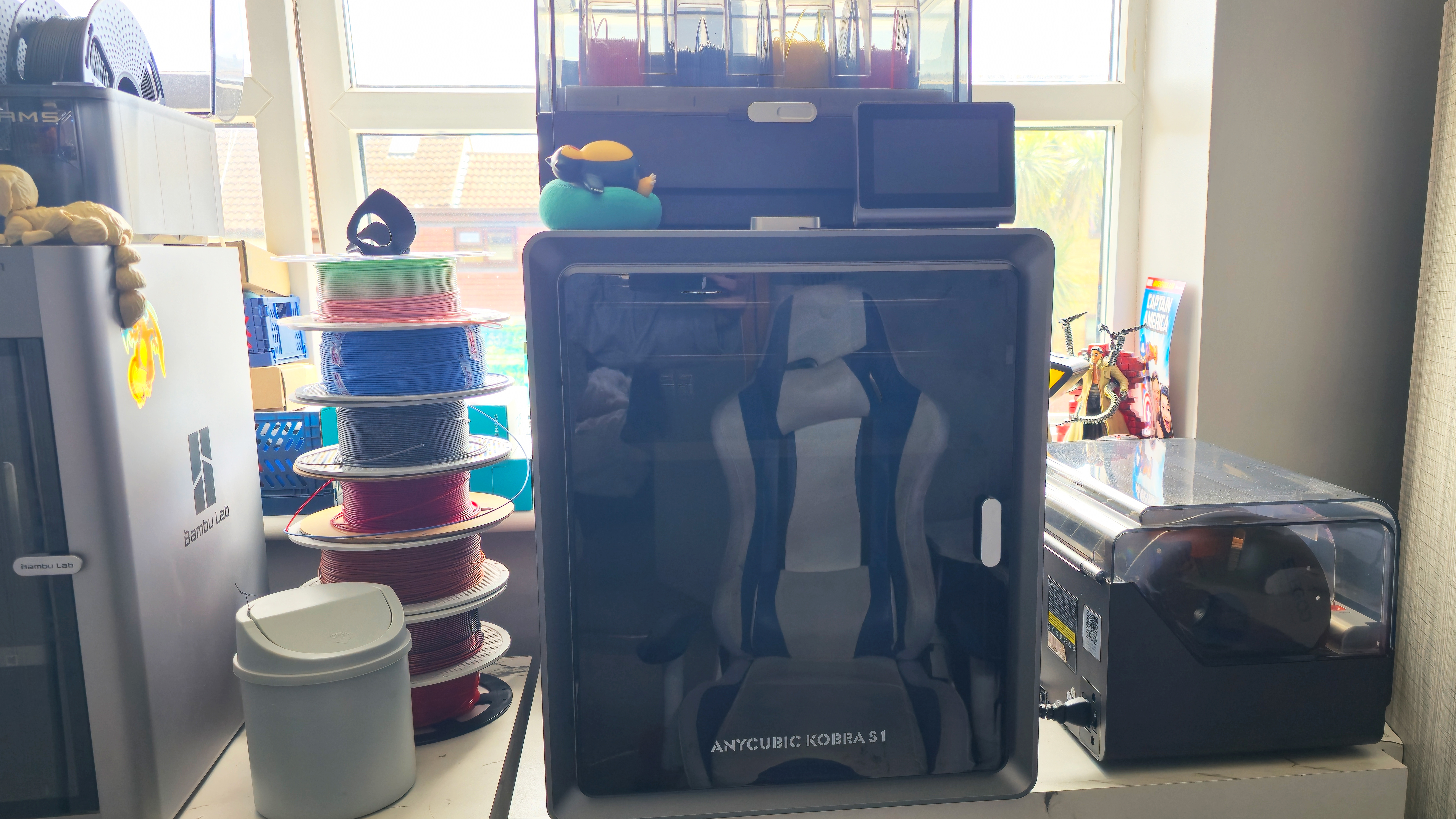
5 reasons to use photography in your designs
There are some times it makes sense to use photography.
When you need to decide between photography and illustration in your design work, sometimes the choice isn't clear cut. Both have their pros and cons creatively; vary in the costs, time and resources required; and can also communicate your message in very different ways, whether abstract and conceptual, or realistic and literal.
To help you make the right decision, read on for our five reasons to choose photography over illustration for your next design project...
01. You're looking for realism
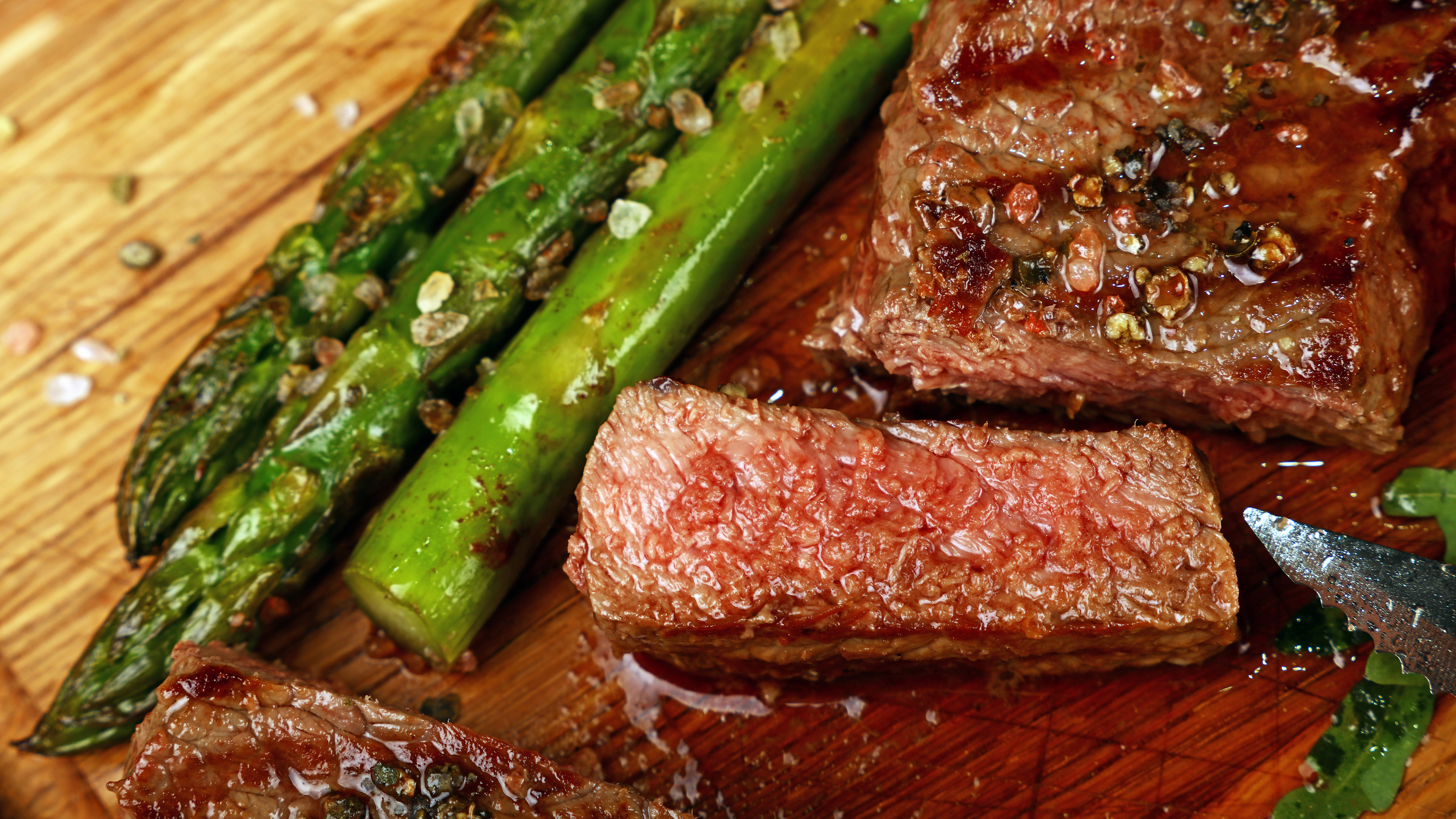
Consider the ultimate goal of your design, and how you need to depict the central subject. If it's realism and accuracy you're after, then photography is usually the best course of action.
In editorial work, investigative photojournalism and news reporting is an obvious example where authenticity is essential. But it's also important for brand imagery relating to food, for instance, where the goal is show mouth-watering produce to whet customers' appetites; or for a sports brand that's presenting a gritty, urban image.
If you're trying to stimulate people's wildest imaginations, visualise something abstract and intangible, or show them a stylised, interpretative version of reality, you probably want illustration. That said, an edgy and experimental photoshoot could also work wonders for these purposes – it all depends on your personal style.
02. You're showing something specific
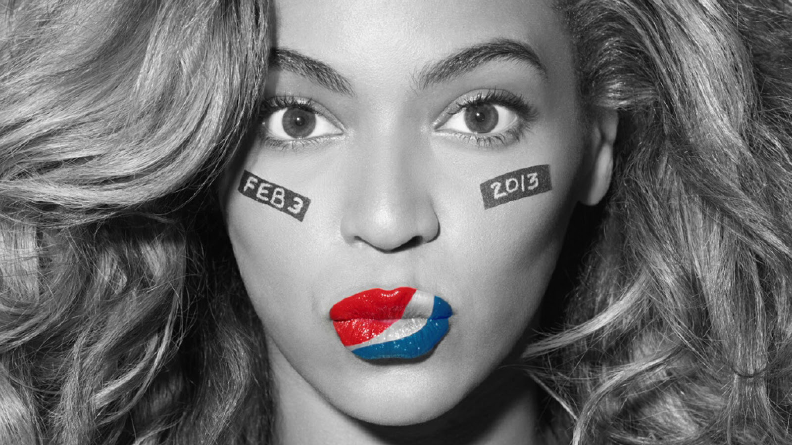
Photography is best if you need to depict someone or something faithfully as part of your design – such as an interview subject, a product or a location. Whether you shoot this yourself or rely on stock imagery, depends on access as well as budget.
Exclusive photography of a well-known celebrity as part of an all-access editorial interview will add a significant amount of value, but if said celebrity is featured in a news piece, a decent stock photo would be a much more appropriate use of money.
If that same celebrity is endorsing a product or service as part of an ad campaign, a bespoke shoot becomes invaluable to the client as it emphasises that association much more effectively than a supplied headshot on the back of the pack.
For the product itself, whether it's shown in an online shop, brochure or catalogue, people are likely to want an accurate representation of what they're buying rather than a stylised illustration of it. However, these could be used to supplement the product shot – to demonstrate how it works, for instance.
Location imagery depends largely on the context. A travel brochure will sell a particular destination more effectively with a photograph, but budgets may dictate that a stock image takes precedence over a bespoke shoot. Or to capture a more general look and feel of a country or culture, illustration may work better.
03. You're looking for wow factor
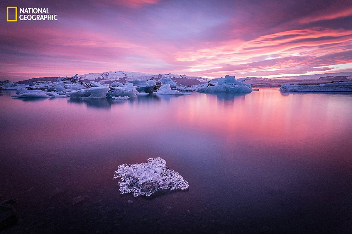
If the context is appropriate, a killer 'hero' photograph can have huge visual impact, whether it's splashed across a billboard, filling a website landing page or full-bleed across a double-page spread in print.
Photography can draw you into a scene and evoke a powerful emotional response as it's much closer to a real sensory experience than an illustration. As a designer, this may mean the content has to play second fiddle to a hero image to avoid fighting for attention. A subtler background image may be a better choice if the copy needs to take centre stage.
Whether you're art directing an amazing shoot yourself, or searching for that killer shot in a stock image library, make sure there's a meaningful connection to the content in question. This could be literal, or more abstract, if a campaign is designed to evoke a particular emotion for instance – like happiness, or ambition.
When working with stunning hero photography, be flexible and let the images dictate the design direction where appropriate rather than squandering their potential by forcing them into unsuitably rigid templates.
04. You need a visual metaphor
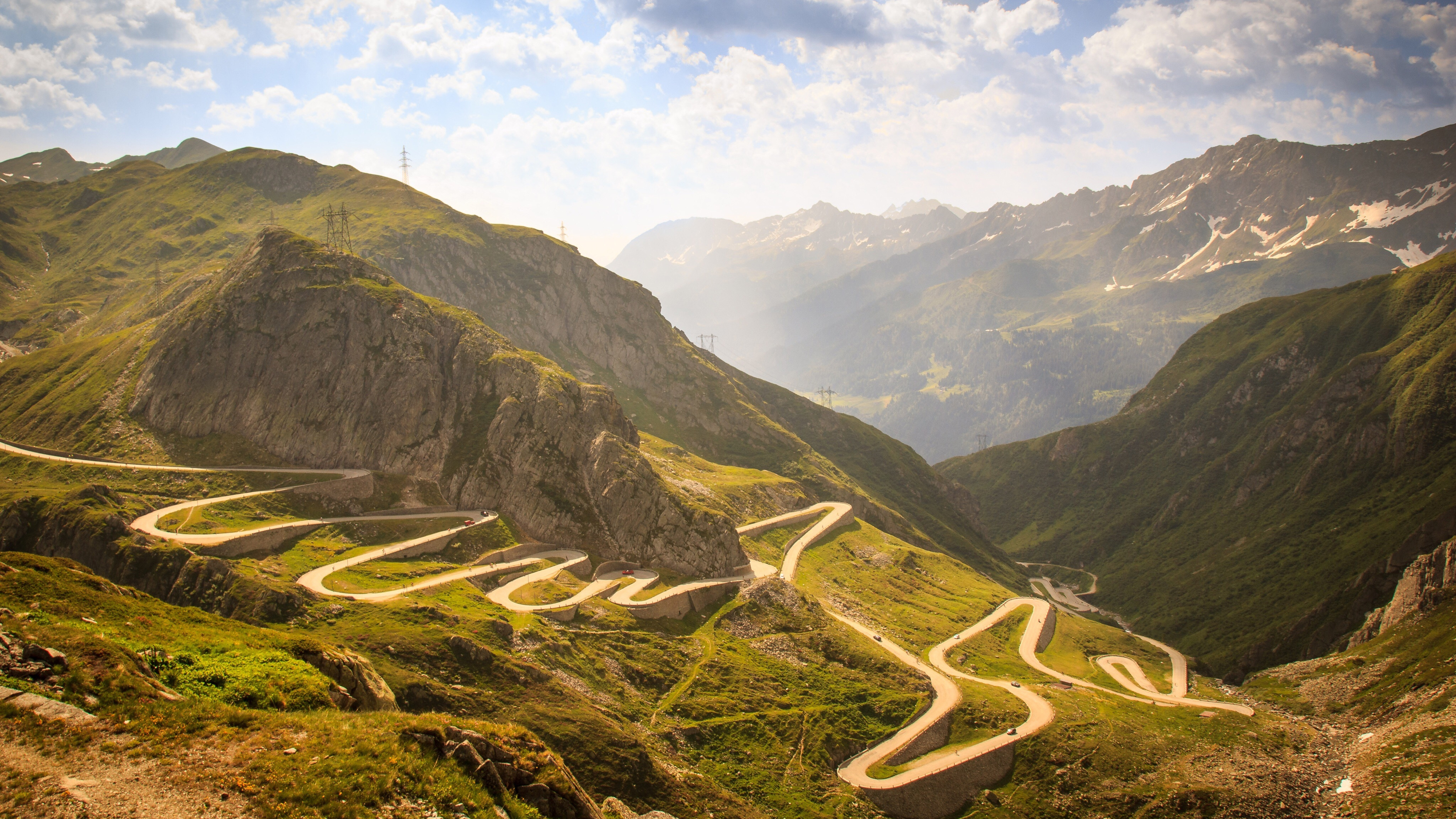
Whether it's for a website, a brochure or an ad campaign, sometimes a visual metaphor is the best way to get your point across – and this is where quality stock photography can really come into its own.
One classic example is using a photograph of a road to symbolise a journey. A straight and clear route has the opposite visual impact, and significance, to one that's steep, winding or full of obstacles.
Another is a shot of the horizon to symbolise the future: compare the effect of a breathtaking vista at sunrise, to that of a troubled, stormy sky. An annual report design might feature sprinters on a running track to symbolise a company striving to finish first, or a summiting mountain-climber to express progress and achievement.
Be careful here, as visual metaphors – while powerful in the right hands – can quickly descend into cliche if you're not careful. The quality of the image, as well as the accompanying design and copywriting, can make the difference between inspiring and insipid. Make an effort to think creatively rather than falling back on tired tropes.
05. You can afford to do it properly
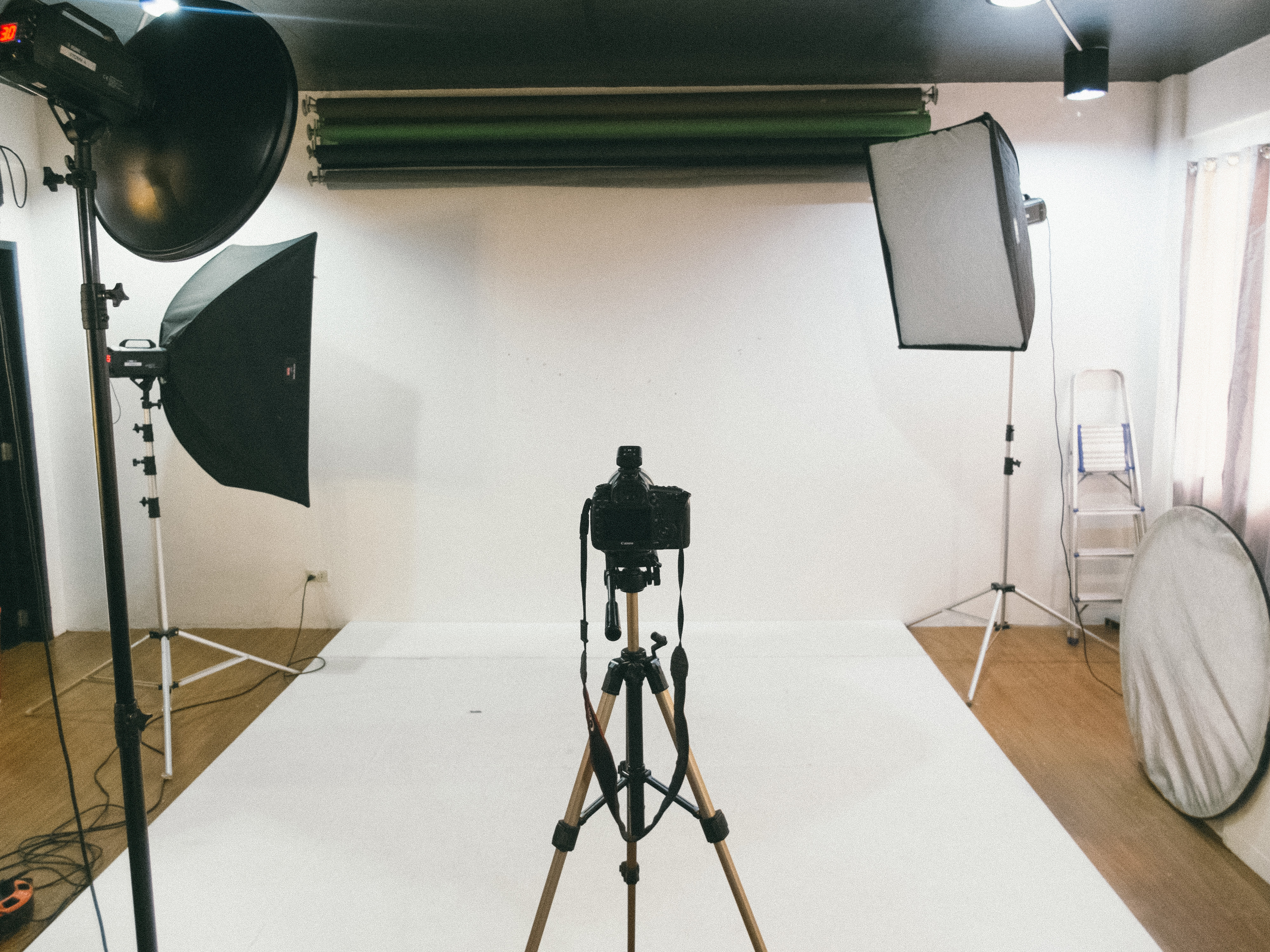
Commissioning photography can be an expensive business, and there may be costs involved that a freelance illustrator working alone at their Mac is very unlikely to incur. As well as the photographer's time, depending on the nature of your shoot these could include studio hire, set design, travel costs, location fees, models, and potentially additional people such as assistants, stylists, make-up and so on.
But if it's the right tool for the job, and you art direct it carefully to suit your needs, a bespoke photoshoot can be a great use of your budget. Just make sure you do it for the right reasons, such as those listed above – stock imagery could do the job just as well in some cases, or there may be more effective ways to spend your client's cash.
Read more:

Thank you for reading 5 articles this month* Join now for unlimited access
Enjoy your first month for just £1 / $1 / €1
*Read 5 free articles per month without a subscription

Join now for unlimited access
Try first month for just £1 / $1 / €1
Get the Creative Bloq Newsletter
Daily design news, reviews, how-tos and more, as picked by the editors.
Nick has worked with world-class agencies including Wolff Olins, Taxi Studio and Vault49 on brand storytelling, tone of voice and verbal strategy for global brands such as Virgin, TikTok, and Bite Back 2030. Nick launched the Brand Impact Awards in 2013 while editor of Computer Arts, and remains chair of judges. He's written for Creative Bloq on design and branding matters since the site's launch.
