5 killer icon design tips
Pro advice for designing icons that are easy to understand, yet packed full of character.
At Reasons To in Brighton last month, designer Jon Hicks took to the stage to share some tips for designing icons. As the man behind the icon design for Skype and Spotify, as well as the author or The Icon Handbook, he had plenty to share.
As he explained, there are two types: iconic and symbolic. Iconic icons represent an object – for example, an envelope sign to indicate email.
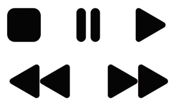
Symbolic icons are abstract, and their meaning must be learned. Think of an arrow for 'play', or more recently the hamburger icon to indicate a hidden menu.
If you've decided to create a bespoke icon – rather than using a free icon – then no matter which type of icon you're using, there are some icon design tips you should follow.
01. If there's a convention, use it
You're a creative type, we know – but this isn't the time to think outside the box.
"You have to have something that's instantly recognised," urges Hicks. That means if there's an existing convention, you need to use it.
Look up your subject on Google image search to see if there's an established icon that users will already know. Hicks also recommends doing some research using the Noun Project, a global community that collects together icons.
02. Run your ideas through local knowledge

This is especially important if your audience is not local to you. To complicate matters, different symbols mean different things, depending on where you are.
Thinking of using a thumbs up icon? You'll need to think again if your product is destined for Australia, Greece, or the Middle East: instead of indicating a job well done, you're essentially saying 'screw you' to your customers.
Similarly, in the West an own stands for wisdom, while in the East it's a symbol of stupidity. Poor old owl. Hicks suggests making the most of your client's knowledge at this stage to make sure you're not making any local faux pas.
03. Use your webcam
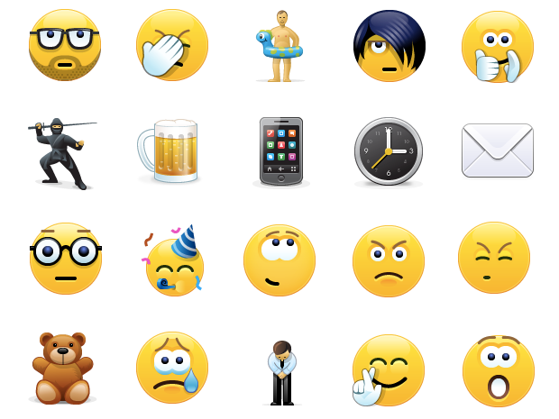
"If you're researching for emojis, you can't beat your own webcam," says Hicks. Take snaps of yourself expressing the emotion you want to capture, then work on translating that into emoji form.
It's a quick and easy way to see how different facial features change to indicate different moods.
04. Keep sizing consistent
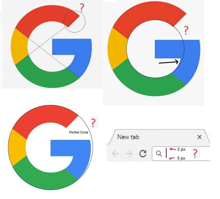
Hicks suggests starting with the baseline grid. "Ideally you want the icon to be slightly larger than the text – you don't want it to mistaken for a text glyph," he explains.
While you want to work to a standard area for all of your icons, be aware that you need to pay attention to your icons' perceived size, too. This is because even if your icons are all the same height, they might not look that way to viewers. If you need convincing, take a look at our article on how a recent discovery about the Google logo sparked a heated discussion on 'correct design'.
Another tip for maintaining consistency is to work on all of your icons within one document. You can't make a unified set if you work on each icon separately.
05. Keep it simple... but not too simple
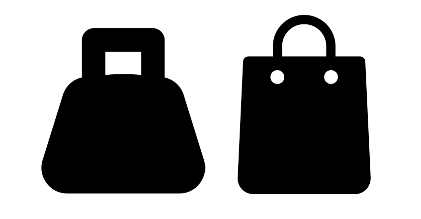
Icons should be simple – everyone knows that, right? "One of the key things is not to get too fancy. Keep it as simple as possible... but not too simple," advises Hicks.
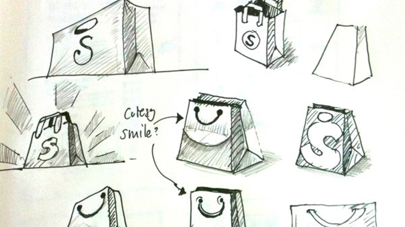
Say you want to design an icon for a shopping bag. The simplest version might be a square with a loop at the top. But that exact same icon could also be a weight, or a padlock. However, add some handle details, or a 10kg label, or a keyhole, and you've removed all possible doubt.
Hicks suggests adding more details when the icon is being used at a larger size. He also advises adjusting your stroke weight at different sizes in order to keep the icons balanced.
Read more:

Thank you for reading 5 articles this month* Join now for unlimited access
Enjoy your first month for just £1 / $1 / €1
*Read 5 free articles per month without a subscription

Join now for unlimited access
Try first month for just £1 / $1 / €1
Get the Creative Bloq Newsletter
Daily design news, reviews, how-tos and more, as picked by the editors.

Ruth spent a couple of years as Deputy Editor of Creative Bloq, and has also either worked on or written for almost all of the site's former and current design print titles, from Computer Arts to ImagineFX. She now spends her days reviewing small appliances as the Homes Editor at TechRadar, but still occasionally writes about design on a freelance basis in her spare time.
