3D fonts: 9 top type tips
Energise your designs with 3D fonts that leap from the page.
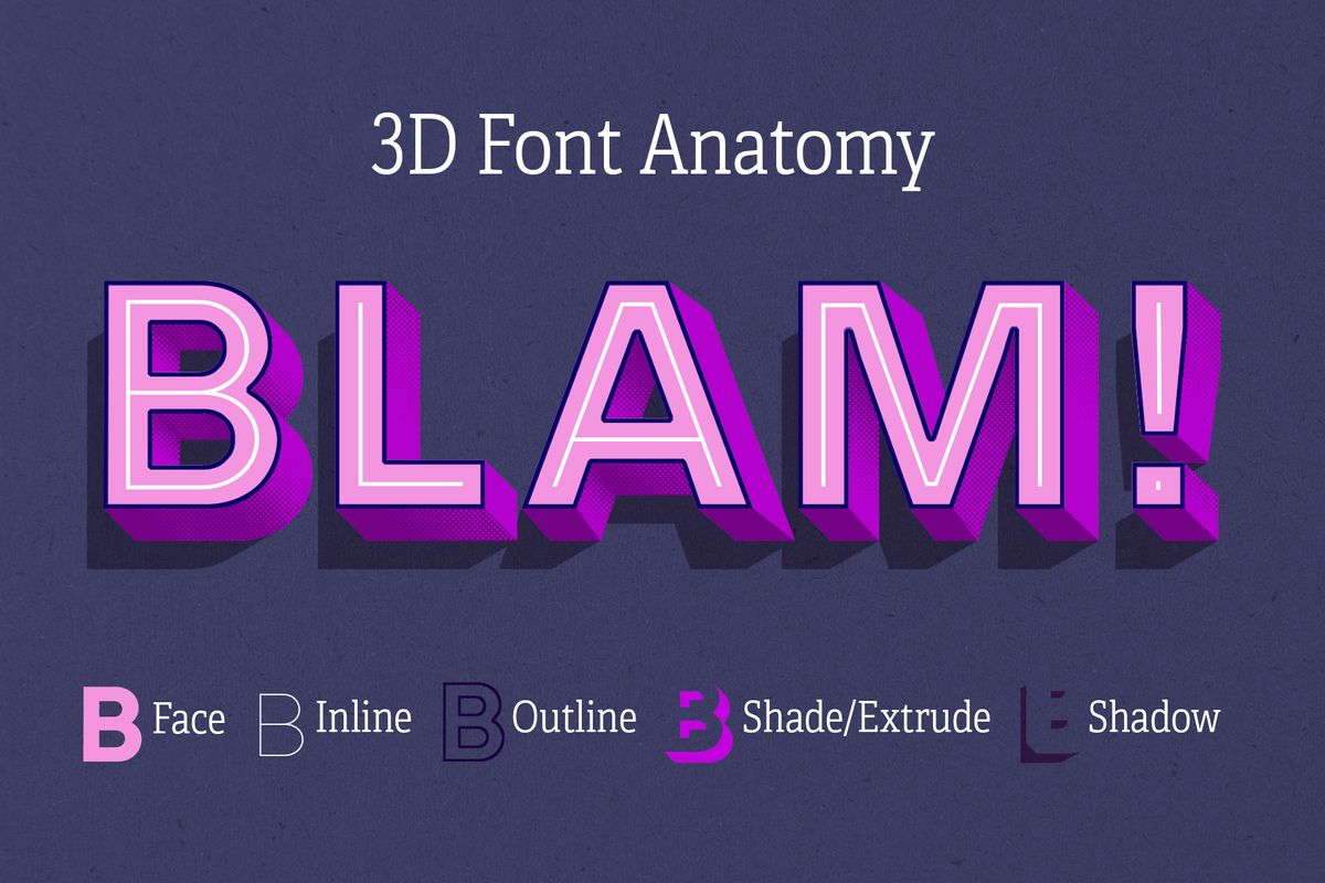
3D fonts are an eye-catching element inside your typographic toolbox. They can be used consistently across both web and print, and, implemented cleverly, will energise your designs, creating stunning work that's fit for your design portfolio.
On-trend for 200 years
The first 3D fonts – or ‘shaded’ typefaces – date from around 1815 in London, and were borne from intense competition between British type foundries. The first is believed to be Thorne Shaded, a tough looking fat face with sharp serifs, by Robert Thorne of the Fann Street Foundry. Since then, 3D type has evolved substantially, withstanding 200 years of changing fashions.
While recently designing my 3D font family, Rig Solid, I discovered that very little has been written about the use of ready-made 3D fonts. So here are some top tips on how to best use them in your design work.
01. 3D Fonts versus lettering
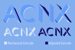
In the same way that script fonts have practical advantages over their written counterparts, so too do 3D fonts over one-off 3D lettering. Their text remains conveniently editable and it can be used across multiple platforms.
A well-designed 3D font will fix the common visual issues that crop up in custom 3D lettering. Extrudes on diagonal shapes (A,K,V,W,X,Z and so on) are evened out so that an X doesn’t have one skinny leg and one fat one.
The spacing and kerning will also take into account the repositioned contours of the extruded shapes. On the flip side, creating 3D lettering from an existing 3D typeface means all this work is done for you so you can focus on the fun aspects of customising it.
02. How to best use 3D fonts

3D type was traditionally made from wood, which restricted its use to larger formats. Now 3D fonts are available wherever you want your type to stand out or add a little excitement. This makes them perfect for headlines, signage, stationary and branding. They can invigorate an otherwise dry design, add a focal point, or enhance consistency when used repeatedly.
3D type adorns the packaging of countless consumer products, attracting our attention from the supermarket shelves. It has also found a comfortable role in branding for coffee shops, barbershops, restaurants and more. Due to their ‘constructed’ feel, 3D typefaces also suit a broad range of subjects, such as architecture, technology, logistics and machinery.
03. Using 3D web fonts
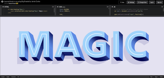
Implementing a 3D font on the web works in the same way as a 2D font. For the broadest choice of designs, you can buy a web license and self-host with relative ease. You’ll also find a growing number of 3D web fonts on Typekit (including all of my own designs) and a handful on Google Fonts.
Using chromatic or ‘layered’ fonts on your site (see below) will require some CSS skills – check out Mandy Michael’s CSS wizardry here.
Font technology is quickly evolving on the web. Color fonts, which have multiple layers or images baked into them, are steadily gaining mainstream support in browsers and design software.
04. Making the most of 3D fonts
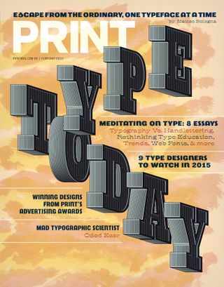
3D fonts are designed to catch the eye, so the bigger they are the more impact they can create. I have seen beautifully set 3D type at small sizes, on menu headings and the like, but if you choose a small setting, just be careful to make sure the details of the typeface reproduce clearly. High-quality print is pretty versatile but, as a general rule, I’d suggest keeping 3D web fonts above 30pt.
For maximum effect, keep text length short with as few lines as possible. If you're setting more than a few words, ensure that there's high contrast between your typeface and its background.
05. Pairing 3D fonts
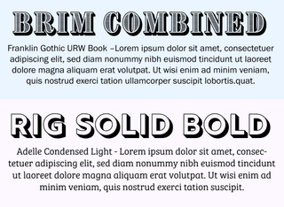
Pairing 3D typefaces, just like pairing regular type, is often based on instincts, taste and a little know-how rather than hard rules. As your 3D font is undoubtedly your headline font, your partner will be for straplines or body copy.
The simplest option is to select a 2D font with appealing contrast. Perhaps something simple and elegant to offset the volume of your headline font. 3D fonts may be based on serif and san-serif designs, so look primarily at its face when pairing. The usual guide of not pairing two sans-serif or serif fonts is less relevant because of the extra dimension with 3D fonts. However, avoid pairing with a typeface that looks similar but not quite the same.
If there is a suitable 2D option in the same family then consider using it, but be wary of using the face style of a chromatic font alone as its spacing may be set to accommodate its extrude style.
06. Pimp your type
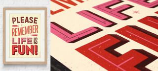
3D fonts offer a playground of opportunity for customisation and for adding your own twist. To give your type an extra tactile quality or a vintage feel, a boundless supply of free textures are available online from scratches to screen print. With the multiple facets of 3D type, you can even apply different textures to the face, extrudes and the background.
If you want to go even further and add custom shadows, lighting, inset panels and more, you can find some great 3D lettering tutorials online. Starting with a pre-made 3D font will also help you to structure your overall composition much faster.
07. Using chromatics
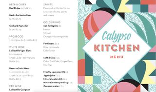
Chromatic, or layered fonts have multiple styles designed to stack on top of one other. Combining these styles and assigning each a colour produces a huge variety of visual effects. Using chromatic type may seem complex at first glance but it’s actually quite straightforward:
- Begin, as usual, by setting your type with one of the family's styles
- Duplicate the type layer and then change its style and colour
- Repeat for each font style and colour as desired
Chromatic fonts make it possible to match multiple colours from a brand palette or, if you use a chromatic font to make a logo, the colours can help form the broader identity.
08. Shaping 3D type
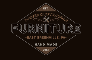
3D typefaces naturally lend themselves to being manipulated along paths, used in diagonal settings and reversed out, due to their substantial shapes. If you're setting type along a curve, keep the shape shallow and add a little extra tracking. If curves are too tight, the extrudes and any shadows will appear to come from different directions and likely look unnatural.
3D type can look fantastic when reversed out in bright colours on dark backgrounds. But be aware that if the design contains any shading to suggest light falling on its surface, it may look like a strange negative when reversed.
09. Getting creative
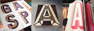
Striking visual options can also be found by separating the face, extrude and outlines of 3D fonts and applying different treatments to them. Faces can be masked out to reveal backgrounds or patterns inside the letters and extrudes can be offset slightly to mimic print misregistration.
Designers like Thomas Mayo, who blends new and old technologies, are taking these isolation techniques to their extreme. For example, he uses laser cutters to rout out each section of his contemporary 3D type in wood. These separate parts are then letterpress printed in a same way as traditional wood type.
Related articles:

Thank you for reading 5 articles this month* Join now for unlimited access
Enjoy your first month for just £1 / $1 / €1
*Read 5 free articles per month without a subscription

Join now for unlimited access
Try first month for just £1 / $1 / €1
Get the Creative Bloq Newsletter
Daily design news, reviews, how-tos and more, as picked by the editors.
Jamie Clarke is a Type Designer and Lettering Artist, expertly bridging both fields. Since refining his skills at Reading University in 2013, Jamie has created a growing collection of contemporary typefaces. He unveiled his first font, Brim Narrow, in 2015, followed by his award-winning 3D font, Rig Solid, which became part of Canva’s library in 2018. His lettering projects are known for blending words and imagery to create meticulously crafted illustrations. Notable examples of his work include branding for Kelmscott Bakery and his cover design for The Woman in Black.
