3 pro tips for building a device-agnostic UX system
Discover three top tips for making sites that work brilliantly, regardless of platform.

It used to be that you'd design web pages and expect that those designs would be what you'd see on your desktop browser. However, with assorted mobile devices becoming the platform of choice for viewing the web, you can't be sure of that any more.
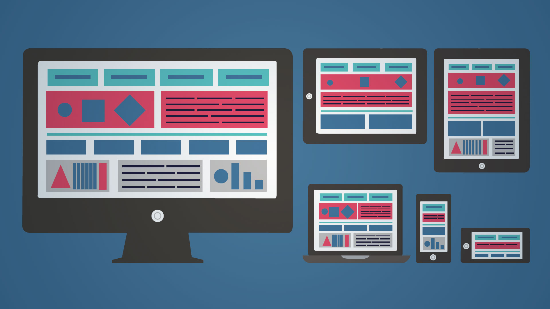
Device-agnostic design is the way forward, and user experience designer Anna Dahlström will be addressing this issue at Generate London in September. In her talk, Building device-agnostic UX systems, she'll walk through why device-agnostic design matters, what it means and how to go about it.
Ahead of her talk, here she shares three tips for breaking out of the desktop paradigm and creating sites that look and feel just as good on an iPhone as they do on a 4K monitor.
01. 'Any' should be your starting point
It goes for any device, any screen size, any input method, any browser, any signal… any anything used anywhere and at any time. There will always be exceptions and good cases for doing something specific, but to ensure that what we design can work on as many devices - current and future ones - and in as many situations as possible, 'any' is a good starting point before breaking into IFs.

02. Approach it like Lego
To get what you design and your content to be as device-agnostic as possible, you need to focus on the building blocks rather than the pages. Doing modular design is a lot like the Lego sets that can be used for building more than one model. You need to know what you're building and what each different model will look like and need. You want to be able to reuse as many pieces as possible and avoid having too many bespoke pieces, though at times bespoke is needed.
It's the same with modular design. Know what the main version of your pages and modules are and define the variations, but aim to keep it as simple as possible and only do variations and bespoke modules when they are really needed.
03. Get sketching and rip up some paper
Sketching is your best friend for quickly getting your head around your main page and module templates, as well as thinking through them on smaller and larger screens.
A really simple exercise I do in my workshops is to take two pieces of A4 paper and fold one in half and rip it into two pieces and continue until you have 5 uniquely sized pieces of paper, the intact A4 piece of paper included. Consider their physical size the size of the screen you're designing for and take your main pages/ views, e.g. the home page, and sketch it on each piece of paper. It's a great way to quickly think through natural breakpoints as well as when the role of a "screen" might change whilst not being too focused on if it's Apple this or Samsung that.
Don't miss Anna's talk on device-agnostic design in September; to find out more about this and other essential sessions and workshops for web designers and frontend developers, head to the Generate London site.

Thank you for reading 5 articles this month* Join now for unlimited access
Enjoy your first month for just £1 / $1 / €1
*Read 5 free articles per month without a subscription

Join now for unlimited access
Try first month for just £1 / $1 / €1
Get the Creative Bloq Newsletter
Daily design news, reviews, how-tos and more, as picked by the editors.


