14 easy ways to make your website more accessible
UX experts offer up their secrets on areas of inclusivity that often get overlooked.

It's nothing new to promote the idea that accessibility should be a key consideration at the start of any design project. In reality, tight budgets and timescales can often render the big features needed to make our digital products fully accessible either neglected or considered ‘something to add in later’.
The end result is that while broad-brush accessibility best practices get implemented, many of the finer elements of accessibility or inclusive design can often be overlooked. Fortunately, as you’ll see, many of these oversights can be addressed with minimal effort, and one of these website builder choices will help too.
Taking just a handful of these points into consideration may help empower an additional percentage of your audience to better engage with your digital products in ways that they otherwise wouldn’t have been able to.
01. Remember alt text
In a world in which uploading visual assets to the internet is as commonplace as starting your day with a coffee – Instagram alone estimates 100 million images are added daily to its platform – we can easily overlook the need for alt text on images and videos when adding content to our own websites and apps.
Consider the percentage of your audience that may be using screen readers to consume your content; if you’re anything like GOV.UK, you may not be catering for 29 per cent of your users. When choosing your visuals, be sure to consider the alt text that will accompany them in order to provide context in relation to the rest of the elements on the page. You’ll be catering for screen readers, users viewing as text-only and failed loading states.
Naming your image layers in your design files with their alt text labels will challenge you to really question the suitability of the images you’re selecting, as you’ll read them for what they are.
02. Consider animations carefully
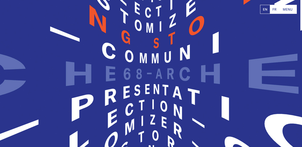
Those gorgeous parallax sites and GIF-tastic web pages you’ve been designing have certainly pushed the online storytelling experience no end, but with 35 per cent of people over the age of 40 suffering from a vestibular disorder, there’s a chance you may make users suffer nausea and motion sickness by going too heavy on the animation. The Arche 68 front page menu is an amazing experiment in animated typography, but can leave even those with the strongest stomachs feeling a little giddy after a minute or two of scrolling.
To address this you could consider providing the option to either disable scrolling animations or to provide a static alternative for viewing your content. Slack provides the option to hide animated images and emojis, demonstrating that motion can be an optional enhancement rather than a must-have feature for all users.
Got a complex site to support? These web hosting services will help.
03. Think about other languages
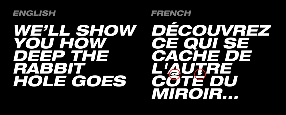
Not all projects you work are going to require the content to be translated into multiple languages, but remember that accessibility and inclusivity extends beyond the need to cater for those with visual or auditory impairments.
Making your line heights too tight can cause all manner of issues when translating into French, for example, as character accents such as the accent grave (à, è, ù) may be overlapped and get lost, rendering an entirely different meaning – for example à = ‘to’ versus a = ‘has’. Other languages like Arabic read right to left so will have a big impact on the way blocks of text are rendered and consequently the way that page flows will be read.
When designing for a global audience, your templates and design systems have a better chance of scaling if you consider the myriad ways alternative languages can affect type layout at the start of the design process. Try mocking up your design files in one or two alternative languages to see if they’ll stand up to translation; it’ll make things easier should this requirement be added later.
04. Keep it straightforward
Given the estimation that around one per cent of the UK population are on the autistic spectrum, it’s important to consider words at face value. Emojis and quirky copylines are great fun and help give brands personality but when addressing serious subjects, writing in plain English will help negate any ambiguity for users, especially when helping them to make important decisions. Be mindful of the diversity of your audience and the tone in which you intend the copy to be read in to keep your message on point.
05. Use simple colours and shapes
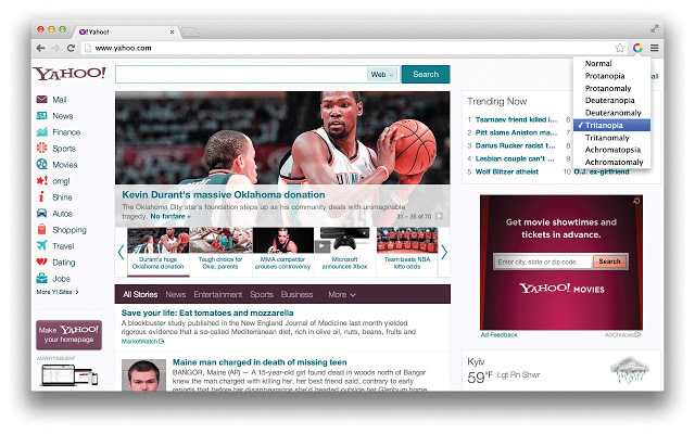
Shapes and colours are so important for various reasons and can have a huge effect on a user’s experience. When we consider the autistic spectrum, colour blindness and other visual difficulties, your choices of colour can be extremely challenging to differentiate between or even recognise.
It is considered that bright and high-contrast arrangements of colours can be hard and overwhelming for autistic users to process; their attention can be easily lost, so try to use simple colours and shapes. Equally, a user with colour blindness will rely heavily on contrasting colours. Approximately one in 12 men and one in 200 women around the world are affected by colour blindness. Choices like red and green, green and blue, blue and purple and green and brown can be troublesome.
Try using a colour-testing tool like the Chrome plugin Spectrum. This enables you to analyse your web pages and simulate colour blindness scenarios. You could also use Userway’s Contrast Checker to test your text and background colours and see if they are WCAG 2.0 AA or AAA compliant.
06. Empower the user
Imagine a digital experience that gives you the opportunity to consume content in the way that best suits your needs. With Harry Potter, you can read the book, watch the film or listen to the audiobook. These three methods empower fans to enjoy the story in the way that suits them and is inclusive of those that are deaf, dyslexic or visually impaired.
Reveal News does this brilliantly with a number of its online long-form articles, the sexual abuse investigation story Rape on the Night Shift being a great example of this. It offers up the options to either read, watch or listen to the same story all within the same interface.
Next time you’re planning your content strategy, it may be worth considering the multiple ways it can be served up, as you’ll not only benefit those with disabilities, you’ll actually provide a much more flexible way for all users to enjoy your offering (and be sure to keep your content files in secure cloud storage).
07. Offer multiple options
Communication can be challenging for users with visual or hearing difficulties. It may be that a user is hard of hearing or deaf and requires the option to respond to a request in writing, or that they have a visual impairment, in which case a phone call may be the preferred means of contact. Providing communication preferences can be a really important consideration to successfully engage with people who face these challenges, so always keep this in mind when designing your next contact page.
08. Offer customisations
It’s so easy to get caught up with how a brand should be visualised online. Sometimes your brands, typography and colour may not be enough or just obstruct an accessible experience. Ideally, you should enable users to customise their viewing preferences, changing themes (light/dark or colour variations) and text sizes.
A study by E-Check concluded 70 per cent of websites are potentially breaking the law and are at a significant potential commercial, PR or legal risk. There are many factors but providing the user with a customisable experience can help them visualise content better.
Take the Guide Dogs website as an example, where users are able to alter text size throughout the website and even change the colour mode. It is known that contrast is very important for users with visual restrictions, so providing alternative themes can be really useful.
09. Think about tabbing
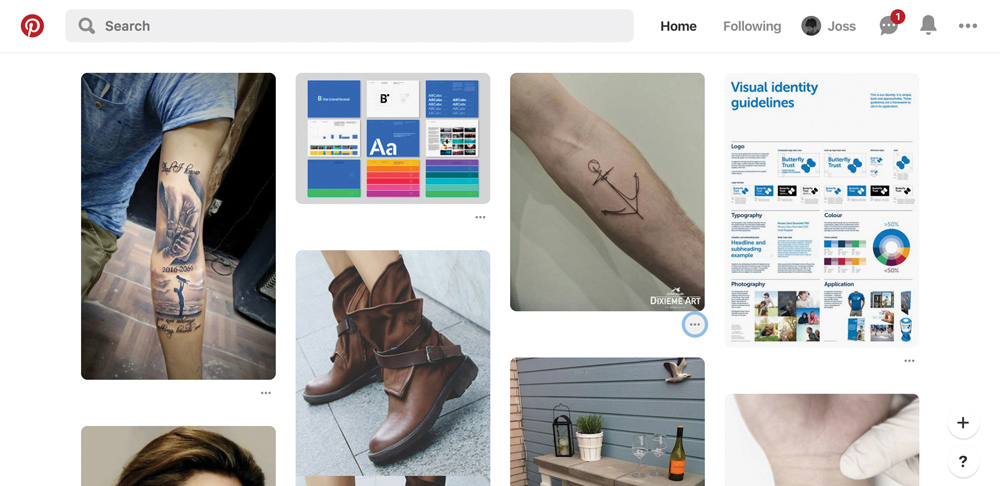
Over 50 per cent of internet traffic now originates from mobile devices, though as a designer you’re pretty likely to still be equipped with a keyboard and mouse, much like the remaining half of the population. Of that population, there are a number of people (an estimated 7 per cent of working adults) with ‘severe dexterity difficulty’, rendering them reliant on a keyboard alone to navigate menus and webpages on their computers. The impact this has on design is twofold.
The first concerns page layout: can users with a keyboard tab through your page in the order you intended the content to be read? Ever tried tabbing through Pinterest’s masonry grid? It’s near impossible to work out where you are in the flow of the page because the focus jumps.
The second concern for tabbing is the actual visual representation of the focus state. Most browsers have default focus states out of the box but some websites like Smashing Magazine have gone the extra mile to create their own style that adopts a thick dashed red line rather than the generic light blue boxes of Chrome or Safari, which don’t work so well if your backgrounds or buttons are light blue themselves.
To truly cater for keyboard-only users, it’s worth taking the time to consider how each of the components of your design system or style guide will appear in their focused state and then work with your developers to perfect these in the browser.
10. Don't forget the bots
Human beings are not the only ones that read websites; bots do too. Consider voice-controlled devices and those clever little Google bots that crawl the web every waking hour. Websites are being scanned and analysed by many technologies, including assistive software. Screen readers are just one of the many types of this assistive software and are used by 90 per cent of people with varying levels of visual impairment.
The way your website is structured is really important. The formatting of content and alt text is what is mostly read by screen readers. Think about how the HTML is ordered and if the flow of content matches your own visual experience of the web page.
11. Get the right line length and amount of text
Engagement is needed to capture an audience’s interest but it’s easy to forget that words matter when it comes to keeping your user focused. The challenge is to write enough to be informative, while at the same time keeping reading fairly light work. Large textual areas can be quite intimidating.
It’s not just about how much text you have though; it’s the way you display it that can often make reading a challenge for some users. The line length for your text can help with that. If a line of text is too long, the reader’s eyes will have a hard time focusing, as the line length makes it difficult to gauge where the line starts or ends. It can also be difficult to continue on to the correct line in large text blocks.
Furthermore, if a line is too short the eye will have to travel back too often, breaking the reader’s rhythm. Shorter lines also tend to stress readers, making them begin on the next before finishing the current one. To help with this, it is considered that 50 to 60 characters per line will ensure comfortable reading.
Take a look at Medium for a masterclass in how reading can be a pleasure.
12. Avoid anxiety-inducing prompts
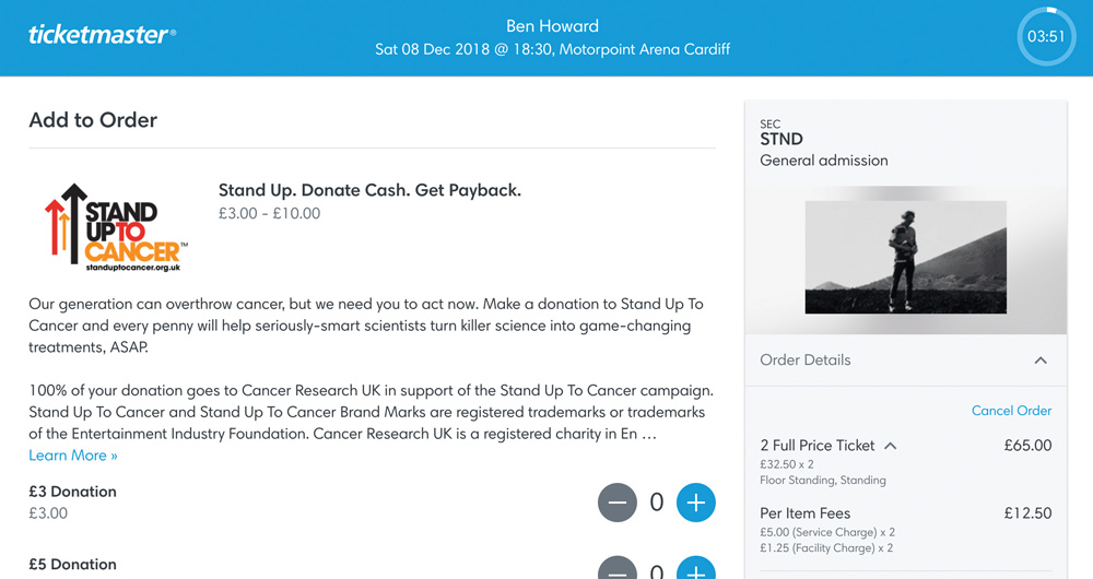
We’re all familiar with the flashing ‘In high demand!’ and ‘Last chance!’ messages on Booking.com. We’re also distinctly aware of the countdown in the corner of the screen when ordering tickets on Ticketmaster. One can only imagine the rise in conversion rates due to these features, but what if these experiences cause genuine anxiety for some users?
More than one in 10 people are likely to suffer a ‘disabling anxiety disorder' at some stage of their life and as designers we should do what we can to avoid contributing towards this problem. There are a number of UX patterns that aim to rush users into taking actions, especially booking processes, where timeouts are an inevitability. As a forward step we can look to cater for those who will take longer to use our applications by gently notifying them that a time limit is in place and giving them the option to extend the time needed as appropriate.
When designing your next booking flow, make sure you include the timeout scenario as part of the sequence and that you strive to create an interface that empowers users to complete, rather than sending them into a panic.
13. Add in verifications and checks
For sufferers of anxiety, there is nothing worse than being left to question the validity of information or data submitted into the digital ether unintentionally. Getting to the end of a lengthy form or booking process rich with important information and pressing ‘next', only to discover that your data has been submitted without the option to undo can be a stressful experience, especially when money is involved.
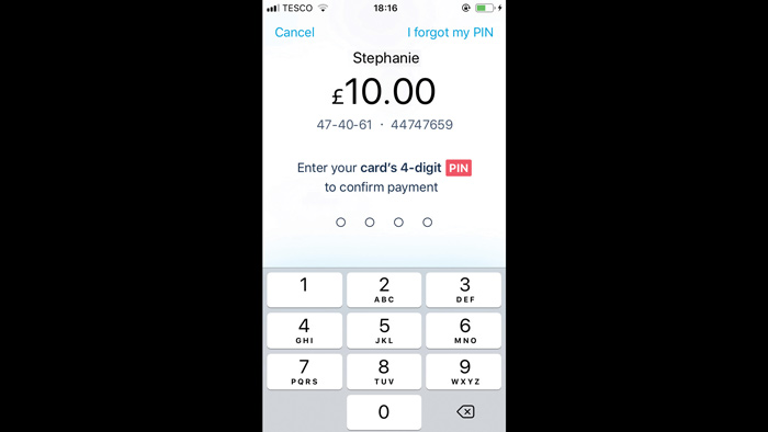
When designing flows that have a consequential call to action at the end, it’s well worth bearing in mind that many users – including those suffering from anxiety – will appreciate the option to double-check that they’ve filled everything out correctly. Monzo does this brilliantly when sending payments, offering customers three layers of verification in one tidy interface.
At the final stage of making a bank transfer, you can perform a final check of the amount to be sent, the sort code and account number of the recipient, as well as having to enter your card’s PIN number to confirm the transaction.
14. Confirm the end of a user journey
A lot of energy can go into understanding user journeys and providing the best user experience but you can find yourself falling short in some scenarios. When a user comes to the end of a process, interaction or submission, the final screen should confirm their actions and inform them of what’s next, even if it’s simply a message that says something like ‘Let’s take you back to the home page’. Any form of confirmation can be really rewarding to the user and lower any anxieties they may have.
This article originally appeared in issue 314 of net magazine; subscribe here.
Lead image: Taras Shypka
Read more:

Thank you for reading 5 articles this month* Join now for unlimited access
Enjoy your first month for just £1 / $1 / €1
*Read 5 free articles per month without a subscription

Join now for unlimited access
Try first month for just £1 / $1 / €1
Get the Creative Bloq Newsletter
Daily design news, reviews, how-tos and more, as picked by the editors.

Carl is a creative who has been in the web industry for more than 14 years. Blessed with a passion for UX/UI design, Carl has been awarded Creative of the Year for his contribution to the industry. His diverse portfolio of past clients includes Facebook, Twitter, Unity Technologies, Ordnance Survey, and beauty brand Lush. He has written features for Web Designer magazine, and currently heads up the Salo Creative agency, which he also founded.
