10 ways to increase your sales
Discover some steps you can take to up the number of orders you’re getting through your online store.

It’s never been easier to set up an online store. But there’s a big difference between setting up a store that allows people to buy, and setting up a store that convinces people to buy. For this reason, hosted platforms – which make setting up an online store easier – are not a threat to web designers and developers. They are an opportunity for us to focus on the real value we can offer through consulting and implementing an exceptional user experience.
Here are 10 ways that you can squeeze more sales out of an online store.
01. Be ready on mobile
Today, over half of the visitors to your clients’ websites will be using mobile and tablet. Mobile is taking over our spare time and now people are getting comfortable buying through mobile too. In fact, the UK leads the world in mobile spending, with around 28 per cent of transactions being done through handheld devices.
You might expect that it’s just low-value products being bought on mobile, but it’s actually the high-end brands leading the charge. Last holiday season, NET-A-PORTER reported on Black Friday that 41 per cent of their transactions were on mobile. That’s orders – not traffic. Fashion and luxury are the industries in which mobile is most important
If that’s not enough to convince you, since April 2015, Google has penalised websites that aren’t optimised for mobile by pushing them lower down the ranks in mobile search results.
Use responsive design to ensure that your website works well on all devices. Make sure clickable elements aren’t too close together and keep font sizes readable without the need to zoom. Also, keep in mind that hover effects won’t work on most mobile devices.
02. Don’t worry about SEO

Every client I meet is concerned about SEO – overly so in my opinion. Some of them may as well be worrying about the layout of chairs on the Titanic. As Google gets more advanced, having to explicitly do ‘SEO’ is getting less important. The crude strategies of keyword stuffing and the like don’t work any more. Google just wants you to help it deliver its service, which is to accurately provide answers to users as quickly as possible.
This means producing good content that answers real user questions. So start by thinking about your target audience and what they might be searching for. The closer this content is to your product, the more effective it’s going to be.
With that said, there are things you can do to improve your listings beyond having good content. Make sure pages are fast to load, easy to read, and that your menu is simple to use.
Improve your chances of people clicking your page in the search engine result pages (SERPs) by editing the search snippet that appears beneath the page title in Google. You can do this by changing the meta description tag.
03. Don’t underestimate email

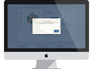
Even in the age of social media, an email address is still the most direct route to your audience. According to data from Monetate, email still converts higher than visitors from social and search. The easiest way to gather email addresses is to add a pop-up box. Love ’em or hate ’em, there’s no denying they work – and if you have the right incentive you can expect to see a conversion rate of five to 10 per cent.
On that note, make sure you give something in return. An email address is incredibly valuable; it’s a direct line to someone’s personal inbox. So offer free shipping or 10 per cent off the next order.
Once you have an email list, send offers, news and interesting content. Make sure your emails offer value to your audience to reduce your unsubscribes, and be sure to monitor your analytics to see what works and what doesn’t.
04. Build trust
Trust is key to increasing your conversions. It takes faith to buy from an online brand: customers are sending their money out into the ether and have all sorts of concerns about their order: When will it arrive? What happens if I change my mind? Is paying through this website safe?’
Good design builds trust. That means making sure the website works on all device sizes, and the design matches the brand consistently throughout the site.
You should also make sure you include trusted logos, such as a Verisign or McAfee site seal – or even just your payment gateway logo if it’s a well known brand.
Beyond this, your product pages need to answer any potential questions a buyer could have. When will the product arrive? How soon is it despatched? How does sizing work? What are the care instructions for the item? Is there a warranty? What is the total cost, including shipping and other fees? Showing this information as early on as possible builds trust and allows the customer to make a decision with all the information they need.
05. Use excellent photography

It’s painful to say this as a web designer, but I think clients need to prioritise spending on good photography before good design. Photography is often the first chance to show your product in the wild, to get a feel for what your brand aspires to, and to inspire the customer. Good photography sells the product.
A professional photographer is a must, but if your client really wants to do it themselves, make sure they use a DSLR and their images are well lit, sharp and inspiring. For your design to work you also need to make sure all lifestyle and product photography is consistent.
06. Offer free shipping

In 2012, Worldpay undertook a study with 19,000 consumers and 153 senior retail decision-makers. It found the biggest reason for visitors dropping out of a purchase was hidden fees. The main culprit is usually shipping fees added at checkout.
Offering free shipping as standard solves the technical problem of having to calculate a shipping fee on the product page. If you do this, you should put it in your website header along with any other strong selling points.
If you can’t offer free shipping on every order, because it’s not priced into your products, consider offering free shipping over a certain price. This will increase your average order value (AOV) because anyone close to the free shipping threshold will likely add more stuff to their cart.
07. Watch visitors use the site
Back in 2000, Nielsen Norman Group did a famous study (netm.ag/neilsen-281) that revealed that you only need to show your website to five people to get most of the feedback you need to improve it. You can get priceless feedback from showing your website to people in your office, customers or even your parents. It’s easy to end up in a bubble when designing, and this simple exercise will make sure you spot any usability problems that have become invisible to you.
08. Automate marketing
Do you want to make money in your sleep? Don’t we all. Advanced and affordable automated email marketing is making this a reality.
The secret to a profitable ecommerce business is that the lifetime value (LTV) of a customer must be more than the first purchase. So you need to encourage repeat purchases. Customer loyalty raises your ROI per customer and increases the chance that customers will become brand advocates.
MailChimp’s automation suite is included in its Pro plan, which starts at $199/month. It allows you to set up automated email campaigns to welcome new customers, win back old ones and reward loyal ones. You define the triggers and the emails you want sending, and MailChimp does the rest once a customer matches the criteria you’ve set.
These emails are great at generating instant sales and increasing your customers’ excitement. Be creative and think about how the emails can reflect your brand personality and tone of voice.
09. Measure what works
The best businesses use data to steer their decisions. Shopify includes easy to digest reports that merchants can use to figure out what marketing is working, which products are popular and which ones are selling best.
Google Analytics can be plugged into most websites and provides a huge range of reports that you can customise. Spend some time defining your favourites and pass them on to your clients, showing them how to make actionable insights from the information provided. Use this to make ongoing improvements. See the boxout opposite for more.
10. Don’t stop improving
Never stop improving; that’s the secret to a successful business and a successful website. You’ll continually be learning what works and what doesn’t, and what you discover may sometimes surprise you. Trends change year-to-year and the best ecommerce brands are always trying out new techniques online. That relentless novelty is what makes our industry so exciting.
This article originally appeared in net magazine issue 281; buy it here.

Thank you for reading 5 articles this month* Join now for unlimited access
Enjoy your first month for just £1 / $1 / €1
*Read 5 free articles per month without a subscription

Join now for unlimited access
Try first month for just £1 / $1 / €1
Get the Creative Bloq Newsletter
Daily design news, reviews, how-tos and more, as picked by the editors.
