It’s frustrating. You’ve spent hours, days, weeks on your logo design, and yet still it isn’t working. But you’re so close to the project personally that you can’t see the wood for the trees, and you can’t work out where you’re going awry.
If you want to avoid this scenario, then read and digest our 10 commandments of logo design. Follow them to the letter and you shouldn’t stray too far from the path of logo righteousness...
01. Thou shalt research the brand
Like all commercial design, a logo doesn’t exist in a vacuum, and is not just about creating something that will look pretty on your portfolio. Brands pay for a logo to be created to fulfil a business need, and you will have to understand that need fully for your design to succeed.
Sometimes, you’ll get an articulate client who can explain where the business is coming from and what the logo needs to achieve quickly and simply. But at other times, the client won’t really understand the business themselves, and you’ll have to do a lot of that work yourself.
Either way, it’s up to you to fully research the company, understand what it’s trying to achieve, who its competitors are, and why the previous logo (if there is one) is being replaced.
Some of that research may take place on the internet, or reading corporate documents, but much of it will depend on meeting the client and asking the right questions. To get you started, here are 5 questions to ask about the brand.
02. Thou shalt respect brand heritage

When it comes to creating a new design for an existing brand, you want it to look updated, modern and forward-looking. But there’s a danger of throwing out the baby with the bathwater.
Logo design history is littered with examples of companies that released new logos that were totally disconnected from their brand heritage, only to watch them crash and burn.
Read about some of the most notorious examples, in our post 7 classic logos that should never have been changed – and make sure you learn from their mistakes.
03. Thou shalt choose the right kind of logo
Some logos are made entirely of type, while others exist entirely as a symbol, and yet others combine text and graphics in the same design. So before you start designing, it’s important to decide what kind of logo you're setting out to create.
This key step will help focus your mind and get you moving in the right direction, before you waste your time going down a series of blind alleys.
If you’re unsure about what the main types of logo are, then check out our 5 basic types of logo post. In it we explain what wordmarks, lettermarks, brandmarks, combination marks and emblems are and how to use them.
04. Thou shalt keep your design simple

A logo needs to be scalable to small sizes (printed on a pen or appearing on a mobile device) and huge ones (for instance, a billboard or an IMAX cinema screen). It needs to be instantly recognisable by consumers, as well as powerfully memorable. It needs to work in any colour. And it needs to be versatile enough to be consistently reproduced in a range of print and digital media.
For these reasons and more, your logo needs to be as simple as possible. Try shrinking it to a tiny size on your screen: does it still work? If not, it probably needs simplifying further. So keep editing, removing and simplifying. Purge your design of unnecessary graphical elements. Simplify shapes. Remove unnecessary shadows, gradients, textures and backgrounds. Reduce the number of fonts to the bare minimum.
This process can be psychologically difficult: we all hate to discard details we’ve worked hard to create. But at the end of the process, you’ll usually end up with a logo that’s simpler and much more successful as a design.
That doesn’t, however, mean every logo you create has to be ultra-minimalist to the nth degree. Consider the Firefox logo as a good example of how a logo can be simple, versatile and scalable while still evoking a unique visual personality.
05. Thou shalt make your design readable
It should go without saying, but so many logo designs fall down on a fundamental basis: their readability. Conversely, many brands work hard over time to make subtle updates to their logo to make it easier to read. Some of these can be extremely subtle, as when Google moved its ‘g’ one pixel to the right and its ‘l’ one pixel down in 2014. But the fact that brands indulge in that level of tinkering just goes to show how important legibility is, and how it should be at the heart of any logo design or redesign.
06. Thou shalt be original
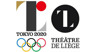
One side effect of the need to simplify is that it’s very easy to end up creating something that resembles an existing logo. There are countless examples of big brands getting caught in this trap, from the debacle of NBC’s 1976 logo (detailed in 5 expensive logos and what they teach us) to the short-lived Tokyo 2020 Olympics logo. This post suggests 5 ways you can avoid falling foul of plagiarism in your logo design.
07. Thou shalt not slavishly follow trends
We all love watching trends, and logos are no different. In fact, we’ve already written a post about 2017’s biggest logo trends ourselves. But in no way does that mean you should slavishly follow them.
A successful logo can potentially stay in place for decades, so if you try to be too hip and modern, your design will only date super-fast. Focus on the classic principles of logo design and think about long-term durability rather than short-term trends.
08. Thou shalt use vector software
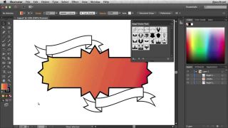
It is possible to design a logo in Photoshop, but it’s not a good idea. This will mean creating your logo as a raster object, which can’t be resized without loss of quality.
Instead, you should use a vector graphics program such as Adobe Illustrator or Affinity Designer. This way, your logo will be a vector object that can be scaled up or down without any pixelation.
For more on the difference between vector and raster images, read Key terms every designer needs to know while you’ll find more vector editing tools here.
09. Thou shalt be appropriate
What works as a logo for one brand may not work for another. A logo for a web startup may be fun, cartoony and tongue in cheek, but that’s unlikely to work for a traditional high street bank, which needs to project an image of authority and reliability.
Like it or not, the style of your logo will instantly convey what a company stands for, so make sure it’s appropriate and that it’s aligned with the overall brand identity. Again, this goes back to understanding the goals and values of the business that’s employed you as a designer.
10. Thou shalt consider thy typography carefully
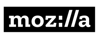
Using original typography is often key to creating a logo that stands out as original and distinctive. So try to avoid commonly used fonts, and play around with different styles of type – serifs and sans-serifs, italics and bold, as well as custom-made fonts – in order to find that unique look that helps your logo become memorable. Just don’t sacrifice scalability or legibility in the process.

Thank you for reading 5 articles this month* Join now for unlimited access
Enjoy your first month for just £1 / $1 / €1
*Read 5 free articles per month without a subscription

Join now for unlimited access
Try first month for just £1 / $1 / €1
Get the Creative Bloq Newsletter
Daily design news, reviews, how-tos and more, as picked by the editors.
Tom May is an award-winning journalist and editor specialising in design, photography and technology. Author of the Amazon #1 bestseller Great TED Talks: Creativity, published by Pavilion Books, Tom was previously editor of Professional Photography magazine, associate editor at Creative Bloq, and deputy editor at net magazine. Today, he is a regular contributor to Creative Bloq and its sister sites Digital Camera World, T3.com and Tech Radar. He also writes for Creative Boom and works on content marketing projects.

