How to make an ad that Saatchi & Saatchi will love
Persistent Peril created a vibrant animation as part of a Saatchi & Saatchi campaign for Tide Pods. We go behind the scenes to learn more.
We're big fans of Brighton-based animation studio Persistent Peril at Creative Bloq. And the ad above is a great example of how they can take something that's essentially pretty mundane - in this case, a laundry detergent - and create something vibrant, colourful and enticing.
"We were approached by Israeli production studio Aniboom after they saw our music promo Fight For Everyone," explains the producer on the project, Sam Bourner. "They thought that our style was exactly what Saatchi & Saatchi NY were looking for in their ad campaign for Tide Pods. Our aim was to bring Tide Pods to life in these colourful 15 second spots.
"From the strong scripts and boards we received from Saatchi & Saatchi NY, and using Tide’s bold visual identity, we crafted these 2D spots from illustration to animation - putting the mighty Tide Pod through its paces by flipping, squashing and stretching them in every which direction."
Creative director Garth Jones takes up the story. “We knew that the client wanted a strong 2D style," he says. "So we started by limiting the colour palette to a handful of colours and working from Tide’s bold visual identity.
"As the spots focused on playful transitions between the scenes, when it came to creating animatics we tended to roughly animate the entire spot rather than time out boards, as it was really important to convey the style of the animation and how the elements would come together.
"The idea was to move the items in 3D space but to land in strong 2D poses to keep things illustrative and flat.”
Cleaning up
Two spots have aired so far in the US and Canada, entitled Cleaning Scale and Active Ingredients (shown above) and a further five spots have been made, including versions in Spanish and French Canadian.
Update: As of 27 May, four more spots have gone live on Vimeo - you can check them out here
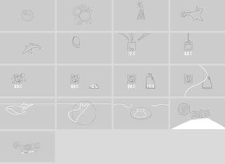
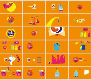
The preliminary sketches below offer a fascinating insight how the animation was developed (click on the image to see a larger version).


Have you seen a great example of animation in advertising? Let us know in the comments!

Thank you for reading 5 articles this month* Join now for unlimited access
Enjoy your first month for just £1 / $1 / €1
*Read 5 free articles per month without a subscription

Join now for unlimited access
Try first month for just £1 / $1 / €1
Get the Creative Bloq Newsletter
Daily design news, reviews, how-tos and more, as picked by the editors.
Tom May is an award-winning journalist and editor specialising in design, photography and technology. Author of the Amazon #1 bestseller Great TED Talks: Creativity, published by Pavilion Books, Tom was previously editor of Professional Photography magazine, associate editor at Creative Bloq, and deputy editor at net magazine. Today, he is a regular contributor to Creative Bloq and its sister sites Digital Camera World, T3.com and Tech Radar. He also writes for Creative Boom and works on content marketing projects.
