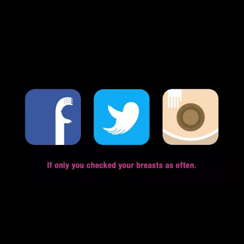
Instagram, Facebook and Twitter logos get the breast redesigns ever
Three social media giants have had clever negative space logo redesigns to raise awareness of breast cancer.

There's been a number of creative campaigns over the past few years that have aimed to raise awareness of cancer, climate change and more. Whilst some go for the shock factor, others take the more subtle approach and we think these icon redesigns are brilliantly effective.
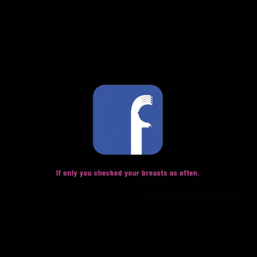
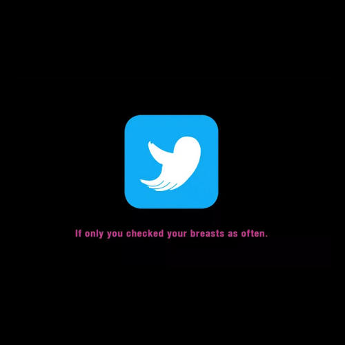
Created by The Breast Cancer Foundation of Singapore, the logos of Facebook, Twitter and Instagram have been redesigned to resemble breasts, in the former pair's case using negative space. With the tag line 'If only you checked your breasts as often,' it's a stark reminder that we often take hours out of our day to keep up to date with social media, yet spare no time for simple, yet important actions such as checking our breasts.
Cleverly incorporating hands into each of the logos, the colour schemes are kept the same for more of an impact. The charity are currently asking each social media platform to temporarily swap their logos in order to raise as much awareness as possible. Take a look at the designs in-depth below.


[via Fast Co Create]
Do you think this campaign works? Let us know in the comments box below!

Thank you for reading 5 articles this month* Join now for unlimited access
Enjoy your first month for just £1 / $1 / €1
*Read 5 free articles per month without a subscription

Join now for unlimited access
Try first month for just £1 / $1 / €1
Get the Creative Bloq Newsletter
Daily design news, reviews, how-tos and more, as picked by the editors.

Sammy Maine was a founding member of the Creative Bloq team way back in the early 2010s, working as a Commissioning Editor. Her interests cover graphic design in music and film, illustration and animation. Since departing, Sammy has written for The Guardian, VICE, The Independent & Metro, and currently co-edits the quarterly music journal Gold Flake Paint.