Exhibition branding brings back the motograph
This bilingual identity for a new British Council exhibition uses the art of the monograph.
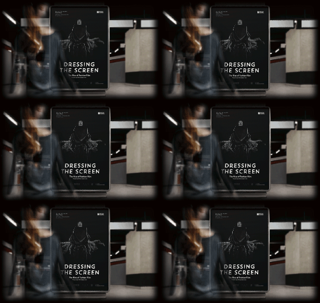
In an increasingly multimedia world, it's getting more and more tricky to catch the eye of the passer-by. To combat this, we've seen increasingly innovative examples of billboard advertising and street art recently. Here, the two collide in an inspiring example of identity design from Roma Lazarev, Kir Khachaturov and Vladislav Poliakov.
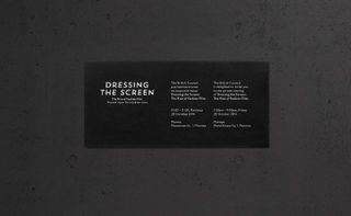
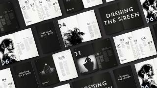
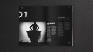
The designers were tasked by the British Council with create a bilingual identity for its 'Dressing the Screen' exhibition about the rise of the fashion film. The team reflected the high-fashion and moving image nature of the exhibition itself by using the age-old technique of the motograph (aka scanimation). By creating a special overlay using stripes, the image comes to life and 'moves' as you move.
The three designers say that they were inspired by the work of fashion photographer Erwin Blumenfield. "We created a special font and developed a system reflecting the pioneering role that Great Britain played in the development of fashion film."
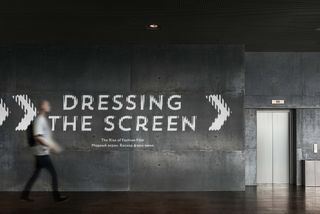
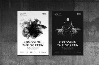
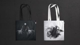
What do you make of this identity? Let us know in the comments box below!

Thank you for reading 5 articles this month* Join now for unlimited access
Enjoy your first month for just £1 / $1 / €1
*Read 5 free articles per month without a subscription

Join now for unlimited access
Try first month for just £1 / $1 / €1
Get the Creative Bloq Newsletter
Daily design news, reviews, how-tos and more, as picked by the editors.
Sammy Maine was a founding member of the Creative Bloq team way back in the early 2010s, working as a Commissioning Editor. Her interests cover graphic design in music and film, illustration and animation. Since departing, Sammy has written for The Guardian, VICE, The Independent & Metro, and currently co-edits the quarterly music journal Gold Flake Paint.
