Why a top agency dumped CGI for hand-crafted mechanics
How a human touch brought magic to a stunning ad campaign.
Retail property landlord Hammerson asked ad agency Isobel to pitch for a UK-wide campaign that would promote all its shopping centre locations, and express the benefits of shopping centres in general. Isobel founder Rob Fletcher goes behind the scenes on the brief…
We knew that Hammerson was looking to do centralised advertising – to create one idea that would represent all their shopping centres. We previously wrote the slogan 'There are many sides to...' for the Highcross shopping centre in Leicester, highlighting it as being multi-faceted and many things to many people.
So once we got the brief to advertise on behalf of all their shopping centres across the UK, we realised that that line could express the benefit of every location.
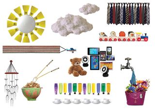
We created the press campaign, and at some point Hammerson asked what the TV execution would look like. We realised it couldn't just be the press advertising brought to life – cutting and editing vignettes together for 30 seconds.
In theory that would be okay, but it wasn't going to put them on the map and make them feel great about themselves.
The slogan 'There are many sides to…' says to me that there are clashes of objects involved. It's about taking shoes, electronics and food, and making them overlap. That's what a shopping centre is – it combines all these things in one place.
Keeping it real
The idea for the Colliderscope was inspired by a TV feature on Rowland Emett, a 1960s sculptor who made these dream machines – magical contraptions made out of wire and found objects.
Get the Creative Bloq Newsletter
Daily design news, reviews, how-tos and more, as picked by the editors.
I thought: "Rather than just editing objects coming together with lots of cuts, what if we took them and made a machine that moves things, clashes things and spins them around, to symbolise what a shopping centre is?"
In my mind's eye we were going to build it in separate pieces and then stitch them together in Flame, or even build bits of it using CGI. But I went to Daniel Cohen at Aardman Animations, and he said we could build it for real. Aardman doesn't exist in that CGI land. There's a humanity in stop-frame animation – it still looks and feels warm because it's completely handmade.
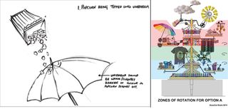
We worked with model-making company ScaryCat Studio, which after some initial drawings, said they could make this as one model. All we would have to do is shoot it at different angles and frame rates and edit it all back together.
Then they got into more specific details of what objects this machine would throw together. They also gave me a number of aesthetic options. We ended up creating more of a Victoriana, 'Bedknobs and Broomsticks' feeling, which was aesthetically pleasing.

If Sony had made it, it would probably have been hyper-modern and Japanese-influenced in its art direction – very Audi. But we wanted to make it a bit more lovely and luxurious – a bit more Tiffany.
Once the initial drawings were finalised and approved, ScaryCat built a three-foot model, and Daniel shot that in the studio on a black background. It was a cardboard cut-out showing where all the different objects would be. That's when I became convinced it was going to work.
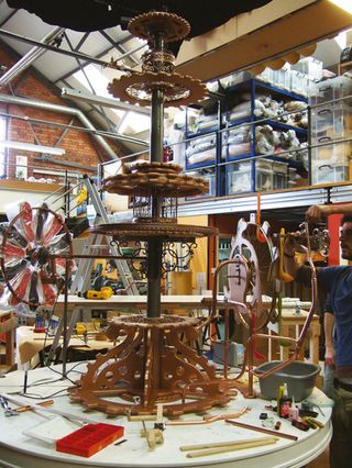
Daniel, ScaryCat and I continued sharing drawings and ideas as we got into the detail of the design. Then ScaryCat built the 13-foot-tall final machine, which took them about four or five weeks. It's built out of pipes, cogs, bike wheels and other miscellaneous hardware, with more than 300 products making up the machine and 14 motors driving it.
When we got to the final stage, they flicked a switch and it worked. We got to this point without using any CGI whatsoever. It was purely old-fashioned mechanics and engineering, craft and art coming together.
For the shoot, we used a motion-controlled camera so we could replicate angles and so on, and very simple soft-box lighting on both sides. We didn't increase the frame rate in the end – pretty much everything that happened, happened in camera.

Powerful human touch
If you can do something for real, then do it. You cannot replicate that human touch. There are tiny errors in the final piece that you don't know are there, but they create this overall effect of something more lovely.
What this commercial does for Hammerson is reflect what they are about without showing the interiors of shopping centres and so on. They are intensely proud of it, because they managed to communicate the core of what they are without using clichés.

Thank you for reading 5 articles this month* Join now for unlimited access
Enjoy your first month for just £1 / $1 / €1
*Read 5 free articles per month without a subscription

Join now for unlimited access
Try first month for just £1 / $1 / €1
The Creative Bloq team is made up of a group of design fans, and has changed and evolved since Creative Bloq began back in 2012. The current website team consists of eight full-time members of staff: Editor Georgia Coggan, Deputy Editor Rosie Hilder, Ecommerce Editor Beren Neale, Senior News Editor Daniel Piper, Editor, Digital Art and 3D Ian Dean, Tech Reviews Editor Erlingur Einarsson and Ecommerce Writer Beth Nicholls and Staff Writer Natalie Fear, as well as a roster of freelancers from around the world. The 3D World and ImagineFX magazine teams also pitch in, ensuring that content from 3D World and ImagineFX is represented on Creative Bloq.
