10 witty ads that will make you smile
Discover the full range and power of wit as a creative tool in these brilliant advertising campaigns.
From billboard advertising to print ads, creating a marketing campaign that grabs people's attention is no easy feat, which is why a little ingenious thinking is required.
A Smile in the Mind is the definitive book on witty thinking – intelligent humour, ideas and playfulness – in design and branding. First published in 1996, the original edition by Beryl McAlhone and David Stuart became a seminal text for a generation of designers. Twenty plus years later, the book has been extensively revised and updated for the next generation by new co-authors Greg Quinton and Nick Asbury.
Here Quinton, now chief creative officer at Superunion, picks 10 of his favourite witty ads that are guaranteed to put a smile on your face.
01. Nivea night cream

- TBWA\NEBOKO, The Netherlands, 2005
A clean product shot with a poetic twist. As the lid glides off the Nivea jar, the white creamy texture is revealed, taking the shape of a moon – a miracle of nature, waiting to be discovered. Beautifully simple, naturally minimal.
02. Good Hair Day?

- Åkestam Holst/ Stopp Family, Sweden, 2014
Wit has the power of conveying a message in a single hit, with an artful combination of words and pictures. One of my favourites is ‘Blowing in the Wind’, a digital campaign for Swedish haircare brand Apolosophy. Displayed in subways, it shows models with great hair but as the trains arrive the rush of air causes havoc with their carefully managed tussles. Of course it's a simple and clever bit of interactivity but the timing and the context makes it a joyful shared experience. If only I had hair.
03. A small campaign with big potential

- Ogilvy & Mather, Czech Republic, 2012
The ambiguity of wit may not seem a natural fit for health ads. But some invite controversy to promote an important message, bringing a smile often to the times when you need it most. The design that makes the pill stand out is created for a younger audience, turning function into fun. Literally.
04. Food for thought

- Pret A Manger / Balloon Dog, 2011
There are always at least two elements in a witty idea – whether the wit is visual or verbal. Combining two-in-one is the mainstay of intelligent humour, giving the viewer the pleasure of recognising the likeness between two things that are different. Pret A Manger's playful take on food – Monkey Coconut Water, Egg preserving its modesty or a potato fish for its Seas Salt chips – was a big hit with its millions of loyal customers.
Get the Creative Bloq Newsletter
Daily design news, reviews, how-tos and more, as picked by the editors.
05. Tickled pink

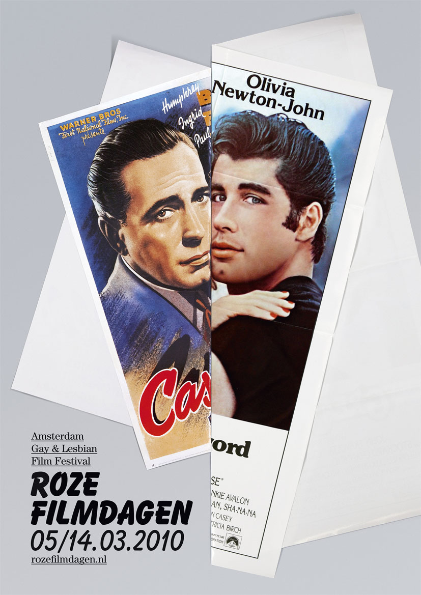
- Gay & Lesbian Film Festival: Pink Days. Lernert & Sander, The Netherlands, 2010
Another great example of juxtaposition of the opposites is when one seemingly incompatible element is playfully swapped with another. The fusion of two produces the typical response to wit – the spark of recognition and surprise. Joining two very different classic Hollywood posters of Travolta and Humphrey Bogart into one. Challenging the viewer to reappraise the norm, the stereotype and enjoy the Gay & Lesbian Film Festival in Amsterdam.
06. I can’t you out of my head
- McCann Erickson, Melbourne, Australia, 2012
Like any good teacher, intelligent humour can communicate complex information without making you work hard for it. Usefully, sometimes it can save lives. Dumb Ways to Die, the public safety campaign for Metro Trains in Melbourne, is complete with a catchy song you just can't forget and endearingly doomed characters that meet their ends by multiple witty and quite charming ways… eventually including around trains. Amazingly, over 167m YouTube views would indicate that the world is a bit safer near trains.
07. Bronx Zoo

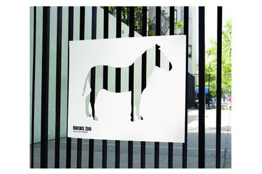
- Bronx Zoo. Y&R New York, USA, 2006
Intelligent humour invites the viewer to question – and doubt – his/her preconceptions of the world around us. In this campaign for Bronx Zoo the city and wildlife are combined, with urban textures playing starring roles, appropriated to advertise the zoo's inhabitants. A powerful and memorable way that makes you stop and take notice of your environment both global and local.
08. WWF Exhaust Emissions Impact

- WWF, Ogilvy & Mather Beijing, China, 2007
Wit has an enormous capacity to make the familiar seem new again, bringing a sense of urgency to what's important. Ogilvy & Mather's Beijing campaign for the WWF uses a car's exhaust fumes to fill up a huge black smoggy cloud. No words required for this impressive symbol of environmental impact – a powerful idea for a dirty problem.
09. NHS Trust Scotland

- NHS Glasgow and Partners/ GRP, UK, 2007 In 2007
NHS trusts in Scotland produced a 'True or false?' book in the style of traditional Ladybird hardbacks. The content was anything but traditional, and explored the questions most commonly circulating amongst teens aged 12-16… if and when to have sex. If the format disarms with old school charm, the content smashes you in the face. Brutally direct and in the one voice the audience might listen too – their own. This piece makes you laugh and wince at the same time.
10. Hans Brinker Hotels

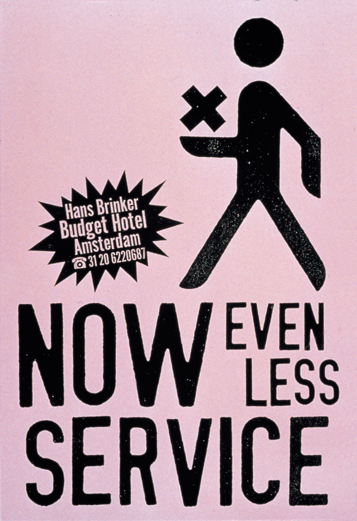
- Hans Brinker hotel, Kessels Kramer and Anthony Burrill, The Netherlands/ UK, 1996.
Hans Brinker Budget Hotel in Amsterdam took a highly unconventional approach to advertising its rooms to travellers, openly calling itself 'The Worst Hotel In The World'. This is probably not entirely true, but the self-depreciating strategy of the hotel that – and I quote – 'Couldn't care less, but will try' – clearly works, continuing, 'Proudly ignoring standards since 1970'…now spreading them in Lisbon!
Related articles:

Thank you for reading 5 articles this month* Join now for unlimited access
Enjoy your first month for just £1 / $1 / €1
*Read 5 free articles per month without a subscription

Join now for unlimited access
Try first month for just £1 / $1 / €1
