Work with different page sizes in one document
Jo Gulliver reveals how to create a set of stationery templates in one document
You no longer need to create multiple documents for one project when working with different page sizes in InDesign. In this tutorial, I’ll explain how to set up a selection of different-sized stationery templates in one document. Multi-page documents can really help streamline your workflow with the use of style sheets, which enable changes to be made quickly across all pages, and help maintain consistency throughout. I’ll also show you how to set up paragraph styles and create nonprinting layers.
The first step for any project is to begin sketching out your ideas, roughly planning the structure of your stationery elements and collating all the copy you need for the documents. Remember to take the time to plan and set up documents correctly at the beginning – it’ll save time later.
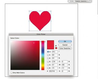
01 Start by setting up a new document in InDesign CS5. We’re going to create a letterhead first, so open an A4 document. Uncheck the Facing Pages box and set up your margins: I’ve set my top margin at 30mm, left: 15mm, bottom: 20mm and outside: 20mm. I’m working with a seven-column grid, which will give me some vertical lines to use as a rough guide. I’ve also chosen a 3mm gutter and have added 3mm bleed on all edges by selecting the More Options box.
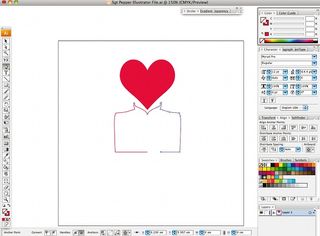
02 Next set up a baseline grid. Although this isn’t essential for a document with such little text, it does help with lining up any text elements you do have on the page. I’m setting my baseline grid to start at the top margin – at 0mm – and the increments at every 9.5pt because I want to use 8pt text. This is also a good stage to add ruler guides to mark potential folds in the paper. I’ve marked a tri-fold.
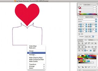
03 With your guides in place, you can begin to add the required elements to your letterhead and experiment with layout. Consider the hierarchy of your information: your logo should take prominence, while your address and other information should be secondary.
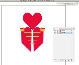
04 Creating style sheets as you go will make it possible to adjust all your pages in one easy step. To set up a style sheet, select the required text, and in the Paragraph Styles tab select New Paragraph Style from the dropdown menu, naming it accordingly. I also added a new black to the Swatches panel at this stage and applied it to my logo. This makes it easier to make a group adjustment to the logo colour if you wish later.
05 It’s beneficial to see how your letterhead works with the main copy in place, so check the balance of the layout by adding a nonprinting layer. Create a new layer and uncheck the Print Layer box. The layer name will appear italicised in the Layers panel. Nonprinting layers are also good for adding print instructions, usage information and measurements.
Get the Creative Bloq Newsletter
Daily design news, reviews, how-tos and more, as picked by the editors.

Thank you for reading 5 articles this month* Join now for unlimited access
Enjoy your first month for just £1 / $1 / €1
*Read 5 free articles per month without a subscription

Join now for unlimited access
Try first month for just £1 / $1 / €1
The Creative Bloq team is made up of a group of design fans, and has changed and evolved since Creative Bloq began back in 2012. The current website team consists of eight full-time members of staff: Editor Georgia Coggan, Deputy Editor Rosie Hilder, Ecommerce Editor Beren Neale, Senior News Editor Daniel Piper, Editor, Digital Art and 3D Ian Dean, Tech Reviews Editor Erlingur Einarsson, Ecommerce Writer Beth Nicholls and Staff Writer Natalie Fear, as well as a roster of freelancers from around the world. The ImagineFX magazine team also pitch in, ensuring that content from leading digital art publication ImagineFX is represented on Creative Bloq.
