Reasons we all see colours differently
Today we're celebrating colour in design, speaking to Adobe's Rufus Deuchler about the fascinating world of colour perception.

How we perceive colour may have became the hot topic with that black and blue dress, but it simply brought into focus a fact that many creative designers, and the team behind Adobe's Creative Cloud, have known for ages. We all see colours differently.
Whether its cultural factors, the way a monitor's been set up, or just because our eyes work differently, the ways we perceive colour are as varied as the colour spectrum itself.
In the first of Adobe's Social Creative Connection sessions that focusses on colour, principal manager of Creative Cloud, Rufus Deuchler, talks colour perception, the new Creative Cloud tools that can make you look at colour in a new way, and why seeing things differently never means restricting creativity.

Why is colour subjectivity important for creatives?
Colour is a language, pretty much like typography or composition. Depending on what colours you use, you're expressing a message.
A typical example is if you make something black and yellow in a Western cultural context it means dangerous: keep back and watch out.
If you're going to be using pastel colours, the effect is warmer and more inciting. Depending on what you need to stress in your design you're going to use different colours for different effects.
And in languages there are variations, slang, regional dialects...
It's vast. One colour can mean one thing in one culture, and another can mean something totally different in another. For instance, in some Celtic countries the colour green symbolises bad luck and misfortune, whereas elsewhere green can make us think of a four-leaf clover, and means luck.
It's super interesting, but also super important to bear in mind when designing for a global audience.

The colour wheel is centuries old. Is it's aim to unify the language of colour?
Absolutely! As humans we need order in something that is complex or chaotic. Colour is like that. The use of a colour wheel is important especially when first learning about design.
To find complementary colours, or start working with monochromatic colours. I think the colour wheel is still definitely very important as a guide.
It's a guide, there's no 'right' and 'wrong' way of using colour?
No, it's just a matter of taste… but then there are generally accepted views on what is good and bad taste!
That's definitely influenced by the use of tools like the colour wheel, and from cultural influence. But then maybe a colour combination that I would find horrific, might appeal to somebody else, so there's always exceptions to any rule.
It can also be confusing because from Adobe's perspective we're talking about colours that you see on a screen, which are additive colours. That brings us to RGB and CMYK, which are completely different ways that colour is reproduced.
All colours that are based on emitting light are called additive colour, and it puts together the colours red, green and blue. Then there's the reflective colour system that, well, reflects light!
The magazine cover in front of you uses reflective colour based on cyan, magenta, yellow and black. Of course, we see differences in the colours when they move from one system to another.
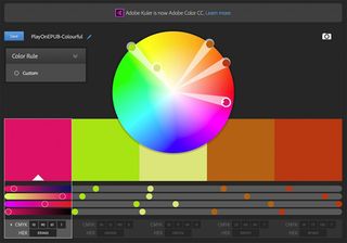
Focusing on RGB, if you go into Adobe Colour CC [formerly Adobe Kuler] you can make colour schemes using a colour wheel. What's more, with Colour CC, you can pick a reflective colour, from 'real life', and bring it into CC, converting it into an additive colour and then create a colour theme from it.

So you pick a set of colours from life and bring it into your work?
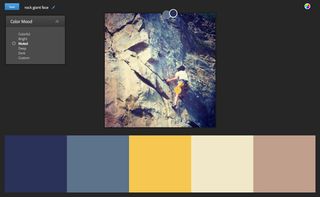
Adobe Color CC is a capture app, yes. I can use it directly on my smartphone, and capture colours that are around me, maybe a beautiful flower, and I can take colours directly from that image and save them as a colour theme that is then populating my Creative Cloud Libraries.
I can use the theme in Photoshop, Illustrator and InDesign, and other mobile apps like Adobe Photoshop Sketch CC, or Adobe Illustrator Draw CC.
You can use it in different ways. If you go to the site, there's a beautiful colour wheel where you have some points where you can move over that colour wheel and really define a colour theme until it's perfect for the work that you want to do.
I can create monochromatic colour themes, or use complementary colours, that is coming from opposite sides of colour wheel, or shades of a specific colour...
What did you learn from the black and blue dress debate?
Initially, it freaked me out. I thought, "how can anyone see anything else but B&B." And I asked my son who hadn't heard anything about it, and he swore that it was white and gold. How is that even possible?!
I found it fascinating because it makes you question everything about colour, right?! All the questions got asked and people started thinking about it in a very interesting way…
So, the different ways we see colour can be just the way our eyes work?
Absolutely. When you look at the cross section of the human eye, there's an image going through the cornea, and hitting the iris, through the lens then getting rotated then onto the retina, inverted, and then the brain has to put this all together!
Thinking about the complexity of all these steps, plus adding the complexity of colour, it makes total sense that we can't possibly all see the same thing.

Then there's colour blindness...
Well actually, I'm a graphic designer with red/green colour blindness. I think around 5 per cent of the male population has it. This is the inability to understand some browns… when red and green get mixed together it gets difficult.
In design school I was told, 'Rufus, you're never going to be a designer.' Then I realised that this is not a problem at all. Having this red/green colour blindness gave me other superpowers!
For example, the differences in tone. Tonality is something that I see much better than a non-colour blind person. The shades of colours, I perceive much more depth as far as shades…
We have shades that go from white to black, all the shades in-between I have a very good sense of how they work, and can express them very well. Colour blindness does not bloke creativity.
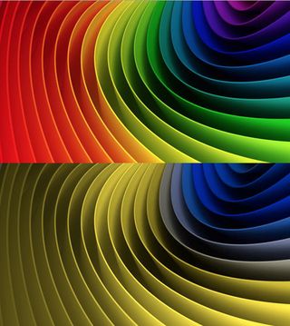
And for those people who are not colour blind, but want to experience how a colour blind person sees, they can go into Illustrator or Photoshop, into Tool Set up, and choose the Colour Blind option!
Next page: Why calibrate your screen, and what role mobile phones are going to play in future workflows...

Thank you for reading 5 articles this month* Join now for unlimited access
Enjoy your first month for just £1 / $1 / €1
*Read 5 free articles per month without a subscription

Join now for unlimited access
Try first month for just £1 / $1 / €1
Get the Creative Bloq Newsletter
Daily design news, reviews, how-tos and more, as picked by the editors.
The Creative Bloq team is made up of a group of design fans, and has changed and evolved since Creative Bloq began back in 2012. The current website team consists of eight full-time members of staff: Editor Georgia Coggan, Deputy Editor Rosie Hilder, Ecommerce Editor Beren Neale, Senior News Editor Daniel Piper, Editor, Digital Art and 3D Ian Dean, Tech Reviews Editor Erlingur Einarsson and Ecommerce Writer Beth Nicholls and Staff Writer Natalie Fear, as well as a roster of freelancers from around the world. The 3D World and ImagineFX magazine teams also pitch in, ensuring that content from 3D World and ImagineFX is represented on Creative Bloq.
