The pro's guide to Adobe Typekit
Lance Evans looks at the principles behind Adobe's font service and what it's like to use in practice.
Sign up to Creative Bloq's daily newsletter, which brings you the latest news and inspiration from the worlds of art, design and technology.
You are now subscribed
Your newsletter sign-up was successful
Want to add more newsletters?
Five times a week
CreativeBloq
Sign up to Creative Bloq's daily newsletter, which brings you the latest news and inspiration from the worlds of art, design and technology.

Once a week
By Design
Sign up to Creative Bloq's daily newsletter, which brings you the latest news and inspiration from the worlds of art, design and technology.
Once a week
State of the Art
Sign up to Creative Bloq's daily newsletter, which brings you the latest news and inspiration from the worlds of art, design and technology.
Seasonal (around events)
Brand Impact Awards
Sign up to Creative Bloq's daily newsletter, which brings you the latest news and inspiration from the worlds of art, design and technology.
For those of us who work with typography on a regular basis, it can be a wake up call to remember we are carrying on a tradition/industry started with Johannes Gutenberg over 500 years ago. Then think of the fact that until just 20 years ago, most type was still being produced with photo-typesetting, T-squares and triangles. Back then there was always some yahoo in the studio sniffing the rubber cement; this too is long gone.
A few decades ago, Adobe set out to change all of that, almost single-handedly, and are in the process of doing it all again, along with other's help. The problem is, in the process, things have become far more confusing than they should, so let's try to sort some of it out.
Adobe's subscription model
Adobe Typekit – essentially a multifaceted online type service – is at the heart of this new typographic revolution. As with other items in the Creative Cloud 2014, it's part software and part services-based. Launched in 2009 by a company named Small Batch, Inc. it was soon purchased by Adobe, who has expanded on it in many ways.
This includes its tight integration with other Creative Cloud applications. You will really see this as you upgrade to the latest CC 2014 versions, many that have new type interfaces.
We'll examine how Typekit works in practice in a moment. However, it's first worth noting that it's not the only type service around. Not even the only Adobe service...
Free alternatives
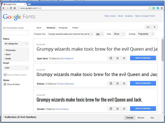
Other companies, including Google, have also jumped into the online type serving arena. Google Fonts offers designers and web developers hundreds of typefaces in their library.
This service is popular, especially because its fonts are all open source and totally free. And while it is designed primarily to solve our online typography needs using similar technology to Typekit, it freely allows any of any of its fonts to be downloaded and used on the desktop with any application.
Sign up to Creative Bloq's daily newsletter, which brings you the latest news and inspiration from the worlds of art, design and technology.
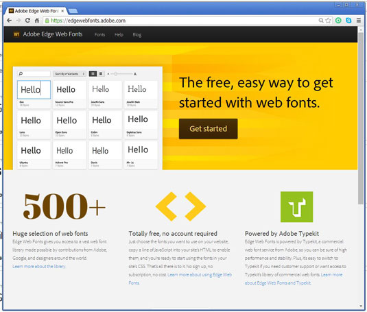
It's tough to fight against free, and so even Adobe with its Typekit offering, has also created its Edge Web Fonts, which is also free. This library has over 500 fonts, and cross agreements with Google so many (if not all) Google Fonts are included as well. It is run on a somewhat modified version of Typekit, and offers another great option.
So what are the problems all these new and exciting services have been trying to solve? Let's look at each in turn.
Problem 01: on the desktop
Publishing and design applications like Adobe's InDesign CC live and breathe their type design. Depending on how they are used, so do programs like Photoshop and Illustrator.
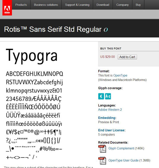
So traditionally if we wanted great typefaces to work with in these programs, we had to go out and buy expensive fonts (see above). Building a large library could very quickly get expensive. (It's also worth noting that from any high-end type foundry's point of view, the growing availability of free fonts cut heavily into their profits.)
Problem 02: on the web
Then there were the web issues over the last decade or more. The web was never designed with type in mind. It even took years before we had the paltry number of 'web safe' fonts assembled (and just how truly 'safe' they are is questionable in itself).
One of the most popular ways to get access to a decent range of typefaces for your web design needs required using Flash, which would embed the fonts you used. This solution was relatively easy and worked well for designers, but is no longer a full-spectrum option today.
A variety of other technologies were given a shot as well, though each came with their own set of complexities, limitations, and compatibility issues. CSS version two offered ways to embed fonts, but wasn't implemented well at the time, and not supported by all browsers. So devs kept looking for exotic solutions.
And we designers? Well, most of us took a big step backwards and 'cheated' by using rasterized images of custom font headlines. Really, this was a throwback to the earlier days of the web, before Flash. But this was all just stop-gap.
Using the old approach
Today, if your main use of type is for printed items, or any non-web applications, you can still continue to go up to digital type foundries and purchase type by either individual face, or by the entire family.
There are somewhere north of 2,000 typefaces offered in this Adobe library, and they can be used with both older and newer versions of either the CS or CC lines. This, we call old school.
Now let's go up to Adobe's Typekit.com site and you will see things are quite different. (Keep in mind that this is a different library than the traditional Adobe type, even if many faces/families are the same.)
Using the new approach
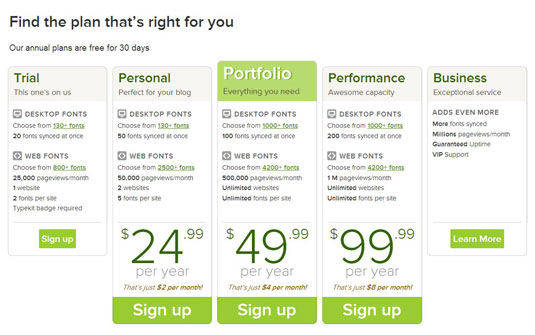
Typekit.com doesn't sell faces or fonts, it sells subscriptions. As of this writing there were five basic options: Trial, Personal, Portfolio, Performance, and Business. And as we begin to look at the various options, we start to realize that we're not in Kansas anymore. Things are getting complex right here in typeville.
While we used to just buy a typeface, we now have a number of decisions to make. Each package offer a different level of access, but both include access to the library's Desktop and Web licensed type.
The plans are billed annually, and are very reasonable across the board. Starting at free for the Trial version, and moving to $25, $50 and $100 for the main offerings of Personal, Portfolio and Performance, respectively.
Desktop fonts
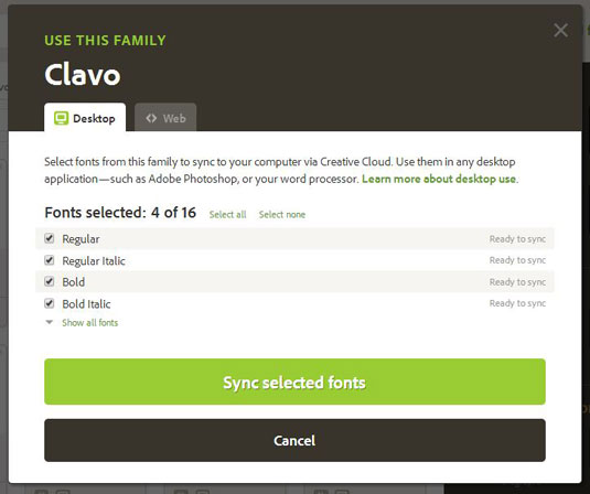
These are, more or less, the type of fonts we were always used to, just the technology and licensing has changed. They can be used in any non-web projects with few limitations, but are not licensed for use on the web.
There are over 1,000 fonts in this library, and once you get the basic hang of it, you'll likely forget about the older way of doing things. That's right, no more hunting around for buried system Font folders or having to buy/run third-party utilities. And to answer a much asked question, yes, any fonts you download ('activate' would be a better word) will be available to all programs running on your computer.
The plans start with the Trial version (free) which offers a choice of 130+ fonts, up to 20 that can be synced at the same time. The Personal version bumps this to 50 fonts synced up at once. And the next two tiers offer 1,000+ fonts to choose from, with either 100 or 200 faces synced at the same time.
Web fonts
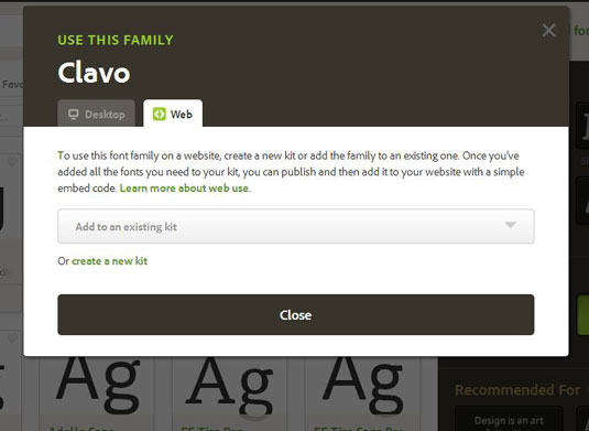
Web fonts are a very different animal. They are designed/offered specifically for use on the web, and with limited exceptions, are not for use on desktop projects (though I don't know if the licensing is as restrictive in that direction). There are over 4,200 fonts available in this library – a huge number.
And here is where things get hairy, er... I mean interesting. When it comes to the web fonts Adobe is no longer giving us unlimited usage. Like a cab ride, the meter is running, and they are clocking things like how many websites you are using faces on, how many typefaces are used per site, and how many pageviews those sites are getting per month. Yeah, 'wow', huh? Are we just about ready to go back to rasterizing the dang type again and throw on Prince's 'Party like it's 1999'?
Alright, it's not really that bad, at least, depending on what plan you sign up for and what your real needs are. For example, if you are designing a site for yourself or just one client, Adobe is actually generous enough to allow you to choose from over 800 faces, and choose two faces to use on one website. All for free.
That's not terrible, and works if you only need a headline and body face. It also includes up to 25,000 page views a month, which frankly, if you are working at this level, good luck getting close.
And don't scoff at this option so fast. Combine it with what Google Fonts offers, and other free offerings online, plus judicious rasterizing, and you find yourself with a huge number of faces to choose from for free. And not to side-step Adobe's good will here, but if you were to open a Trial account for each of your clients individually (which makes sense for other reasons as well, see below), then your limitations here are much less.
Levelling up
The next level up is called the Personal account and ups your choice to 2500 fonts and 50,000 pageviews/month, both of which is just fine. But you may find that its limitation to just two websites and only five fonts per site a bit snug for your tastes.
Let's face it, the real fun comes when we up our ante to the more mainstream options of the Portfolio and Performance accounts. Her we get a whopping choice from over 4,200 fonts and, most importantly, unlimited websites and unlimited number of fonts per site.
Do remember that there are many practical limits still in place. Too many fonts on a site and things slow down, and design wise we don't want to create typographic vomit, right? So design wisely. Pageviews are limited to either 500,000 or one million per month. So again, for most practical applications there is no limitation here.
Putting these new fonts to work
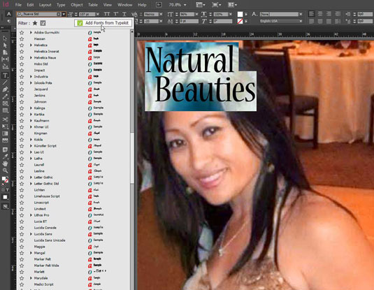
So how do we actually use them? Let's start with the Desktop variety. The easiest ways to get to the Typekit library is either via the CC control panel's Font tab, or from any application that is Typekit aware. Now that most CC applications are Typekit aware, this is made pretty easy.
For example, run InDesign CC 2014 and you'll see the type selection interface that allows you to choose between your system fonts, other installed fonts, and also any activated TK fonts. But there is also an option to 'Add Fonts from Typekit'. Click on that and you launch the Typekit web interface.
Using the Typekit interface
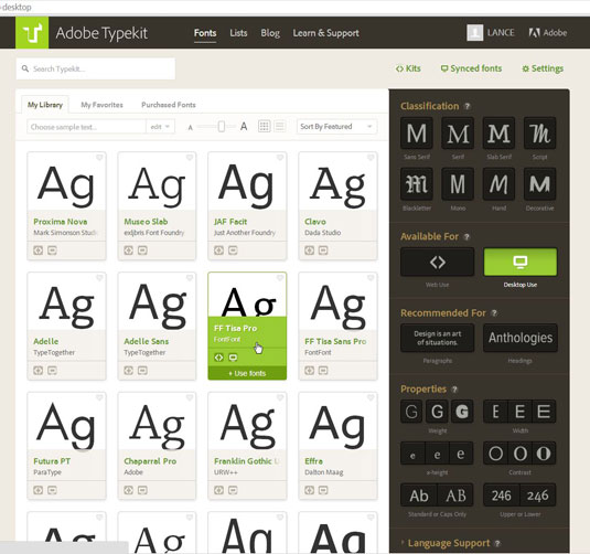
The TK interface allows you to choose fonts by dialing in a great many parameters. The first one you are likely to choose between is Desktop Use or Web Use. Though you could also have both selected at the same time as well. There are the type classifications options (serif, san serif, script, etc.), and a wide range of property filters (like weight, width, contrast).
There is also a toggle for Headings and Paragraphs, which filter for faces that are well suited for headlines and body copy, respectively. Along the top you can see links that will take you to a listing of your Kits, Synched Fonts, and Settings.
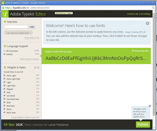
When you select a font to use options come up for desktop use and/or web use. If you opt to use the font for the web, then a 'kit' needs to be created, alternatively, the face can be used with an existing kit. Why kits? Unlike the free type alternatives, TK uses fonts to control the licensing and regulate the number of sites that a face and account are using.
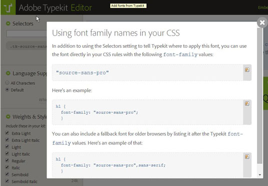
The next step in setting up for web use is to click on a small line that says 'Using fonts in CSS', which is found in the upper left of the 'Selector' section in each kit interface. Here you will find the CSS lines to be placed in your website code. Finally, don't forget to hit the 'Publish' button to get the fonts online and available to your site and its viewers.
All of this may sound a bit more complex than it really is. That isn't to say its all simple, as it isn't quite yet. For more help see some items on this page for a more detailed explanations.
Typekit and Muse
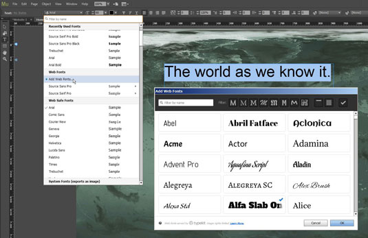
With all this typographic-availability we now have, it must be a great time for designers working on the web, right? I mean we Adobe Muse users must be kicking our heels together mid-air with joy, right? Not quite, because as it turns out, Muse doesn't actually work with Typekit. At least not yet.
In a conference session with Adobe staff, Stephen Nielson, Photoshop Product Manager, explained: "Muse is a special case, in that fonts that you use for your local design also get published and served up in the live web page."
Dani Beaumont, the Group Product Manager on Adobe Muse, then added: "In the Muse case we do not currently have Typekit Desktop sync. Also the Typekit fonts available within Muse are specifically limited to the Edge Web Font library. We did the original Edge Web font integration in the 1.0 version of Muse, during the first months of Adobe's TypeKit acquisition. We're working with the TypeKit team now on the engineering effort for deeper integration."
Real world uses
When it come to web use fonts there are two significant techie things to keep in mind here. The first is that type is no longer residing on the viewer's computer (i.e. web safe fonts), nor even necessarily being streamed from the same server that the rest of the website data is coming from (i.e. your server). Instead, the webpage code has a pointer directing the viewer's browser to an Adobe Typekit server (or Google Font server, etc).
The second thing is that if for any reason that type server being pointed to was unavailable, the web pages would still be served, but end up looking off, since regular system fonts would get replaced on the fly. So reliable type servers are critical to pages looking better than before, otherwise, they would actually end up looking worse than before this technology was in place. Fortunately, the resources of companies like Adobe and Google are quite vast. They are able to keep their server up-times extremely high, and good speeds with which the the data is served. Adobe actually provides a publicly available logging of the status of their TK servers.
Remember that TK faces never reside on your computer, so they can't be backed up, moved or installed on other computers like purchased fonts can. And can't be shared with your friends, co-workers or service bureau either. Google Fonts, on the other hand, can be.
Work for clients
One thing came to mind when I started thinking some of these new processes through, and the subscription model applied to websites. Let's say you, a web design studio, design a site for a client and use fonts linked to your design company's Adobe ID account.
Then let's say if for whatever reason, somewhere down the road that Adobe ID is no longer active. Well within a few weeks what will happen is that the sites you designed are going to start looking rather odd. Or at least not like you had designed and your (now former?) client signed off on.
And guess what? There is no way around this with the new way of doing things. As stated in Adobe's help pages: "the site that was using that account for Typekit web fonts will display the text in the fallback fonts specified in the font stacks in that site’s CSS, or your browser’s defaults. So, the text will still appear, just in a system font."
Best practice
What this means is that when you design a new site for a client, best practice would be to have them purchase their own Adobe Typekit account, thus they are responsible for paying for its annual fee. My first reaction to this was: "That's crazy. Clients don't want that extra burden." And they don't.
But on the other hand, if you purchase or otherwise admin their domain name, the same thing will happen in a year if you aren't there to pay the fee. Actually far worse, the site will just go 'poof'. So best practices will now mean making sure the client acts like a grown up and handles at least those two items themselves, in their own best interests.
What this means for working with various clients at the same time, each with their own TK account, is unclear. Are we to spend our days signing in and signing out of various client accounts? Well, probably not. The new automatic type replacements that work almost seamlessly with TK may allow us to work with our on TK account, and then streamline a transfer at the end. Maybe. I haven't haven't had the opportunity to test run any of this yet. Can any of you let us know? Obviously, the free services avoid these issues as no account is needed.
Adobe's response
I put these points to the Typekit team and got this response. "As you say, the designer can create an account for the client from the outset. This is a great solution as long as the designer isn't trying to manage different accounts for different clients (as you note).
"Alternatively, a designer would simply use their own Typekit account during design and development of all their client projects, and save the hand-off for last. The client (perhaps with assistance from the designer) would create a Typekit account at the end of the process and make a permanent kit to replace the development version. In the final build, the new kit ID would just need to be replaced everywhere the original kit ID is used [...] Neither approach is perhaps best for all occasions, but having a choice helps.
"Note that in any case, a completed website is best transferred to a client with a Typekit account of their own. When the designer keeps kits under their own account, they are accumulating all the collective pageviews, which could trigger overage charges. For a client expecting a lot of traffic to their site, it is far better for them to take that responsibility, and perhaps upgrade to a Typekit plan which supports the traffic and support levels which meet their own needs."
Final thoughts
The truth is, type has become more powerful, and also far more complex. While TK is certainly the most cared for product/service out there, the other options like Adobe Edge Web Fonts, Google Fonts and other options are extremely useful. In five years, all of this is going to be so killer.
Here are some helpful and/or interesting links I came across while writing this article, and wanted to share with you:
- Fonts.com teams with Google fonts to streamline their use in desktop apps, via their SkyFonts system: http://www.fonts.com/web-fonts/google
- Google Font Directory offers all of the font files, including the source files: https://code.google.com/p/googlefontdirectory
- Typecast.com teams with Google Fonts to use their Typecast sytem to preview/build HTML pages: http://typecast.com/fonts/google
- A Wordpress plugin to allow the use of Google Fonts in WP pages: https://wordpress.org/plugins/easy-google-fonts/
- Google Font Loader, for managing web fonts from multiple sources: https://developers.google.com/fonts/docs/webfont_loader
- The absolute beginner’s guide to using Adobe’s new Edge Web Fonts on your site: http://thenextweb.com/dd/2012/10/01/the-absolute-beginners-guide-using-adobes-new-edge-web-fonts-site
- A project to develop a new universal font, underwritten by BIC (yeah, the pen people): http://theuniversaltypeface.com/home (loads slowly)
Words: Lance Evans
Lance Evans is creative director of Graphlink Media. He has written books on 3D, and produced the 3DNY Seminars for Apple and Alias.

The Creative Bloq team is made up of a group of art and design enthusiasts, and has changed and evolved since Creative Bloq began back in 2012. The current website team consists of eight full-time members of staff: Editor Georgia Coggan, Deputy Editor Rosie Hilder, Ecommerce Editor Beren Neale, Senior News Editor Daniel Piper, Editor, Digital Art and 3D Ian Dean, Tech Reviews Editor Erlingur Einarsson, Ecommerce Writer Beth Nicholls and Staff Writer Natalie Fear, as well as a roster of freelancers from around the world. The ImagineFX magazine team also pitch in, ensuring that content from leading digital art publication ImagineFX is represented on Creative Bloq.
