Our Verdict
There's clear room for improvement, but this is still the best tool on the market for code-free web creation.
For
- No coding required
- Easy to pick up
- Creative Cloud integration
- Good resources
Against
- Quality of code
- No Plug and Play
- Sites not strictly responsive
Why you can trust Creative Bloq
Yesterday I wrote in some detail about how Adobe Muse solves a problem that's been a thorn in the side of designers like myself for many years. Namely, the lack of a way to create functioning web page layouts without learning how to code. So before you cry foul and dismiss the very nature of this project on the basis that "all designers should code", I'd urge you to read my reasoning on this score.
If you remain unconvinced, then I bid you farewell. For the rest of you, let me share my experiences in getting hands on with Muse...
The basics

First, a quick summary. Adobe Muse CC is a tool for designing websites without writing a line of code. In fact, unlike other tools, it doesn't even LET you code.
It bundles with the Creative Cloud, so you need a subscription to that service to use it. As a result, it integrates with all the other CC apps and services, including Typekit and Adobe Edge Fonts.
You get 20GB of cloud storage when you're a member of Creative Cloud, enabling you to access your website files when you're away from your computer. You can share design mockups and live site demos with clients and colleagues. You can even let the website owners make changes to content on live sites through a browser (with the ability to retain control and accept or reject those changes).
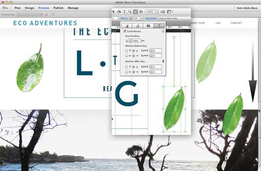
Within the template-driven software, you can drag and drop to add custom navigation, slide shows, contact forms, scrolling effects and more to your websites. All the interactive widgets are touch-enabled, so you don't need to do anything extra to make them tappable on touchscreen devices.
That's the theory, anyway - how does it work in practice?
Muse templates

I started working with Muse CC on a few typically small websites of five or six pages. I began developing sites both from scratch, and with templates from third-party companies that are selling a range of items to this new market.
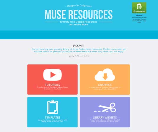
I worked with templates from Muse Themes, Muse Grid, Muse Layers, and Muse Resources. This last one bills itself as an "entirely free design resource for Adobe Muse".
Overall, the resources for Muse are great and appear to only be getting larger. They range from free to paid, to sharing with other users, to add-on widgets and enhanced functionality, to templates that cater to almost any general type of site you may be designing.
Familiar style
My first reaction to learning Muse and making my way around it was that it was not similar to InDesign as Adobe's marketing had suggested. That's fine though, as it's still very much a familiar Adobe style program, which Flash and Dreamweaver never quite were.
In general, then, those coming from InDesign start at a good place. Those who cut their web chops with Flash, though, will have to come to terms with the fact that this is no longer a timeline-based interface.
Also of note is Muse's good integration with Photoshop CC, which is always important to the design process and moving from mockup through production.
Learning curve

Doing your actual layout work, one begins to see the challenges faced by Muse's design team. While it's obviously not a fully web compliant canvas and instead has more static components, it isn't just patently ignoring the ways of the web the way Flash did. It's a mix of static and moveable elements, of which we the designer have a good amount of control. So there is some getting used to which I for one, am still doing, and finding interesting.
Expect a learning curve, both for the toolset, and also for the medium. I'm still getting up to speed with the aesthetics the pages the program puts out. Some pages look larger than I have expected, the word 'horsier' from advertising design circles comes to mind. I'm sure this is controllable in the design and layout process, and will continue to hone my control of such things in Muse.
Room for improvement
As of this writing Muse is up to version 7.4. And while it's a solid program, it's not without its share of foibles and oddnesses. Here are the top noteworthy items I came across:
- While working with Muse I often felt it was less than responsive, even on a powerful desktop workstation. Such sluggishness has been noted by many users. Simple page changes would take a few more seconds than it really should. Muse was apparently developed using Flash, Flex and AIR: could this be the source of its stodginess? I don't know, but I often had to remind myself I was working with a desktop application and not an often much slower web-based (i.e. Java) app. I'll assume Muse will move past this as the program is further optimized. In the meantime, know that slower computers may have issues.
- There were times when a simple line of text would not stay where I put it, and in preview would always reposition itself further north on the page. Taking that line of text in the LAYERS pallet and dragging it into a folder with other page items solved the issue. I'll allow that this may be my own error in still learning what moves and what stays put. But it was not as intuitive as hoped for.
- When in the PLAN mode, double-clicking one of the page icons would sometimes fail to open that page in the DESIGN mode and I had to resort to using the context menu (by right-clicking on the page icon, or Cmd-click on a Mac). On one occasion, some pages would not open at all and I had to reboot.
- One item I find particularly frustrating is the fact that unlike InDesign, Photoshop and Illustrator, Muse is unable to proportionately scale blocks of text, either individually or if grouped with other graphic elements. You are instead forced to resize the text separately. If you happen to have variously formatted text in a single text box, you're out of luck and must painstakingly reformat it all by hand. Ouch!
- The tool palletes interlock in ways that would not allow comfortable configurations. For example, the very necessary LAYERS pallet could not be expanded vertically as far as needed, nor could it be torn off the other pallets to allow for functionality similar to other Adobe products. This meant I had to keep scrolling up and down it's long list of items.
So there's clearly room for improvement with Muse, although the way that updates are made via the Cloud means that hopefully many of these issues will be fixed in the background as time goes on.
Quality of code
For many, though, the main issue with Muse will be that it creates so-called 'bad code'. And yes, the machine generated code that is created by Muse is, to humans, a mess. It is inefficient code by any standards. All true, and I agree I wish it was not the case.
I tested some of what I created, again from scratch and from professionally made templates. The results were not quite as good as I had hoped for. While my ultra-simple sites worked with just about everything I tried it with, two of the template sites had troubles with browsers on Android.
We won't be able to expect to do much/any post-Muse work with the files. And if you can, the time spent will kill all the value you saved by using Muse in the first place.
In short, you're unlikely to create a site in Muse that works as well as one that's been handcoded by an experienced developer. But does that mean that you shouldn't go near it?
Sticking point?
If you're an experienced developer yourself, then I'd say yes. But if you're not, I think it's a case of recognising Muse's limitations, and focusing what it can do and well as what it can't.
Programmers have long spoken of the importance of efficent (i.e. small) code to provide the fastest downloads. However, in the age of Netflix and YouTube gigafiles flying to your phone while on the commute to work, it may be time to lay this to rest. No Muse file is getting large enough to impede delivery of your site.
Muse's compatibility with all the browsers and devices out there is more of a issue. One of the benefits of hand coding is its ability to add in fixes for compatibility with a wider range of browsers. But then if you were sold on hand coding, you probably wouldn't be interested in Muse in the first place. So whether Muse is the best fit for a particular project really comes down to a cost-benefit analysis based on how complex the site must be, who your audience is and what devices/browsers they're using.
Plug 'n' play limitations
A number of folks have commented that there are so many limitations with Muse, because not having code, we are thus limited to the functionality that Adobe and third parties build into it via the program or plugins. This is true, and it is a reality of the platform. Adobe also reminds us that we can import many things into Muse, like animations files, but there are limitations.
Desktop v mobile

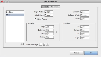
Muse sites are not technically responsive in the narrowly defined sense: the program actually has separate modules for 'desktop', 'tablet' and 'phone' layouts. Functionally speaking, a desktop layout can be produced that should be very functional on most tablets over about 8in. Thus we can often get away with only developing two layouts, the desktop and phone. Still, it means developing two or more separate sites rather than one truly responsive one.
Is non-responsive a problem? I'll be an outlyer from the masses and say not really. But in full disclosure, I am not a great fan of the concept, at least until it gets easier and more flexible to execute. Creating a truly responsive site that is also a pleasing design is not an easy thing to do. It takes longer than designing a non-responsive site. So in theory, one might be able to knock out that desktop and phone sized sites in Muse in far less time than creating a responsive site in Dreamweaver. Chalk this one up to personal call.
The future of Muse
In the last 18 or so months Adobe has released seven full-version updates to Muse, a huge number in such a short time. Despite this impressiveness, each release was not the equivalent of an old-style upgrade. Nonetheless, each brought the program up to the next level in a reasonably short time frame.
As long as Adobe continues this pace, and the issues keep getting ironed out, it is hard to see how anyone can have anything but praise for a program that adds to our toolkit in such a productive way.
Review by: Lance Evans, creative director of Graphlink Media.

Thank you for reading 5 articles this month* Join now for unlimited access
Enjoy your first month for just £1 / $1 / €1
*Read 5 free articles per month without a subscription

Join now for unlimited access
Try first month for just £1 / $1 / €1
out of 10
There's clear room for improvement, but this is still the best tool on the market for code-free web creation.

Tom May is an award-winning journalist and editor specialising in design, photography and technology. Author of the Amazon #1 bestseller Great TED Talks: Creativity, published by Pavilion Books, Tom was previously editor of Professional Photography magazine, associate editor at Creative Bloq, and deputy editor at net magazine. Today, he is a regular contributor to Creative Bloq and its sister sites Digital Camera World, T3.com and Tech Radar. He also writes for Creative Boom and works on content marketing projects.
