Master colour in Creative Cloud
Use Color CC to choose and create colour themes – no matter what your intended output – and use them in your CC apps and services.
Colour. It's fundamental to conveying mood and tone of voice – from designing a logo, website or brochure, to producing content for print, digital or motion. The simple fact is, your colour palette – or theme – is vitally important.
With Creative Cloud you can be sure that you'll get consistent colour. Its vast range of swatches for both digital and print use means you have all the options you need. Plus your colour themes are with you whenever you need them, and can be shared with your colleagues or The World. But often, choosing colour palettes is the hardest part; where do you find inspiration?
Luckily, choosing and creating a colour palette has never been easier, thanks to Adobe Color CC, an app and website that integrates across Creative Cloud to enable you to grab stimulus and collect colours from your surroundings or create a harmonious colour scheme, wherever inspiration strikes for use in your work.
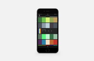
The Color app (available for iOS) is a brilliant way of creating and storing colour palettes on the move. For instance, you may see a sign or poster on your travels and want to capture the feel of it – and with Color it's no problem. You can, within the app, access your iPhone or iPad's camera as a live feed, and as you move the device around it generates colour schemes automatically, picking colours out of what you are seeing through your camera.
To freeze the view and the scheme simply tap the screen. You can then use the swatches at the top to edit your scheme, or simply tap on one of the dots on the live view and drag to a new place to switch to a different colour. There's also a mode where you can choose an existing photo from your library and select a colour theme that way. In addition, if you want to just create colour schemes using the normal colour picker/wheel approach, you can. See our tips below for more on these options.
But the best thing about Color CC is how it plugs into your design workflow. After you've created themes on the move, by signing in online at color.adobe.com you can further edit these themes and download .ASE files to import as swatches into the likes of Photoshop, Illustrator and InDesign. You can even explore themes that others have created and use them as inspiration.
Even better still, you can use the brilliant Creative Cloud Libraries to automatically get these themes into your Creative Cloud tools. Whatever your project, Color CC is a brilliant way of defining, editing and sharing colour palettes. Read on for some more tips on using the app with your Creative Cloud design tools.
Integrate Adobe Color CC into your workflow…
01. Get Color CC

First thing's first – download the Color CC from the App Store and sign in using your Creative Cloud login. This makes sure everything syncs and you can easily obtain your colour palettes in your CC tools.
02. Pick from camera

One of the coolest features of Adobe Color CC is the ability to dynamically pick up colour palettes from your surroundings. Open up the app and you're presented with a live view of your camera. Move it around and the app automatically picks up the colour palette of the object you're looking at. From here, tap the button bottom-right to choose your palette and go to the colour picker.
03. Freeze!

You can easily freeze your camera, taking the colour palette that's on display at the time and, by hitting the tick at the bottom of the screen, create a colour theme and save it directly to Creative Cloud. Once you're done, simply hit the + button to continue creating themes. In addition to the camera, you can pick colour themes from images in your camera roll.
04. Analogous picker

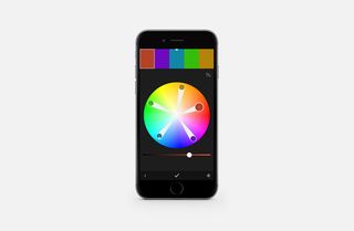
A perhaps more conventional approach to choosing colour themes is to use the Analogous picker. This enables you to choose a starting colour (top-left of the screen) and, using the pickers, create a harmonious colour theme. You can, in addition, define individual colours by tapping them at the top of the interface (or on the picker itself) and moving the handles around.
05. Monochromatic and more

Hit the button bottom-right to choose a different colour model. For instance, you may want a theme with lots of different tones of one colour – in which case choose Monochromatic.

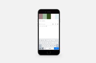
Or you may want to use the complementary model. Experiment with the pickers and remember to save your themes as you go by hitting the tick, choosing a name and adding tags if necessary.
Next page: five more ways to master colour in Creative Cloud

Thank you for reading 5 articles this month* Join now for unlimited access
Enjoy your first month for just £1 / $1 / €1
*Read 5 free articles per month without a subscription

Join now for unlimited access
Try first month for just £1 / $1 / €1
Get the Creative Bloq Newsletter
Daily design news, reviews, how-tos and more, as picked by the editors.
The Creative Bloq team is made up of a group of design fans, and has changed and evolved since Creative Bloq began back in 2012. The current website team consists of eight full-time members of staff: Editor Georgia Coggan, Deputy Editor Rosie Hilder, Ecommerce Editor Beren Neale, Senior News Editor Daniel Piper, Editor, Digital Art and 3D Ian Dean, Tech Reviews Editor Erlingur Einarsson, Ecommerce Writer Beth Nicholls and Staff Writer Natalie Fear, as well as a roster of freelancers from around the world. The ImagineFX magazine team also pitch in, ensuring that content from leading digital art publication ImagineFX is represented on Creative Bloq.
