4 features that would make Photoshop perfect
After 25 years of development, is Photoshop as good as it used to be? Lance Evans investigates.
Photoshop just celebrated its 25th anniversary. And much like some of our readers who may also be around that age, 25 is a great place to be, but still leaves plenty of room for improvement.
Discover how Photoshop changed the way we work
Reflecting back to the original version of the program, today's Creative Cloud version of Photoshop is practically from another planet. Our current PS does so much, it almost makes the early versions look like MacPaint.
The downside to all this wonderfulness of our current version is that today's PS is far more complex to learn, and the hope of mastering it is somewhat pretentious. It simply grows faster than we can learn it. Yet despite that growth, there are omissions.

Interface: Organic vs Logical
Part of the problem with learning PS in recent years is that its growth has been 'organic', which might be better for food than for software development.
Think of a house designed for a couple. When kids come along everyone wonders where an extension can be tacked-on. PS has suffered similar growing pains. For example, with the rise of the internet Adobe added Slice, Export for Web, and other tools. As computer power increased PS added Layers, masks, Smart Objects and Adjustment Layers. Then 3D.
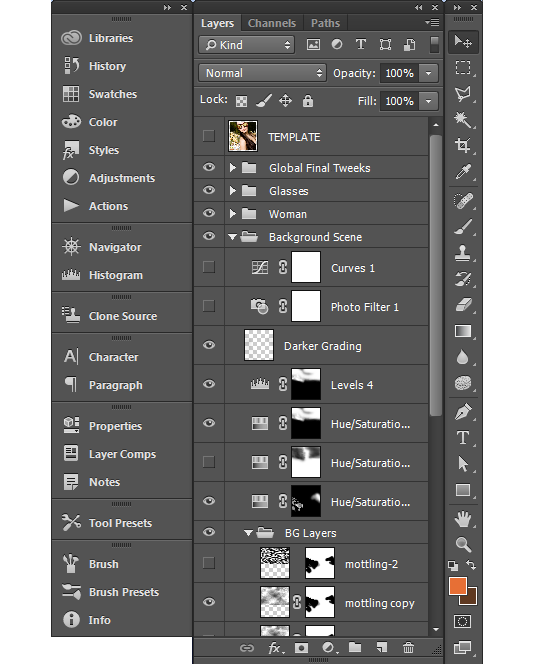
This spurred organic growth where some things found logical homes in the interface, and other elements were left feeling decidedly tacked-on. Users were sometimes forced to learn oddly interfacing toolsets, placed in rather strangely chosen locations.
Get the Creative Bloq Newsletter
Daily design news, reviews, how-tos and more, as picked by the editors.
One recurring complaint: Users have long objected to tools like 'Lighting Effects' that open into their own interfaces rather than work within the main window. PS has continued to organically expand its tools by adding these 'filters', which really are discreet mini-applications that run within Photoshop.
Despite tremendous feature growth, Photoshop's user interface is essentially quarter of a century old. A more logical, and holistic approach if you will, in designing a program is to first understand the scope of tools you will include, and find a way to incorporate it all in a more accessible interface.
Yes, this is certainly easier said than done, and not an easy task for a behemoth like PS. But perhaps this will mean that sometime down the road Adobe will need to rethink PS's design in newer, and broader terms.
Too much of a Swiss Army Knife?
In an effort to make PS everything to everyone, we have seen PS outgrow itself to the point of needing to be spun off into multiple versions, each accommodating different markets. For example, Photoshop Elements reduced cost as well as learning curve for the casual user.
The most significant professional spinoff was the creation of the 'Extended' version. While it only existed through three versions, CS3-CS6, it underscored that PS had added many specialty features (3D, video, etc.) that were really not core tools.
It's easy to see why many users have questioned whether core development has suffered over the years from Adobe's desire to have PS be everything under the sun. Many users question whether existing tools and workflows would be better served by efforts of refinement, instead of expansion.
Next page: the ultimate Photoshop wish list...

Thank you for reading 5 articles this month* Join now for unlimited access
Enjoy your first month for just £1 / $1 / €1
*Read 5 free articles per month without a subscription

Join now for unlimited access
Try first month for just £1 / $1 / €1

The Creative Bloq team is made up of a group of art and design enthusiasts, and has changed and evolved since Creative Bloq began back in 2012. The current website team consists of eight full-time members of staff: Editor Georgia Coggan, Deputy Editor Rosie Hilder, Ecommerce Editor Beren Neale, Senior News Editor Daniel Piper, Editor, Digital Art and 3D Ian Dean, Tech Reviews Editor Erlingur Einarsson, Ecommerce Writer Beth Nicholls and Staff Writer Natalie Fear, as well as a roster of freelancers from around the world. The ImagineFX magazine team also pitch in, ensuring that content from leading digital art publication ImagineFX is represented on Creative Bloq.
