Harness CS6’s vector shape tools
Luke O’Neill shows how to use Photoshop CS6’s new features to create a striking typographic book cover
09 Repeat this process, experimenting with the different shape layer options. Here I’ve applied a dashed line stroke with a foreground to transparent gradient fill to a number of polygon shapes. Try playing around with the direction and style of the gradient and the different shape fill options, but remember to keep the colours harmonious. If the shape options disappear after you’ve moved an object, simply click the Shape icon again in the tool bar to bring them back up.
10 Another addition to CS6’s shape layers is the ability to build or combine shapes without the need to rasterize the layers first, meaning that they will still be scaleable to any size without any loss of quality. On a new layer select the Custom Shape tool, and set the Custom Shape Picker to Show All. Choose the wave shape and, with Shift held down, draw a perfect wave shape anywhere on the canvas.
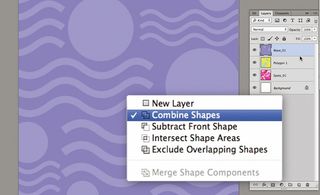
11 Now select the Ellipse shape tool and draw a perfect circle, ensuring that Combine Shapes is selected from the path operations drop-down. The shapes will now act as one vector layer, enabling you to duplicate and resize them as you see fit. Have a play around with the different options, try subtracting and intersecting the layers, add a contrasting fill background, and rasterize and merge the layers as we did before.
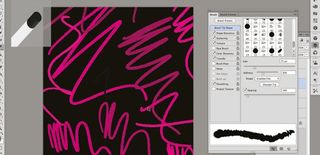
12 Now to have some fun with Photoshop’s new erodible pencils, which wear down naturally as you use them, just like real pencils. Create a new layer, select the Pencil tool, bring up the Brush panel and select the Erodible Flat brush. Start creating random marks and you’ll notice in the new window at the top-left that the brush gradually wears down, creating more natural marks. You can sharpen it again back in the Brush panel. You really need a graphics tablet to take full advantage of this new function.
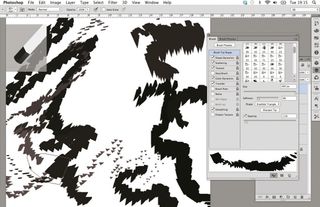
13 Try experimenting with the different erodible pencils, creating and naming the new layers as you go. Here I’ve used the Erodible Triangle nib to create some random yet interesting marks. There’s no need to be precise, just have fun. Once you’re happy that you have enough different effects layers, save the file and switch back over to InDesign.
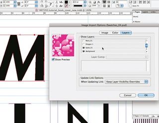
14 Back in InDesign, select the first outlined letter of the title and hit Cmd/Ctrl+D to bring up the Place dialog. Check the Show Import Options box, and under the Layers tab turn off all but the layer that you want to fill the character with.
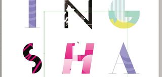
15 Repeat this process for all of the letters, placing different layers within the individual characters. Adjust the size, crop and orientation of each image that you place, and try to make sure the design gels together as a whole, with each letter complimenting the next.
Get the Creative Bloq Newsletter
Daily design news, reviews, how-tos and more, as picked by the editors.
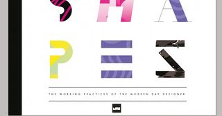
16 Finally, add any finer details, such as a strap, logo and, in this case, a thick black bar that sits flush to the spine. Be careful not to over-do it with these details as we want the title typography to really speak for itself.

Thank you for reading 5 articles this month* Join now for unlimited access
Enjoy your first month for just £1 / $1 / €1
*Read 5 free articles per month without a subscription

Join now for unlimited access
Try first month for just £1 / $1 / €1
The Creative Bloq team is made up of a group of design fans, and has changed and evolved since Creative Bloq began back in 2012. The current website team consists of eight full-time members of staff: Editor Georgia Coggan, Deputy Editor Rosie Hilder, Ecommerce Editor Beren Neale, Senior News Editor Daniel Piper, Editor, Digital Art and 3D Ian Dean, Tech Reviews Editor Erlingur Einarsson, Ecommerce Writer Beth Nicholls and Staff Writer Natalie Fear, as well as a roster of freelancers from around the world. The ImagineFX magazine team also pitch in, ensuring that content from leading digital art publication ImagineFX is represented on Creative Bloq.
