Harness CS6’s vector shape tools
Luke O’Neill shows how to use Photoshop CS6’s new features to create a striking typographic book cover
A piece of design often achieves impact through the things you take away or choose to omit, rather than the elements you might add. Clarity of message and impact are two essential aspects to bear in mind when designing a book cover, or anything that relies heavily on its outer packaging to sell what’s inside.
Through this tutorial I’ll show you how to create a simple, bold, typographic cover for an imaginary new design journal, which I’ve (with tongue firmly in cheek) named Moving Shapes. I’ll run you through the basics of setting up a cover template and making type choices, and show you how to produce some striking effects using a few of Photoshop CS6’s new features.
We’ll look at the new vector shape layers, which enable you to combine different vector shapes in a non-destructive manner – much in the same way as Illustrator. The new erodible pencils are a great addition for any digital painter or illustrator, and shouldn’t be overlooked by designers either. With a little imagination these new features can be used in conjunction with other Creative Suite programs to create striking, eye-catching designs with ease.
01 Begin by setting up a new document in InDesign measuring 232x300mm. Uncheck Facing Pages and add 3mm bleed to all edges. Go to Layout>Margins and Columns and enter 20mm for all margins except the the left margin, which should be 30mm. Choose 3 as the number of columns and apply a 7mm gutter. Holding Shift, draw a perfect square and snap a guide to its bottom edge.
02 Select the new guide that you’ve created, and step and repeat it once (Cmd/Ctrl+Opt/Alt+U) entering 7mm as the vertical offset – the same as the gutter. Repeat this until you have a grid of 12 squares and then add new 7mm offset guides to all outer edges of the grid. The title of my book measures an even 12 characters, but you might need to adjust the grid depending on the number of characters in your chosen headline.
03 Select the Type tool and click on the top-left frame to make it a text frame. Type the first letter of your title, choosing a font (in this case Futura) and centrally aligning it. Ctrl-click on the text frame to bring up the Text Frame Options dialog and choose Centre as its Vertical Justification so that the character sits slap-bang in the centre of the text frame. Either repeat this process for all the frames or simply duplicate this one.
04 Now to start having fun with your type. Remember that your font choices will largely determine the look and feel of the cover, so be sure that you make the right decisions. I have extended the text frames so they sit flush to the guides 7mm outside of the grid, which enables me to resize the font to the maximum size of the square grid without it disappearing into overmatter. Use Cmd/Ctrl+Shift+. to increase the point size and Cmd/Ctrl+Shift+, to decrease the point size.
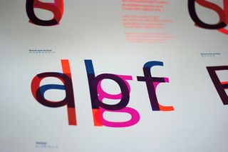
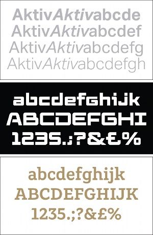
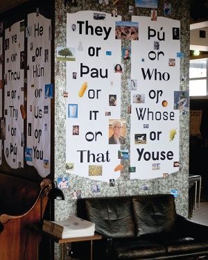
05 To keep things simple and stylised, I chose a handful of fonts: F37 Bella, Futura, P.22Bifur and Ivory. Play around with the point size and relationship between each character until you’re satisfied with the overall look and feel. You might find that some characters don’t sit perfectly central within the frame, but this can easily be rectified by inserting a space before the character and using Opt/Alt and the cursor keys to kern it into place. You might also need to add a baseline shift to ensure that it sits central on the vertical axis.
Get the Creative Bloq Newsletter
Daily design news, reviews, how-tos and more, as picked by the editors.
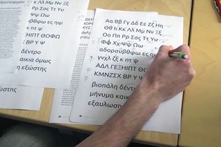
06 You might wish to edit some of the typography or create some characters of your own, like I’ve done here. I’ve created a graphic capital ‘E’ by duplicating three black bars. Once you’re happy with the typography, duplicate the page and, on the new page, select all the type and go to Type>Create Outlines in preparation for the next stage. By duplicating the page we’ve ensured that we can go back and edit the original live type quickly and easily, should we need to do so.
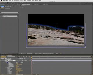
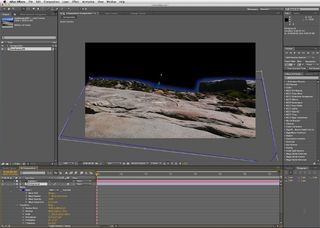
07 Switch to Photoshop CS6 and create a new document measuring 200x200mm. Set a foreground and background colour, and on a new layer draw a rectangle using CS6’s new vector shape tools. You’ll notice that there’s a new option bar at the top where you can specify a fill and a stroke. Give the stroke a foreground to background fill and increase its point size.

08 Interesting effects can be achieved by playing around with the new shape options. Increase the size of the stroke further, and in the drop-down menu select the dotted line. Start to duplicate the shape layer by holding Opt/Alt and dragging it like you would any layer. Re-size and reposition it, and you’ll notice that the stroke adjusts on the fly as you move around. Repeat this process using different stroke weights until you have filled the canvas. Then select all the shape layers, rasterize them, merge them and give the new flat layer a name.

Thank you for reading 5 articles this month* Join now for unlimited access
Enjoy your first month for just £1 / $1 / €1
*Read 5 free articles per month without a subscription

Join now for unlimited access
Try first month for just £1 / $1 / €1
The Creative Bloq team is made up of a group of design fans, and has changed and evolved since Creative Bloq began back in 2012. The current website team consists of eight full-time members of staff: Editor Georgia Coggan, Deputy Editor Rosie Hilder, Ecommerce Editor Beren Neale, Senior News Editor Daniel Piper, Editor, Digital Art and 3D Ian Dean, Tech Reviews Editor Erlingur Einarsson, Ecommerce Writer Beth Nicholls and Staff Writer Natalie Fear, as well as a roster of freelancers from around the world. The ImagineFX magazine team also pitch in, ensuring that content from leading digital art publication ImagineFX is represented on Creative Bloq.
