CS6: The Creative Pro's Guide
Discover what's new in the CS6 Master Collection – from Photoshop to InDesign to Illustrator to After Effects. Plus, discover how to use some of the incredible new tools…
InDesign CS6: The Creative Pro's Guide
The page layout application gets a workflow-orientated upgrade. But what's new and how can you utilise it in your daily work?

In recent versions InDesign has been focused on digital publishing – and with CS6 that doesn't change. In fact, the app becomes more digital focused than ever – but of course whilst retaining its roots in print design. What do we mean by this? Well, there is increasing pressure on designers to design for multiple devices, in multiple formats – with so many devices available that your publication can be viewed on, how can a designer still be efficient, meet deadlines and not design everything from scratch for each new delivery. But, it's not just digital – if you have a print ad layout for example that needs to be supplied in many different sizes, how can you keep workload to a minimum? That's where InDesign CS6 comes in, with the top new feature of InDesign CS6 is Alternate layout.
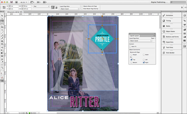
In a nutshell, the Alternate Layout feature makes it easier to adapt your primary InDesign layout for other orientations, page sizes, or devices while retaining complete control over the design. InDesign does the work of adding pages and copying your content over to the new size. So, how does it work? Well, with your primary InDesign document open, go to Layout>Create Alternate Layout. This brings up a dialog prompting you to name the alternate layout and also choose the source. You can also, like in the normal Document Setup dialog, choose page size and orientation. Where it gets interesting however is in the Options part of the dialog – most notably Liquid Page Rule.
Liquid Page Rule links to Liquid Layout – another new feature, but one that links closely to Alternate Layout. When you need to repurpose a layout for pages with different dimensions, apply liquid page rules – using the Liquid Layout panel found under Layout>Liquid Layout – to individual pages in your layout. Then, when you create an alternate layout, InDesign applies those rules to arrange content in relationship to the new page size. Of course, you can still make manual changes to the design, but if you apply liquid page rules with some common sense, a lot of the work will be done for you.
Adobe advises that you select the appropriate liquid page rule for the type of page, saying that Scale works best when you’re adapting a page for a layout that has the same aspect ratio and orientation and re-centre is appropriate when you’re repurposing content for a similar device and orientation with a larger size. Guide-based is useful for simpler pages that include mostly text and a few images. Finally, object-based lets you customise the way each object will be adjusted for the new page. The tools are interesting – and when used correctly can save a lot of time when repurposing layouts. Some will prefer to do everything by hand – but again the 80/20 rule applies – InDesign will take you 80 per cent of the way there, you do the rest.
In a similar vein, you can also link elements – anything that's in a frame including text, images or even interactivity – across multiple documents. The process of doing this is easy. In a document, select the content you wish to link across multiple docs and go to Edit>Place and Link. The Content Conveyor appears (more on this in a moment) with your content in it. Create a new document and drag the content from this to your new document. Then, when you change the source file of your content, you can update it across all of your documents with ease. The link alert icon now shows on the frame itself rather than just in the links panel. Why would you want to do this? Well how about to keep company logos consistent across all documents? Or if you have text edited that needs to go across multiple documents, just update it in the master, or source document, and it will update across your different documents when you hit the warning icon on the frame. It's clever – when you know how to use it.
So, the Content Conveyor – what's that? It's one of InDesign CS6's new Content collector tools, joining the Content Collector and the Content Placer. All of these tools are designed with the intention of, again, letting you reuse text and objects in the same, or other documents. Go to the Tools panel and select the Content Collector tool. Now, select the frame you want to grab, place it in the Content Conveyor, and then go to any document where you want to use the item again. Use the Content Placer tool to place the item on the page. As you place the item, by default it disappears from the Content Conveyor, but you can change this option.
There are other smaller additions as well. You can now create PDF forms directly within InDesign (do this using Window>Interactive>Buttons and Forms) and align objects to a 'key' object. To do this, select the objects you wish to align and in the Align panel choose Key Object under 'the Align To' drop down. You'll see a thicker border on one of your objects – this is the key object. Click on a different object to change that to the key object, then align as you wish. Other enhancements include small improvements to the digital publishing and EPUB tools and recently used fonts being displayed at the top of the Type>Font menu. You can also now keep paragraphs together even when one paragraph splits or spans columns, so that you can determine how InDesign breaks text. And you can, in the Text Frame Options, set the frame to move with the text – as text expands or shrinks, so does the frame around it. Finally, you can now export grayscale PDFs.
Get the Creative Bloq Newsletter
Daily design news, reviews, how-tos and more, as picked by the editors.
The upgrade here isn't massive but the intention is clear – to make it possible to re-use content and repurpose layouts with ease. If that's something you're doing on a daily basis and it's causing you headaches, InDesign CS6 may be just what you're after.
More about InDesign there's a full InDesign CS6 review over at CreativeBloq
Next up: After Effects CS6

Thank you for reading 5 articles this month* Join now for unlimited access
Enjoy your first month for just £1 / $1 / €1
*Read 5 free articles per month without a subscription

Join now for unlimited access
Try first month for just £1 / $1 / €1
The Creative Bloq team is made up of a group of design fans, and has changed and evolved since Creative Bloq began back in 2012. The current website team consists of eight full-time members of staff: Editor Georgia Coggan, Deputy Editor Rosie Hilder, Ecommerce Editor Beren Neale, Senior News Editor Daniel Piper, Editor, Digital Art and 3D Ian Dean, Tech Reviews Editor Erlingur Einarsson, Ecommerce Writer Beth Nicholls and Staff Writer Natalie Fear, as well as a roster of freelancers from around the world. The ImagineFX magazine team also pitch in, ensuring that content from leading digital art publication ImagineFX is represented on Creative Bloq.
