How to create contact sheets using Photoshop
Learn how to present your images professionally in our step-by-step tutorial.
At some point when working with images, you will want to share your results with others. There are several ways of doing this, such as a presentation on a laptop, on a tablet or even a smartphone. But what happens if you want to send a quick proof to someone or you want to do a presentation and you don’t have any portable electronic devices?
A simple solution is to create contact sheets within Adobe Bridge or Photoshop, which you can easily carry in a binder or send as JPEG or PDF.
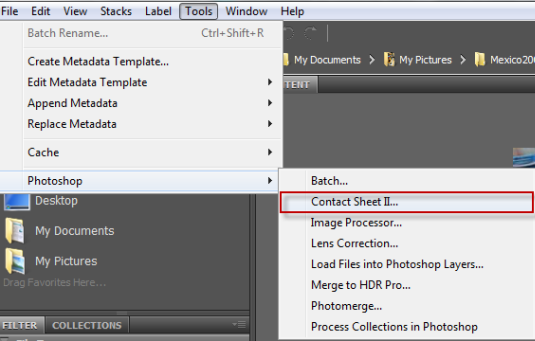
In Bridge CC, here’s how to get started, go to Tools>Photoshop>Contact Sheet II. Note that selecting this option will take you directly into Photoshop and the Contact Sheet II dialog box will appear.
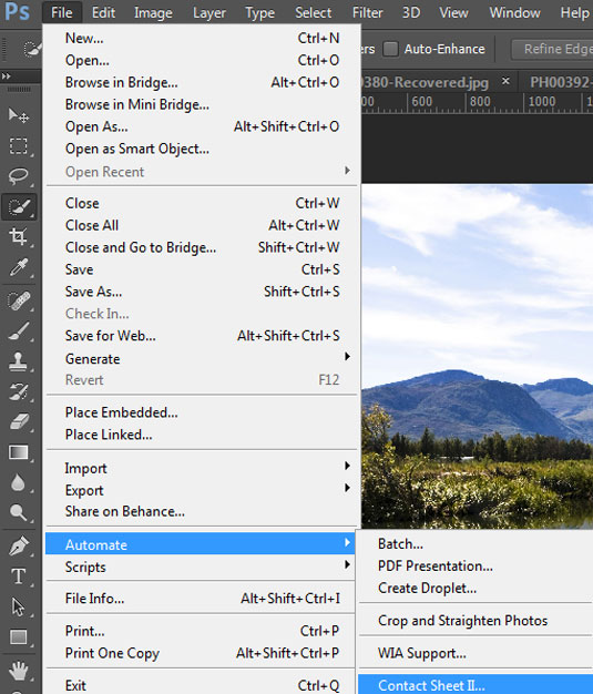
In Photoshop CC, go to File>Automate>Contact Sheet II.
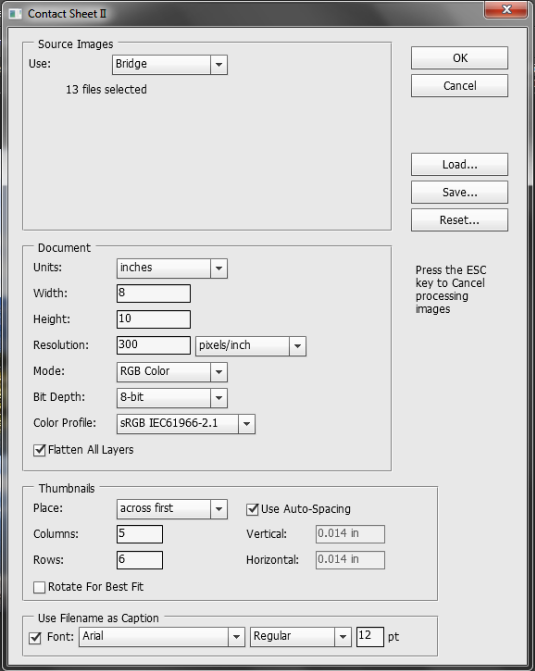
Both options bring up the Contact Sheet II dialog box. Here, you have many options for building contact sheets. Note that what you see on this page are the default settings. We will begin with these then create a customized layout.
Note that if you use Bridge as your starting point, some images might not be in the proper orientation. If that is the case, click on the image and one of the rotate buttons at the top of the layout to fix the problem before you build the contact sheet.
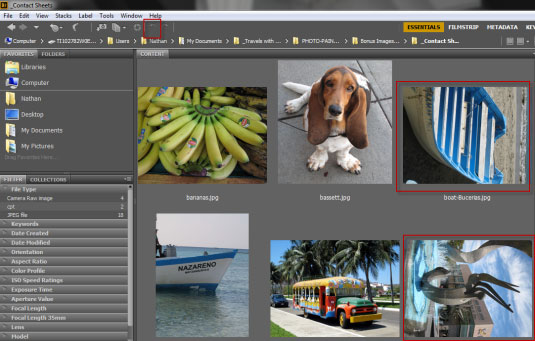
When you are ready to build your contact sheet, select all the images you want to use or Cmd+A to select them all.
Get the Creative Bloq Newsletter
Daily design news, reviews, how-tos and more, as picked by the editors.
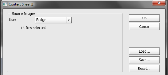
At the top of the dialog box is a drop down for the source images. In the screen shot above those came from Bridge, though they could have come from Photoshop as well.
On the bottom right are three buttons. The first one to look at is the Save button, which will allow you to save your settings for the next time you want to create contact sheets. The Load button allows you to load your file and the Reset button resets the dialog box.
The middle part of the dialog box controls the settings for the document. By default the size of the document is in inches and 8x10 as a portrait setting.

The print resolution is 300 pixels/inch, the mode is RGB , the bit depth is 8-bit and a default color profile is loaded. All of these can be changed. As an example, the units can be inches, centimeters or pixels and the mode can be changed to Grayscale, RGB, CMYK Color or Lab Color.
At the bottom of this screen shot is Flatten All Layers and this is enabled. If you turn it off, all image components from each file will be displayed in the contact sheet. By default Flatten All Layers is turned on, saving you from the task of flattening your images before they are used in the contact sheet.
In the Thumbnails section, you have control over how the images are placed. Images will placed across first, though you can change to images down if you wish.
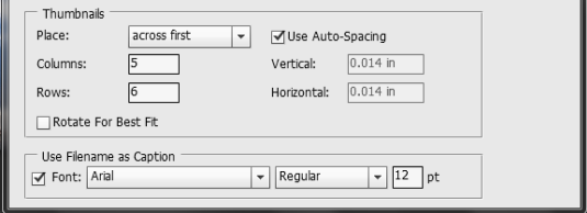
The default setting is for 5 columns and 6 rows. Auto spacing is enabled for both vertical and horizontal at .014 inches. The Rotate For Best Fit option is not enabled and it is recommended to leave it that way.
At the bottom is Use Filename as Caption. Leave this enabled if you want a caption. You can choose from the fonts available on your computer. For now we will use default.
Note that the above settings allow you to place 30 images on a page. If there are any more than this in a given folder, additional pages will be created for the remaining images.
Start building
When you are satisfied with your setting, click on OK. Photoshop will create the page and begin building the contact sheet. If you have large files this may take a few minutes.
Here is the completed contact sheet with the default settings with the following files: JPEG, CR2 and CPT. Of these, the first two file types worked, but not the .CPT files. When planning to use contact sheets, check to make sure your file types are supported, first.

Note that each image comes with its own type layer which you can change after the fact.
Recommended settings
While you can use the default settings in Photoshop I recommend not doing that, partly because the default settings will create many images on the page which are quite small. Instead, fewer columns and rows will create larger images which are easier to see.
It is important to give images some breathing room and use more white space. With the default the images are very close together and can interfere with each other on the page. Creating space allows the images to 'breathe' and be seen alone. If the spacing is still not enough, you might want to use cropping bars when you view the images.
Use separate folders
Do not group both horizontal and vertical images together on a page. It creates a messy looking layout. Instead, group horizontal and vertical images together in separate folders. Your presentations will look more professional as a result. Also, if necessary, crop all images so they match in both height and width.
Here is a contact sheet of horizontal images only which was set to 3 columns, 4 rows and a vertical and horizontal spacing of .5 inches.

As you can see, the process of creating contact sheets is straightforward and easy to do. This gives you a fast and easy way of generating previews of your content which you can print or save as a JPEG or PDF to send to your friends and colleagues.
Words: Nathan Segal

Thank you for reading 5 articles this month* Join now for unlimited access
Enjoy your first month for just £1 / $1 / €1
*Read 5 free articles per month without a subscription

Join now for unlimited access
Try first month for just £1 / $1 / €1

The Creative Bloq team is made up of a group of art and design enthusiasts, and has changed and evolved since Creative Bloq began back in 2012. The current website team consists of eight full-time members of staff: Editor Georgia Coggan, Deputy Editor Rosie Hilder, Ecommerce Editor Beren Neale, Senior News Editor Daniel Piper, Editor, Digital Art and 3D Ian Dean, Tech Reviews Editor Erlingur Einarsson, Ecommerce Writer Beth Nicholls and Staff Writer Natalie Fear, as well as a roster of freelancers from around the world. The ImagineFX magazine team also pitch in, ensuring that content from leading digital art publication ImagineFX is represented on Creative Bloq.
