Construct a type-based identity
Ruben Pater from Lava explains how designing a custom typeface can work for an identity
In 2010, the Ruhr area of Germany was named European Capital of Culture and Lava was asked to design an identity for all cultural activities in the Netherlands. The principal idea was to organise all the activities as a travelling cultural festival, which would encompass everything from fine arts, to music and theatre. The identity needed to be strong and simple so that all the cultural activities could adopt its style without copyright issues.
Having few funds for media attention, even the simplest signifier needed to be recognisable as the festival style. In this tutorial, I’ll show you how we designed the logo, which became the starting point for the identity.
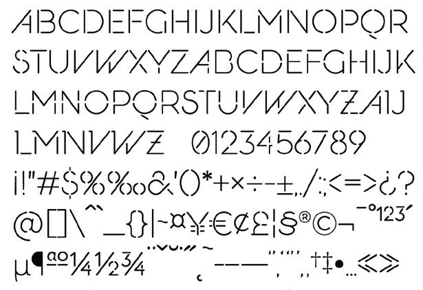
01 We started by coming up with the name and the concept for the identity. Before you start designing, working with the right name and concept is essential. in this case, we were able to come up with both the name and the concept, which is an ideal scenario. The client wanted a short and descriptive name. Since the Dutch are known to travel through the area with caravans on their way to their vacations, we wanted to use the Dutch licence plate as an ironic reference. From the descriptive name NL-Ruhr we came up with NL-RU-HR to use as the writing system on the licence plates: something that was both simple and immediately recognisable.
02 The licence plate in itself was only a reference to the Netherlands, so we needed to change the typeface to something related to the Ruhr area of Germany. The Ruhr is known for its industrial heritage, boasting many old factory buildings and mines, and these industrial parks play a key role in the area’s identity to this day.
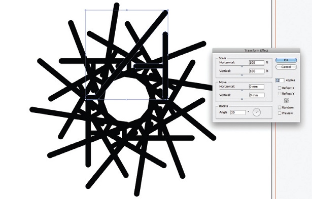
03 The factories from that time have distinctive forms, such as their towers, their steel construction and their large pulleys. From these forms we traced graphic elements that we could use to build the typeface.

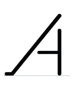
04 Because the letter ‘R’ was in the logo and used a round shape as well as a diagonal, it was a good letter to start the typeface off with. From our previous sketches we constructed the first letter to get an idea of the feel of the type. at this stage, it was still a rough idea, but it gave us the basis for something we could develop further in time.
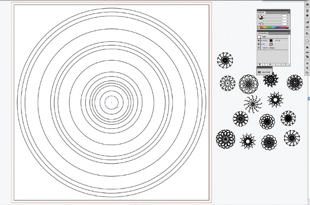
05 To find a proper weight, we redrew the ‘R’ in strokes, enabling us to look at its different weights. Details like the rounding of the joints had to be drawn as a solid instead of a stroke. For your own work, try different stroke sizes and print out the results as small as 10pt – they will look very different to how they do on screen.
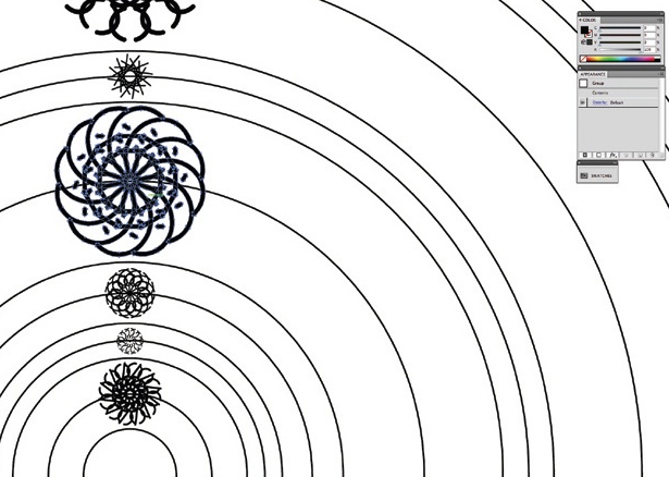
06 As we played around with the various font elements, we looked for ways to construct the typeface and create a common logic. With the chain elements as serifs, we started connecting the letters at a later stage – something that echoed the festival’s travelling activities – just like a route.
Get the Creative Bloq Newsletter
Daily design news, reviews, how-tos and more, as picked by the editors.
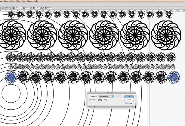
07 Using the building blocks as our starting point, we created a first draft of the typeface. In this case, the curly serifs made the font look less technical and somewhat romantic, while the strong diagonals added a technical feel. It’s always a good idea to have a few quirky details like this in the design of a typeface – without being too radical – otherwise the end result could end up being indistinct.

Thank you for reading 5 articles this month* Join now for unlimited access
Enjoy your first month for just £1 / $1 / €1
*Read 5 free articles per month without a subscription

Join now for unlimited access
Try first month for just £1 / $1 / €1

The Creative Bloq team is made up of a group of art and design enthusiasts, and has changed and evolved since Creative Bloq began back in 2012. The current website team consists of eight full-time members of staff: Editor Georgia Coggan, Deputy Editor Rosie Hilder, Ecommerce Editor Beren Neale, Senior News Editor Daniel Piper, Editor, Digital Art and 3D Ian Dean, Tech Reviews Editor Erlingur Einarsson, Ecommerce Writer Beth Nicholls and Staff Writer Natalie Fear, as well as a roster of freelancers from around the world. The ImagineFX magazine team also pitch in, ensuring that content from leading digital art publication ImagineFX is represented on Creative Bloq.
